Email Development
Email Accessibility in 2024: A Complete Guide for More Inclusive and Effective Campaigns
We need to have a serious talk about email accessibility. Writing, designing, and coding emails that are accessible to every contact on your list is a big deal. The problem is – many brands are missing the mark and leaving some subscribers with a less than ideal experience.
Not only does an inaccessible email marginalize some of your contacts and customers, but it’s also going to have a negative impact on email performance, brand reputation, and the overall business.
The reason is simple: If people have trouble viewing, reading, clicking on, or understanding your email campaigns, they won’t take the actions you expect.
Of course, the real reason to focus on accessibility in email marketing is because it’s the right thing to do. So, let’s explore this important topic more. Our complete guide will cover email accessibility best practices and how to design and develop campaigns for every subscriber on your list.
What is email accessibility?
Accessibility is the practice of making things meaningful and easy to use for people of all physical and cognitive abilities. The goal is to let as many people as possible access a resource. That could include a building, a restroom, an event or activity, a website, an application, or an email.
Email accessibility is the practice of writing, designing, and coding HTML emails that people can easily understand and engage with regardless of their physical or mental constraints. That includes optimizing emails for people who use assistive technology to access the internet and their email inboxes.
Improving email accessibility is a big commitment. It takes time and effort. But if you want an effective and inclusive email marketing program, it’s worth it.
Are email marketers focused on accessibility?
For the past few years, the Email Markup Consortium (EMC) has conducted research on email accessibility. Since 2021, the EMC analyzed hundreds of thousands of email campaigns to get an idea of whether brands and marketers are working to make emails accessible.
To put it bluntly, we’re doing a pretty horrible job. More than 99% of the emails analyzed contained accessibility issues considered “Serious” or “Critical,” and that stat has not changed much since the EMC began its annual research.
I spoke with two of the EMC’s administrators about the 2024 findings during an on-demand session of Email Camp MessageMania. Check out my Q&A with Alice Li and Naomi West below.
The point of conducting this research is not to shame email marketers for dropping the ball on accessibility. The idea is to raise awareness about the importance of taking the time to make emails more accessible. Naomi West called it a “glaring issue” and a sign that something was “gravely wrong in the industry.” She feels accessibility is a human right. However, Naomi also admits there was a time when she simply didn’t realize what needed to be done.
When I started learning about email accessibility I was just like ‘Oh my goodness.’ There are all these things I had no awareness that I was doing wrong or could easily course correct.

There are a bunch of things you can do to improve email accessibility starting today, and many of them are quite simple. We’ll tell you more and show you how to do it throughout this article. But if you want to get right to the good stuff, check out my article on how to code accessible emails.
Why is accessibility in email marketing important?
To paint a picture that illustrates the importance of email accessibility, let’s put ourselves in the shoes of someone with a disability…
Imagine you get an email from one of your favorite ecommerce brands. You’re excited about the offer mentioned in the subject line, but your excitement fades when you open the campaign.
Color contrast issues and a tiny font make it unreadable. You’re not sure where to find the promo code or where you should click. Tap targets on CTAs are too small on your mobile device. You try using software that reads the email to you, and it sounds like nothing but a confusing mess of garbled words and numbers.
That’s the kind of experience a subscriber with a vision impairment or other disabilities could have when senders fail to consider email accessibility. However, people with disabilities are far from the only ones who benefit from a focus on email accessibility. Making it easier to read, click, and comprehend email campaigns improves the experience for everyone on your list. As an added bonus, it also supports better email engagement and overall campaign performance.
While there are plenty of people who deal with a disability, it’s a mistake to think of email accessibility as something you do for a small subset of subscribers. At any given time, an injury, surgery, or temporary situation could mean someone is counting on your email to be accessible. As Alice Li pointed out during our Email Camp panel discussion, accessible digital communication will become even more important as Gen X, Millennials, and even Gen Z get older and start having issues with vision, dexterity, and more.
We are all only temporarily ‘abled’. We need to consider, as our digitally native generations age, how we can all continue to access web-based information like email.

Accessible emails not only ensure your marketing messages are easy to engage with, but they also support crucial customer communications delivered to the email inbox. That could include anything from transactional emails to messages delivering important health and safety information. Think of how brands relied on email during the COVID-19 pandemic, for example.
Failure to deliver accessible emails may even get you in legal trouble…
Accessibility regulations and standards for email

The most well-known and comprehensive law connected to accessibility in the U.S. is the Americans with Disabilities Act (ADA). This legislation protects the rights of individuals with disabilities, and it has been the basis for many lawsuits in which businesses are sued for failing to provide accessible experiences.
So, do any of the regulations in the ADA apply to email marketing? The ADA became law back in 1990. At the time, the internet, email, and digital media weren’t at the forefront of lawmakers’ minds. There are no specific guidelines for accessible websites, emails, or applications.
However, the Bureau of Internet Accessibility explains that Title III of the ADA “prohibits businesses from discriminating on the basis of disability in places of public accommodation.” Technically speaking, a website, app, or email could also be interpreted as a “place of public accommodation.”
By extension, emails may also fall under the Title III of the ADA, especially when emails include exclusive discounts, pre-sale opportunities, or other perks that aren’t available elsewhere.
What’s more? Transactional emails such as order confirmations, shipping updates, and password resets, should be always accessible because they’re more than marketing. Those communications often contain very important information that all your subscribers need to easily access.
Various industries have their own regulations and requirements around accessibility. Check out our article on email accessibility regulations by industry to find out more.
While the ADA has no direct technical guidance on digital accessibility, the group responsible for providing global guidelines in this area is the Worldwide Web Consortium (W3C), which publishes the Web Content Accessibility Guidelines (WCAG).
Currently, brands should be trying to follow WCAG 2.2. Updated guidelines are on the way, but WCAG 3 is not expected to be released for a few years.
Statistics on disabilities and accessibility
While it’s not hard to see why email accessibility matters, it helps to have some facts and hard numbers that drive the point home. Consider these accessibility statistics…
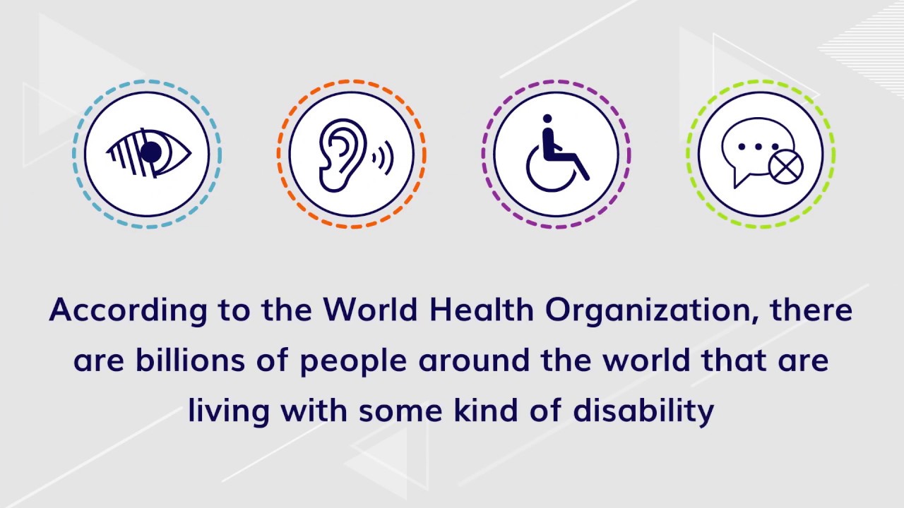
Over one billion people are estimated to live with some sort of disability. That’s approximately 15% of the world’s population. To break that down a little further:
- At least 2.2 billion people worldwide have some level of vision impairment. About 217 million of those individuals have moderate to severe vision difficulties.
- Hearing impairment is the third most reported chronic problem among the aged population, but 65% of people with hearing loss are younger than retirement age.
- Globally, 1 in 12 men and 1 in 200 women experience some level of color blindness.
- Around 5-10% of the global population is dyslexic.
So, if your emails aren’t accessible, you may be delivering a poor experience for a significant portion of your subscriber list.
Email accessibility studies
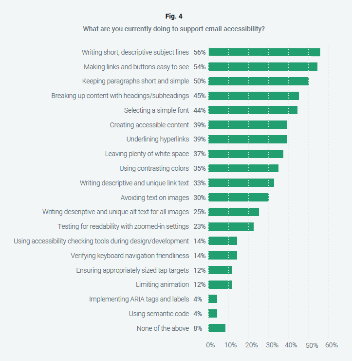
When we surveyed marketers for the “Accessibility in the Inbox” report, more than half of those questioned said they do consider accessibility factors during email production. But further questioning revealed that many weren’t doing nearly enough to truly support email accessibility.
For example, more than 50% of those surveyed said they were doing things like writing short, descriptive subject lines and keeping paragraphs short for readability. However, just 14% said they were using accessibility testing tools, and less than 25% said they were writing alt text for images.
You can also dive into the Email Markup Consortium’s latest research. The 2024 accessibility report provides insights into the most common missteps among email marketing teams while offering some actionable advice on how to fix those problems and make improvements.
Another helpful study comes from ActionRocket and Beyond the Envelope. In 2021, they teamed up to survey everyday people about important accessibility factors. That included asking participants about the types of text, color contrast, links, and layouts they found easiest to interact with or consume. Get the results in the Email for All report.
How email accessibility supports marketing efforts
Ignoring the need for accessible emails is certainly inconsiderate for subscribers with disabilities. But it also means missed opportunities and potential pitfalls for your marketing efforts. Here are six reasons why improving email accessibility supports a brand’s marketing strategy:
1. Accessible design improves usability for everyone on your list
Because human-centered design is at the core of accessibility, the changes you make — from color contrast to font sizes — will benefit every person on your list. They’ll all enjoy a fuller, richer inbox experience, which ultimately increases your return on investing in email accessibility.
2. Email accessibility helps you reach more people
With accessible emails, you can reach everyone on your list, including those with permanent disabilities or temporary impairments. If your emails aren’t accessible, you’re automatically excluding a subset of your audience and reducing your reach.
3. Accessible emails improve engagement and retention
If subscribers can’t read your email content or interact with your calls to action (CTAs), then they literally can’t engage with your emails. They also won’t be likely to stick around for future emails, either. That can negatively impact your email program performance while increasing your unsubscribe rate.
Find out more about how accessibility and email engagement are connected.
4. Following accessibility best practices minimizes legal risk
The number of website accessibility lawsuits filed in 2022 increased by 12% from the previous year. And there were likely many more unreported state lawsuits and demand letters with out-of-court settlements. Litigation is a serious threat to any company not meeting the needs of its entire audience.
But shockwaves from a lawsuit reach far beyond the economic damage. Even if it doesn’t have merit, when customers hear about these cases, their opinion of your brand is diminished.
5. Accessible email design separates you from competitors
If someone gets two emails from competing brands – one they can read and interact with and the other that isn’t accessible – which email do you think they’ll click on? Who do you think will win their business?
Even if they’ve been purchasing from your competitor for quite some time, if your accessible emails are easier to engage with and understand, they’re more likely to make a switch.
6. Accessibility enhances your brand
Knowing your audience is at the heart of every good marketing strategy. By making your emails accessible to everyone, you’re speaking directly to their needs and showing that you understand their everyday lives.
Thinking about subscribers as people rather than just contacts in a database shows that you care about them and put their needs first. The Association of National Advertisers (ANA) cites a study that found 92% of consumers want brands to practice empathy. That means creating accessible emails that show you understand how people with both temporary and permanent impairments engage with your brand.
Find out more about how to add a human touch to email marketing.
Types of disabilities email marketers must consider
When you focus on accessibility, you’re accommodating a variety of disabilities and impairments. Here’s a list of disability types, along with a few ways you can support subscribers with these challenges when building your emails:

Vision impairments
Vision disabilities go far beyond blindness or low vision. They also include color blindness and those who have sensitivities to brightness, cataracts, glaucoma, and diabetic retinopathy. Vision impairments are the most likely way a subscriber would have trouble accessing an HTML email. For example, astigmatism is a condition that can make it hard to read emails in dark mode.
There are many ways you can improve the email experience for people with impaired vision. That includes providing appropriate color contrast in your emails, using a readable font/font size, and coding emails so they are compatible with screen reading software.

Auditory impairments
Auditory disabilities include those who are deaf or hard of hearing. Someone with an auditory disability might have trouble with the volume of sound, frequency of sound, or phantom noises (called tinnitus).
In your emails, consider things like video captions and podcast transcripts.

Cognitive issues
People with mental limitations that affect memory, problem-solving, attention, or comprehension. For example, dyslexia is a common cognitive issue that can impact the ability to engage with an email.
When building emails, use a simple layout and presentation, avoid technical language, include clear instructions when necessary, and steer clear of distracting animation.

Neurological conditions
People with conditions that affect the central and peripheral nervous system — brain, spinal cord, cranial nerves, etc. This includes things like strokes, epilepsy, dementia, Parkinson’s disease, and brain tumors. ADD and ADHD are also neurological disorders that may impact how subscribers engage with email campaigns.
Make sure your email is easy to navigate, break up text into smaller sections, and avoid precise actions that would be difficult for someone with tremors or who is using a mouth stick.

Physical limitations
Physical disabilities include those who have weaknesses or limitations of motor control. It may also involve problems like tremors, lack of coordination, paralysis, joint disorders such as arthritis, and missing limbs.
Ensure that your email can be easily accessed with keyboard navigation and screen readers.

Speech impairments
This includes people who are unable to produce speech that is recognizable by others or by software. Muteness and stuttering are just two examples here. Include options in your email to get in touch beyond a phone call, like a contact form, live chat box, or a reply-to email address.
In fact, accessibility is another reason to stop using a no-reply from address in your campaigns.
Temporary impairments and environmental considerations

This includes a wide range of factors that temporarily make it difficult for people to consume your emails: broken arms, missing glasses, slow internet speeds, using a mobile phone in the sun, watching video without sound in a public space, or even using Alexa or Siri.
Remember, the same people that easily consume your content now might have eye surgery or carpal tunnel in a few weeks.
Writing accessible email copy
Accessible email copywriting helps people who may have cognitive, neurological, or visual impairments. But writing content with accessibility in mind makes email copy easier for all your subscribers to read and understand.
Avoid writing too many long, complex sentences. That goes for paragraphs too. Big blocks of text are harder to read. Using active voice and clear language that’s free of jargon is also more accessible, and it’s a best practice for writing overall. While it depends on your target audience, an 8th-grade reading level is considered accessible for 85% of the general public.
It’s also helpful to use things like headings and subheadings as well as bullet points. This helps organize content in a logical and meaningful way. That makes email copywriting easier for both people and assistive technology to navigate.
Alt text (or alternative text) is intended to describe images and graphics online. Every important image in an email campaign should have alt text. It may be a good idea to have copywriters or email marketing specialists compose alt text rather than leaving it up to developers to decide what it should be.
Here are some quick tips for writing alt text:
- Use different alt text for each image, even if the images are similar. Imagine how confusing it would be to someone using a screen reader if all the pictures were described the same way.
- Don’t add image title text in addition to alt text. Most screen readers will read both the title text and alt text, which doesn’t provide an ideal listening experience.
- Use empty alt text when appropriate. If your image strictly serves a design purpose (like a swirl, pattern, or shadow) then alt text may not be necessary.
Designing accessible email campaigns
There’s a lot to consider when you’re designing an email with accessibility in mind. One of the most crucial email accessibility best practices involves something you shouldn’t do.
Any important information in an email should be presented as live text – not as part of the graphic alone. That includes things like promo codes, dates and times, or calls-to-action such as the copy on buttons. Of course, there are still ways to get the look you want using live text, but you may need to get a developer to code it.
Using alt descriptions for images in emails is also beneficial because the alternative text will display when a subscriber has image downloading turned off. Don’t forget, Outlook often blocks images by default.
Other design choices related to text also support email accessibility:
- Choose a readable font
- San serif is usually preferred for the body copy, but high-resolution displays make a readable serif typeface less of a problem.
- Use a large enough font size
- A minimum of 16 px is recommended
- Make blocks of text left-aligned
- Centered paragraphs can be harder to read
- Adjust line spacing and kerning
- Letters and lines that are too close together can impede readability
- Avoid using color to convey meaning
- It could be confusing for people with color blindness
- Screen readers don’t interpret colors
- Use good color contrast between your text and background
- Normal text should have a contrast ratio of 4.5:1 against the background
Appropriate color contrast in email design is a must for accessibility. That’s why Sinch Email on Acid has accessibility features that evaluate contrast in campaign design. A contrast ratio of 21:1 is black text on a white background, which is the best you can get. A contrast ratio of 1:1 would be like white text on a white background (obviously, that text would disappear).

Speaking of white – using a good amount of white space also supports accessible email design. Email campaigns with a busy design can be distracting and confusing to subscribers with ADD/ADHD. Overusing animations can also be distracting. If they are too intense or flashy (like a strobe effect), it can be a problem for people who suffer from seizures or conditions like epilepsy.
Yet another consideration for accessible design is dark mode emails. When rendering in dark mode, email clients invert colors in different ways, and that could cause accessibility issues. Find out what we learned in our exploration of dark mode and email accessibility.
Coding accessible emails
While your subscribers won’t see the code, there are many things email developers can do to improve accessibility. The truth is – some of the practices we mentioned for accessible design rely on accessible coding. For example, developers may need to include inline CSS styling that ensures there’s a minimum 16 px font size.
Note: Using em units to code font size is preferred because it’s more flexible than using px. Pixels are static while em is relative. Here’s a px to em converter that can help.
A good place to start with accessible email development is making sure you include alt text for images and that you code bulletproof buttons with live text. Both of those steps will improve the email experience for people using screen readers. However, there’s much more you can do to code accessible emails.
Semantic HTML adds meaning to your email code. That’s because semantic markup accurately and intuitively describes the element you’re coding. That helps assistive technology make sense out of everything. For example, using either <em> or <i> will italicize text. But <em> would tell a screen reader to emphasize a certain word while <i> would work better for italicizing a title.
For the same reason, paragraph tags <p> are preferred for email accessibility over line breaks <br>, because a paragraph stands for something while line breaks may only be used for spacing.
The use of h-tags (<h1>, <h2>, <h3>, etc.) for headings and subsections is also good for email accessibility. That’s because, unlike simply using a larger font size, h-tags organize the content in a logical way. They also help subscribers using assistive technology skip between sections using keyboard navigation. Every email should have an <h1> and only one. Then you should follow a logical order with sub-headings.
ARIA, which stands for Accessible Rich Internet Applications, is a set of attributes that help make content more accessible. While ARIA isn’t fully supported among email clients, there are some valuable uses for it.
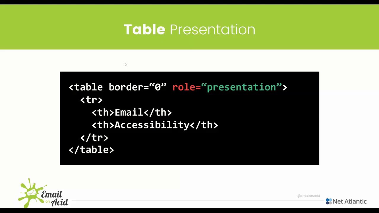
An important ARIA label for email accessibility is the attribute role="presentation". When email developers set tables to role="presentation", it tells the assistive technology (screen reader) that the table is being used for layout purposes instead of for presenting data.
It makes a big difference. Listen to this video to hear the way a screen reader interprets a table with and without role="presentation".
Another ARIA attribute that proves useful to email developers is aria-hidden= "true". This can be added to hide certain elements of an email from screen readers. That could include decorative graphics and duplicative content that you want the software to skip.
For more tips and examples, check out our article on how to code accessible emails.
Screen readers and email accessibility
We’ve brought up screen reading software several times in this article. If you’re unfamiliar with the term, screen readers are assistive technology that primarily helps people with vision problems, but people with cognitive or mobility challenges may use them too.
Screen readers convert digital content into either spoken word audio or Braille. People use keyboard navigation with desktop screen readers, jumping between elements such as headings. Mobile screen readers allow for swiping and touch navigation.
Here’s a list of some of popular screen readers:
- NVDA: The NVDA (Nonvisual Desktop Access) screen reader is free to download. According to a WebAIM survey, it is also one of the most used.
- JAWS: Another popular option is JAWS (Job Access With Speech), which is a screen reader from Freedom Scientific. It can also provide Braille output.
- VoiceOver: (from Apple): For subscribers using a Mac or iPhone, this proprietary screen reader will likely be their choice. It’s built into devices running on iOS. Find out more about using VoiceOver to evaluate accessibility.
- Talkback: (for Android): This screen reader from Google is part of its larger Android Accessibility Suite. It has more than 2.7 million downloads.
- Narrator: This is the default screen reader in Windows. Assistiv Labs (the software’s developer) claims its usage is growing. There’s been a 150% increase since 2017.
Since Android, Apple, and Microsoft offer screen reading options, you can easily test how your emails are read aloud by these software solutions. In addition, more people are beginning to use digital assistants like Siri, Alexa, and Google Assistant to access their inboxes. Optimizing for screen readers helps improve the experience when artificial intelligence (AI) reads email too.
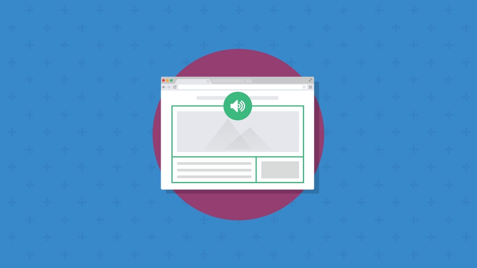
Check out the following video to learn more about how screen readers work with email:
It’s important to note that screen readers present content to users one item at a time, which is completely different from the way we visually consume emails. While sighted subscribers can get the gist of email content and design all at once, those with screen readers progress through the email in steps.
They can, however, navigate more quickly through digital content using headings, page sections, paragraphs, and “skip navigation” links. These key differences are why it’s so important that your email structure and content are designed specifically with screen readers in mind.
Smart home devices and digital assistants
The rise of smart home devices and digital assistants such as Amazon Echo, Google Home, and Siri mean more people are using assistive technology to access the contents of their email inboxes. When emails are coded to be accessible, it’s easier for this technology to present information to users in a clear and efficient way.
With voice-activated devices like Google Home, Amazon Echo, and even Siri becoming more popular You’re going to a growing population who are reading their emails with screen readers or screen reader adjacent devices. So, making emails accessible will make it naturally easier for anyone to read your emails.
You can also expect that emerging tools built with generative AI, such as ChatGPT, will work best when emails are optimized for screen reader technology.
14 email accessibility best practices
We’ve covered a lot in our guide so far. Now, let’s go over some of the key takeaways in a list of email accessibility best practices.
- Write email subject lines, sentences, and paragraphs that are clear and concise.
- Avoid complex language and confusing industry jargon.
- Use headings, subheadings, and bullet lists for better content organization and navigation.
- Compose and add alt text for every important image in an email campaign.
- Choose readable typefaces and an appropriate font size.
- Never place important information inside of a graphic (always use live text).
- Use good color contrast, especially between the text and background (minimum 4.5:1).
- Avoid using color in email design to convey meaning.
- Stay away from excessive and/or distracting animations.
- Include enough white space for accessibility (including padding and margin) to support readability and comprehension.
- Code bulletproof buttons for CTAs that use live text.
- Implement semantic HTML so that your email code has meaning.
- Use h-tags for subheadings in email content.
- Add the ARIA label role=”presentation” to tables used for email layout.
If you accomplish all these email accessibility best practices, you’ll be delivering campaigns that people of all abilities can engage with and enjoy.
Accessibility testing tools for email marketing
There’s one more email accessibility best practice we should mention – accessibility testing. The “Accessibility in the Inbox” report found that nearly 40% of marketers weren’t using any accessibility testing tools before launching an email campaign.
Following best practices is great, but the only way to be 100% certain that you’ve built an accessible email is to test it. That’s why Email on Acid includes accessibility checks in our email testing platform.
Our accessibility testing tool allows you to:
- Preview email designs with filters representing different color deficiencies
- See how alt text displays with images turned off
- Adjust and optimize text-to-background color contrast ratio
- Enhance the accessibility of hyperlinks in your email
- See how using the zoom function impacts the experience
- Set the email title, language, and content-type for screen readers
- And more…
- Start Your Free Trial Today
There are also some free online resources that can help you design accessible emails. They include a color contrast checker from WebAIM. The website accessible-email.org provides free reports and helps you adjust your code. If you use Parcel.io for email editing, they recently made their Accessibility Checker free for everyone. Plus, Microsoft made its testing tool, Accessibility Insights, open source and free as well.
It’s not as important which accessibility testing tools you use as long as you integrate accessibility testing into your normal processes. Find out about even more accessibility testing tools in Sinch Mailjet’s comprehensive comparison article.
Beyond tools, consider talking to real people with disabilities and having them provide feedback on how they experience your emails. User testing always provides amazing insights on how to improve emails.
Learn more about email accessibility
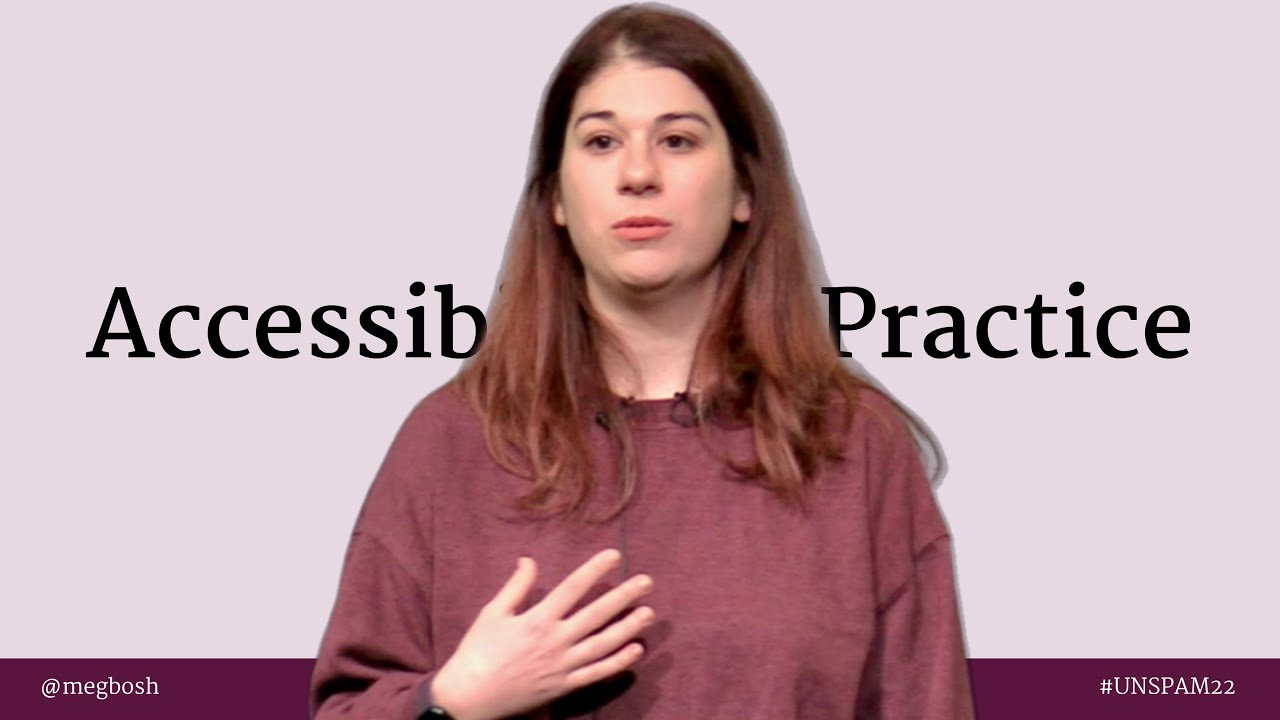
Email on Acid takes accessibility seriously, and it’s also a topic I’m personally very passionate about. I had the opportunity to deliver a presentation on email accessibility at UNSPAM in 2022. Check out the video below:
You can also listen to email marketing podcasts that cover accessibility. Recently, I joined Janice Dombrowski on the podcast Marketing Magnified from Streamline to offer some email accessibility advice for developers. The hosts of Email Einstein interviewed me on the topic as well.
My friend and fellow email geek, Najee Bartley, joined me on an episode of Notes from the Dev: Video Edition to offer her insights on email accessibility, including an eye-opening example of what happens when screen readers encounter an inaccessible email.
Here are even more accessibility resources to explore:
- The EMC’s 2024 Accessibility Report: See what happens when you review thousands of HTML emails and learn about some of the most common and critical email accessibility issues.
- Emails for All – Parcel Unpacked: Check out this recording of a great presentation from email developer and accessibility advocate, Najee Bartley.
- The A11Y Project: A community-driven effort to simplify accessibility with lots of great information about the fundamentals.
- W3C’s accessibility overview: A helpful resource including accessibility guidelines for digital content.
- WebAIM’s accessibility training: Virtual and in-person training opportunities around online accessibility.
- Deque’s Empathy Lab: Learn in a hands-on, interactive way and speak directly with those who have disabilities.
- Cards for Humanity: A fun, interactive tool that helps you consider the situations your subscribers may find themselves in and how you can show empathy.
Finally, if you’re committed to email accessibility, and you want to make your existing templates and automations more accessible, check out our article on how to conduct an email accessibility audit and then build those changes into your processes. For more on that, you’ll want to read our tips on creating an accessible email design system.