Email Development
How to Code Accessible Emails with Semantic HTML and ARIA
When a new email campaign gets into the hands of an experienced email developer, some of the most important work to support email accessibility begins.
Two key factors for coding accessible emails are the use of semantic HTML markup and certain ARIA attributes. However, a survey of marketers featured in the report, Accessibility in the Inbox, found that only 4% of marketers considered semantic HTML or ARIA during email production.
If you believe your email code could use an accessibility upgrade, this article will outline the perfect places to start.
Why accessible email code matters
Accessible email code is crucial for people who use screen readers to access the contents of their inbox. The majority of these subscribers are people who are blind or have a severe vision impairment.
That’s why using descriptive image alt text in emails is essential for supporting accessibility. Screen readers use the alt description to describe what’s depicted in an image. Adding alt text is an easy way to ensure every subscriber has a cohesive email experience.
Code can also solve accessibility issues that graphic design cannot. Buttons that are added as graphical elements aren’t as accessible as bulletproof buttons, which use HTML and CSS with live text for the call to action.
However, when it comes to certain aspects of HTML in emails, screen readers get confused. The result is a jumbled mess of audio that frustrates subscribers and customers who took the time to open the email.
An email that isn’t coded with accessibility in mind may also be difficult for a subscriber with a vision disability to navigate effectively. People who use assistive technology to access email often use their keyboard to jump to the portion of the message they’re interested in.
Some simple semantic HTML markup and ARIA attributes can solve these problems and improve email accessibility. Let’s take a look!
How to use semantic HTML5 for email accessibility
What is semantic HTML? Even if you’re not familiar with the term, you’re definitely familiar with some of its most basic forms.
Put simply, semantic HTML5 adds context (or meaning) to your code. It’s markup that makes sense to both software and humans, which ends up creating a more accessible email experience as screen readers interpret the message.
Problems tend to arise when screen readers encounter code that many email developers are accustomed to using. That includes using <table></table> for layout purposes as well as <div> and <span> with class= or id= to describe an element’s purpose.
FreeCodeCamp.org offers this example for an email’s header:
| Semantic HTML | Not semantic HTML |
| <header> | <div class=”header”> |
Let’s check out some of the simplest ways to implement semantic HTML5 into emails to improve their accessibility.
Using <p> tags for paragraphs
Some developers may use line breaks <br> to separate paragraphs in email content. While this may look acceptable, it fails to provide meaning. Wrapping paragraphs in a <p> tag is more accessible because both humans and machines understand what a paragraph is.
On the flip side, developers should avoid using <p> tags for things such as extra spacing. As an article from ThoughtCo.com points out, while you could use <p> </p> to create a spacer between elements, there are better ways. I use CSS margins for spacing between paragraphs. But since margins aren’t universally supported in email, I’ll use HTML padding elsewhere.
Get more advice on margins and padding for email.
Likewise, avoid using <ul> and <blockquote> for the purpose of indenting text. Those elements should be reserved for their intended purposes: calling out quotations and unordered bullet lists.
Using <h> tags for section headings
Styling a <span> tag to increase the font size of a text heading in an email and making it bold doesn’t provide much meaning. But using logically structured <h> tags throughout email text helps screen readers and subscribers understand how the content is meant to be organized.
Two important rules for <h> tags in email:
- Only use one <h1> heading per email.
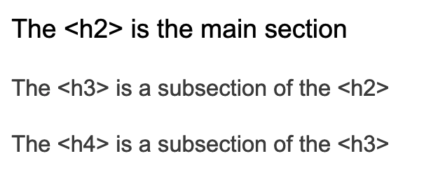
- Always follow a logical downward hierarchy for subheadings: h2, h3, h4, etc.
The <h1> is the main headline of your email. People using screen readers may locate the <h1> to identify the start of the email content. That’s why multiple <h1> tags can be disorienting. The same goes for other heading tags when used out of order.
You can have multiple <h2>s and <h3>s as long as there is a sensible hierarchy within email sections:
Subscribers using keyboard navigation can jump between sections and subsections to find what they need or skip over what doesn’t interest them. You can always adjust the size and styling of <h> tags in the CSS to meet visual needs. But to support accessibility and avoid screen reader confusion, only use them as headings and not as a way to format text.
Using lang= for different languages
The language attribute (lang=) is very valuable for multilingual email campaigns. If you have an international audience or are segmenting your list based on language, lang= helps screen readers, as well as browser and email clients, determine how to interpret and render the content correctly.
This attribute supports accessible email code because it tells the screen reader to read the email in the right language. Without lang=”es” in the email’s code, screen reading software may try to read an email that’s written in Spanish in English, which is often the default language.
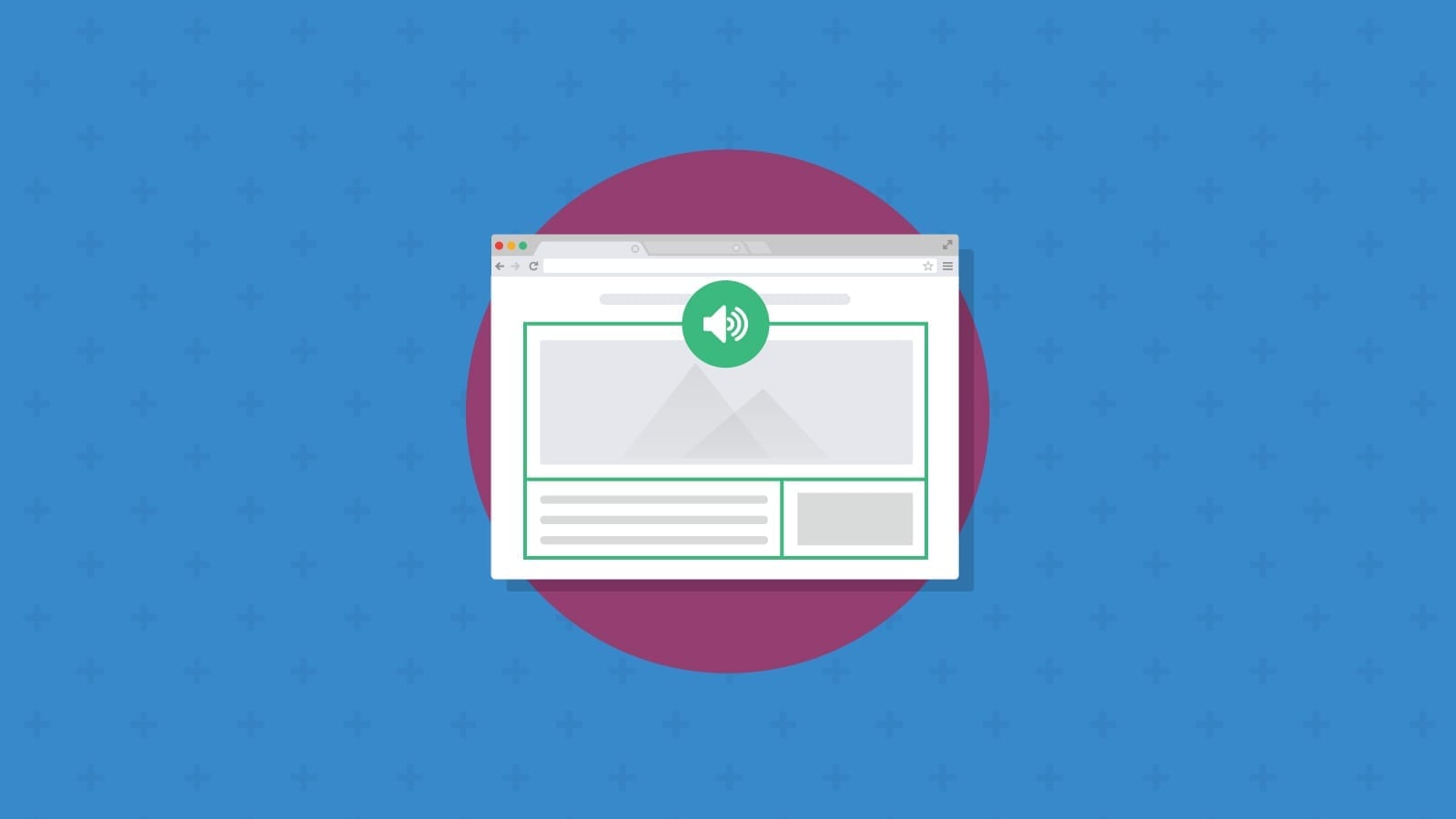
The video below shows how the popular screen reader JAWS sounds when reading an email in Brazilian Portuguese with and without using the lang= attribute.
Place lang= in the <html> tag of your email to have the entire thing read in a particular language. Be aware that some clients will strip it out of the <head> tag. You can also add the lang= attribute to a <p> tag if a portion of the email should be read in another language.
Get a full list of HTML language codes from W3Schools.com.
Using <em> and <strong> for emphasis
What’s the difference between using <b> and <i> to create bold or italicized text compared to <strong> and <em>? Turns out, it’s just semantics.
The purpose of the <strong> and <em> tags is to indicate that certain words should be emphasized. You may also want to call out words in bold for visual effect only or put a title in italics, but it may not mean those words should be read differently.
Perhaps because of that ambiguity, it may not matter which you choose to use. Accessibility experts at Penn State say that, while it is possible in theory, screen readers rarely pronounce text wrapped in <strong> or <em> differently. Most screen readers treat them the same as <b> and <i> tags.
Still, it’s good to follow best practices. Use <strong> or <em> when you want to call attention to important text, including warnings, promotional expirations, or key terms.
Using other semantic HTML tags in email
There are many other types of semantic markup that may be beneficial to subscribers using assistive technology. For example, the <button> element could help indicate where there’s an actionable item in the email.
However, as you might expect, email client support for some semantic HTML5 elements is inconsistent at times. According to Can I Email, the following elements are fully or partially supported in major clients (Apple Mail, Gmail, and Outlook):
Semantic markup options for email
- <article> For indicating a self-contained composition in an email. Could be useful for content-heavy email newsletters.
- <aside> For indicating sidebar content in an email.
- <details> For creating a disclosure widget that can be toggled on and off.
- <figure> To represent self-contained contained content, namely media such as images.
- <figcaption> For captions describing images and graphics.
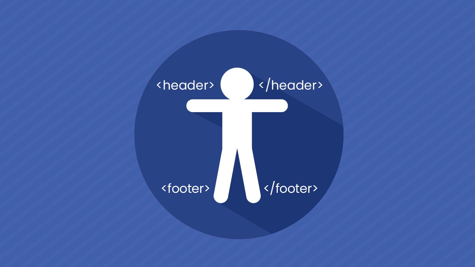
- <footer> To indicate footer content that a subscriber may not need to review.
- <header> For indicating header content that a subscriber may not need to review.
- <main> To indicate the dominant content in an email.
- <mark> For highlighting text of interest or importance.
- <nav> To indicate navigational elements in an email.
- <section> For indicating a generic, standalone section in an email.
- <summary> Used within the <details> element as a disclosure box.
- <time> For indicating:
- Time on a 24-hour clock.
- A specific date/time.
- A certain duration of time.
In addition to somewhat inconsistent email client support, developers should be aware that screen readers treat less-common semantic HTML elements differently as well. That’s why it’s worth previewing important emails using a variety of screen-reading applications.
As email evolves and digital accessibility continues to be an issue, developers can start with <h> and <p> tags while experimenting with other semantic markups. Email Accessibility advocate, Paul Airy of Beyond the Envelope™ says it’s’ about shifting your mindset.
“Challenge yourself and actually ask, ‘How should I describe this element?’ rather than putting a piece of content in a that has no real reference to what it is.”

ARIA for email accessibility
ARIA stands for Accessible Rich Internet Applications. It is a set of attributes that define ways to make digital content more accessible.
Like semantic HTML5, not every ARIA label is fully supported among major email clients. However, there is one very important attribute that helps you code accessible emails. That would be role=“presentation”.
According to a blog post on the Email Geeks Community website, using role=“presentation” is a sign of a good developer. But why is that?
Using role=“presentation” with tables
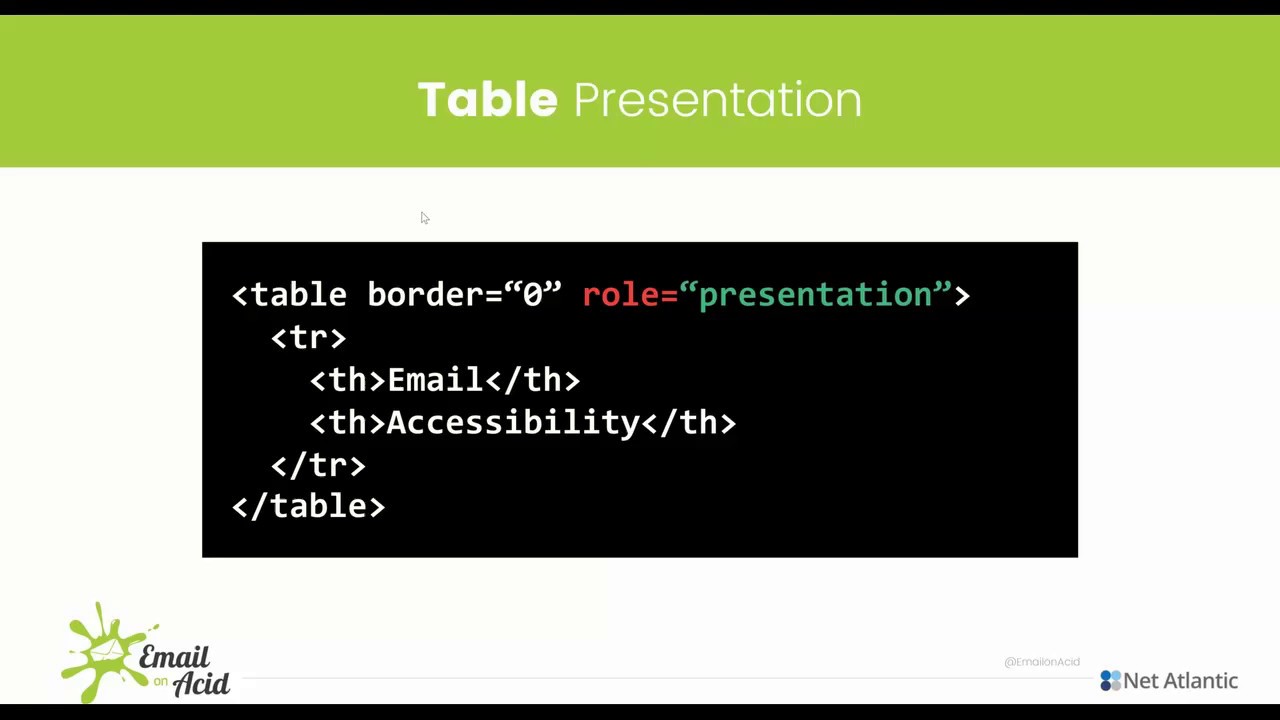
Earlier in this article, we mentioned how email devs often use <table> for layout purposes. But that creates issues for subscribers using screen readers to access email.
Here’s how a typical screen reader sounds when it encounters a <table>:
It’s easy to understand why this would confuse and frustrate a subscriber who is blind. The reason for that confusion is that tables are meant for displaying data. So, the screen reader tries to present it that way.
The user experience changes dramatically when you use an ARIA attribute to set the table’s role to presentation. Here’s an example of how that accessilbe email code might look:
<table width="100%" border="0" cellpadding="0" cellspacing="0" style="width: 100%;" role="presentation">
Listen to how much clearer and cleaner the email copy comes through with role= “presentation”:

Using aria-hidden=“true”
Another ARIA attribute that proves useful to email developers is aria-hidden=“true”. This can be added to hide certain elements of an email from screen readers. That could include decorative graphics and duplicative content.
Use aria-hidden=“true” to make the email experience cleaner, but keep in mind that it should not be used on focusable elements in an email. Focusable elements are interactive portions of an email, which someone would interact with using keyboard navigation. That could include buttons, links, or anything a subscriber would click or select.
Keep in mind, subscribers who are blind as well as people with difficulty using a mouse or trackpad may rely on keyboard navigation to interact with emails.
According to Can I Email, the aria-hidden attribute is supported in nearly every version of Apple Mail, Gmail, and Outlook.
Checking your email code for accessibility
How can you be certain you’ve coded an accessible email? The only way to know for sure is to test it. Pathwire’s report, Accessibility in the Inbox, found just 14% of marketers said they used accessibility testing tools during email production.
With Email on Acid’s Campaign Precheck, an automatic accessibility evaluation becomes part of the email pre-deployment process. Using our innovative Email Accessibility features you can:
- Evaluate and enhance color contrast.
- Optimize email code for screen readers.
- Automatically set presentation roles for tables.
- Add image alt text.
- Improve link accessibility.
- Review emails using zoom settings.
- Preview your email design with filters for color vision deficiency.
Plus, Email on Acid helps you optimize and fix a host of other factors before you hit send while providing previews from dozens of popular email clients. Sign up for a free trial and find out if your emails are meeting accessibility guidelines.