Email Development
Responsive Email Design Challenges? Try Mobile-First Email Coding

Want to get the most out of email marketing? Better make sure you’re keeping responsive email design top of mind. It seems like a no-brainer, right? But the truth is, optimizing email campaigns for mobile devices isn’t as easy as you might assume.
I recently co-hosted an Email Academy webinar on the topic of design with my colleagues from Sinch Mailjet. There were plenty of users from both Mailjet and Email on Acid in attendance. When we surveyed people about their biggest design struggles, responsive email design topped the list.
Most people have been checking emails on smartphones and mobile devices for at least a decade at this point. So, why is designing and coding mobile-friendly emails still such a headache?
It could be because responsive email design is an afterthought instead of your starting point. The first step in changing your ways involves a simple switch in your code. For some email developers, this is a bit of a mind shift. Many of us code responsive emails for desktop first and then add CSS media queries to adjust for smaller screens. But it may be time for you to flip that approach on its head. Keep reading and I’ll explain…
Why responsive email design is important
You don’t have to look far to find email marketing statistics and studies showing the rise in smartphone use for email viewing. At this point, it’s safe to say that at least half of all email opens occur on mobile devices.
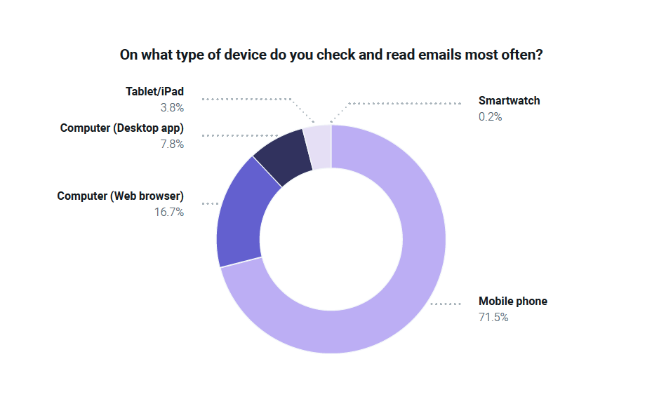
A 2024 report on how consumers around the world engage with email found around 71.5% most often use a mobile phone to view emails while just under 4% use a tablet. Less then 25% of consumers said they primarily use a computer to check their email inboxes.
Of course, while a smartphone might be the main device used to check email, it’s not the only one. Many recipients will view an email in one environment and then go back to it later using a different device or application. For example, someone could check an email on desktop while at work, and later, engage with it while chilling on their couch that night.
You need to deliver an ideal experience no matter where the email is opened. That means focusing on responsive email design, which adjusts your HTML email campaign’s layout for different screen sizes.
Even B2B brands with email opens that trend toward desktops and laptops should consider responsive email design. Because you never know when your next big prospect is going to open an email on their smartphone.
A tale of two email campaigns…
Let’s paint a picture of why responsive email design is so crucial:
Scenario 1: Non-responsive nightmare
Imagine you’ve just launched a flash sale, and your email goes out to thousands of subscribers. But uh-oh – the design isn’t mobile-friendly. Your CTA button is tiny, the text is unreadable without zooming, and the image files are so large they take forever to load. The result? Frustrated customers, missed sales opportunities, a spike in the unsubscribe rate, and a collective groan from the rest of the marketing team.
Scenario 2: Mobile-friendly dream come true
Now, flip that script. Your flash sale email is designed and coded to respond to various screen sizes. Some contacts see a single-column layout on their phones while others see featured products in a three column design when it’s opened on desktop. The CTA button stands out and and is easy to tap – not just click. There’s excellent readability and the images are optimized for quick loading. The result? A successful campaign in which your email drove more traffic and sales than any other marketing channel.
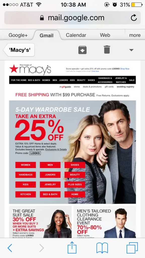
Here’s a visual example of a problematic email design. It’s from almost nine years ago, so we’ll give Macy’s some grace (and hope by now they know better). One look at this campaign and you can probably see the big issue. Just imagine trying to tap on those product category buttons not to mention read some of that text on a mobile phone.
If your goal is to optimize emails for conversions, you need to be sure people can engage with what you’re sending. But we should mention… a mobile-friendly email isn’t quite the same as a responsive email.
Mobile-friendly vs. responsive email design
Let’s clarify the difference between mobile-friendly and responsive: A responsive email should be mobile-friendly, but a mobile-friendly email is not necessarily responsive.
While you can follow best practices for mobile-friendly emails, that’s not the same as a responsive email. Responsive email design means your email’s layout, font size, buttons, email content, and more adjust and adapt to deliver an ideal experience on different screens. To make this happen, you either need to know how to code emails, or you need to be using responsive email templates that are already coded adapt to screen sizes while using a drag-and-drop email editor.
Of course, you could also have an email that adjusts to different screen sizes, yet it still doesn’t look or function well on mobile devices. To deliver the best experience you need to take two steps:
- Make sure your email is responsive.
- That typically means using CSS media queries
- Make sure your email is also mobile-friendly.
- This means following email design best practices for a good mobile experience.
Why is responsive email design a challenge?
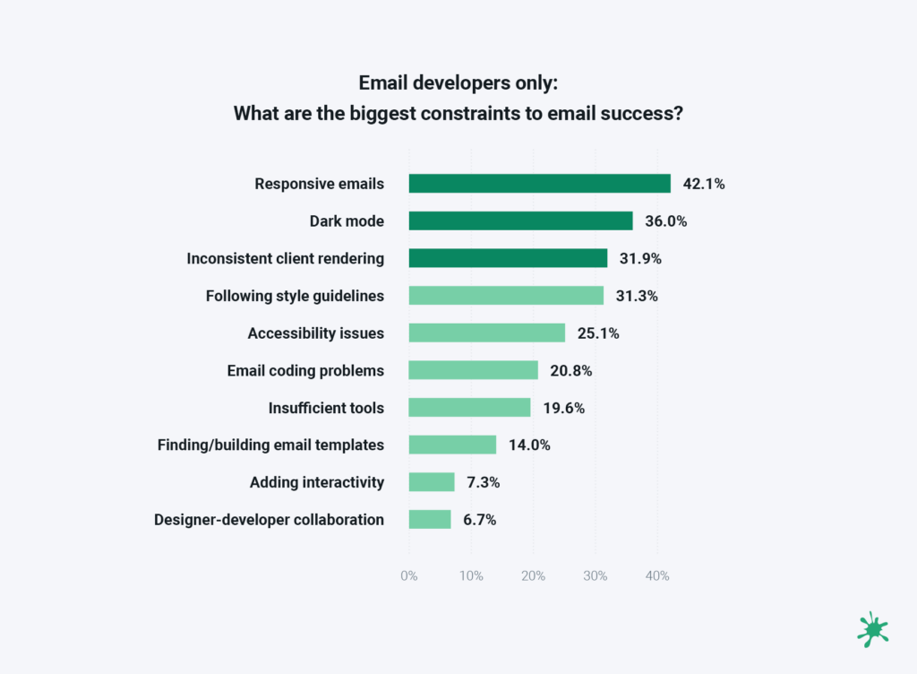
Inbox Insights 2023 from Sinch Mailjet found that email senders around the world identified responsive email design as a major challenge. It’s an especially big deal for those who code email marketing campaigns.
While just over 36% of all survey respondents selected Responsive emails as one of their three biggest challenges, more than 42% of email developers selected that option. Find out more in our article on the email developer perspective.
So, what is it that makes responsive email design so challenging and how could a mobile-first approach change things?
For one thing, it’s easy to default to a desktop-first approach to email development. After all, that’s the environment in which we’re writing code. As a result, however, we end up developing emails for larger screens first, and that can make things more difficult in the long run.
For example, taking an email designed for desktop with a three-column layout and re-coding it to look right on various mobile devices is going to require a lot of development work.
- How should those columns stack?
- How will images and text need to change?
- What mobile breakpoints should you consider?
The more code you need to write to adapt for smaller screens, the more opportunities there are for minor mistakes that cause things to break. One missing curly bracket and suddenly the entire email layout is messed up.
On the other hand, when you start with a simple layout for viewing emails on smartphones, and then expand the design for desktop, it’s a different story. If subscribers viewing emails on desktop end up seeing the mobile layout for your email campaign, it will still look fine, and they can still engage.
But you can’t say the same thing about viewing the desktop version of an email on mobile. That’s why mobile-first email coding is a safer bet.
How to switch to mobile-first email coding
Arguably, the most popular way to achieve responsive email design with code is to use media queries.
Now, it’s certainly possible to develop responsive emails without using media queries. Fellow email geek Nicole Merlin has an excellent write-up on her process for coding responsive emails without media queries. However, in this article, we’ll focus on coding with media queries.
At this point, media query support for screen size is well supported across nearly all of the major email clients. (Check out CanIEmail.com for the latest.) That’s what I use for responsive email design. And when you code for mobile first, media queries are fairly foolproof.
The biggest switch for most people will be using min-width media queries instead of max-width. By simply doing that, you’ll be taking a mobile-first approach to email development.
Media queries: max-width vs min-width
When you learned to code responsive emails with media queries, there’s a good chance you were told to use the max-width property, which is essentially a desktop-first mentality. That may have made sense for a lot of senders 10 years ago, but things have changed.
So, what’s the big difference between min-width and max-width?
Desktop-first = max-width
When you use the max-width property, you are essentially telling email clients that your desktop styles are the default, and you use media queries to adapt for smaller screens. The max-width describes the maximum width before your mobile styles stop being applied. So, your styles should be ordered from largest to smallest.
In other words, max-width indicates that: If the screen size is less than or equal to X, then do Y.
Here’s how you might code a basic two-column email for desktop using a max-width media query that would stack the columns for mobile viewing:
<style> :root { color-scheme: light dark; supported-color-schemes: light dark; font-size: 16px; font-color: #222; } h2 { margin: 0; } .column { width: 50%; display: table-cell; padding: .5em; } @media screen and (max-width:480px) { .column { display: block !important; width: 100% !important; } .column:last-child { margin-top: 2em !important; } } </style>
Basically, what we’re saying is that any code nested in the max-width media query should only trigger if the screen size or viewport is less than 480 pixels. When the screen for a mobile device, or a browser window on desktop, is under 480px, the columns will stack.
The class .column sets each div’s display property to table-cell, which allows the columns to function like a table. The media query says to use these styles when the screen size is above 480px. (Note: the parent div’s display property needs to be set to table for this to work.)
Then you need to change the display property to block for mobile and set the width property to 100%. You also need to use !important to override the code above the media query.
Mobile-first = min-width
When you use the min-width property, you are telling email clients your mobile styles are the default, and you use media queries to adapt for larger screens. The min-width defines the minimum width before styles start being applied. So, you’d list your styles from smallest to largest (AKA mobile first).
In other words, min-width indicates that: If the screen size is greater than or equal to X, then do Y.
Here’s the same basic code for a two-column email layout. Except, this time we are using a min-width media query and coding for mobile first. It’s still set to 480 pixels, but now it will apply desktop styles when screens are larger than 480 pixels.
<style> :root { color-scheme: light dark; supported-color-schemes: light dark; font-size: 16px; font-color: #222; } h2 { margin: 0; } .column:last-child { margin-top: 2em; } @media screen and (min-width:480px) { .column { width: 50%; display: table-cell; padding: .5em; } .column:last-child { margin-top: 0; } } </style>
One thing you may notice with the min-width example is that the code is actually a little cleaner and more concise. You only have to set the .column class in the media query to a width of 50% (instead of 100%) so that two columns display when desktop styles kick in. You don’t have to set it as a block element, you just use display: table-cell.
I’m also using a pseudo-class .colum:last-child to add some spacing around the mobile or stacked version of the email, which gets overridden and removed within the media query.
When you take a desktop-first approach, you end up overriding a lot more than that in those media queries. However, if you do mobile-first email coding, most of the mobile styles you set will transfer to desktop.
Plus, if your media queries don’t work, the mobile styles will be displayed by default. Things may look smaller than you intended for desktop screens, but the layout won’t break, and subscribers may not even know the difference.
That means you actually have to change less when you do things mobile first. Plus, your desktop styles end up being much shorter rather than having really long mobile styles that override so much from desktop.
Using min-width is also helpful for those using the Gmail app with non-Google accounts. Those so-called GANGA accounts can have lots of rendering issues in which media queries break.
The truth about mobile-first email development
While I am a big believer in coding for mobile screens first and using min-width to make thing responsive, I seem to be in the minority, which is a bit surprising.
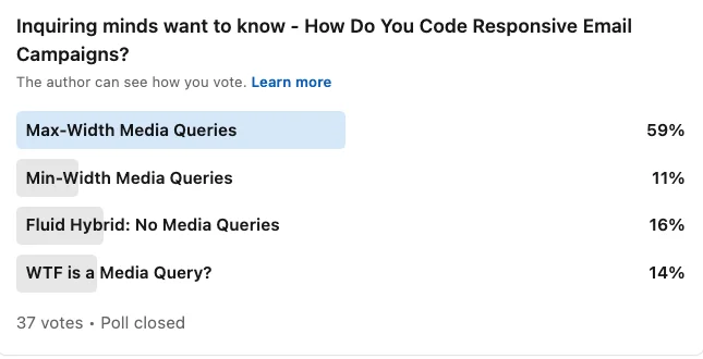
When we conducted an informal, unscientific poll of Sinch Email on Acid’s LinkdedIn followers, we found that most email developers are using max-width media queries. Only 11% take the mobile-first approach and use min-width. In fact, more people are using the fluid hybrid email coding method, which practically skips media queries altogether.
This could be one of those “But that’s how we’ve always done it” sort of situations. If you learned to code emails using max-width, that might be a hard habit to break. But if you ask me, the advantages of using min-width for mobile-first responsive emails outweigh the challenge of updating your code.
7 tips for a mobile-first email design system
Before you start coding emails with a mobile-first mindset, you may have to rethink the way your campaigns are designed to begin with. Responsive email design is faster and more efficient when you’ve got a defined system to follow.
If you’re not already using an email design system, this would be the perfect opportunity to start. And if you already have a defined system, you’ll simply need to make some adjustments. Here’s some essential advice…
1. Email design mockups
If you’ve been scaling down emails designed for desktop in an attempt to make them more mobile-friendly, you’ll need to rethink your approach.
It may be easiest to switch everything to one-column email layouts no matter the screen size. Simplicity is definitely important in mobile-first email creation. However, it’s not the only way.
Try rethinking your responsive HTML email templates with the beginning and the end in mind. In other words, how should an email template be displayed on the smallest and largest screens? Instead of thinking about how elements of a desktop layout will stack on mobile, consider how a responsive, single-column email could “unstack” or expand on larger screens.
Create mockups for mobile and desktop while keeping breakpoints in mind. The most common mobile breakpoint is 480px, but some smaller iPhones are 320px.
2. Font size
Take a close look at your primary font as well as any others you’re using in your font stack. Make sure the text size is readable on handheld devices.
While 16px font is generally considered a best practice for accessibility, I chose to bump up the font size for mobile emails to 18 pixels in our design system. With the fonts our brands use, it felt like 16px was just too small for smartphones, especially with the high-resolution displays on some devices.
Remember that “best practices” aren’t hard rules, and they sometimes need to be adjusted for different situations.
3. White space
Give your mobile-first emails room to breathe. Adequate white space in email design is important for a good mobile experience.
Space between elements makes it easier to consume information and understand the message you’re delivering. Leaving white space around important features like calls-to-action or product images helps draw the viewer’s eyes to that part of the design.
Keep paragraphs nice and short because big blocks of text are harder to read on small screens. If you have text links that are very close together, it can be difficult for recipients to tap the right thing.
4. Tap targets
Speaking of tapping, that’s one of the biggest differences between the mobile and desktop user experience. Your subscribers are tapping with a finger or thumb – not clicking with a mouse and cursor. No matter how compelling and creative your CTA button may be, if the touch target is tough to tap, your click rate is going to suffer.
The minimum recommended size for accessible tap or touch targets is 44px x 44px. That size is based on the average adult finger pad, which is around 10mm. You may want your buttons to be even larger than that. There are some email developers who recommend using full-width CTA buttons because it makes them easier to tap with a thumb if someone is using one hand to operate their device.
5. Columns
While a single-column layout is going to provide the most mobile-friendly email design, there could certainly be situations in which you would use columns without stacking all the contents.
I once did this in Email on Acid’s newsletter for April Fools’ Day, which mimicked the look of a Myspace page as a fun throwback. For the section of the email displaying the “Top 8” friends, I used a two-column layout on mobile and four columns for desktop viewing.


It wouldn’t have looked quite right if that Top 8 was single profile photos stacked on top of each other. But since these were just small, thumbnail-sized images, two columns worked fine.
You could also do something like this in an ecommerce email featuring a spread of product thumbnails. Or two columns could work as a mobile-friendly photo gallery in an email. What you don’t want to do is put body copy in columns on mobile emails as that would most likely be difficult to read.
For each campaign you create, carefully consider the subscriber experience on different screen sizes.
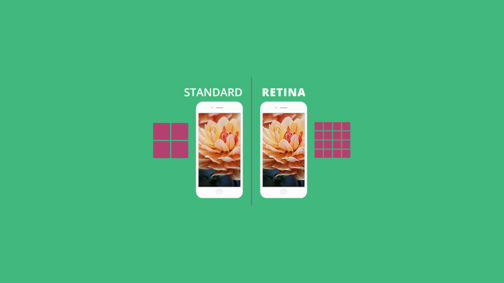
6. Retina displays
Most computer monitors have high-resolution displays as do Apple devices using Retina display technology. For these screens, you’ll want your images to look nice and sharp.
For that to happen, use images that are twice the size at which you want them to ultimately display on the largest screens. So, in our example from earlier, an image displaying at 600 pixels wide should be 1200 pixels for its actual size.
Doing this provides a greater pixel density, so that the images don’t look blurry on Retina screens.
7. Image file sizes
While you want those images to look crisp, you shouldn’t slow down email load times with huge image files. This is especially important for mobile-first email development because you never know when recipients could be somewhere without high-speed internet. Plus, it’s good to be mindful that people may have limited data plans as well.
What you don’t want is to have subscribers staring at a blank screen waiting for the images in your email to load. So be sure to compress images and try to keep their file size to 200kb or less. Using too many animated GIFs in emails can also cause slow load times. Each frame in a GIF is its own image. Try to keep GIFs to less than 1mb.
Benefits of the mobile-first approach to responsive email design
As we wrap up this deep dive into mobile-first email design, let’s recap why this approach is worth your time and effort:
- Simplify your workflow: Starting with mobile designs and expanding for larger screens is often easier than the reverse.
- Improve user experience: With more people checking email on mobile devices, a mobile-first approach ensures your message looks great where it’s most likely to be seen first.
- Future-proof your emails: As mobile usage continues to grow, your emails will be ready for whatever new device hits the market.
- Boost engagement: When emails are easy to read and interact with on mobile, you’re more likely to see higher click-through and conversion rates.
Remember, responsive email design isn’t just about making things look pretty (although that’s a nice bonus). It’s about creating better experiences for our subscribers, boosting engagement, and ultimately driving better results for our email campaigns.
Test your responsive email designs before sending
There’s only one way to be certain your email campaigns are rendering the way you want on mobile devices – and that’s by testing and previewing them before hitting the send button.
If you’re updating templates to support responsive email design, you can use Sinch Email on Acid to see exactly how they will render on the most popular mobile operating systems and devices. Take advantage of our Email Previews to see how the most important clients render your code.
While there are plenty of platforms that let you see how an HTML email looks on mobile and desktop in general, our solution goes much further. You’ll get screenshots from actual email client renderings. So, for example, test and preview how your email looks in Outlook on an iPhone, or how it looks on the on the Gmail App in dark mode. Customize your own testing profile for the clients and devices you want to see.
Our email quality assurance platform also provides checks for accessibility, deliverability, inbox display, URL validation and more. It’s an ideal tool for optimizing campaigns and simplifying the complexities of email marketing. Every paid plan enjoys unlimited email testing. Take Sinch Email on Acid for a test drive with a one-week free trial.


