Email Development
Build Better Accessibility Into Your Email Design System

When you start to understand email accessibility and everything that goes into it, changing how you design and code campaigns might feel like a major undertaking. But don’t worry, it will become second nature once accessibility is part of your defined processes.
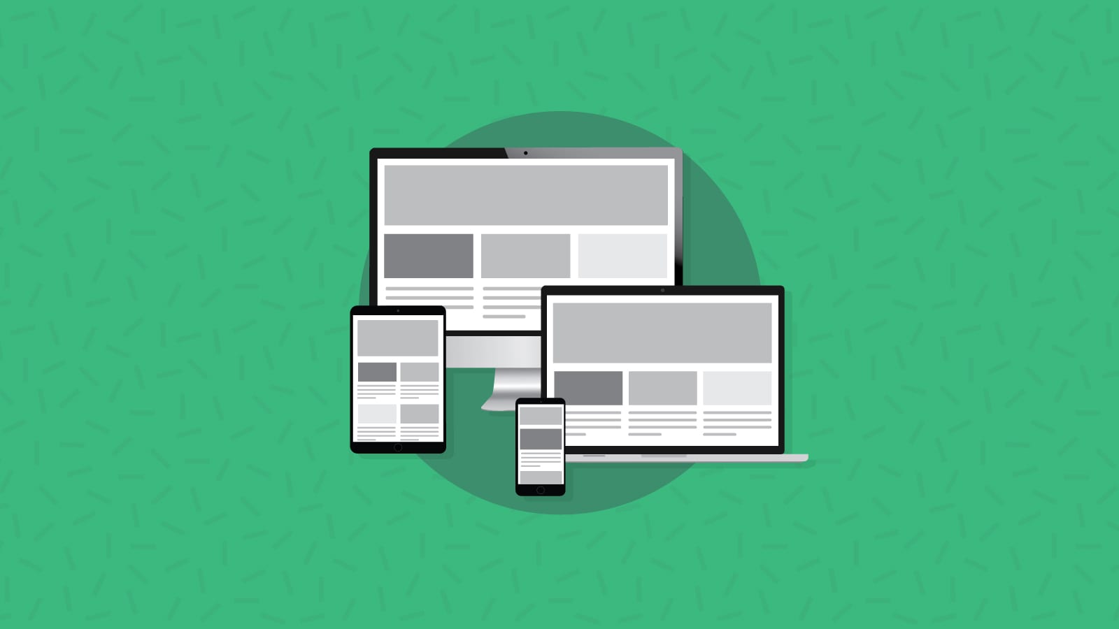
What defined processes you ask? We’re talking about starting an email design system, which can help make email campaign production more consistent and efficient.
They say the best way to eat an elephant is one bite at a time. So, if you’re ready to make accessible emails a priority, we’ll break it down into bite-sized pieces. This article explores what’s needed in an email design system that puts accessibility first.
Do you have an accessible design system?
Inbox Insights 2023 from Sinch Mailjet found that around 36% of the senders in its global survey always use an email design system. However, another 25.6% of respondents said they either never use a design system, or they don’t know what one is.

A component-driven design system is made up of reusable blocks of code and approved design assets that you can use to quickly build emails in a reliable way. We like to compare it to building with Lego bricks. And if your design system takes email accessibility into account from the beginning, you can be confident that every subscriber will be able to engage with your emails.
From websites to apps to emails, adopting an inclusive, “accessibility-first mindset” for all sorts of digital design is the right thing to do. As a bonus, email accessibility also makes it easier for all subscribers to see, understand, and engage with your messages. The point is – better accessibility leads to better email marketing performance.
Accessible emails from the ground up
Accessible email development requires both empathy for subscribers with physical and mental challenges as well as technical knowledge and creativity. Let’s take a look at the copywriting, design, and email coding changes you can implement to build an accessible design system.
The reading experience: Accessible email copy
While someone will likely write fresh copy for new campaigns, there are certain guidelines and best practices you can build into your email templates and the reusable components in your design system. Here are some tips for supporting an accessible email reading experience.
Sentences and paragraphs
Accessible writing is clear and concise. While you may not always have control over the specific language that’s written, you can use design system components to nudge copywriters toward accessibility.
Shorter sentences and paragraphs are easier to read than big blocks of text. Use Lorem ipsum in your templates and text-heavy components that reflect this practice. Try to keep paragraphs to no more than three sentences. That’s good for the mobile reading experience as well as accessibility.
Another tip for accessible reading is to use left-aligned text for body copy. Most people find centered and justified paragraphs harder to read. So, build text-heavy components for your design system with left-aligned copy.
Headings
Titles and subheadings in emails with lots of text help make the reading experience easy for everyone to follow. For people using screen reading software with email, headings also help them use keyboard navigation to access different sections of the message. The feature mimics the way someone with healthy vision might scan email text for what they’re most interested in reading.
However, you shouldn’t format headings by making the font larger and bolder. Screen readers won’t interpret that text as a heading. Components in your accessible email design system should be coded with <h> tags that follow a logical order or hierarchy:
<h1>for the main headline/title<h2>for headings<h3>subheadings beneath the<h2>, etc.
This is known as semantic code, which we’ll talk about more later.
Writing alt text
Whether it’s a copywriter, an email marketer, or a developer, someone on your email team should be writing alternative text or alt text for all of the important images in each campaign.
Screen readers use alt text to describe images to users with vision problems. This copy should be descriptive yet concise. You want recipients with visual impairments to understand the image and its purpose in the email.
Avoid repeating the same alt text on similar images and don’t add it to visual elements that are only decorative. Alt text shouldn’t interrupt the flow of the email with unnecessary copy.
If your email design system includes space for alt text in the code for image placeholders, you’ll be less likely to forget about adding it. However, it’s best to mindfully write alt text copy before it gets to the email developer – not at the last minute.
The visual experience: Accessible email design elements

When we built the design system for Sinch Email, I worked closely with our Sr. Graphic Designer to make sure the reusable components adhered to our brands’ style guides as much as possible. If there are style elements and current design practices that may be inaccessible, this is a good time to address them and improve the entire brand experience.
Font type and size
For email accessibility, the size of your chosen font should be 16 pixels at the smallest. That’s what’s recommended for body copy, but that is a minimum. For Sinch Email campaigns, we chose to bump up the font size to 18px for mobile viewing.
The typeface you choose to use may also impact accessibility and readability. Here are some factors to consider when choosing a readable typeface:
- It performs well when it’s small or large.
- It has a large x-height.
- The character is large for its point size.
- The metrics (such as x-height) are consistent between letterforms.
- Individual letterforms are distinct in shape and can’t they be confused with others.
Tips from Accessibility.gov
Another best practice for accessible fonts in email is to be sure text can be enlarged to 200% of its original size. That’s so people can use the zoom function if needed.
By precoding accessible font sizes into your email design system components, you ensure your messages can be read by people with vision impairments. That includes 8% of American adults. So, it probably includes around 8% of your email list too.
Color contrast
Perhaps the most important choice you’ll make when building an accessible design system is how to use appropriate color contrast in email. Primarily, you’ll want to have good contrast between foreground and background colors, which includes how the text appears on the background.
Color blindness, or color vision deficiency (CVD), impacts 1 in 12 men and 1 in 200 women around the world, according to ColourBlindAwareness.org. So, contrast is key when creating accessible components for your email design system.
The WCAG recommends text should have a contrast ratio of at least 4.5:1 against the background to meet the AA success criterion and 7:1 to meet a AAA success criterion.
Don’t forget to check out how your text and images will appear for subscribers viewing emails in dark mode. Some email clients automatically invert colors, which could lead to an inaccessible experience. When Email on Acid tested this a few years ago, we found that good contrast in light mode doesn’t always lead to an accessible email in dark mode.
Text and images
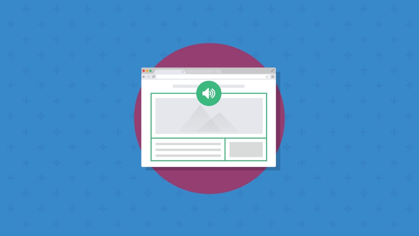
One of the biggest mistakes in email marketing involves the failure to use live text with graphics. When important text is only on the graphic, people with email clients that block images will miss the message. It’s also extremely bad for accessibility.
Screen readers can’t interpret text that is part of a graphic. So, if you send a marketing email that is one big graphic or a spliced image, recipients using assistive technology may have no idea what you want from them. If you have to include important copy on graphics, make sure to reiterate the point elsewhere in the email copy or include it in the alt text.
Better yet, try overlaying live text on your graphic with overlapping elements. Get some tips on how to do that using faux absolute positioning in our Notes from the Dev episode with Niven Ranchod.

CTA buttons
When it comes to email engagement, clicks are king. An accessible email design system includes call-to-action (CTA) button components that are easy to see and interact with.
Just as you’d use live text on images, you want the same for the copy on your buttons. Buttons that are clickable graphics could easily be missed and won’t be read aloud by screen readers. Email developers should code bulletproof buttons, which are built with HTML and CSS instead of being standalone images.
Building buttons with code rather than using graphics is also an excellent way to use your email design system. That’s because when you want to update the text on the CTA button, you don’t need a designer to create a new button that needs to be uploaded and added. Just change the text. That gives email teams flexibility to test out creative email CTAs.
The size of your email CTA buttons is another important accessibility factor. People with mobility or dexterity challenges may have a hard time clicking or tapping on buttons that are too small. The recommended minimum button size for touch targets is 44px by 44px, which happens to be the average size of a human finger pad.
Behind the scenes: Accessible email code
A bunch of the accessible design and copywriting advice we’ve already provided involves coding. That includes everything from alt text for images and text alignment for body copy to background colors and bulletproof buttons.
As with many things, the real magic happens inside the code. While subscribers may never see any of your HTML and CSS, your code can make the email experience much more accessible, especially for subscribers using screen readers.
Here are some accessible email development tips for writing reusable code for your design system.
Use relative units for sizing and spacing
We’ve been using pixels (px) to describe design elements throughout this article. But pixels are not an ideal unit for accessible sizing and spacing or for CSS styling.
A pixel is an absolute unit while relative units, such as em and rem, are more accessible and provide better flexibility for responsive email design. Relative units make it easier for subscribers to customize the viewing experience to their personal preferences. That’s because the ratio of the entire design stays the same when a recipient uses the zoom function. Plus, em units are supported across all email clients.
You should use em units for styling the size of fonts, buttons, and backgrounds as well as the margin and padding in your layout.
With font sizes, for example, a unit of 1em is equal to the current or default size. So, if an email client or web browser displays text at 16px by default, 2em would display text at 32px and 1.5em would show text at 24px. Using a unit less than 1, such as 0.75em, would display a smaller 12px font to potentially use in email footer copy or for disclaimers.
Here’s an example in which the default or root font size is 16px:
                                <h1 style="font-size:2em; margin:1em 0">Main Heading is 32px</h1>

<p style="font-size:1em; margin:1em 0">Body copy in the paragraph is 16px, and there is 16 pixels of margin for spacing around the text and headings.</p>

<h2 style="font-size:1.5em; margin:1em 0">H2 sub-heading is 24px</h2>
Learn more about using absolute vs. relative units in email in an explainer from Mark Robbins on his blog Good Email Code.
Set the lang attribute
Before a screen reader produces an audio output from the text in your email, it needs to know what language it’s processing. Using lang=”“ ensures the assistive technology pronounces words correctly.
This attribute should be located in the HTML doctype at the top of your email code. Here’s how it would look for an email you intend to be read in Spanish:
                                <!DOCTYPE html>
<html lang="es" style="padding: 0; margin: 0;">
…
</html>
Using lang="es" let’s the screen reader know it should speak in Spanish and roll its “Rs”. The language code lang= “en” is used for English, and you can find a list of other HTML language codes from W3 schools.
Sinch Mailjet emails subscribers in four different languages. So, coding this attribute into shells of emails saves time and makes it easy to switch between templates for different languages in our design system.
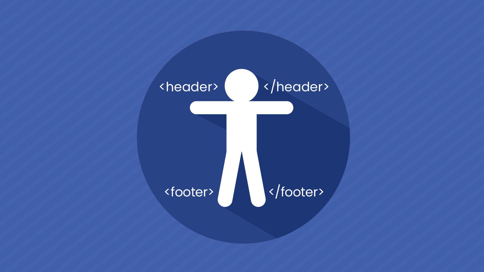
Use semantic HTML
Maybe you’ve noticed that accessibility in the inbox has a lot to do with helping screen readers understand your emails. Semantic HTML is one very effective way to do that because it involves the use of code that provides meaning and context to the content.
Tags like <div> and <span> are non-semantic. They do not provide meaning and won’t aid in screen navigation, which is why you should use them for layout purposes only.
The <h> tags and lang attribute we’ve already mentioned are examples of semantic HTML. There are many others, and not all are supported in email. However, if you aren’t already using standard semantic elements, coding design system components with them will make your emails much more accessible.
For example, using <p> tags instead of line breaks <br> helps the software understand where paragraphs are in your copy. Using <em> for emphasis instead of <i> to italicize text lets screen readers know the audio output should emphasize those words.
There are other semantic HTML elements including:
<header><footer><article><time><section><nav>for navigation<figure>for images<figcaption>for image captions
Many of these could be useful in letting screen readers know what kind of content they’re presenting to users. However, email client support for these HTML5 semantic elements is still spotty. While they are fully supported in Apple Mail and Outlook for MacOS, Gmail offers partial support, and don’t get your hopes up for the desktop versions of Outlook.
If you’re using <h> and <p> tags in your email code, you’re taking the most important steps toward using semantic HTML.
Set table roles to presentation
Until the new Outlook for Windows makes it into the mainstream, most of us will still be using tables to code email layouts. To make your email templates accessible, you’ll need to define the roles of tables.
The default purpose of the <table> tag is to display data. When you use tables to build your layout, you need to define it using role= “presentation”. It would look something like this:
<table width="100%" border="0" cellpadding="0" cellspacing="0" style="min-width: 100%;" role="presentation">
This ensures that screen readers understand the tables are being used to present text and visual content. Without role= “presentation”, the software would try to read the HTML and it would sound like a jumbled mess to the subscriber.
It’s worth noting that when you are using a table to show data, you should leave role= “presentation off those specific tables, as you still want them to be read as data.
Hiding elements from screen readers
ARIA (Accessible Rich Internet Applications) attributes are used in the world of web development to help label and define elements of a page. There are some ARIA labels that can be used to make emails more accessible, but you should use semantic HTML over ARIA labels when possible.
The attribute aria-hidden=“true” is one that may be useful in coding an accessible experience. Email developers can use this to hide content from screen readers even though it is being displayed on the screen. For example, if you had text you wanted to be visible, but you want screen readers to skip it, you could add the attribute to the <p> tag.
                                <p aria-hidden="true">
Screen readers will not read this.
</p>
You may want to hide certain elements such as collapsed text that’s attached to a menu or duplicate copy that’s repeated in the design – but you only want screen readers to read once.
Another instance where this might be helpful is when you’re using text characters as decorations, but you don’t want screen readers to read them aloud. For example, if the title of your newsletter is The {Awesome} Newsletter, but you don’t want those curly braces turned into speech, you can hide them from the screen reader with aria-hidden=”true” in a <span> tag.
<p>The <span aria-hidden="true">{</span>Awesome<span aria-hidden="true">}</span> Newsletter.</p>
According to Can I Email, the aria-hidden attribute is supported in nearly every version of Apple Mail, Gmail, and Outlook. For more on how three popular screen readers handle punctuation, symbols, and special characters, check out this resource from Deque.
Put your accessible email design system to the test
Once you’ve updated your design system for email accessibility, make sure you test the templates and all components to ensure they’re rendering as expected on all major clients and devices. What looks accessible in theory could look different, depending on the mailbox provider.
Even after your design system is up and running, it’s still crucial to test every email every time. Small changes to your components and templates could leave you with an unsightly campaign in inboxes from certain problematic email clients. But when you use the state-of-the-art Email Previews from Sinch Email on Acid, you can see how campaigns render before you hit send.
We’ve also built email accessibility checks into the platform, so you can make it part of your pre-send QA process:
- Check for color contrast issues
- Automatically set table roles to presentation
- Add unique alt text for images and apply language tags
- View your campaign with filters for different color vision deficiencies
- See how the zoom function works with your design
- Make sure your hyperlinks are accessible
Accessible email marketing doesn’t have to be challenging. Start with an accessibility-first mindset and build into your design system. Then, double check and refine accessibility factors with Sinch Email on Acid.