Email Development
Notes from the Dev: Email Accessibility Insights for Developers
If you’ve hung around this blog long enough, you’ve probably noticed that I believe coding accessible emails is a very big deal. So, I was thrilled to bring someone on the show who cares just as much about this important topic as me.
Najee Bartley is a Salesforce Marketing Cloud developer who is also a vocal advocate for accessibility and diversity in digital marketing. She joined me recently to share an amazing presentation that will open your eyes to how we as email developers can make a difference with our code.
Check out this episode of Notes from the Dev: Video Edition below and find out how to start making your email campaigns more accessible. That way, every subscriber on your list can enjoy and engage with what you send.
Emails and the screen reader experience
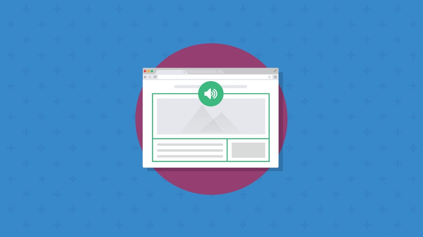
What I found most striking about Najee’s presentation on email accessibility was hearing firsthand how screen readers handle HTML emails. The difference in experiences between an email coded with and without accessibility in mind is a big wakeup call.
Screen readers are a form of assistive technology that people with blindness and low vision often use to read and interpret the contents of emails and websites. Screen readers also help those with disabilities navigate digital content. Recipients taking advantage of this technology will use a computer keyboard to move between sections, skip things they aren’t interested in, and click buttons or links.
Something as easy as adding descriptive image alt text can make a huge difference in the experience these subscribers have with your emails. Najee played a screen reader recording of an email from a popular fashion brand (which we will not name). The email was missing lots of alt text or failed to format it in an accessible way.
We kept hearing “Unlabeled image” over and over again. The screen reader also occasionally announced the letters N-E-W. That’s because some of the alt text included the word “new” in ALL CAPS. So, the point that these were images of new products didn’t come through at all.
Later in this episode, Najee played audio showing how a screen reader interpreted a much more accessible email from the brand OpenTable. One thing that stood out was how well using descriptive image alt text helps recreate the look of the email with words.
Whoever writes alt text for email images should think about how the words they choose can spark the imagination of the subscriber so they can picture it in their mind. But it’s also important to write descriptions that are helpful. For example, Najee explained how a phrase like “red cotton t-shirt” would be more helpful than just adding “red shirt” as alt text.
Najee’s steps to support email accessibility
After delivering a bunch of statistics to convince us all that focusing on email accessibility is a worthwhile investment, Najee got down to the heart of the matter. What are the most crucial things email developers and marketers can do to make campaigns more accessible?
Here are her top recommendations:
1. Write clear subject lines and preheader text
Visually impaired people Najee has spoken to about email accessibility say the information provided at the inbox level isn’t enough to tell them why they should open an email. So, don’t sacrifice clarity for cleverness.
While it’s okay if you want to create some curiosity, being straightforward with subject lines and preview text helps people decide whether your email is actually going to be worth their time. This is good advice for your entire list, by the way. Busy people who are trying to get through a full inbox may not have time for your puns and emojis.
Semantic HTML adds meaning to your code while providing structure that makes it easier for screen readers to interpret and prioritize content. Some of these tags also make it easier for subscribers with vision impairments to navigate email content with a keyboard.
Two of the most helpful examples of semantic HTML in emails are <h> tags for hierarchical subheadings (H1, H2, H3 etc.) as well as using a <p> tag for paragraphs instead of </br> line breaks.
3. Include alt text for all images
Najee is a big proponent of image alt text. She says it’s not just about labeling the images you think are important.
If you want people with visual impairments to experience your campaign in the best way possible, even things like icons and social media logos in your email footer should include alt text.
“I get teary-eyed when people don’t put alt text in their stuff. I’m just like, ‘How dare you?’ Treat alt text like you treat seasoning on chicken. Put it on everything!”

Whether you use bulletproof buttons for CTAs or add them as clickable graphics, these email elements should be big enough so that they are extra easy to engage with. The general rule of thumb is to make buttons at least 45 pixels high, which is about the width of your thumb. (So… pun intended.)
Button size is an important accessibility consideration for people with mobility and motor control challenges.
By the way, if you do add CTA buttons as images instead of with live text in your email, be sure to include alt text. That allows screen readers to announce the button copy.
ARIA, which stands for Accessible Rich Internet Applications, includes a set of roles and attributes that improve the accessibility of digital content like emails and web pages.
When you include an aria-label in the code for a button, you can describe the type of button as well as the state it’s in. For example, it could inform subscribers using screen readers that they’re encountering multiple choice buttons. It could also tell them they’re interacting with a checkbox button that’s in the unchecked state.
An aria-label can also serve as an additional image description, which allows you to further describe the design and visuals in your campaign.
Yet another important aria-label for email accessibility is role=”presentation” – which you should use with <table>s in your email code so that screen readers understand the table is being used for layout purposes and not to display data.
Resources for coding accessible emails
Najee’s presentation included some sample email code to help ensure the <body> of your messages is built with accessibility in mind. Use the boilerplate below to get started:
                                <body>

<table role="presentation" width="600" border="0" cellpadding="0" cellspacing="0" bgcolor="#f3a8a4" style="background:#f3a8a4;">

<tr>
<td align="center" valign="top"><table width="100%" role="presentation" border="0" cellpadding="0" cellspacing="0">

<tr>
<td align="center" valign="top" style="border-left:4px solid #ffffff;padding:15px 0 12px;">

<!-- Header tags -->

<h1></h1>
<h2></h2>

<h2></h2>
<h3></h3>
<h4></h4>

<h5></h5>

<h6></h6>
<!-- Image -->
<img src="SOME IMAGE URL GOES HERE" alt="VERY DESCRIPTIVE ALT TEXT" aria-label="a second descriptive option ex: clicking on this image will redirect
you to the retail website" >


<!-- paragraph -->

<p> Paragraph</p>


<!-- UnOrder List -->

<ul>
<li></li>

</ul>

<!-- Order List -->

<ol>
<li></li>

</ol>
</td>
</tr>

</table>
</td>
</tr>
</table>
</body>
If you’re interested in learning more about email accessibility, we’ve got plenty of resources here at Sinch Email on Acid:
- Email Accessibility: A Complete Guide for Marketers, Designers, and Developers
- How to Code Accessible Emails with Semantic HTML and ARIA
- Build Better Accessibility Into Your Email Design System
- How to Conduct an Email Accessibility Audit
- Color Contrast Accessibility: Tips for Email Design
Najee also reminded us of some different ways to evaluate email accessibility. That includes hiring people with disabilities as consultants and asking them to review their experience and look for ways to improve. She also suggests using accessibility testing suites like Axe from Deque Systems. You can also run your emails through popular screen readers such as JAWS.
If you’re using Sinch Email on Acid for pre-send testing and quality assurance, we’ve built some helpful accessibility checks into the workflow. That includes color contrast adjustments for text and background, alt text, table roles, link accessibility, and more.
Of course, Najee Bartley is out there ready to be your human accessibility resource too. You can connect with her on LinkedIn and Twitter. And you can download the slides from her full presentation below. Thanks to Najee for joining us and sharing her tips and expert insights!
More Notes from the Dev will be on the way soon. So, don’t forget to subscribe to our YouTube channel as well as the Email on Acid newsletter, and you’ll never miss an episode.