Email Development
Dark Mode Accessibility in Email: Truth & Coding Tips

Most developers are very familiar with dark mode and its challenges in email. Those of us who stare at code all day appreciate the aesthetic and believe it gives our eyes a bit of a break. However, putting personal preferences aside, there is still a great deal of debate relating to dark mode and email accessibility.
You’ll find dark mode settings under “Accessibility” on many devices and platforms, but does that mean anything designed with darker settings is more accessible? What about dark mode emails? Will emails designed for light mode still be accessible when an email client inverts colors?
Let’s explore how dark mode impacts email accessibility and how we can develop emails that ensure an accessible experience whether a subscriber uses light mode or dark mode.
Are dark mode emails accessible?
There is no simple answer to this question. From the email client doing the rendering to the device being used to the text and background colors featured in an email, there are lots of things to consider.
The only truth here is that accessibility is based on the individual’s needs and preferences and (especially when we are talking about disability) everyone’s needs are different.
According to Nielsen Norman Group, people with cataracts and related disorders may prefer reading texts in dark mode. This is because a dark screen environment causes the viewer’s pupils to dilate and let more light in. That same research also tells us that long-term reading in light mode may be associated with myopia (short-sightedness).
However, the Bureau of Internet Accessibility (BOIA) reports that people with conditions such as dyslexia (affecting an estimated 5-10% of the US population), and astigmatism may struggle to read the text in dark mode. According to UX Collective, the light text on a dark background can produce a halo effect that decreases readability for some people.
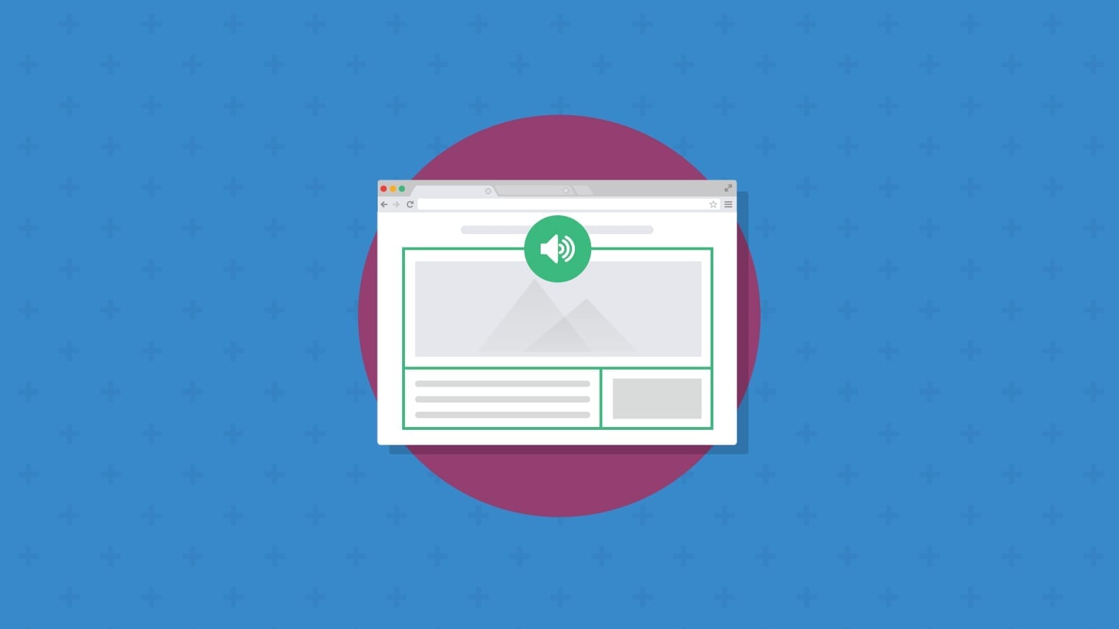
For more, check out the video below that examines dark mode’s history and whether it’s actually better for your eyes.
The bottom line is that dark mode may improve accessibility for some subscribers but make the situation worse for others. We have to assume people are choosing the mode that best suits their needs. And email developers should strive to build the best experience for as many subscribers as possible.
Dark mode accessibility for email developers
In dark mode, various email clients will either completely invert, partially invert, or do absolutely nothing to your email. This creates a genuine problem for email marketers who have no idea how their email will render in different mailboxes.
When an email client automatically inverts colors for dark mode, it may cause color contrast issues that make text difficult to read and impact accessibility as defined by the Web Content Accessibility Guidelines (WCAG). Email on Acid tested this in 2019 and found that (sometimes) even though an email designed in light mode is accessible, it doesn’t remain that way following a color inversion for dark mode.
Meta tags and media queries
When your email campaigns fail the color contrast ratio accessibility check, a quick fix is available by simply adding a few lines of code in the CSS. Essentially, this fix tells the client to show a certain version of an email (or certain elements) based on the mode being used.
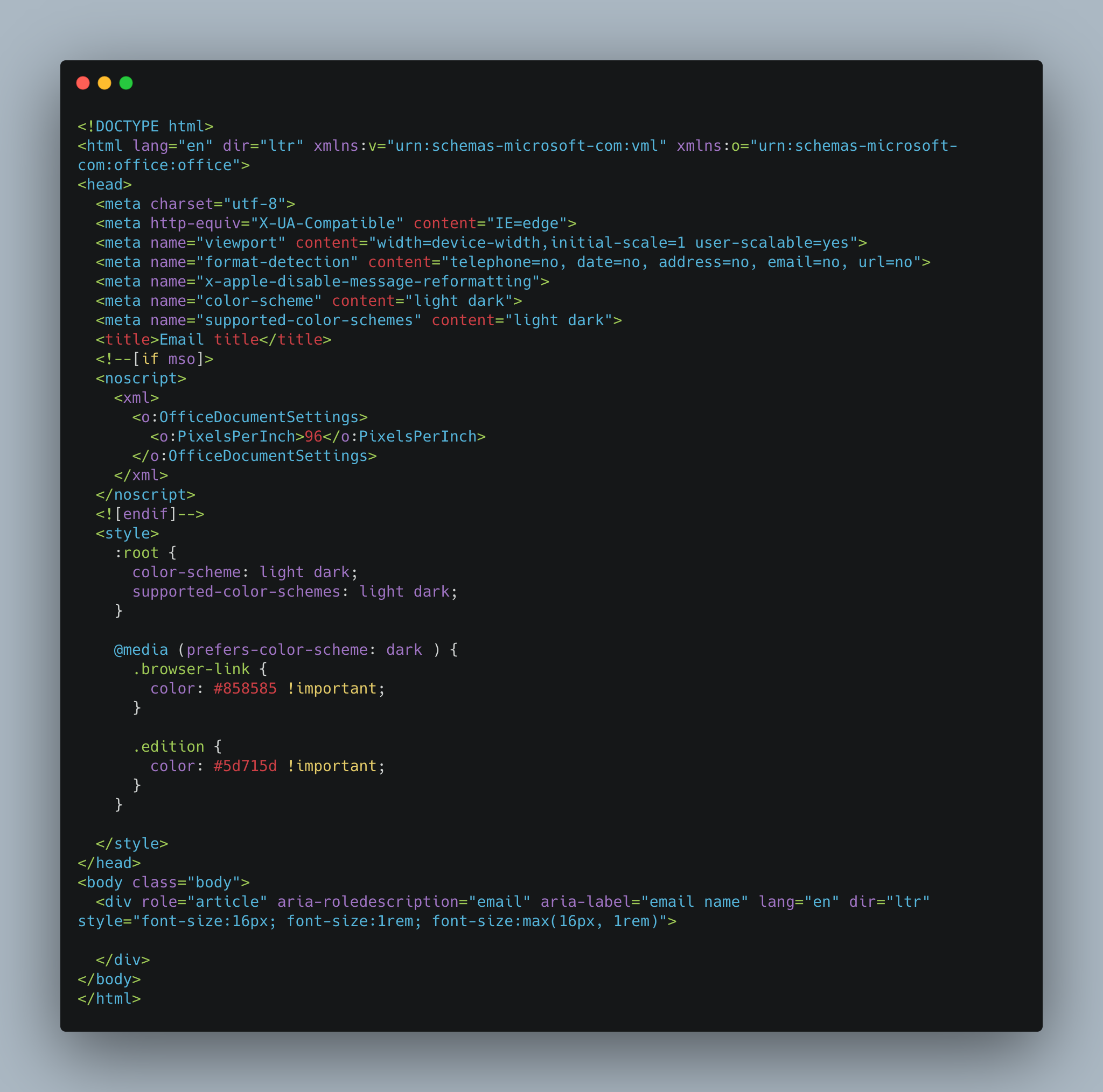
The first step is to place meta tags (shown below) between the <head></head> tags of your code. These tags will help figure out if a device has dark or light mode enabled and treat the email accordingly.
                                <div class="bg-dark text-primary rounded fs-sm p-1 overflow-auto mb-5">
    <pre>
    <code>
    <meta name="color-scheme" content="light dark">
    <meta name="supported-color-schemes" content="light dark">
    </code>
    </pre>
</div>
We then add the following code before the media query in the CSS of the email.
                                <div class="bg-dark text-primary rounded fs-sm p-1 overflow-auto mb-5">
    <pre>
    <code>
        :root {
            color-scheme: light dark;
            supported-color-schemes: light dark;
        }
    </code>
    </pre>
</div>
The :root selector targets the highest-level parent: HTML, and it also helps target if the device has dark mode or Light Mode enabled.
The media query we used in this example was the @media (prefers-color-scheme: dark)
                                @media (prefers-color-scheme: dark ) {
    .browser-link{
        color:#858585 !important;
    }
    .browser-link{
        color:#5d715d !important;
    }
}
Putting everything together
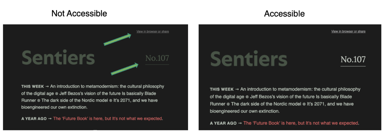
Here’s how that code looks inside of an actual email.
Example after adding CSS
Take a look at the screenshot of an email we experimented with back in 2020.
By adding the classes .browser-link to the “View in Browser” link at the top of the email and .edition to the “No.107” text, we were able to change the inaccessible colors in dark mode using the meta tags and the @media (prefers-color-scheme:dark).
Email accessibility beyond dark mode
Dark mode is just one element of email marketing that can impact your campaigns’ accessibility. The bottom line is that we need to build the best email experience we can whenever we can.
We’ve gone deep on email accessibility on this blog before, and it is something we remain committed to. Accessibility should be prioritized alongside all the other checks you perform on your email campaigns before sending, including deliverability issues, spelling and grammatical errors, broken links and images, and email client rendering. Email on Acid’s pre-deployment campaign checklist ticks all of these boxes to ensure your email campaigns are fully optimized and deliver on your objectives.
Check for dark mode and accessibility issues
Email on Acid’s pre-deployment campaign checklist should be your first port of call to troubleshoot any issues relating to email accessibility in dark mode. The pre-deployment service checks your emails across 90+ email clients and devices for any issues relating to color contrast ratio, enabling you to make changes before hitting the send button.
The only way to check the negative impact of poor accessibility on your email campaigns is to actively test your campaigns in dark mode across all available email clients. You could try and do this manually (impossible) or employ accessibility testing features that check your emails for accessibility across multiple clients and devices.
To learn more about how dark mode is impacting the world of email marketing, check out Pathwire’s dark mode for email survey.