Email Development
Conditional CSS for Email: What Developers Need to Know
An HTML email that renders perfectly in every client is a developer’s frustratingly elusive white whale. While many email clients have improved support for certain features over the years, there are still a lot of differences that make it impossible to create an email that looks exactly the same across every device and client.
But do you really need your emails to look exactly the same from client to client? It’s better to have emails that look attractive and are readable, even if they vary a bit, than to spend hours trying to get your emails to look absolutely identical across every environment. This is where conditional code swoops in to save the day.
Outlook and the need for conditional code
Microsoft Outlook (MSO) is perhaps the most notorious for its inconsistencies in rendering emails. While Outlook for Mac and Outlook online both use Webkit to render emails, Outlook for Windows uses Microsoft Word.
If a campaign needs to be displayed correctly by Outlook, developers have to work with the specific idiosyncrasies of the Word rendering engine. You can code your emails with Vector Markup Language (VML), but it only works in older versions of Outlook (2007-2013), so that won’t really solve your rendering consistency problems.
What is conditional code?
Conditional code uses “if” statements to determine whether instructions within your code should be executed. When a piece of code says, “If A is true, then execute B,” condition “A” must be met in order for “B” to execute.
While complex conditional code is limited to programming languages (e.g. JavaScript, PHP, Python, C#, et al), markup languages like HTML and CSS do have the ability to handle a limited set of conditional statements. You can use these conditional statements in your HTML emails to display platform-specific content across different devices and clients. You can target different versions of Outlook with Microsoft Office (MSO) conditional comments and different devices using conditional CSS.
MSO conditional comments
MSO conditional comments use the same <!-- and --> tags that allow developers to add ignored content to their HTML documents. You might use comments in your email templates to explain why you added a certain piece of code or styled an element in a particular way. For example:
<!-- Outlook styles below. Do not strip MSO tagged comments before sending your email. -->
While HTML comments are usually ignored by browsers and email clients, MSO tags were developed by Microsoft to be recognized and their content is displayed only by Outlook. Although in most situations any content within a comment using MSO tags will display only in Outlook, there is one email client that will render all comments — T-online. So if your emails are being sent to t-online.de domains, you can use the workaround from Rémi Parmentier’s GitHub to hide these comments from that client..
MSO conditional comments can include plain text, HTML, or CSS. This can be useful if you need to implement unique styles, content, or behavior for different versions of Outlook.
Here’s an example of an MSO conditional comment that renders an HTML table that will only be displayed in Outlook:
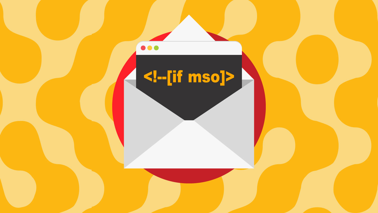
                                <!--[if mso]>
<table><tr><td>
       <p>This information will display only in Microsoft Outlook.</p>
   </td></tr></table>
<![endif]-->
In this example, the table and its contents will only be recognized and applied by Outlook. Other email clients will ignore the comment and the styles will not be applied.
You can also use MSO conditional comments to include CSS styles in the <head> that target Outlook. For instance, if you wanted to make the body style 16px Arial in a dark gray, you would use the following code:
                                <!--[if mso]>
   <style>
       .body {
       	font-family: Arial, sans serif;
	font-size: 16px;
	color: #434345;
       }
   </style>
<![endif]-->
You can even use mso- prefixed CSS to style elements specific to Outlook and insert these styles within your MSO conditional comments. The following example creates the equivalent of a text shadow in Outlook.
                                <!--[if mso]>
<p style="mso-effects-shadow-color: #2e2ed2; mso-effects-shadow-alpha: 100%;
	mso-effects-shadow-dpiradius: 0pt; mso-effects-shadow-dpidistance: 10pt;
	mso-effects-shadow-angledirection: 2700000; mso-effects-shadow-pctsx: 100%;
	mso-effects-shadow-pctsy: 100%;">Cool Blue Text Shadow Effect</p>
<![endif]-->
With a slight change in syntax and some additional comment closing symbols, you can use MSO conditional comments to target all clients besides Outlook:
                                <!--[if !mso]><!-->
  <p>This is a secret message for everyone who doesn’t use Outlook!</p>
<!--<![endif]-->
“if !mso” is declaring, “if the client is not Microsoft Outlook”. You’ll also need to append your initial <!--[if !mso]> tag with <!--> and preface your closing <![endif]--> tag with <!-- in order for Outlook to acknowledge this code.
You can even target specific versions of Outlook by declaring the version number after “if mso”.
| Outlook Version | MSO Comment Code |
| All versions of Outlook | <!–[if mso]> code <![endif]–> |
| Outlook 2000 | <!–[if mso 9]> code <![endif]–> |
| Outlook 2002 | <!–[if mso 10]> code <![endif]–> |
| Outlook 2003 | <!–[if mso 11]> code <![endif]–> |
| Outlook 2007 | <!–[if mso 12]> code <![endif]–> |
| Outlook 2010 | <!–[if mso 14]> code <![endif]–> |
| Outlook 2013 | <!–[if mso 15]> code <![endif]–> |
| Outlook 2016 and 2019 | <!–[if mso 16]> code <![endif]–> |
If you need to target multiple versions of Outlook, you can use conditions like “greater than,” “less than,” “equal to,” etc. by using the following code:
| Code | Definition | MSO Comment Code |
| gt | Greater than | <!–[if gt mso 14]> Greater than MSO 2010 <![endif]–> |
| lt | Less than | <!–[if lt mso 12]> Less than MSO 2007 <![endif]–> |
| gte | Greater than or equal to | <!–[if gte mso 15]> Greater than or equal to MSO 2013 <![endif]–> |
| lte | Less than or equal to | <!–[if lte mso 11]> Less than or equal to MSO 2003 <![endif]–> |
| | | or | <!–[if mso 9 | mso 10]> If MSO 2000 or 2002 <![endif]–> |
| ! | not | <!–[if !mso 9]><!–> If not MSO <!–<![endif]–> |
So if you want to display a table in Outlook 2013 and older one way, in any newer version of Outlook another way, and in any client that isn’t MSO yet another way, you could write something like this:
                                <!--[if lte mso 15]>
<table width=”100%” style=”border: 1px solid #dedede;”><tr><td>
     	  	<p>This information will display only in Microsoft Outlook 2013 and newer.</p>
</td></tr></table>
<![endif]-->
<!--[if gt mso 15]>
<table width=”80%” style=”border: 2px solid #000000;”><tr><td>
     	  	<p>This information will display only in Microsoft Outlook 2010 and older.</p>
</td></tr></table>
<![endif]-->
<!--[if !mso]><!-->
<table width=”100%” style=”border: 3px solid #2e2ed2;”><tr><td>
     	  	<p>This information will display only if the client is not Microsoft Outlook.</p>
</td></tr></table>
<!--<![endif]-->
Conditional CSS
In addition to using CSS within MSO conditional comments, you can use conditional CSS via media queries (@media) or assign fallback classes within your <style> tags in your email <head> to tailor the appearance of an email to different clients and devices. Even though Outlook may be the thorniest email client to contend with, others also have varying levels of support for CSS.
Additionally, mobile devices have a wide variety of viewport sizes, which means emails can display very differently from device to device. Since these other variables cannot be targeted with MSO conditional comments, email developers often use conditional CSS to address inconsistencies and apply styles that are only supported by certain clients.
Conditional CSS is an invaluable tool for ensuring that your emails look as intended across a wide range of email clients and devices. Below, we’ll go into a little more detail about some of the common use cases for conditional CSS as well as MSO conditional statements and give some specific code examples.
When to use conditional code in email development
If your emails are being sent to multiple email clients and will be read on a wide variety of devices, you’ll want to use at least some amount of conditional code to ensure that they display well.
But conditional code also allows developers to create more engaging email content for those clients that support it. Conditional code allows you to take advantage of HTML5 videos, animated GIFs, web fonts, and more to create striking and impactful email campaigns, while providing fallback content and design for clients that lack support for those features.
Here are a few other examples of how you might use conditional CSS in an email:
1. Applying different styles based on email client or viewport size
An <h1> heading at 24px on a mobile email client might look fine, but if you’re reading that email on a desktop computer, your title may seem small compared to your body copy. You can set a larger h1 size for desktop displays using a conditional CSS media query. The @media rule allows you to apply styles based on the dimensions of the viewport or other features of the subscriber’s device.
In the below example, the h1 elements will have a font size of 24px by default. However, if the width of the viewport is 1025px or more (which is likely the case on a laptop or desktop display), the font size of the h1 elements will be increased to 48px.
                                h1 {
  font-size: 24px;
}

@media screen and (min-width: 1025px) {
  h1 {
    font-size: 48px;
  }
}
Note that when you’re using @media, you’ll need to include additional brace after your @media statement and before your h1 selector. This code should be included in your <style> section in your email <head>.
You can use similar rules to apply different styles to other elements in your email based on viewport dimensions. Just be aware that not all email clients support media queries, so you may need to use multiple @media rules or use them in conjunction with other conditional code to cover a range of clients.
2. Hiding specific email elements
Some email clients do not support certain HTML and CSS elements. To prevent these elements from being displayed awkwardly in certain environments, you can use conditional CSS to hide them.
There are a few different ways you can hide specific email elements:
- Use inline CSS. You can use inline CSS to hide an element by setting the display property to none. For example:
<div style="display:none;">Hidden content</div>
- Use the mso-hide property. You can use the mso-hide property in a style tag to hide an element in certain versions of Microsoft Outlook. For example:
<style> .mso-hide {display:none;} </style> <div class="mso-hide">Hidden content</div>
- Use display:none in a media query: You can use a media query to hide an element on certain devices by setting the display property to none.
                                @media only screen and (max-width: 600px) {
    .hide-on-mobile {
        display: none;
    }
}
- Use an MSO conditional comment. You can use an MSO conditional comment to hide an element based on a certain condition. For example, you might want to hide an element if the version of Outlook is older than 2010.
                                <!--[if gt mso 14]>
<img src=”https://yourimagelocation.com/image.jpg”>
<![endif]-->
In the above code, the image will only display in Outlook versions later than 2010 and will be hidden from all other email clients.
- Include a HTML5 hidden attribute. Although support for the HTML5 “hidden” attribute is limited. In the email clients that do support it, however, your element will be hidden for screen readers, will not be selectable, and will stay hidden even if CSS doesn’t load. Here’s an example of hiding a table row within a table:
                                <table>
    <tr hidden>
        <td>
            <p>hidden table cell content</p>
	    </td>
    </tr>
	<tr>
        <td>
            <p>visible table cell content</p>
        </td>
    </tr>
</table>
- Set opacity to zero. You can hide elements by making them entirely transparent using the “opacity” property in HTML. Opacity ranges between 1 (opaque) and 0 (transparent). If you use opacity to hide an element, the element still exists and takes up the same amount of space as if it were being displayed. It can also be selected by the user and is readable by a screen reader. This is useful if you want that extra spacing and don’t necessarily need that element to be entirely unavailable, but it can look clunky if the object is very large and confusing to those using screen readers.
                                <td style="opacity: 0;">
    <img src="https://youranimatedgif.com/babygoats.gif" width="600" height="400" style="display: block;">
</td>
- Set visibility to hidden. The
visibility:hidden;declaration works exactly like opacity, except that it has the unique feature of being able to be overridden in child elements by setting the child element tovisibility:visible;.
                                <td style=”visibility:hidden;”>
    <img src="https://youranimatedgif.com/babygoats.gif" width="600" height="400" style="display: block;">
</td>
- Use conditional CSS to hide elements based on the recipient’s email client. There are several ways you can use CSS classes to hide elements based on the email client being used. Jay Oram over at ActionRocket has some tricks worth checking out.
It’s important to note that these are just a handful of methods you can use to hide elements in your emails. Also, not all email clients will support all of these methods, so you may need to use a combination to achieve the desired result.
3. Page break problems
The Word rendering engine in Outlook 2010 and prior versions wreaks havoc on email design due to its document length limit of around 1800 pixels. When your email becomes longer than this limit, Outlook will unhelpfully add a page break.
This can absolutely wreck your email design and make it difficult to read, especially when the break happens in the middle of an image tag or some other vital piece of HTML. MSO conditional statements allow you to create layouts that will work specifically with these versions of Outlook.
For example, you could create a table with a forced page break only for Outlook 2010 and older, while displaying a normally-styled table for newer versions of Outlook that don’t have this issue.
                                <!--[if lte mso 14]>
<table width=”100%” style=”border: 1px solid #dedede;”><tr><td>
     	  	<p>First row of table content.</p>
</td></tr>
<tr style="page-break-before: always"><td>
     	  	<p>This code will force a page break at table row.</p>
</td></tr>
<tr><td>
     	  	<p>Last row of table content.</p>
</td></tr></table>
<![endif]-->

<!--[if gt mso 14]>
<table width=”100%” style=”border: 1px solid #dedede;”><tr><td>
     	  	<p>First row of table content.</p>
</td></tr>
<tr><td>
     	  	<p>This is just a normal row of content now.</p>
</td></tr>
<tr><td>
     	  	<p>Last row of table content.</p>
</td></tr></table>
<![endif]-->
4. Ghost tables
Creating “ghost tables” in emails is useful particularly when you are using fluid design in emails and you don’t want Outlook to break things just because it doesn’t acknowledge the min-width, max-width, and inline-block properties. There are a couple of different ways to create a ghost table. One option is to build a fixed-width table wrapped in MSO conditional comments and insert the fluid table styles in div tags that Outlook will ignore.
                                <!--[if mso]>
<table role="presentation" cellspacing="0" cellpadding="0" border="0" width="100%">
<tr>
<td width="340">
<![endif]-->
   <div style="display:inline-block; width:100%; min-width:200px; max-width:340px;">
       <p>Here’s the table cell content. Since we’ve declared a fixed width for the table cell in the MSO conditional statement, we’ll be able to use a static width for Outlook while preserving fluid table design in other email clients that respect div styles.
   </div>
<!--[if mso]>
</td>
</tr>
</table>
<![endif]-->
Another option is to use <!--[if true]> tags to create your ghost tables.
                                <!--[if true]>
<table role="presentation" width="100%" style="all:unset;opacity:0;">
  <tr>
<![endif]-->
<!--[if false]></td></tr></table><![endif]-->
<div style="display:table;width:100%;">
  <!--[if true]>
    <td width="100%">
  <![endif]-->
  <!--[if !true]><!-->
    <div style="display:table-cell;width:100%">
  <!--<![endif]-->
      Column content
  <!--[if !true]><!-->
    </div>
  <!--<![endif]-->
  <!--[if true]>
    </td>
  <![endif]-->
  </div>
<!--[if true]>
  </tr>
</table>
<![endif]-->
You can also use ghost tables to conditionally display background images in emails while providing fallback code for Outlook.
Bulletproof design elements in email may have slight design variations from client to client, but they retain their functionality across all platforms and devices. A button may be coded to display with rounded corners and appear perfectly in Apple Mail, but appear without a border radius in Outlook. The appearance might differ slightly, but it doesn’t affect the functionality.
Below is an example of a bulletproof button with an image background as well as a fallback color for clients that don’t support background images. It also includes VML markup for Outlook 2003 and earlier (which does support background images, unlike later versions of Outlook).
                                <div><!--[if mso 11]>
  <v:roundrect xmlns:v="urn:schemas-microsoft-com:vml" xmlns:w="urn:schemas-microsoft-com:office:word" href="https://www.emailonacid.com/blog/article/email-development/how-to-make-your-emails-bulletproof/" style="height:40px;v-text-anchor:middle;width:200px;" arcsize="25%" stroke="f" fill="t">
    <v:fill type="tile" src="https://imgur.com/uQg9nTA" color="#fa0031" />
    <w:anchorlock/>
    <center style="color:#ffffff;font-family:sans-serif;font-size:13px;font-weight:bold;">Example Button</center>
  </v:roundrect>
<![endif]-->
<!--[if gte mso 12]>
<a href="https://www.emailonacid.com/blog/article/email-development/how-to-make-your-emails-bulletproof/"
style="background-color:#fa0031;color:#ffffff;font-family:sans-serif;font-size:13px;font-weight:bold;height:40px;text-align:center;text-decoration:none;width:200px;">Example Button</a>
<![endif]-->
<a href="https://www.emailonacid.com/blog/article/email-development/how-to-make-your-emails-bulletproof/"
style="background-color:#fa0031;background-image:url(https://imgur.com/uQg9nTA);border-radius:10px;color:#ffffff;display:inline-block;font-family:sans-serif;font-size:13px;font-weight:bold;line-height:40px;text-align:center;text-decoration:none;width:200px;-webkit-text-size-adjust:none;mso-hide:all;">Example Button</a></div>
Don’t need to use VML in your code? Mark Robbins over at Good Email Code has a good example of how to code a bulletproof button for email.
6. Replacing GIFs with static images
Support for animated GIFs in email is almost universal at this point… almost. Of course, our buddy Outlook for Windows still does not support GIFs. Outlook doesn’t even have a standard treatment of GIFs across versions. Outlook 2007-2013 will simply display the first frame of the GIF, which would be fine if you wanted to design all your GIFs so that the first frame communicated the message you wanted. Unfortunately, Outlook 2016-2019 will play the animated GIF once and then display a play button over the image.
To keep our Outlook subscribers from feeling design-neglected and to convey our visual message more effectively, we can use conditional comments to display a specific static image.
First you’ll want to add your image class and any styles you want to the <style> section of your <head>. Then, you’ll declare your image class and source between two MSO conditional tags stating that if the email client is NOT Outlook, to display the baby goats GIF.
                                <!--[if !mso]><!-->

<img class="notoutlook-img" src="babygoats.gif">

<!--<![endif]-->

Then, you’ll want to add instructions on what to display if the client is Outlook.

<!--[if mso]>

<img src="babygoats-static.jpg">

<![endif]-->
With the above code, most of your recipients will be able to enjoy some stampeding baby goats in animated GIF format, while Outlook users can experience the still very cute static image taken midway through the GIF.

7. Interactive email fallbacks
If you’re using interactive elements in your emails, you’ll want to provide fallbacks for clients that don’t support those features. Examples of interactive elements include hover animations, side-scrolling images, and image carousels.
For hover animations, which have spotty email client support, you can simply make sure that your first image is the one that you want to be displayed as a static image. Email clients that don’t support the hover pseudo-class will simply ignore it. But for side-scrolling images, add a fallback class in your <style> section in the email <head> and declare the fallback in your table. See the full code for side scrolling images and fallbacks.
If you want to create an image carousel for your emails, it might look amazing in Apple Mail, but Gmail, Yahoo! Mail, and Outlook will all render a single static image. Depending on how you code your carousel, you might just get an empty and weirdly formatted box. Providing your own static image fallback will help ensure that your email displays well in clients that don’t support image carousels.
Want to get image carousels and fallback content right? Check out this helpful tutorial for creating animated image carousels for email.
8. Using conditional code in your email templates
Using MSO conditional comments and conditional CSS in your email templates is a good practice to get into. It will save you time and design headaches when drafting email campaigns and ensure that you don’t forget to include display options for each of the major email clients and device types.
You’ll also be able to rest easy knowing that your emails will have a consistent look and reliable behavior. But no matter how solid you think your email templates are, don’t forget to test their display before you hit send!
This is why you test email campaigns
Email clients can have widely varying support for HTML and CSS, and there are many techniques that you can use to try to achieve consistent rendering of your emails across different clients. The complexity of addressing these inconsistencies is the main reason email teams need to test and preview their campaigns.
Use Sinch Email on Acid to test your emails across a variety of email clients to ensure your conditional CSS and other code works as expected. By testing your emails, you’ll be able to catch and fix any display issues before your emails land in those valuable inboxes.


