
A Fluid Hybrid Design Primer
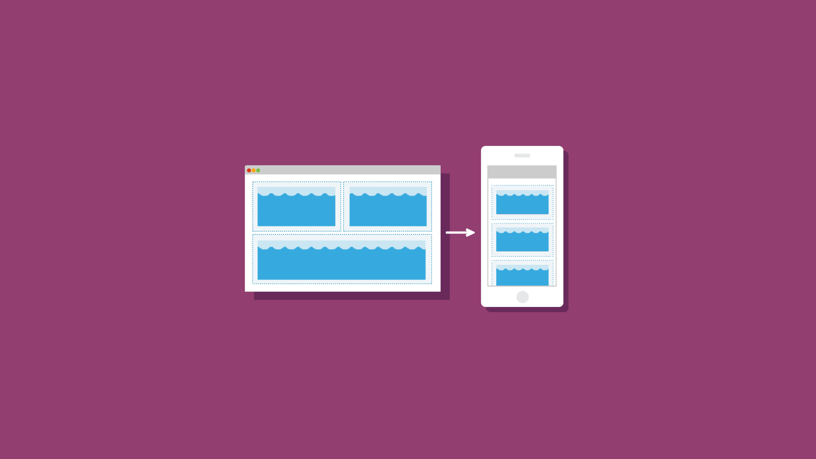
Fluid hybrid design is on the way to replacing media query-based design as the go-to framework for responsive emails. Also known as “spongy” design, this technique creates emails that look great on almost any device and in almost any email client. No, it doesn’t magically turn your email into gold in Lotus Notes 6.5, but come on, we’re not magical wish-granting genies here.
What is fluid hybrid design?
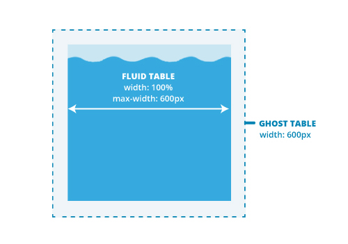
Fluid design has been around for a while. This technique uses content blocks that have width: 100%, and max-width: 600px; or whatever width the creator desires. In this way, larger screens will show a centered, 600px wide column of content, while tablets and phones will show the content filling the screen. The issue here is that Outlook (various versions) doesn’t support max-width. In Outlook, emails built using this technique will be blown out to the full width of the viewing pane.
To overcome this limitation, “ghost tables” can be used to constrain the email in Outlook. Ghost tables are fixed-width tables built around the fluid tables, but wrapped in MSO conditional tags. The conditional tags make sure that the ghost tables are visible only to Outlook desktop clients. This is the hybrid aspect of this coding technique.
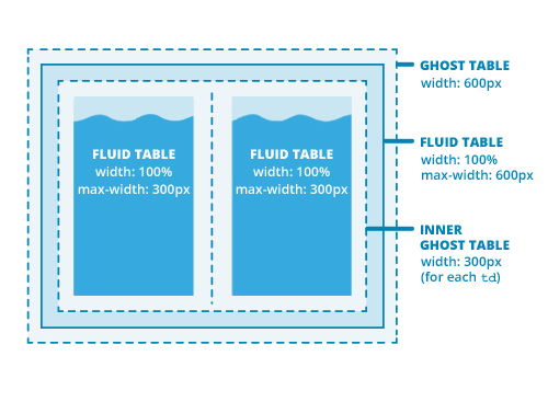
Building on this technique, you can create two or three column layouts that stack naturally on smaller screens. Another ghost table (inside the outer ghost table and fluid container) helps to make sure that the inner fluid tables will work properly in Outlook. This inner ghost table can have two or three TDs, depending on how many columns you want to have in your layout. Want to really get into the code? Check out Creating a Future-Proof Responsive Email Without Media Queries.
Why use fluid hybrid?
This technique offers a number of advantages over responsive designs that depend on media queries. First, the design will be responsive in Gmail and the Gmail app. Because Gmail has such a large market share, this is a huge win. It will also be responsive in all web clients, making for a better viewing experience on laptops and smaller screens.
Fluid hybrid will also let you escape from the pain of “breakpoints.” You don’t need to worry about which screen size is the most popular with your users, or how the new iPhone 14S+ will affect your email development. Fluid designs will always expand to the screen size.
Many media query-based responsive designs use TD-stacking to create the responsive behavior. Essentially, two TDs that had been side by side on desktop will become stacked for mobile displays. The problem with this technique is that it doesn’t work with some versions of Android. The table-stacking method has better support, but comes with its own set of limitations. For example, on smaller screens it can be difficult to have multiple tables with align=left and align=right line up, as each will move to a different side of its container. Similarly, two tables of different height that are side by side will need to be aligned to the top or bottom of the table, not the center. Fluid hybrid can solve all of these problems.
Want to start coding in fluid hybrid now?
We just came out with a fluid hybrid email template that’s free to download. Come grab it now, and get started coding your own fluid hybrid emails!
If you’d like to access templates like this, as well as white papers, our helpful forum, and tips & tricks for tons of email clients, join our Community today.
More reading on fluid hybrid.
If you’d like to get more information on fluid hybrid design, check out these resources:
- Fabio Carneiro’s code samples from his TEDC15 talk. Fabio coined the term “spongy design!”
- Nicole Merlin’s excellent tutorial on how to build a fluid hybrid template.
- ActionRocket’s inaugural post on the technique.
- Campaign Monitor’s article on this technique from 2014.
Author: Kyle Lapaglia
13 thoughts on “A Fluid Hybrid Design Primer”
Comments are closed.
I did a little work on simplifying the implementation of the ‘fluid-hybrid’ approach, if anybody is interested. It essentially swaps out the use of
Another great post Geoff. I’m assuming that you coded the new coffee shop templates that go along with this post – good job. You’ve got a lot of good stuff going on there.
It’s nice to see the shout out to Nicole’s tutorial. I just remembered that I actually gave a bit of a shout out to you (well to Email on Acid) in the comments on Nicole’s tutorial when I mentioned the solution that you found for the problem I was having with the IE=Edge meta tag. It’s interesting that help that you gave to me got passed along to Nicole who incorporated it into something that eventually got passed back to you – small email dev world 🙂
Thank you Geoff and thank you Andy – both very interesting and informative posts and examples.
Wunderman,
Thank you! Yes, I did code the new coffee shop template. I wanted to do a tutorial as well, but Nicole’s is so thorough that I didn’t know what I would be able to add! It’s great when we can all help each other improve.
Thanks for reading!
Really interesting approach, and amazing benefits toward this. It works really well for simplistic and bold emailers, where it doesn’t rely on a lot of images, but also advantageous for product-led emails. You’ve included so many methods of usability, it’s foolproof. Why did this come at a time when I had almost refinished my current email project with snap points?! (Don’t answer that; sod’s law is the answer.)
Am I right in thinking that this method will negate the ability for image swaps, and hiding content depending on device screen sizes, or is that still available as long as you add the media query for max-device-width? (But possibly screw up in Google with the fluid/media-query code mix?)
I’m a novice at coding by all means, but to get a non-stacking 4 / 5 / 6 column, would these need to be wrapped in individual ghost-tables, or side by side
Adu,
Glad you liked it!
No, you can still do image swaps and hide content using media queries. They shouldn’t affect the fluid hybrid code at all.
If you want non-stacking columns, you can just use TDs in the same TR. These will be shown the same way everywhere. The complexity comes from creating stacking (on mobile) columns.
Great post! Loving the fluid-hybrid love that’s everywhere now.
Don, it sure is a small world, in a good way 😀
This is fantastic! Is there a way to set the image and content width to 100% on for the three column layout viewed on mobile?
Nick,
The three column layout should become a single column on (small enough) mobile displays. The content in that column will be as wide as the max-width setting you choose. You can override this for some clients using media queries if you wish to have it be 100%, but unfortunately that won’t work for gmail.
This is exactly how we have been coding our emails for our company. our highest opens and views are in Gmail so we have had to modify our code to be gmail friendly first and then work everywhere else second. This is a great example and solidifyies my reasoning behind the coding path we chose for going responsive. Thanks for the article!
Amazing template! It just made 2016 so much cooler. Emails render beautifully on all devices… so far 🙂 Thank youuuuuu
Hello!
I am using the hybrid/fluid method where I am hiding a right border on mobile.
Of course my class=”noborder” works on all the mobile clients except the GMAIL APP.
So here is my
And here’s what my class looks like:
.noborder {
border-style: none !important;
}
Is there a way I could inline this noborder class so the Gmail app will hide the border?
I’ve tried ALL the css inline tools and it’s not doing the trick.
Any help would be incredible!!!
Thanks
Hey Matt,
Glad to hear you’re trying out Hybrid email.
Unfortunately there’s not a way, to my knowledge, that we you can do that. The Gmail app doesn’t support media queries which is why we’re forced to use a hybrid approach to begin with.
If your design allows it, you could have the border hidden by default (for clients that don’t support it) and show it on the email clients that allow you too. However, I don’t know how feasible this is with your design. I’d be happy to help further if you wanted to open a topic on our forums.
Sorry I couldn’t be more helpful!
Alex