Email Development
HTML Email Development Best Practices: Rules to Code By
There are a lot of ways to create an email to send out to your subscribers. From using drag-and-drop editors built into your email service provider (ESP) or utilizing free email templates, to creating your own email template library from scratch. That last option is what’s known as HTML email development.
Each method has its own pros and cons, but if you consider yourself a true email geek, you’re probably interested in coding your own campaigns. Before you jump right in, let’s cover some basics, including HTML email development best practices that will put you on the right track.
HTML email development is the process of coding, designing, testing, and troubleshooting original templates and campaigns for email marketing efforts.
Coding your own emails allows you the creative freedom on every single detail of your email without the limitations that come with a drag-and-drop editor.
It’s no secret that email development is tough! The lack of email code standards compared to the web means that every email client is rendering your email differently. While your email may look amazing in one email client it could be getting butchered in the next. That’s why testing your emails is one of the most crucial steps to sending out winning email campaigns.
An email developer is responsible for bringing campaign ideas to life, They often work with designers, marketers, and other stakeholders to ensure HTML emails display and function as expected so that subscribers can engage with what’s delivered.
HTML email development presents many unique challenges that are not present in web development. While some may think that developing an email is merely “just coding HTML”, the reality is that an email developer’s role encompasses much more.
Email developers possess specialized knowledge beyond coding, delving into the intricacies of email clients, rendering quirks, and responsive design.
HTML email development is also surprisingly fast-paced compared to web or app development. While websites or mobile apps often take many months to create and execute, email development often moves much faster with emails being sent weekly or even daily by many senders.
Overall, HTML email development is a fascinating, fast-paced and results orientated role. For me personally, my love of email stems from the fact that as soon as we deploy an email we get instant feedback. The results of that email are instantly being used to shape the subsequent sends we have. Being able to see the effect on revenue from an email almost immediately is not something that’s present in other forms of development.
Email Dev Showdown: Different ways to code emails
They say there’s more than one way to skin a cat. We do not recommend you skin any cats (that’s mean). But we do know there’s more than one way to approach email development.
They also say rules are meant to be broken. While we’re sharing some general best practices for email coding, each developer has their own way of doing things. If you’re more of a visual learner, check this out…
In the video below from Parcel Unpacked 2024, Email on Acid’s Megan Boyshuzen joined veteran email developer Anne Tomlin to showcase their unique techniques. Get ideas from their email coding methods and decide what’s right for you.

Due to the lack of specific HTML email code standards there are many ways to achieve your desired designs. There are often an infinite amount of ways to achieve a goal, despite it being “just HTML”.
To help you get started, these are some basic HTML email development best practices that we recommend including in all your emails.
A doctype, or document type declaration, is an instruction to your subscribers’ email clients. It lets the client know what version of HTML and what language to use when rendering the email. This prevents the browser or email client from rendering the email in quirks mode. When the client renders the email in quirks mode, the email may not render properly.
It’s important that you always set a doctype on your emails, it should be a ubiquitous part of all your email templates.
We recommend using the HTML5 doctype in your emails, as seen below, though it may be worth investigating the differences between the different doctypes to figure out what’s best for your specific needs.
<!DOCTYPE html>
The HTML tag lets the browser or email client know we’re going to be writing an HTML document.
<html lang="en" xmlns="https://www.w3.org/1999/xhtml" xmlns:v="urn:schemas-microsoft-com:vml" xmlns:o="urn:schemas-microsoft-com:office:office">
First off, we set a language of “en” for accessibility purposes, which means the email is in English. These two letters tell screen readers, and other non-human systems such as search engines, to expect a certain language and pronounce or display the words a specific way. Here’s a list of other HTML language codes.
We’re also including a Vector Markup Language (VML) namespace declaration, to ensure our email will render any VML we decide to add. VML is used specifically for Microsoft Outlook clients and gives us more control over some elements of the email.
Emails are coded using tables for layout purposes due to the limitations and inconsistencies of HTML and CSS support in various email clients and platforms.
Tables provide a structured grid system that allows email developers to control the placement of content and ensure it appears correctly in different email clients, regardless of their varying levels of HTML and CSS support.
While the use of tables for layout has been a longstanding practice in HTML email development, it’s worth noting that modern HTML and CSS techniques are gradually gaining more support in email clients.
Although it’s possible to code beautiful, responsive emails without tables, thanks to the use of ghost tables (for our old nemesis Outlook), we recommend sticking with the tried and tested table method until you’re comfortable enough to dive into the world of non-table reliant email code. Both methods of email coding are legitimate, but coding without tables tends to require a little more knowledge and expertise.
It’s also worth noting that the big drawback to coding with tables is the adverse effect it has on email accessibility, luckily there’s a quick and easy way to drastically improve the accessibility by including role=”presentation” in your table code. More on that later.
Creating beautiful emails involves consistent and reliable spacing between elements and email developers are spoiled for choice when it comes to physically coding that spacing.
There is no one-size-fits-all when it comes to coding spacing in your emails. Often email developers will have a preferred way of achieving the spacing, but there isn’t really a right or wrong.
To code spacing in your emails you have a multitude of options:
- Using cellpadding on your tables
- Utilizing empty table cells
- Using line breaks
- Using inline CSS padding and/or margins
- A combination of all of the above
It’s important to note that using modern CSS techniques like flexbox and grid for spacing is not universally supported in all email clients. While they may work in some clients, they may not in others. Therefore, relying on more traditional table-based approaches or utilizing inline padding for spacing tends to offer better cross-client compatibility for HTML emails.
Regardless of which method of spacing you choose to use, testing your emails in different clients and platforms is crucial to ensure consistent rendering.
When it comes to choosing a custom font, there are some limitations in HTML email development that you should know about.
Using font stacks is our recommended approach for ensuring font consistency and fallback options in HTML emails. Font stacks allow you to specify multiple fonts in the CSS font-family property, providing a hierarchy of font choices that the email client will attempt to render based on availability. Here’s an example of using font stacks in HTML emails:
<p style="font-family: 'Roboto', 'Arial', sans-serif; font-size: 16px; font-weight: 400;">Lorem ipsum dolor sit amet</p>
In the example above, the email will attempt to use the Google Font Roboto, falling back to Arial if Roboto is not available and finally defaulting to a system sans-serif font.
Speaking of Google Fonts, one of the most common questions when it comes to font stacks is about using them, or similar web fonts, in email. Although they won’t be supported everywhere it’s completely safe to include them as a top level font in your stack and have them fallback to the widely supported fonts such as Arial. Ironically, however, Google fonts are not well supported in the Gmail client.
When choosing fonts for your font stack, it’s important to consider widely available fonts and include generic font categories (such as “serif,” “sans-serif,” or “monospace”) as part of the stack to increase compatibility.
Remember to test your fonts across various email clients and devices to verify that the desired fonts are displaying correctly and providing the intended consistency, making sure the email still looks great with your assigned fallback fonts.
Coding background images in emails
Incorporating background images into your emails is an incredibly effective way to elevate their visual appeal and create a memorable impression. The use of these design elements allows you to transform ordinary emails into engaging and visually captivating experiences that leave a lasting impact on your subscribers.
When using background images in emails, there are several considerations to keep in mind to ensure optimal compatibility and rendering across different email clients:
- Email client support: Although over 70% of all email clients now support the use of background images, it’s important to make sure you know where your images won’t load and have the necessary fallbacks and workarounds in place.
- Image size and optimization: Ensure you optimize your background images, keeping the file size as low as possible, especially when using multiple background images in your email to avoid any long loading times
- File format: Make sure you’re using widely supported image formats like PNGs and JPGS, avoid using other image file types to keep up the consistent support.
- Testing and previewing: It’s important that you constantly test emails where you’re using background images. Both to make sure that the images are loading and having the desired effect on your email and also to test that the fallbacks are loading correctly.
- Accessibility: Consider the accessibility of your emails when you use background images. If you have text over a background image, make sure that the font remains readable and accessible both with and without the background image.
Once you’re ready to start adding background images to your emails we have a handy guide on all things background images, including workarounds for clients without full support for native background images.
Coding your preheader text
Email preheader text, also known as a preview text or snippet, is the brief summary or introduction that appears next to or below the subject line in the preview pane of an email client. It’s a valuable tool for enhancing the email’s overall appeal and driving higher open rates.
Preheader text appears above the header inside the email itself. However, it can also be hidden if you only want it to display at the inbox preview level to save valuable real estate inside the message.
Defining your preheader text is extremely important. Without defining it yourself your subscribers’ email clients will pull the preheader from the email content. By choosing the preheader text yourself, you gain an additional opportunity to entice subscribers to open and engage with the email.
There are many methods to adding preheader text to your code, personally I use this snippet of code in all the emails I send, unless working with an ESP who specifically has their own preheader text system:
<!-- Hidden Preheader Text →<div style="display:none;font-size:1px;line-height:1px;max-height:0px;max-width:0px;opacity:0;overflow:hidden;mso-hide:all;font-family:sans-serif;"> Get 10% off. Use offer code JUNE10 for 10% off or show this email in-restaurant. </div><!-- Hidden Preheader Text - END -->
This code should be placed at the top of your email table code so that it’s the first thing being rendered by the email client. As you see in the code, our goal is to completely hide the text in the email and have it only visible in the inbox. We achieve this with a combination of inline CSS styles including font-size, line-height and display:none.
Don’t forget to constantly update your preheader text! There’s no worse feeling than sending out an email with an old preheader.
As evidenced by all the code snippets above there are a lot of fallbacks and workarounds that must be included when coding emails. It’s inevitable that as we add preheaders, background images, and large table structures our email file size starts to creep up.
Those HTML file sizes creeping up can have some adverse effects on your email’s performance. Emails above 100kb receive worse spam test scoring and may be subject to Gmail Clipping. Larger emails will also take longer to load which could be the valuable few seconds you needed to capture the attention of your subscribers.
That’s why minifying your email code is a crucial step for all email developers before deploying an email. Luckily for us the ever-resourceful #EmailGeeks community has us covered. Two fantastic tools exist created by Roy Revelt:
- HTML Crush is a tool that minifies our HTML email code without breaking it, like many web HTML minifiers do, notably it won’t remove or modify any of your VML.
- EmailComb removes any CSS styles and classes that aren’t being used in your email, also allowing you complete control over how much you want to strip back.
Don’t forget the most crucial part of any HTML email development process and make sure you fully test your email after you’ve minified and stripped the code just to be sure that it’s still looking great.
CSS can cause issues in email development due to the varying levels of CSS support across different email clients and platforms. Unlike web browsers, which have advanced support for modern CSS properties and features, email clients often have limited or inconsistent CSS rendering capabilities.
Many email clients default to rendering emails in a restricted or “safe” mode to prevent potential security vulnerabilities. This often means that certain CSS properties or attributes that are considered potentially malicious, such as JavaScript-based styles or external CSS files, may be stripped or ignored.
This is why all emails should be coded with inline styles, Inline CSS refers to the practice of applying CSS styles directly within HTML tags using the style attribute like so:
<p style="font-size: 16px; font-family: Aerials, sans-serif;">This is a paragraph with inline CSS styling.</p>
It’s important to note that inline CSS can result in larger HTML file sizes, especially for complex email templates. That’s why it’s so important to minify your email code.
As we’re using a lot of inline styles in email, we can often have the need to override these styles. That’s where our good friend !important comes in to help us, allowing us to break the CSS hierarchy to ensure a specific style takes the highest priority.
Although a powerful tool to use, it’s good practice to only use !important when you have no other way of achieving your desired results as overusing it can lead to code clutter and issues with the maintainability of your email templates.
Media queries in email allow for responsive design, enabling email templates to adapt and display appropriately across different devices and screen sizes. They provide a way to apply specific CSS styles based on the characteristics of the viewing environment, most often device or screen width.
By utilizing media queries, email developers can selectively apply CSS styles that respond to the unique attributes of the viewing environment. This flexibility enables emails to adapt their layout, typography, and other design elements, ensuring a consistent and user-friendly experience for subscribers, regardless of the device they use to access their emails.
There are many different ways to utilize media queries that’s why we recommend reading the next section in this blog to check out our best practices for coding responsive emails.
Media queries aren’t only for adding mobile responsive code though. They can also be used to help with coding emails for dark mode. By using ’prefers-color-scheme: dark’ as our query inside the media query, we can target devices using dark mode to adapt our email’s styling to match the user’s preferred color scheme as you can see in the example below:
                                @media (prefers-color-scheme: dark) {
  /* Styles for dark mode mode */
  p {
    color: #FFFFFF !important;
  }
  h1 {
    color: #EFEFEF !important;
  }
}
In this example, when a user has selected dark mode as their preferred device color scheme we simply switch our heading and font colors that will render nicely on a dark background.
We can also target light mode users, with ‘prefers-color-scheme: light’ or use ‘no-preference’ for those who have not set their preferred color scheme.
Using fallbacks and conditional code for email
Using fallbacks and conditional code in HTML email development is a valuable technique to ensure a consistent and optimized experience across different email clients and platforms. It allows you to account for variations in CSS support, rendering engines, and client-specific quirks.
Getting an email to look the same on every device and email client should not be an email developer’s goal, the variation in support across those devices and clients means you’ll have a never-ending task to get it looking the same everywhere.
Rather, our goal as developers is to ensure that every subscriber gets the best experience possible. By employing fallbacks and conditional code, you can address compatibility challenges and tailor the rendering of your emails to different environments. Here is a selection of our most-used fallbacks and conditional code to help you achieve this:
- Using Microsoft Office (MSO) conditional CSS to tackle Outlook.
- Utilizing font stacks and fallback fonts.
- Using image fallbacks for GIFs for Outlook.
- Using Hybrid Coding.
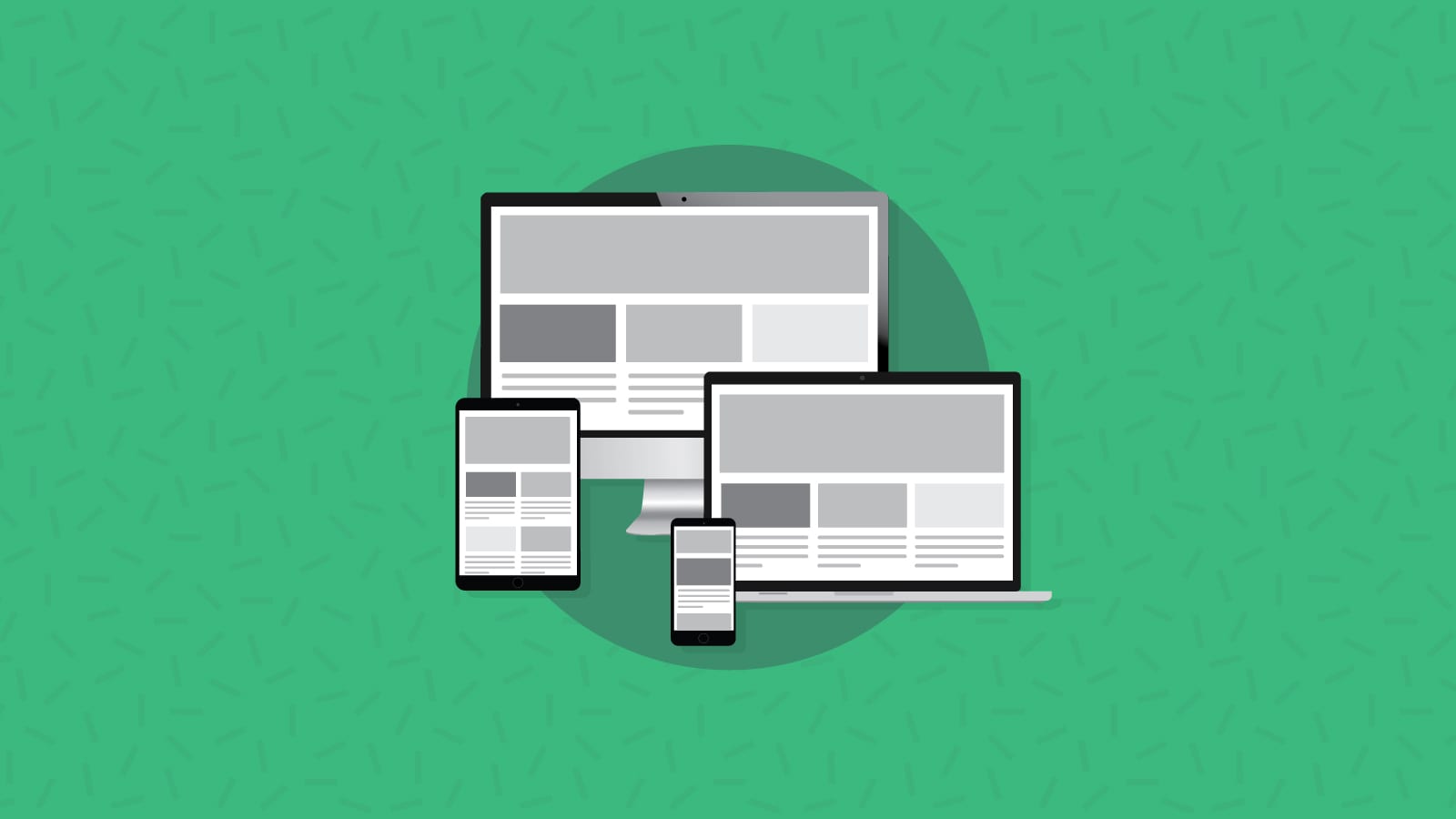
Coding responsive emails that adapt to screen sizes is crucial in today’s mobile-centric world. With the increasing use of smartphones and tablets for email consumption, it’s essential to provide a seamless and optimized experience across different devices and screen sizes.
By coding responsive emails you give your subscribers a much improved email experience, making it infinitely more likely for them to engage and convert on your emails. When designing and building emails for mobile there are a lot of factors to consider. Here are some of our best practices for coding responsive emails:
Take mobile first approach to HTML email development.
Historically, emails have been coded in a desktop-first manner, where developers have built out the desktop version of the email first then utilized media queries to adapt the email to mobile devices.
We recommend going the other way and designing your emails with a mobile first approach, coding your email with a simple, mobile optimized layout and then expanding the design for desktop.
To oversimplify it, we simply switch from max-width media queries, which is essentially telling the browser “If the screen size is less than X, initiate this code” to a min-width media query which is the opposite, we’re telling the browser “when the screen size is over X, initiate this code.”
If you’d like to level up your mobile emails by taking a mobile first approach, check out our full guide on developing mobile first emails.
Sticking to a single column design can really improve the readability of your email on mobile devices, prioritizing the most important content and making it easily scannable. Consider stacking elements vertically on smaller screens to ensure a clear hierarchy and improved readability. Make sure the primary call-to-action (CTA) is prominently displayed and easily clickable.
Consider the limited screen space on mobile devices and prioritize the most important content. Make sure the primary call-to-action (CTA) is prominently displayed and easy to click.
There’s nothing more frustrating for a subscriber than wanting to engage with your emails and then having to fight to be able to click a button or not being able to read your clever copy because your text isn’t scaled properly for mobile devices.
Gone are the days of all mobile devices being 480px wide and a one-media-query-fits all world has passed us. Whether you’re coding mobile first, doing a hybrid coding technique, or are just looking to implement one of these techniques for the first time, keeping up-to-date with the email industry will be an invaluable tool to constantly ensure you’re sending the best emails you can.
Email accessibility is crucial in ensuring that your email content is inclusive and can be accessed and understood by all recipients, regardless of their abilities or disabilities. Inaccessibility in emails can have a significant negative impact on engagement and performance.
The reason is simple: If people have trouble viewing, reading, clicking on, or understanding your email campaigns, they won’t take the actions you expect.
Improving email accessibility is a big commitment. It takes time and effort. But don’t let that turn you away, we have some handy tips to help start shaping the accessibility of your emails:
- Set table roles as presentation – This massively improves your email experience for those using screen readers or other types of assistive technology.
- Set the correct language in your HTML tag – Again, this massively improves the experience for those using screen readers.
- Use semantic HTML – Semantic HTML adds meaning to your code, accurately describing the elements your coding helps screen readers make sense of everything. Where possible always use semantic HTML (
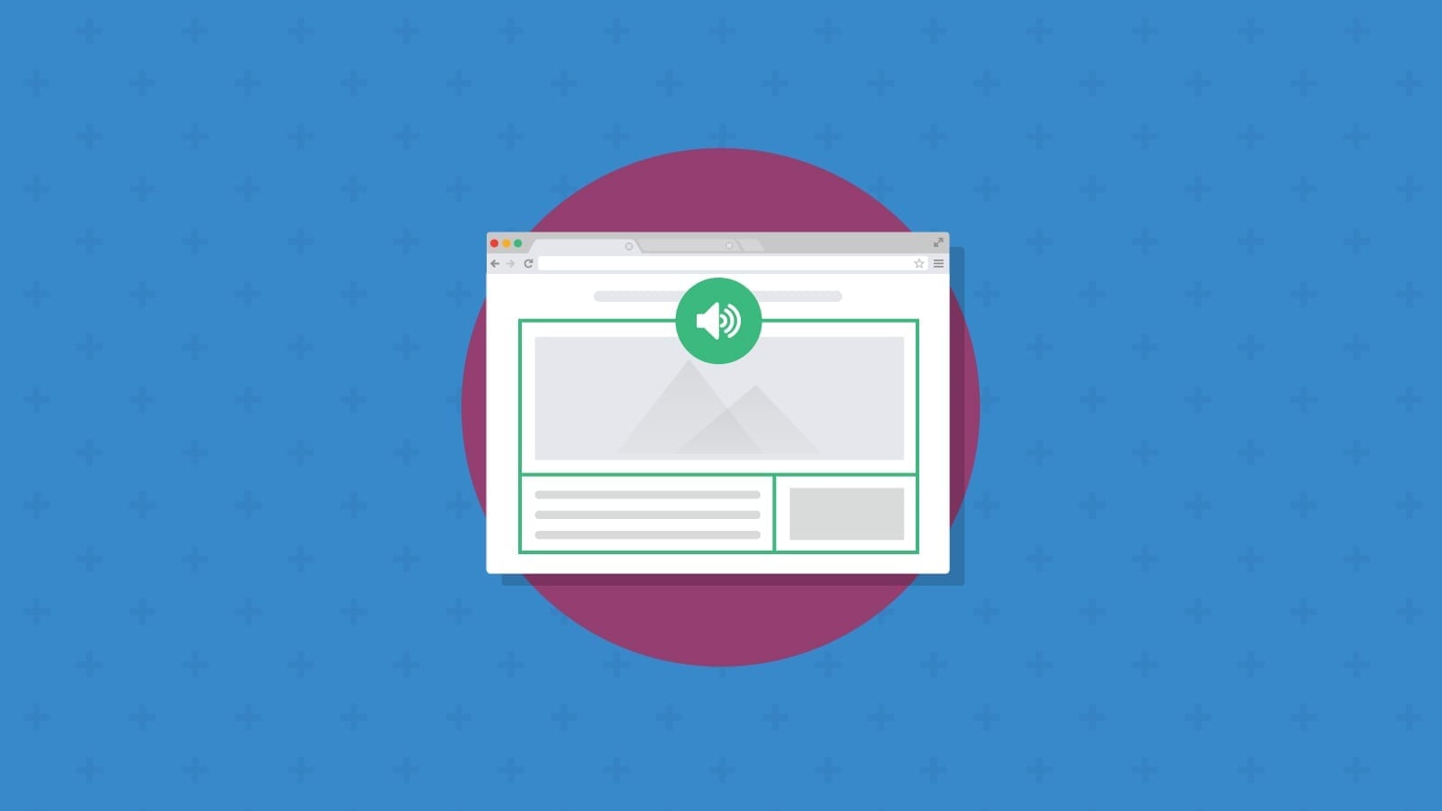
<p>for paragraphs,<h>tags for headings) - Always include Alt text on your images – Shockingly, only 25% of marketers are currently utilizing proper alt text on their images. Alt text not only improves the experience for those using assistive technology, but also improves your images-off email experience.
- Avoid image-only emails – Your emails should always include live text and never rely solely on imagery to convey their message.
By prioritizing email accessibility, you create a more inclusive and engaging experience for all subscribers. This not only aligns with ethical considerations but also positively impacts the performance and effectiveness of your email campaigns.
Developing consistent processes and conducting quality assurance (QA) are crucial steps in HTML email development to avoid coding mistakes and ensure high-quality email campaigns. As we’ve already mentioned, email often moves fast, there are no 6 month deadlines in email and email developers are often relied upon to deliver email code rapidly and accurately.
That’s why we recommend email developers to work on an email design system.
An email design system is a collection of reusable components, guidelines, and assets that enable consistent and efficient email development. It establishes a standardized framework for designing and coding emails, also serving as a central resource for documentation, guidelines, and best practices.
By utilizing an email design system, you can streamline the development process, improve efficiency, and reduce the likelihood of coding mistakes. It becomes a valuable asset in maintaining code quality, aligning with brand guidelines, and delivering high-quality email campaigns.
Having a comprehensive Quality Assurance (QA) plan for email is crucial to ensure the accuracy, functionality, and overall quality of your email campaigns. A well-executed QA plan helps identify and resolve potential issues before sending emails, minimizing the risk of errors.
Whether you’re already code reviewing or not we recommend checking out our code review process and our tips on using a pre-send email checklist.
The best email developers will absolutely preach to you about the importance of testing and how crucial it is for every email.
Thorough testing is essential for email developers to deliver high-quality, visually appealing, and functional email campaigns. It helps ensure compatibility across email clients, optimize the user experience, maintain content accuracy, adhere to accessibility standards, and improve overall campaign performance. By investing time and effort into testing, the best email developers can provide a seamless and engaging experience for subscribers while achieving their desired campaign goals.
With Sinch Email on Acid, you can take advantage of unlimited email testing. See as many email previews as you want and fix rendering issues before you use a new template or launch a new campaign.