Email Development
The Best Fonts for Email: A Guide for Developers and Designers
Font choice is an essential part of nearly any design project, and fonts play an important role in the email experience. But what are the best fonts for email marketers to use?
There are many factors to consider: readability, branding, audience preference, and email client limitations. Email developers and designers can’t pick just any font and expect it to render perfectly with every mailbox provider.
If you’re not careful, you could end up with an ugly-looking, unreadable campaign because your font isn’t supported and an email client decided to choose one for you.
So, what is possible with fonts and email? This guide will walk you through the basics, including opportunities and roadblocks when you’re trying to find the best fonts for email campaigns.
Types of fonts for email
Where do you go to find the best fonts for email marketing? Before you jump in, you need to understand the limits. We’ll begin by examining a few options:
- Web fonts
- Web safe fonts
- Email safe fonts
Web fonts
While desktop fonts are loaded onto an individual computer so they can be used in word processors and other applications, web fonts are stored online and downloaded by browsers. When someone accesses a page on a website, web fonts are specified through CSS ⸺ often using the @font-face declaration.
Web fonts emerged with the Web Open Font Format (WOFF) around 2009. They opened up a whole new world of possibilities for web developers — but not so much in the world of email where support is very limited.
Email clients that do support web fonts include:
- Apple Mail
- iOS Mail
- Android Mail (not Gmail)
- Thunderbird
- Outlook for macOS
So, you’ll have the best luck with web fonts if your subscribers are using Apple devices.
According to Can I Email, certain versions of Outlook for Windows also have partial support for web fonts in email. You’ll notice Gmail does not fully support web fonts. As of our latest update to this guide, the two web fonts Gmail will support are Roboto and Google Sans. That’s because Gmail uses those web fonts itself.
Web safe fonts
There are also web safe fonts, which include a list of font families that are found on the majority of devices by default. W3Schools.com lists the following as the best web safe fonts for HTML and CSS:
- Arial (sans-serif)
- Verdana (sans-serif)
- Helvetica (sans-serif)
- Tahoma (sans-serif)
- Trebuchet MS (sans-serif)
- Times New Roman (serif)
- Georgia (serif)
- Garamond (serif)
- Courier New (monospace)
- Brush Script MT (cursive)
If you’re interested in expanding your options for web safe fonts, check out CSS font stack for stats on the percentage of users with a given font on their machine.
Web safe fonts have a higher likelihood of being supported in email clients. But just because a font is web safe doesn’t mean it is 100% safe to use in email marketing.
Email safe fonts
While web fonts give developers a wide range of options, email safe fonts are limited to the basics.
Email safe fonts include:
- Arial
- Courier New
- Georgia
- Times New Roman
- Trebuchet
- Verdana
It’s an even shorter list than web safe fonts. That’s primarily because these are fonts that come pre-loaded on nearly every computer or device.
Admittedly, it’s not a very exciting selection of fonts. However, using these font options is the safest way to ensure a consistent experience across email clients. You may even be able to find an email safe font that resembles your brand’s preferred typeface.
Using web fonts in email
What if you want to use web fonts in email despite the lack of support? Maybe a particular font is important for branding. Or perhaps you know that most of your subscribers view their emails in a client that supports web fonts.
There are three methods for coding web fonts into emails: <link>, @font-face, and @import.
@font-face
The most reliable way to include a specific web font into your email is with @font-face. This method has the widest email client support.
To include a font using @font-face you will need to find certain file formats that are ideal for email. Web fonts are stored in .svg, .eot, .ttf, .woff and .woff2. For email, you will need to find the link to the .woff and .woff2 versions, as these have the most support across clients.
Including fonts with @font-face means you can specify all the CSS properties. Check out the code below:
                                 <style type="text/css">
 @font-face {
   font-family: 'Timmana';
   font-style: normal;
   font-weight: 400;
   src: local('Timmana'), url(https://fonts.gstatic.com/s/timmana/v3/6xKvdShfL9yK-rvpOmzRKV4KQOI.woff2) format('woff2');
 }
 </style>
If we break down the above:
- <style> tags, which enclose the @font-face.
- font-family: ‘Timmana’; the name of the font.
- font-style: normal; the style of the font.
- font-weight: 400; the weight or boldness of the font to be used.
- src: url(https://fonts.gstatic.com/s/timmana/v3/6xKvdShfL9yK-rvpOmzRKV4KQOI.woff2) the font location.
- format (‘woff2’); the format of the font.
To use the imported font in your font-stack (which we’ll discuss later), you can include the name in the font-family attribute inline:
style=”font-family: ‘Timmana’, Helvetica, Arial, sans-serif;”.
<link>
One of the easiest ways to import a font is to use <link>. Add the following line of code in the <head> of your email (substituting your font selection in the href):
<link href="https://fonts.googleapis.com/css?family=Lora" rel="stylesheet">
To use the <link> method, find the hosted link to the web font and place it in the href=””. If you use fonts.google.com to grab code, you can include different font styles and weights. For example:
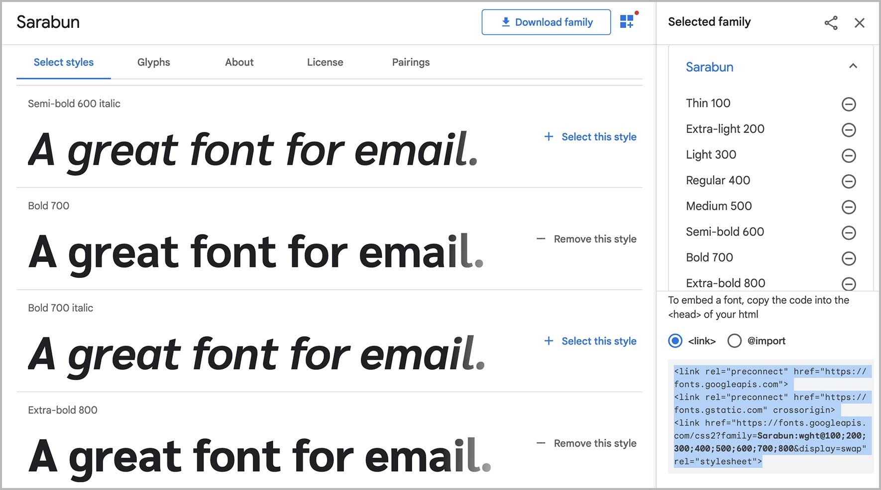
Using <link> to import a web font, your code would look something like this:
<link rel ="preconnect" href="https://fonts.googleapis.com" crossorigin> <link href="https://fonts.googleapis.com/css2?family=Sarabun:wght@100;200;300;400;500;600;700;800&display=swap" rel="stylesheet">
To use the font inline in your HTML, you can declare it in your font stack and style it as follows:
<td style="font-family: 'Sarabun', 'Roboto', 'Arial', serif; font-size: 16px; font-weight: 400;">Lorem ipsum dolor sit amet</td>
@import
The @import method is similar to using <link> to embed a web font in emails. It also goes in the <head> in between the <style> tags.
Using @import vs. <link> may help your email load faster. While the <link> method loads the font inline with HTML as it is read, the @import method defers loading of the font until the rest of the HTML is loaded.
With @import a client’s default font may display until the preferred option is loaded. With <link> a large font file could delay the loading of your entire email.
Using font stacks in email

Because of the inconsistency around supported fonts in email, the use of font stacks tells email clients what to use instead. A font stack lists your preferred options for the best fonts for emails. When choice No. 1 doesn’t load, the email client moves down the list to the next option.
Using a specific font within your email is like setting any style throughout the message. You can specify the font in the head of the email or as an inline style by declaring the CSS attribute font-family and following it in order of preference with your font choices.
A sans-serif inline style font-stack could look like this:
style="font-family: Helvetica, Arial, sans-serif;"
In this case, if a user opened the email on an Apple device, he or she would see the text in Helvetica, whereas a Windows user, who does not have Helvetica, would see Arial. If Helvetica and Arial were not available on the client, the user would see whichever sans-serif font was available on their device.
As a general rule for building the font stack, start with custom choices and move towards more generic options. So, a font stack could look something like this:
Preferred web font > Web safe font option > Email safe font option > serif or sans serif
Font names following font-family are separated by commas. Font names with multiple words should be enclosed in quotation marks.
Bear in mind that each email client has a default font:
- Gmail’s default font: Roboto
- Apple Mail’s default font: Helvetica
- Outlook’s default font: Calibri
Font stacks in Outlook can be problematic. Traditionally, the biggest issue has been Outlook reverting to Times New Roman. Get some tips for addressing this in our article on making custom font stacks work in Outlook.
Styling fonts for email
Let’s explore some essential information about fonts to help you make the right choice when formatting text in your emails.
Font vs typeface: Is there a difference?
While the terms “typeface” and “font” are often used interchangeably, there’s a distinct difference between them.
A typeface is a series of letters, numbers, punctuation, and other symbols in a collection that share the same basic design features. A font is a specific variation in weight, size, slope, or decoration within a typeface.
As you build emails with HTML and CSS, think of “font-family” as the typeface.
Serif vs San-serif: What’s better for email?
Serif typefaces include elements that extend out from the basic letter form. Most styles of serifs are tapered in some way, but some can have flat, slab-shaped serifs or include a rounded ball-like shape.
Sans-serif typefaces are simpler, sleek, and more modern with no decorative elements.
As Jay Oram from ActionRocket puts it, serif fonts come with the “curly bits” but sans-serif options do not. Just remember that “sans” means without, and you won’t forget that sans-serif fonts are curly-bit free.

While it’s no longer considered a hard rule, many designers would suggest using a sans serif font for email marketing. San-serif fonts are considered easier to read on digital screens while serif fonts are used more often in print.
Email fonts and CSS properties
When you’re working with text in an email, the following CSS properties will help you make changes to improve legibility and make style adjustments.
font-size
Everyone is familiar with this one. A font’s size indicates how large it appears in your design.
Font sizes can be defined with pixels (px), points (pt), percentage (%), viewport width (vw), em, and relative em (rem). Pixels are the most common font-size measurement and the unit is fully supported among email clients.
What’s the right font size for email?
To make the text readable and accessible, email marketing best practices suggest using no less than a 14px font-size for email body copy. Many marketers increase the font-size to 16px or 18px for mobile.
font-weight
The CSS property font-weight defines the thickness of your letters. In layman’s terms, it could be described as how bold the font appears. The higher the font-weight, the greater the boldness.
Developers can define the weight of an email in the code using a word (Light, Normal, Bold, Bolder). Or font-weight can be fine-tuned using numbers in integers between 1 and 1,000. See below for an example and play around with the code here.
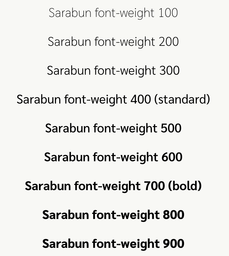
It’s important to remember that you must import or link each of these weights for your font. Otherwise, the email client will choose the closest number and, in the case of web-safe fonts, many only have 400 (normal) or 700 (bold).
What’s the best font-weight for email?
Don’t assume that bolder is always better. There is such a thing as a font that’s too heavy. Once you increase the font-weight to a certain thickness, it may start to look “muddy.”
ActionRocket’s survey, Email for All, revealed that most people (78%) seem to find a mid-range thickness as easiest to read. Only 25% found an extra bold font to be readable and just 21% said it was easy to read a lightweight font.
font-style
Font-style is the presentation or style of the text. In CSS, this can be:
- Normal
- Italic
- Oblique
x-height
The x-height is defined as the height of the letter “x” in a font. This is helpful when choosing fonts that look similar. By choosing a group with a similar x-height, you can ensure a good design experience across email clients.

The x-height is the distance between the baseline of a typeface and the top of the letter “x”. Other lowercase letters may have components that ascend above and descend below the x-height to a small degree. Exceptions to this rule would include specialty display fonts and some handwriting or cursive fonts.
line-height
Line-height defines the height of the (usually invisible) box containing a line of text.
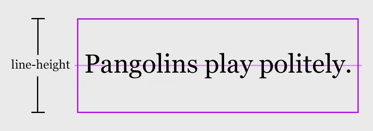
You can use the following values to define line-height:
- Keyword or global values: normal, inherit, initial, revert, unset.
- Unitless value: A number (e.g. 2.5). This value is multiplied by the font size to get the resulting line-height.
- Length: em, rem.
- Pixel or point size: px, pt.
- Percentage: %.
Some email clients (like Outlook) require you to set the line-height to display the font as designed. You can set line-height using any of the same units used for font size, but it should always be larger than the font size.
Because an email client may not support a font you’ve chosen, it’s best to use either a unitless value or a percentage to get more consistent results, especially if you’re using custom web fonts in your emails.
letter-spacing
The letter-spacing property defines the amount of space between each letter in a selection of text. Typographers and graphic designers refer to this as tracking. You can define letter-spacing with the same units as font-size and line-height. Additional spacing can make some fonts more legible or draw attention to a certain part of the email.

text-transform
Using the text-transform property helps define what case the letters are displayed in.
- text-transform:lowercase; sets all letters in lowercase (no capital letters)
- text-transform:uppercase; will make all letters UPPERCASE
- text-transform:capitalize; Will Add A Capital Or Uppercase Letter To The Start Of Every Word, But Not Immediately After A Number (For example 4th Of July).
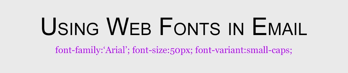
font-variant
With font-variant, you can add small-caps to capitalize all letters while retaining the lowercase x-height.
Best practices for email fonts
Readability is the most important thing to consider when choosing the best font for emails. If subscribers can’t read it, you can’t accomplish your goals. It’s as simple as that.
What is a readable font? W3C’s Web Content Accessibility Guidelines (WCAG) should help you in selecting fonts that are readable across the broadest spectrum of people in your audience:
Use crisp, clear fonts with minimal decoration. There are many readable serif and sans-serif fonts that fall into this category.
Your font size should be at least 14px for desktop or 16px for mobile devices. You may want to scale up to 16px for desktop and 18px for mobile to account for variation in font display across email clients.
Use a line-height of 1.5 for body copy. When lines of text don’t have enough breathing space, it can negatively impact legibility. Lines that are too close to one another can feel crowded and confusing.
For paragraph text, use a font-weight of normal (400). Overly thin fonts can be difficult to read, especially when displayed at a smaller size. Avoid large blocks of italicized text as well as multiple combinations of font styles for body text (e.g. bold, italic, and underlined).
Chunky, bold fonts can be overwhelming and, like ALL CAPS, can give the impression that you’re yelling. If you’re using a font whose normal weight is relatively thin, you might opt for a semibold weight for your body text.
Use obvious style differences between your headers, body, and link text. By using differences in size, weight, color, case, and text decoration, you’ll create a visual hierarchy within your email that will guide the reader.
Use media queries to adjust font styles across multiple screen sizes. While you typically want to make the font size larger on mobile than desktop, you often want headings to be smaller on mobile devices.
A 50px heading may look great on desktop but could be broken up over many lines in mobile, causing a painful reading experience with lots of scrolling. Using media queries to define specific font sizes at certain screen widths will keep your emails readable no matter the device. Get more tips on improving mobile email design.
Use high color contrast. When choosing the color of your font, make sure there’s adequate contrast with the background color. WCAG has standards for contrast ratios that you can reference to ensure your email is accessible and readable for users with visual impairments. Learn more about color contrast and email accessibility.
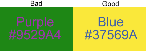
There are several online tools you can use to check your font contrast, including WebAim’s Color Contrast Checker. Email on Acid’s Campaign Precheck accessibility check also includes a color contrast review as well as a tool to show you what your email looks like with different color vision deficiencies (AKA types of color blindness).
If you’re using fonts on background images, don’t forget to include a thoughtful fallback background color. Although most email clients will show background images, the image may not load or the subscriber may have configured their settings not to render images. You don’t want them to miss out on your message.
Don’t create image-only emails. If you’re thinking that an effective way to get around font challenges in email is to create an image and use whatever fonts you want — stop right there! Images are not the answer. While it may be acceptable for a graphic or two, image-only emails can’t be read by screen readers and are a poor choice for accessibility. They’ll also create a major problem when a subscriber has images turned off.
What’s the best font for email?
Getting the right font to display in email campaigns can be tricky. To put things simply, the best font for email is one that is readable, widely supported by major email clients, and manages to fit your brand’s preferred style.
Use font stacks wisely to ensure you’re delivering an acceptable email experience no matter what mailbox provider your subscribers use.
Testing email campaigns before you hit send is an excellent way to catch issues with fonts. While you can try testing manually by sending your emails to a bunch of different inboxes and devices, that process is time-consuming and unreliable.
Email on Acid previews provide accurate screenshots from the most popular clients and devices. Unlike the competition, you’ll enjoy unlimited email testing, which means you can keep checking previews and making changes until your email is perfect. You’ll never hit a ceiling.
Fonts are just one of the many complexities email developers face. But Email on Acid is designed to simplify those complexities while helping you deliver perfection.
This article was originally published in January of 2019 and was updated in October of 2025. Jay Oram contributed to the original content. He is part of the design and code solutions team at the email specialist agency, ActionRocket. See more articles from Jay at Email Design Review.