Email Development
Notes from the Dev: How to Use Faux Absolute Positioning in Email

Here’s a tight spot that email developers will be very familiar with. You get an email campaign mockup from a designer and in order to make it both functional and accessible, you need to use overlapping elements.
As developers, it’s our job to make the email look as close to the proposed design as possible. But coding overlapping elements is much more complicated in an HTML email when compared to web development. However… it’s not impossible.
This time on Notes from the Dev: Video Edition, we’re going to explore a technique for coding overlapping elements in email using what’s known as faux absolute positioning. My guest for this episode is Niven Ranchhod from mailix by Mayoris AG. He’s going to show us this method in action.
Check out the video below to see how Niven uses faux absolute positioning to “trick” rendering engines so he can build emails with separate, yet overlapping text, background, and graphics.
What is absolute position in CSS?
The CSS position property is used to place objects next to or on top of each other as well as control their placement in other ways. There are five different types of CSS positioning (Find out more from CSStricks.com):
- Absolute: Allows an element to be placed anywhere you want.
- Fixed: Keeps an element in the viewport as you scroll.
- Relative: Uses top, left, bottom, and right to adjust an element’s position relative to itself.
- Static: The default CSS position for any element.
- Sticky: A combination of relative and fixed that keeps an element in view until you scroll beyond a certain point (outside a parent element).
So, position:absolute is pretty powerful because it gives the coder a lot of flexibility in terms of where elements get placed. There’s just one big problem for email developers…
Why you need to “fake it”
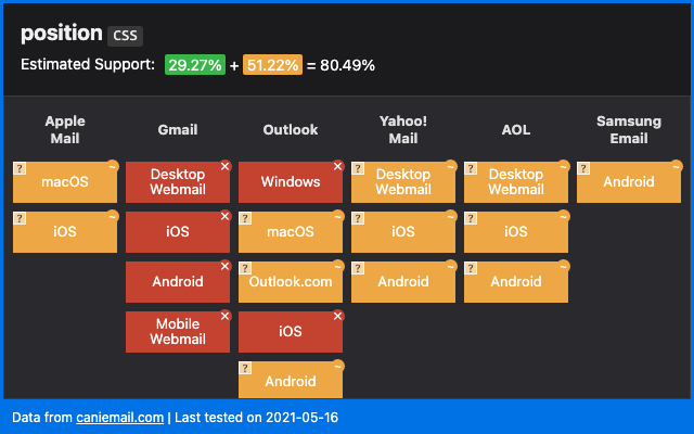
As Can I Email shows us, the position property doesn’t have widespread support in email (at all).
The technique we’re talking about today is called faux absolute positioning because we’re using a hack to get email client rendering engines to treat elements in a way that’s similar to position:absolute. Fake it ‘til you make it, right?
The first people to figure out faux absolute positioning for email development were Mark Robbins and Steven Sayo. You can check out Mark’s blog post, and Steven’s article on Medium to find out more.
But first, let’s explore how Niven uses the technique. You can also find all of this in an article he wrote for mailix by Mayoris AG.
How to achieve overlapping elements in emails
In his big-picture explanation of faux absolute positioning, Niven told us that we are essentially fooling the rendering engines by setting either max-height or max-width to zero and adjusting these values to get the precise position needed. Adjusting the width is actually a new method that Niven adapted from Mark and Steven’s original approach.
Using faux absolute positioning, the element (or block) you add beneath moves into that space to fill the void, and the first block ends up displaying on top of the element you’ve coded below it. As Niven showed us in the video, you can use this trick to reposition an element from the top, bottom, left, or right.
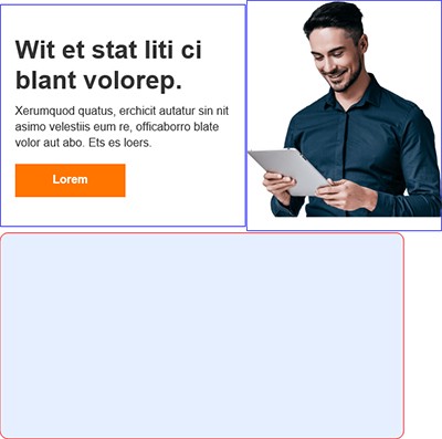
Here’s a look at the overlapping elements Niven needed to code into an email and how it looked before he applied faux absolute positioning:
The original design

Before faux absolute positioning
Now, you might look at this and wonder why it couldn’t be a single, clickable graphic in the email. Or maybe you think image splicing in the email would be an acceptable approach. There are a few reasons why one graphic is a bad idea.
- You need live text: Since this graphic includes a call-to-action (CTA) button, any subscriber with image downloading turned off won’t see it at all. That goes for the text too. They simply can’t read it and won’t click the button. Don’t forget, images are turned off by default in Outlook.
- It’s inaccessible: If you aren’t using live text, screen reading software won’t be able to interpret the email copy for people with vision impairments. That means those subscribers won’t get the message and can’t engage with the email either.
- It may not be mobile-friendly: If you splice an image like this and put it together like a puzzle, you could have responsiveness issues. The pieces may end up stacking on mobile devices, leaving an ugly mess.
Niven pointed out that you could also combine the photo and the background to make a single background image with live text on top. But the issue there is you’d need to use multiple media queries to get the text and background to resize accurately for different screen sizes.
That would require a lot of extra code, and Niven needed to keep this email simple so a Mailix client could update elements for different brands. Plus, there were dark mode challenges to consider as well. So, faux absolute positioning provides an ideal alternative solution.
Building an email block with overlapping elements
Below, you’ll see how and where the elements in this combined block overlay. Niven knew it would be tricky. The image needs to line up with the bottom of the background tile while extending beyond the top. The text needs to sit on top of the background while overlapping the image, and there needs to be adequate padding around all elements.

In Niven’s email code, the text and button are combined with the image to create a content block that’s wrapped in a <div> tag. The text and button are in one column and the image is in another. The background is a VML that’s in a separate block, which needed to move up and underneath the content block.
To make that happen, Niven sets the max-height of the <div> wrapper for the content block to zero.
<div class="content-block" style="max-height:0;">
As you’ll see in the video, the background VML moves up and the text and image are overlayed on top of it. Still, it’s not quite perfect. Niven had to adjust things to get them in alignment and match the original design. To do that, he simply experimented until he found that setting the max-height to 20 pixels fixed it for this particular design.
<div class="content-block" style="max-height:20px;">
When it came to adjusting the content horizontally, Niven used the same concept but applied it to the max-width.He then used a larger internal width for text so that it pushed the content out and created an overlap.
As Niven explains in the video, he’s kind of lying in the code in order to move elements where he needs them to be placed:
“All it’s doing is tricking the rendering engine by saying, ‘This is how big I’m supposed to be: 225 pixels wide.’ And then, inside I’m actually 600 pixels wide. But I’m not going to tell the rendering engine that.”

When using this method for horizontal positioning in your email code, you’ll have to experiment to find out what faux width gets overlapping elements to align the way your design requires.
Addressing coding challenges for Outlook
As every email developer knows, a lot of extra work goes into making things work in Outlook. This time, we need to add some conditional CSS statements to target Outlook for Windows desktop because it does not support nested VMLs.
But guess what? In this situation, we can use position: absolute without faking it because using absolute positioning with VMLs is supported in Outlook. Although, Niven told us he believes this is only true when it comes to VML.
Niven used a <v:rect> element along with position: absolute to move the background tile up. He then used another <v:rect> to achieve the intersection of the text and image.
As with the max-height adjustment, he needed to make some tweaks to the conditional code as well. It turned out that the 20 pixels needed to align the image correctly in other clients was -16 pixels using absolution positioning for Outlook. He then did the same for the width.
                                <v:rect stroked="f" filled="false" style="position:absolute; top:-16px; left:-15px; width:203pt;">
                        <v:textbox inset="0,0,0,0" style="mso-fit-shape-to-text:true;">
Again, this is something Niven worked out through trial and error, and you’d need to do the same with your code.
There’s another way to work with Outlook and VMLs that Steven Sayo describes in Part 2 of his faux absolute positioning tips. It involves using <v:textbox> with the style mso-fit-shape-to-text instead of adjusting the height of the <v:rect>.
The complete code
Here’s the full view of Niven’s email code. It’s got everything he used to achieve both vertical and horizontal faux absolute positioning:
One thing about the design that wasn’t achieved was rounded corners for Outlook. Niven and I both agreed on how that’s a progressive enhancement that would require too much time, extra work, and additional code to make it worth the effort. The good news is that the majority of subscribers are going to see an email that almost perfectly reflects the original design concept.
Testing how overlapping elements render is important. So, if you try faux absolute positioning, make sure you use a solution like Email on Acid’s previews to see how your code works on more than 90 clients and devices.
Find out more
I’ve used the faux absolute positioning trick for vertical overlaps before, but I’m excited to try it for horizontal adjustment of overlapping elements in email.
As always, it’s awesome to connect with fellow email geeks and share their development tips. Don’t you agree? A huge thanks goes to Niven Ranchhod for breaking down his approach on Notes for the Dev: Video Edition.
Connect with Niven on Twitter to find out what he’s up to. You can also visit Niven’s portfolio to see more of his amazing work. And best of all? He’s recently launched a new website Bare-Bones.dev where you’ll find code tutorials, design teardowns, and more.
Here are some links for learning more about faux absolute positioning for email:
- Mark Robbins’ post on Good Email Code
- Steven Sayo’s Medium articles:
- Niven’s post on multi-axis faux absolute positioning
If you’re loving these tips and tutorials, make sure you subscribe to Email on Acid’s YouTube channel. That way, you’ll be the first to know when new Notes from the Dev episodes come out.


