Email Marketing
How to Use Advanced Email Analytics Data to Ramp Up ROI

This post was updated on May 10, 2019. It was originally published in June, 2016.
We have all been on the merry-go-round of tracking, interpreting and applying email analytics data. Open rates, click-through rates and conversion rates are go-to metrics to get a pulse on an email’s performance, but we can still go deeper. Email on Acid’s advanced Email Analytics feature calculates the engagement and effectiveness of every email. One problem email marketers face with advanced analytics is turning their data into actionable marketing strategies and tactics. Here, we do that for you. Coming up, we’re going to break down each advanced Email Analytics feature and give real-world advice on how to apply this data to future emails to increase ROI.
Engagement Reporting
“Engagement” means something slightly different to every marketer. For the sake of this post, we’ll define engagement as a subscriber’s activity between an email open and a click-through. Email Analytics can track how long a subscriber has an email open and provides data on the most popular email clients the email was viewed. It can also tell you if the email was engaged with on desktop, web browser or mobile.
Read/Skim/Glance Metrics
These insights offer context to your open rates because you can uncover the percentage of people who opened your email only to immediately hit delete and those who actually engaged with your content (even if they didn’t click through). The guideline ‘thresholds’ categorizing a read, skim or glance are as follows:
- Glance/Delete Rate – Email open for 2 seconds or less
- Skim Rate – Email open for 3 to 7 seconds
- Read Rate – Email open for 8 seconds or more
Please note, these are a guideline only. Take into account the content of each email and adjust these figures appropriately. An email with a 1,500-word embedded blog post is going to have different read/skim/glance metrics than a super short image-heavy email would. You’re also presented with an engagement time distribution report like this:
This report shows that at least 64% of the email opens werefor 8 seconds or more, qualifying them as reads. Much better engagement compared to the quarter of subscribers who opened it just to quickly close out.
Engagement by Email Medium
Engagement reporting also allows you to view how engaging your email is based on the type of email medium used to view it.
If these patterns remain consistent email to email, you have a pretty good idea on which email mediums your subscribers tend to view your emails. This is going to help you optimize future emails for those mediums. We can tell here the email was most engaging or best optimized for desktop and mobile. We can also see that the email was mostly read on desktop and web. The sender now knows to optimize future emails for web as well, since more subscribers view the message there than on mobile. For the sake of argument, let’s say you had low read rates on mobile compared to desktop or web. You would want to revisit how your email displayed on mobile. Maybe it wasn’t rendering correctly, or maybe you didn’t use large enough buttons for readers to tap.
Engagement by Email Client
Lastly, your Engagement report will give you a hover read/skim/glance breakdown based on email clients and devices your subscribers use.
How to Apply Engagement Insights
If you find yourself having consistently high glance/delete rates, it’s time to revisit your email strategy. If subscribers are often unmotivated to absorb your content, it’s time for a new content strategy. You can also employ your read/skim/delete metrics on a more granular level and hone in on what elements made a certain email less engaged with compared to others, or which clients it lacked engagement as a whole. There are lots of different design elements to keep in mind for mobile, so make sure you’re optimizing each email for easy digestion in every inbox. Engagement reporting helps you understand how well your email got its message across, no matter where it was read or the size of the screen.
Heatmapping
Go a step beyond engagement reporting and visually see how subscribers interact with your emails via heatmaps. This lets you gauge what about your email interests your audience most. The click map overlay tells you if your audience prefers pictures to text, where in the email clicks are most likely to happen, etc.
In the example above, 34.51% of people clicked the top “Get Access” button. Under that CTA is an image that received 38.05% clicks. This tells the sender that both a button and image must always be present on the upper half because they drive the most engagement by far. The heatmap also shows that only 1.77% of clicks occurred on the bottom “Upgrade” button. This reveals most people only click the upper half of the email. Once again helping the sender ensure the most important elements and CTAs are kept toward the top.
How to Apply Heatmap Insights
There’s an opportunity to get extremely detailed information on subscriber preference and behavior. Say you’re a startup and you want to know what types of product images would drive the most return. You’d test out several emails, all using different images, and hone in on the hero. From there, you rinse and repeat when you go about discovering what color buttons your audience prefers, placement, etc. This tool is the small package that good things come in, and the possibilities are vast when it comes to tracking audience preferences and what makes them click. Speaking of clicking…
Click Tracking
The Click Tracking tool allows you to understand how email clicks are being dispersed:
If your main CTA didn’t get the most clicks out of all the email links, you’ll know to rework your strategy. Perhaps it was too far down the page or the text wasn’t quite motivating. At the end of the day, Click Tracking and Heatmapping give you an idea of the effectiveness of your email’s elements and design. They’re your visual representation of what’s working and what needs optimizing.
How to Apply Click Tracking Insights
You can easily tell which section of the email subscribers are most likely to click on based on where your links are placed. It can also be helpful to test and learn if certain colors, button shapes, or any other decorative linked elements attract more engagement than others. Let’s say you’re announcing a sale. You want to test if a linked image promoting 20% off performs better or worse than if it promotes the reduced dollar amount. Click Tracking is going to tell you exactly which image that is. Then when you go to send your reminder emails, you know which one is going to earn the highest return. It’s also not a bad practice to compare your site’s bounce rate on these linked pages during the time you send the email. Bounce rates will tell you if your message was clear about what subscribers were clicking into.
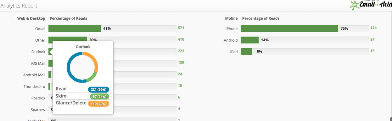
Email Client Tracking
There are countless client quirks out there ready to make your email look shabby. That’s why we help you optimize your email code for clients your subscribers are actually using. This tool tracks the clients and devices on which your emails are being read:
How to Apply Email Client Insights
Knowing which email clients and providers your subscribers use also allows you to tailor your email previews selection within the Email Testing step of your workflow. This saves you time by not having to filter through previews no subscriber of yours will ever see. Another way you could use this data is for optimizing emails in the clients and devices that are most popular among your audience. For example, if the #1 mobile device is the iPhone 6 and the most popular email client is Outlook.com, you had better know how to fix alignment issues in Outlook and use media queries for iOS devices. Better yet, maybe you know that 50% of your audience reads email on mobile. You make a case using that data point to turn your brand’s email templates mobile-friendly through responsive or fluid hybrid design.
Geolocation Reporting
Knowing where your contacts live can be powerful information. Tracking subscriber behavior by geographic location gives critical insights such as when to deploy your emails.
How to Apply Geolocation Insights
Use subscribers’ geolocation to stagger your emails by time zone. Or do some testing to find out what time in particular generates the highest engagement by country. Then schedule your emails to send to each country at their preferred time for the highest return. You can also use this information to celebrate with them on relevant cultural holidays and occasions. This helps you connect with them in a meaningful way and reinforce their affinity for your brand.
Test. Learn. Optimize. Adapt.
Audience data and analytics are the key to progress and improvement. Use that key to behavioral insights to keep your brand and emails constantly evolving in response to audience learnings. What you don’t know can hurt you, and that’s why you need to go beyond tracking opens and clicks. Advanced Email Analytics tell you when, where, for how long and the clients and devices used to view your emails. Sign up for a free trial to see these in action.