Email Marketing
Five Questions About Heat Maps and Email

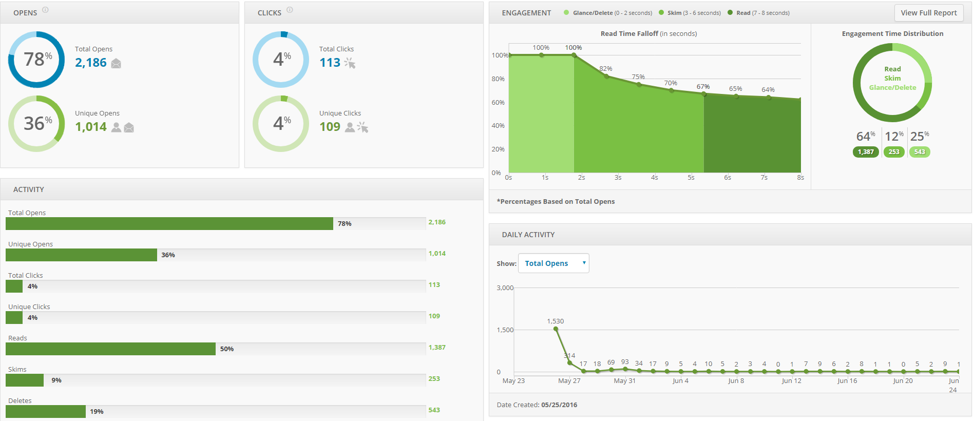
There are many ways marketers can track an email’s success. Depending on the goals of the email, you may be looking at how many users clicked on a call to action, or what percentage spent time reading the email.
One of the more interesting email analytics tools is a heat map. These nifty visualizations can help give marketers insight into both the content and the layout of their emails.
1. What are heat maps used for?
Heat maps help you visualize where subscribers are clicking in your email. The map will show which links are most popular and the percentage of email subscribers that clicked each link.
2. What do the colors on heat maps mean?
Heat maps will add a color overlay to each hyperlinked section of your email. The warmer the color is, the higher the clicks. In Email on Acid’s heat map tool, blue areas represent the fewest clicks, green and yellow are middle-of-the-road, and red areas receive the most clicks.
As you can see in the example below, the “Email Analytics” link (below the image) drew the most clicks.
In addition to the colors, some heat maps (like ours) will include a percentage over each hyperlink. This represents the percentage of subscribers who clicked that particular link. When you hover over the percentages in the Email on Acid heat maps, it will show the destination of the link as well as total clicks and unique clicks.
3. What’s the difference between total clicks and unique clicks?
Total clicks represent all the clicks a link received, including repeat clicks by the same subscriber. Unique clicks do not include repeat clicks from the same user. In other words, unique clicks only count the first time a user clicked on a link. Heat maps typically rank the links based on total clicks.
4. How can I use heat maps to improve my email campaign?
Heat maps can help inform where you place links and important information in your email. If you notice links near the center of the email tend to get the most clicks, it might be a good place to add a call to action (CTA) button or link.
Heat maps can also help with content decisions. Take a look at the most popular links in your email – how were they worded? Did you use certain phrasing that may have drawn more people to engage with that link?
Another use case you may want to consider is A/B testing. Heat maps are a great tool to test whether content performs better based on its location in the email. For example, you could send one email with your CTA button 1/3 way through the message, and another with the button near the bottom. Just remember to test only one element at a time; don’t change the content of your CTA if you’re also changing the placement in the message.
5. How Do I Use Email on Acid’s Heat Map?
If you’re using Email on Acid’s analytics to track your email clicks, we’ll give you a snippet of code to add to your email’s HTML. This code includes a tracking pixel (don’t worry – it’s invisible!) that follows where subscribers click.
To set up the heat map, just click on the Analytics tab within the Email on Acid tool. This will bring you to a new analytics campaign page. Make sure to fill out all the required fields and paste your email’s HTML in the box provided. Once you’ve done this, click the “Create Tracking Code” button. Take this HTML code and paste it into the bottom of your email code.
This new HTML code will add a redirect to all the links in your email. When subscribers click a link, they will hit our servers for a split second before being redirected to the intended destination (the redirect is super-fast and the subscribers probably won’t even notice it). With that redirect, our servers record the click and the merge tag in the URL. This allows us to track how many clicks a link got as well as who clicked the links.
Once you’ve hit “send” on your email campaign, you can go back to your Inbox and view the report from your campaign, which will include the heat map.
Track Your Email Performance
At Email on Acid, we help you test and track your emails. With our Premium plan, you can use our advanced analytics tool to look beyond just the open rates; find which links are getting the most clicks and analyze how many people are reading, skimming, or deleting your email. We also analyze the different platforms and devices your subscribers are using, so you can craft the perfect email for your audience.