Email Marketing
Government Email Marketing: Email Design Tips for the Public Sector

As an industry, government marketing emails rank second in open rates and third in click-through rates (CTRs) according to Mailchimp’s Email Marketing Benchmarks. With that level of subscriber engagement, it’s important to know what the email best practices for government are.
John Thies recently sat down with Adobe’s Jonathan Benett, IT and public sector business expert and Bruce Swann, with nearly two decades of digital marketing expertise to chat about what email marketers in the public sector can do to optimize the email experience for subscribers and improve results.
Challenges Around Email Strategies
While most email marketers face the same types of issues—good email design, standing out in the inbox, or how to land in them—marketers in the public sector tend to face those and then some. These include issues with segmentation, visibility into performance analytics, limitations of using out-of-date systems, etc.
Using an out-of-date system with limited capabilities can trigger a cascade of other email marketing snafus. It can be the reason an email’s design doesn’t have a modern feel, or why the marketer doesn’t have good visibility into their email analytics or deliverability rates.
Lots of systems aren’t yet able to give detailed engagement insights, which can present issues with segmentation. How can you segment if you can’t tell which subscribers find what content the most engaging?
The single biggest problem in communication is the illusion it has taken place.
Shaw—famous playwright, Nobel prize winner and novelist—probably didn’t have the email marketer in mind when he made this timeless statement. The quote envelopes some of the biggest challenges that many deal with and we’ll alleviate with these email design tips.
Email Design and Best Practices
We’re all email marketers here, so we’re all in agreement that email is a relevant channel to drive engagement. The fact is, people spend a lot of time in their inbox:
- Subscribers can spend up to 5 hours a day checking email
- 60% check email and social media while watching TV
- 25% check email before they go to work
- 35% check email while on the phone
- 31% check email during a meal with others
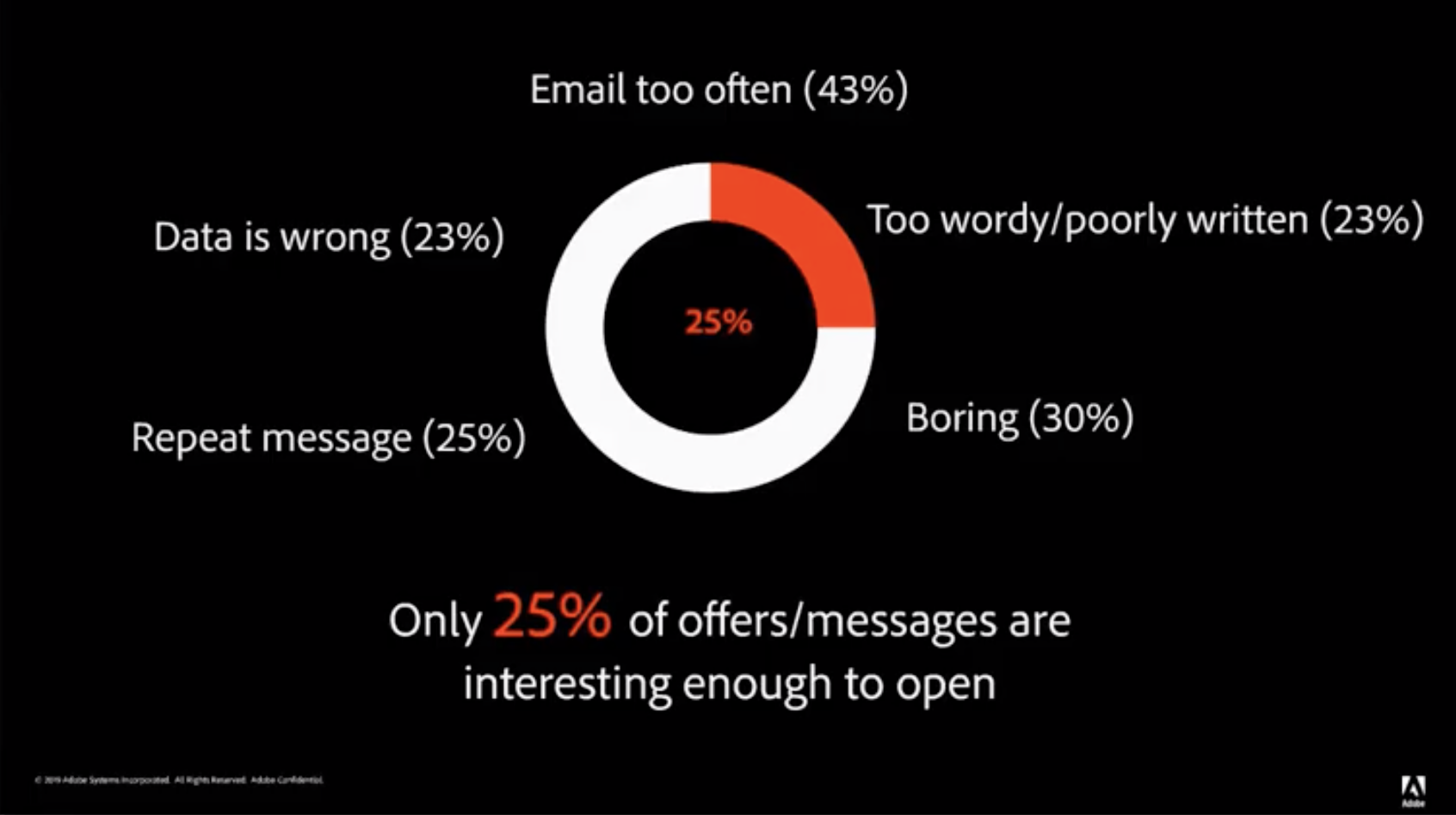
The key is to engage subscribers regularly with content they care about so they care more and more about your brand. Below is a poll from a sample of subscribers who were asked what their biggest pain points are with marketing emails:
For this post, we’re going to show you how to put your best public sector foot forward after the open with these email best practices for government.
Email layout
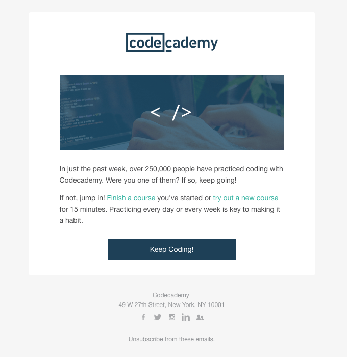
Single column
A single column layout is mobile-first design. It’s incredibly simplistic because it scales perfectly to every device subscribers are on. Email on Acid’s tools allow you to understand the design of your email and ensure that it’s going to render for every subscriber.
Codecademy uses a single column layout in their emails which makes them easy to understand and perfect for mobile devices.
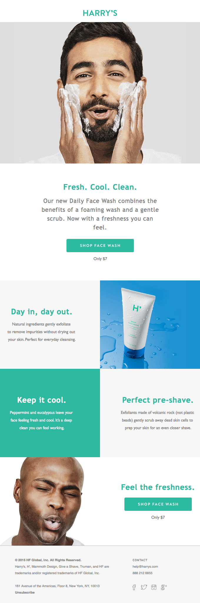
Inverted Pyramid
This concept “flows” the reader down through the content to the call-to-action (CTA). With the header image leading to the headline and body, it all drives attention to that one CTA button.
While this is a single column layout, there are design elements all throughout the email. Always consider the amount of content that you’re including. Generally, body text is center-aligned in a single column layout, but if your text is too lengthy or dense, that’s not accessible for subscribers with dyslexia. If you are going to center-align text in a single column layout, keep it concise or left-aligned.
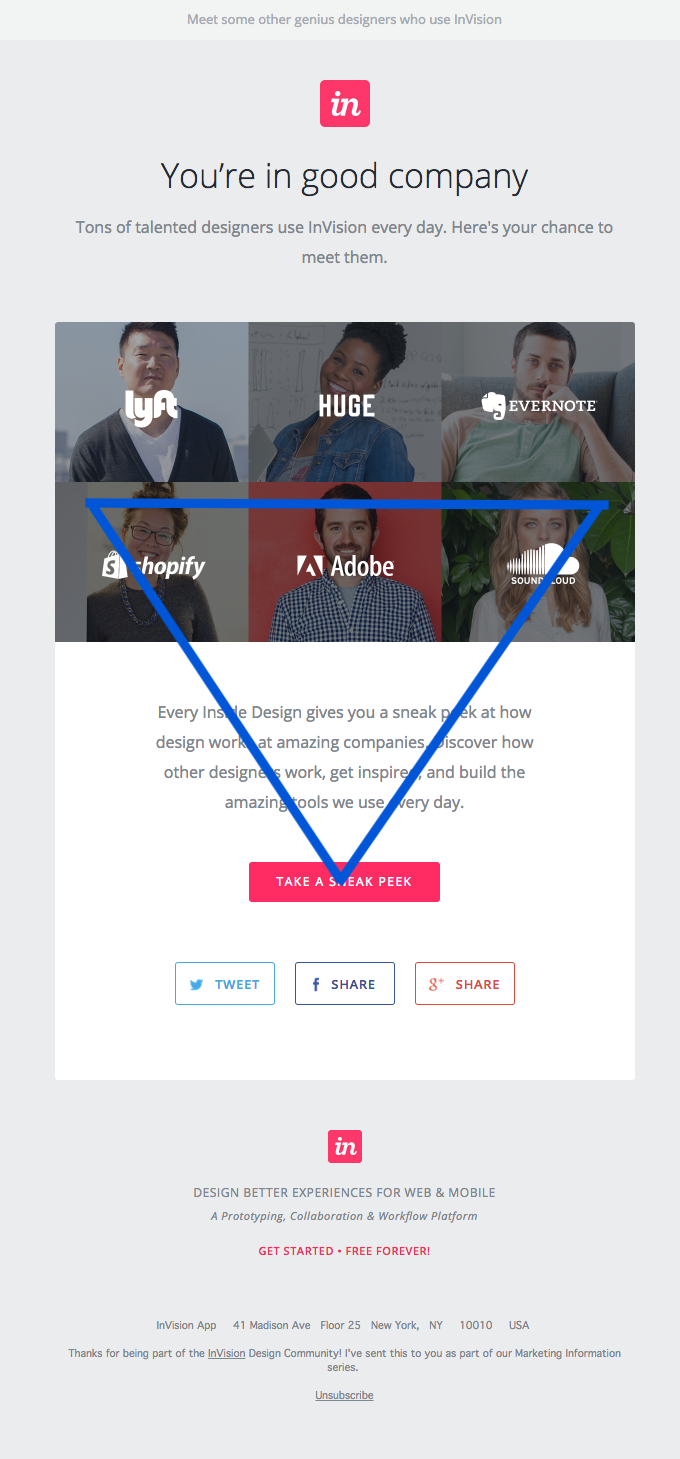
This inverted pyramid concept is also a very popular approach for landing pages.
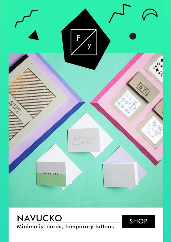
Zig zag
You’ll see this a lot too on websites, where diagonal lines are used to break up the content with images and CTAs and guide the reader’s eye. This is a great way for public sector emails to help separate out an email’s content and more tactfully guide the reader toward what you want them to know or act on.
In the example below, your eye is immediately drawn down the lines of zig zags until you get to the CTA.
Progressive enhancement
Progressive enhancement means your email doesn’t have to look the same on every medium or device. For example, we know the most popular email client out there is iOS. As an email client, iOS gives email marketers so much flexibility and creative freedom in terms of what you can do with your email’s HTML from a design and interactivity perspective. So, even though clients like Outlook don’t offer the same capabilities, why limit your email’s design and interactivity for the number of subscribers that can appreciate those touches?
Progressive enhancement relies on the fallback tools you can use so everyone has a great experience with your email, whether or not their email client supports your well-designed messages.
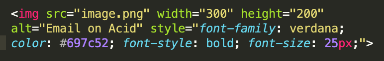
Stylized alt text
Every non-decorative image in an email should have alt text. However, you can go a step further and give it a little branding so it’s not just hum-drum text. Subscribers with images turned off will see (and appreciate) this when they open your email. It really can go a long way to improve the user experience.
According to John Thies, it’s a safe assumption that 30-40% of a brand’s email list opens emails without images. This is a great chance for you to create a better experience for them than just with blank image space. Using the style tag in the example below allows you to add a little context and extra flair to your alt text.
Efforts like these are what lead to people wanting to see emails from you in their inbox, which is one of the main goals of email marketing.
Animated GIFs
In email, people don’t expect animation because email is inherently flat. But an animated GIF is a great way to add motion and spontaneity to an email.
If you think about it, email is not a conversion tool. It’s a driver trying to steer people to the destination you want them to go. How can you do that? Through engaging design elements like this that make you really stand out and not be “boring.”
Again, we are talking about email and not every email client supports animated GIFs. What’s an email marketer to do with that space for Outlook subscribers? If a motion GIF isn’t going to show up, select the frame people must see as the fallback graphic. That way, any client that can play the GIF does, and any that can’t display the fallback images instead so it’s still a meaningful graphic for all readers.
Video in Email
Video in email isn’t commonly used by brands, so embedding one is definitely an attention-grabber. So far, some versions of Apple Mail and iOS will play a video in the actual email. This is also where you can use a fallback GIF or still image for clients that don’t support native video in email.
All of these fallback tactics provide an amazing experience for subscribers so they’re not missing out on anything. They still get to see the CTA and they’re engaging with your intended content.
CSS animation or ‘kinetic emails’
CSS is a great way to create really unique touches for emails. You can add things like interactive hotspots, pulsing CTAs, click-to-reveal capabilities and so much more. The fallback for these types of animations, again, is a static image.
Now that you have a good handle on progressive enhancements, let’s pivot to content psychology.
Content Psychology
How do marketers engage a subscriber to the point of converting? That’s what our jobs inherently are, motivating people to take action. Content has a major impact on getting people to engage.
People in images
As human beings, we relate to people we see in certain situations. Using people in images creates that connection with the people who are going to see it.
There’s also this concept of explicit and implicit cues. For example, if the people in your images are looking at something, that’s an implicit cue for the viewer to look at that same thing. If they’re pointing at something, that’s an explicit cue to look at what they’re pointing to. Use cues tactfully to steer the viewer’s gaze toward what you want them to land on.
Social proof
The concept of social proof can execute in several different ways, some of which you probably interact with regularly.
It’s showing that other people use and like your brand’s products or services. Influencers or celebrity spokespeople are forms of social proof, saying “these famous people engage with us…” So is highlighting your social numbers, such as “300,000 teachers work with us…”
Customer ratings are another form of social proof. Review sites are a great example. When you’re going to make a dinner reservation or find someplace new to eat, you probably peek at their ratings and reviews to see if other diners have enjoyed their experiences.
For nonprofits, a great tactic is to show what notable brands or individuals donate to or champion your cause. Doing so can give other people and brands the confidence to follow suit.
Lastly, don’t underestimate the power of accolades or awards you’ve won. Showing your audience how awesome you are is always a good recommendation.
Having that visible social proof reaffirms your legitimacy and adds validity to your cause when someone clicks through from your email to landing page.
Sense of urgency
If you have some kind of time-based campaign, a sense of urgency is a great way to drive it because it triggers a part of the brain that wants to take action quickly.
Using exclusivity can also help achieve urgency—“first five people that sign up” “first 300 get a free white paper” “only 50 spots available.” These can easily translate to the public sector.
Most important message first
People are so used to scrolling on a device that you have to engage them off the bat. Then you can charm. You can’t serve them any of your awesome content until they stop scrolling and engage.
Grandma Test
Write in plain language. Plain and simple. That’s not to say your subscribers aren’t intelligent, but people are busy, and they tend to multi-task. Writing in super simple grandma-friendly language helps people digest your message more effectively. Always write your emails assuming subscribers will be doing something else while reading them. Keep it short, simple, concise.
Once they get to your landing page, that’s where you can expand more. Again, use email as the driver, not the main conversion channel.
How Many Things?
Emails can get complex. There’s so much we want our subscribers to know, and you think, ‘oh, since we’re already emailing them, let’s just put this other little mention in there.’ It’s easy to get carried away with content.
Keep it simple. Only include the most important content. It’s okay to have a lot of things in your email, but use white space. White space is your friend, it allows each element and CTA to breathe. This then lets subscribers easily digest it and understand where the CTA will take them.
It’s not as important to cram everything in a single view (ex: above the fold), because subscribers will see all of the content once they start scrolling. You simply need to use that initial view to engage them enough to scroll in the first place.
Pricing Psychology
How a brand displays its pricing—font, spacing, border, etc.—has a sizable impact on conversion. Human brains receive so much information every day that they put automations in place. These are our biases. To manage the information overload, our cognitive biases make split-second decisions for us that ultimately drive our actions and purchases.
Length of price
Statistics show that people perceive a longer price ($6.00 as opposed to $6) as being more valuable. While the $6 certainly looks cleaner in the main body of Dollar Shave Club’s email, they were sure to include the longer version so as to not miss out on those split-second bias conversion clicks.
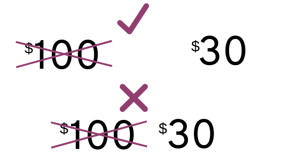
Use of $
Seriously. The use of the dollar sign. This one is especially fascinating, because stats show that the bigger the dollar sign, the bigger perception of the cost (not value—cost). So, if you’re asking for a donation or showing how low something’s price is, use a smaller font dollar sign next to the number so it doesn’t turn off prospective buyers.

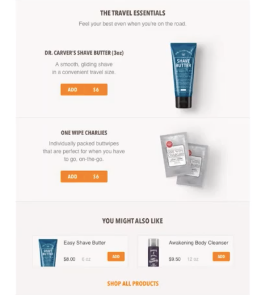
Price & bundles
It’s incredibly painful to ask people for money. So what some brands do, such as retail or sports brands, is they’ll bundle several items together. That way, it’s only asking for money once, not several times for individual items.
Price distance
If you’re sending an email about a discount or sale, the old vs. new price positioning is critical. Always put the old price on the left and the new price on the right. People read from left to right, so their eye will always end on whatever is on the right.
Also what’s interesting is the more space between the old price and the new one, the bigger the perceived value of the savings.
Charm price (ends in 9)
This is pricing that ends with 9, whether $10.29 or just $9. Numbers that end in nine are statistically linked to conversion upticks. The number of people that purchase something that ends in nine is almost 3-4x greater than purchases whose prices end in any other number.
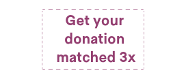
Coupons
People are conditioned to know that a dotted line indicates a coupon. Even in a digital format, we gravitate toward those cut-out cues. They’re very effective when you’re announcing a sale and putting your offer / CTA in that dotted box to drive clicks.
Simple Tips to Get Started
Fix the easy things first. Don’t get caught up in heavy design if you’re just starting to make changes. Prioritize the easiest elements, such as thoughtful preview text. Preview text is valuable real estate that so many email marketers don’t take advantage of, and it has no impact on your email’s design.
Another priority should be effective design elements. Whether you’re stylizing your alt text, adding in rave reviews or changing the size of your dollar signs, small changes won’t go unnoticed by your subscribers.
After you’ve gone to all the trouble of making your email spiffy and engaging for readers, make sure it’s one they’ll love to see. Check your content in Campaign Precheck and run an email test to see how it renders across 90+ email clients and devices.
Follow these email best practices for government agencies and see your subscriber engagement climb.