Email Development
How to Create Interactive Hotspots in Email

Do you want to add detail to an image, share some information, or have another crazy idea that involves using an interactive hotspot in email? This guide should help you get the basics into your HTML and CSS, so only your imagination will hold you back!
Email Client Support
To enable hotspots in your email design, you can use the CSS checkbox code that turns a piece of content on and off. This also allows you to control the position of one or more buttons on top of an image.
WebKit-based email clients only support the CSS, so you will need to check which clients your audience uses, as well as ensure a fallback is in place for clients that do not support this progressive enhancement.
It is also worth thinking about how users typically see an email – most of the time an email is not interactive, so the subscriber isn’t expecting an interactive element. So, we will add CSS animation to the buttons to bring attention to them.
Setting Up the Code
Before we start with the code, we need to set up our content. One background image:

An image for the buttons:

And finally, all the images that will appear once the subscriber clicks a button:


Now we can start setting up the code.
First, we first check whether the email client supports checkboxes:
                                <style>
/* check for webkit */
@media only screen and (-webkit-min-device-pixel-ratio:0), (min--moz-device-pixel-ratio:0) {
#webkitnocheck:checked ~ .fallback {display:none;}
#webkitnocheck:checked ~ div .interactive {display:block !important; max-height:none !important;}
}

/* Check for yahoo */
@media screen yahoo {.fallback {display:block!important;max-height:none;}
.interactive {display:none!important;}
}

<!-- Samsung mail device detection -->
@media screen and (-webkit-min-device-pixel-ratio: 0) {
#MessageViewBody .fallback, body.MsgBody .fallback{display:block!important;}
#MessageViewBody .interactive, body.MsgBody .interactive {display:none !important;}
#MessageViewBody .samsung {display:none !important;}

/* Check for gmail */
@media screen and (max-width:9999px) {
u + .gmailbody .fallback {display:block!important;max-height:none;}
u + .gmailbody .interactive {display:none!important;}
</style>
We will add the class .fallback to the div containing our fallback and .interactive to the div surrounding our whole interactive section.
After this we can set up the interactive area:
                                @media only screen and (-webkit-min-device-pixel-ratio:0), (min--moz-device-pixel-ratio:0) {
.area { position: relative; display: block !important; overflow: hidden; max-width: 640px; max-height: 640px; width: 100vw; height: 100vw; background-image:url(images/leaf-bg.png); background-size:contain; }
We need to create an area that is relative to its surroundings to allow it to slot into an email anywhere, as well as add the background image details. This includes:
Max-width: (maximum width of the image)Max-height: (maximum height of the image)- Setting the
width: 100vw - Setting the
height: 100vw
These parameters help make sure that on any screen below the max-width, the image is contained to the viewport width. As for the height, the image is square in this example, so working out the height relative to the viewport width was easy. But if you have a longer image, you can work this out by setting what percentage (%) the width of image is compared to the height (640).
Then, we set the image using background-image:url(link/image.png) and the background size to be contained within the area we already set:
.leaf1, .leaf2, .leaf3 { visibility: visible!important; display: block!important; max-height: 50px!important; position: absolute!important; width: 50px; height: 50px; background-size: cover; background-position:center; -webkit-animation: pulse 2s ease 0s infinite; border-radius:25px; -webkit-box-shadow: 0px 0px 5px 5px rgba(50,50,50,0.5); cursor:pointer; background-image:url(images/hotspot.png);}
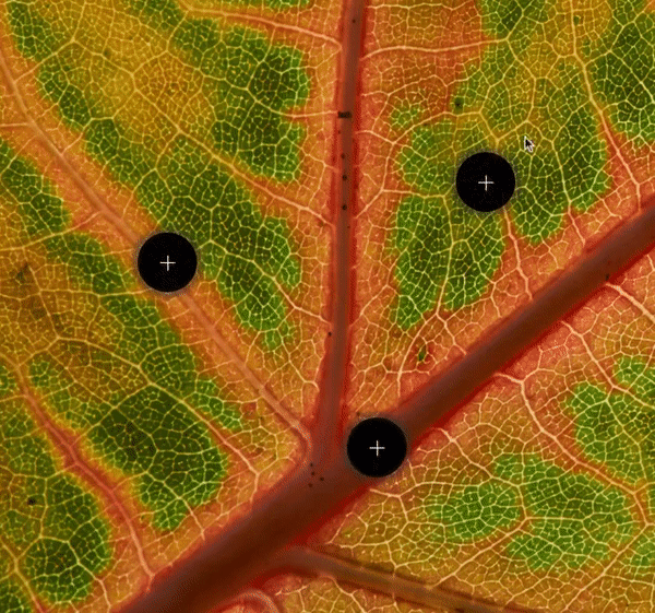
Now, let’s move on to the hotspots. We’ll set the hotspots’ image, size, cursor, background-image, webkit-box-shadow and webkit-animation in a bit. First, you can get organized with your different hotspot buttons.
If you have different buttons, they can all be set with different names, but to make things easy, adding a number to the end will help you find and control them.
                                /* Desktop button positions */
.leaf1 { left: 450px!important; top: 152px!important;}
.leaf2 { left: 140px!important; top: 230px!important;}
.leaf3 { left: 344px!important; top: 410px!important;}
We can then set the position of the desktop buttons using the left and top positioning. The button’s position is absolute; the left and top property set the left edge of the button image to the left edge of its nearest positioned ancestor, and the top edge of the button image to the top edge of its nearest positioned ancestor, which is the area we set above.
Following this, we can set what happens when the subscriber clicks the button:
                                #leaf1:checked ~ div #leaf1-content { display: block!important; background-image:url(images/lamina.png)!important; background-size: contain; z-index:10; }
#leaf2:checked ~ div #leaf2-content { display: block!important; background-image:url(images/veins.png) !important; background-size: contain; z-index:10; }
#leaf3:checked ~ div #leaf3-content { display: block!important; background-image:url(images/midrib.png)!important; background-size: contain; z-index:10; }
With the code above, when a subscriber clicks the button with the identification #leaf1 – corresponding to our hotspot image above with the class .leaf1 – the div that has the #leaf1-content will change its style from display:none; to display:block;. It will also change its z-index and background-image set to show the label we created. We do this with a general selector ( ~ ) followed by the div and the identification #leaf1-content.
                                #leaf1-content { position:absolute; left:375px; top:170px; width: 200px; height: 40px;}
#leaf2-content { position:absolute; left:70px; top:248px; width: 200px; height: 40px;}
#leaf3-content { position:absolute; left:270px; top:425px; width: 200px; height: 40px;}
After setting up how the content appears, we need to position the content. Using the same method as the button, we set the position: absolute along with the left and top positioning. We also set the width and height of the content.
As I mentioned earlier, users are still not used to seeing interactive elements in email. By highlighting the hotspot button with a pulsing animation, users are more likely to click or tap.
                                /* keyframe animation - button pulse */
@-webkit-keyframes pulse { 0% { opacity: 0.7; -webkit-transform: scale(1); } 50% { opacity: 1; -webkit-transform: scale(1.2); } 100% { opacity: 0.7; -webkit-transform: scale(1); } }
Before jumping in, I recommend checking out Email on Acid’s CSS animation guide. But, to break it down, we name the animation pulse, set the opacity and increasing size using -webkit-transform: scale, at 0%, 50% and 100%.
We then add the -webkit-animation: pulse 2s ease 0s infinite; to the buttons in the above section. This adds the animation to the element with the name pulse, lasting 2s, easing to 0s and continuing infinitely.
Setting the Hotspot HTML
The above is the final CSS for the desktop version of the hotspots on the image. But before we set the final positions of the buttons and content, we need to set how the hotspot image HTML will appear in our email.
First, we set up a table to contain the interactive module:
                                <table role="presentation" width="640" style="width:640px;" border="0" align="center" cellpadding="0" cellspacing="0" class="w100pc">
<tr>
<td valign="top" align="center" class="w100pc">

</td>
</tr>
</table>
Set up the table as you would for any element within an email. The table and td surrounding the interactive image has the class w100pc – setting them to 100% when on screens with a maximum width of 640px:
                                <style type="text/css">
@media screen and (max-device-width:640px), screen and (max-width:640px) {
.w100pc {
width: 100%!important;
min-width: 100%!important;
max-width: 1000px!important;
height: auto!important;
}
}
</style>
Within the table we add the first checkbox to see if the email client supports this CSS:
                                <!--[if !mso]><!-- -->
<input type="checkbox" id="webkitnocheck" name="webkit" checked="checked" style="display:none;max-height:0;visibility:hidden;">
<!--<![endif]-->
We’ll wrap an input in mso tags to hide it within Outlook. Then, set up the checkbox with id=”webkitnocheck” and name “webkit” we set the box to checked=”checked” and hide the checkbox with style="display:none;max-height:0;visibility:hidden;". If an email client supports checkboxes, the interactive module will show, if not, the fallback will display.
Creating the Fallback
As a rule, I try to put the fallback first within the interactive module. If an email client loads the HTML in the order it’s coded, if the connection is slow, or if the code is cut off (for example, hitting the Gmail 102kb limit), then the fallback will display first and loading won’t be as slow in clients that do not support the interactive element.
                                <div class="fallback">
<table role="presentation" width="100%" border="0" cellspacing="0" cellpadding="0" align="center">
<tr>
<td align="center"><img src="images/leaf-fallback.png" width="640" height="auto" alt="Leaf image with labels." style="height: auto; display: block;" class="w100pc"/></td>
</tr>
</table>
</div>
We set the fallback within a table as it will show on Outlook. You can set the fallback to be whatever you want – a full separate module or anything that you want to replace the interactive module.
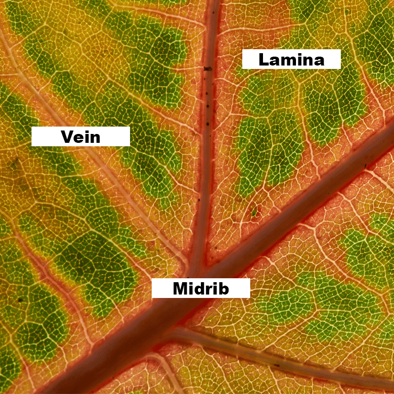
In this case I have included the complete image with the labels, so any subscriber that can’t see the interactive module won’t miss out on the information:
All of the fallback content is wrapped in a div with class=”fallback”, which will be hidden on email clients that support checkbox and shown on all others.
Targeting Samsung Mail
Because Samsung mail is detected separately, we’ll need to set a containing div with class="samsung". This surrouns our interactive section, followed by <!--[if !mso]><!-- -->, which hides the section from Outlook. Finally, we wrap all the content with <div class="interactive" style="mso-hide:all;display:none;max-height:0;overflow:hidden;"> The class “interactive” allows the interactive module to show to all email clients that support checkboxes, and the default style set to hide it from all other clients. Next, we line up the checkboxes for each button:
                                <input type="checkbox" class="leaf" id="leaf1" name="leaf" style="display:none;max-height:0;visibility:hidden;">
<input type="checkbox" class="leaf" id="leaf2" name="leaf" style="display:none;max-height:0;visibility:hidden;">
<input type="checkbox" class="leaf" id="leaf3" name="leaf" style="display:none;max-height:0;visibility:hidden;">
Each checkbox has the class leaf and ID for each leaf. The style is set to hide all the checkboxes, as we don’t want them visible. After that, we’ll set u[ the interactive area, <div class="area"> so that it can contain the background image. Next, we add in each div containing the labels for the hotspots and we’ll give each label a class to match one of the hotspots:
                                <label class="leaf1" for="leaf1" style="display:none;max-height:0;visibility:hidden;"></label>
<label class="leaf2" for="leaf2" style="display:none;max-height:0;visibility:hidden;"></label>
<label class="leaf3" for="leaf3" style="display:none;max-height:0;visibility:hidden;"></label>
Within the interactive area, we add the div for each piece of content to appear when clicked:
                                <div id="leaf1-content"></div>
<div id="leaf2-content"></div>
<div id="leaf3-content"></div>
Finally, we close all the div and table tags to contain the interactive module and the containing table.
Setting Positions
Now that we have the hotspots all in the content area, as well as the background image and content, we can set the positions. This is often trial and error with a little bit of knowledge. For example, halfway across the image will be 320px – so, starting with that I can find the center of the image and work outwards, for both the hotspot buttons and the content. We’ll need to set positions to a specific pixel position that will need to be responsive on mobile. Because of this, we’ll use a media query in a separate style tag to set the responsive position of the buttons and content:
                                <style>
@media screen and (max-device-width:640px), screen and (max-width:640px) {

/* Mobile content label positions vw - vh support is inconsistent on mobile */
#leaf1-content { position:absolute; left:60vw; top:23vw; width: 24vw; height: 5vw;}
#leaf2-content { position:absolute; left:15vw; top:39vw; width: 21vw; height: 4vw;}
#leaf3-content { position:absolute; left:40vw; top:68vw; width: 21vw; height: 4vw;}

/* Mobile button positions */
.leaf1 { left: 65vw!important; top: 21vw!important; }
.leaf2 { left: 20vw!important; top: 37vw!important; }
.leaf3 { left: 45vw!important; top: 66vw!important; }
}
</style>
This was also done with trial and error to set the correct positioning on screens below 640px. The full code is all available on codepen.
Test your Interactive Hot Spots!
As with all interactive emails, it’s difficult to test in different email clients. But before sending to a range of live test devices we have at Action Rocket, using an email QA platform like Email on Acid can confirm whether the fallback and the interactive section are showing in the correct email clients. Check out the Email on Acid email previews of this technique.


