Email Development
Progressive Enhancements for Email Design and Development

HTML email development can be fun and creative. It can also be complicated and frustrating. You may spend hours crafting the perfect email, using clever interactive elements, custom fonts, and captivating CSS animations. But how many of your subscribers will be able to experience it all?
If you start out with the most complex version of your email, you can end up spending hours re-coding (and possibly re-evaluating your career choice). Even then, you may never get it to display perfectly across all email clients. So was it worth the effort? Is there a better way to enhance the emails you’re coding?
What if you started with something simple, something that was ideal for every inbox, and then built upon that basic email?
Progressive enhancement is a scalable approach that focuses on simplicity and accessibility first, so your emails are only as complex as they need to be.
What is progressive enhancement?
Progressive enhancement is a method of building digital content and applications in a way that prioritizes usability across all environments. It’s usually discussed as a strategy for website design. But the principles of progressive enhancement are also important in other fields like software design and HTML email development.
The basic concept is to initially craft your website, app, or email so that your content is usable across all platforms, then add enhanced styles and functions using conditional statements and fallbacks so that only the clients that support them will display them.
The overall concept is the same for any field’s design and development process, but there are some specific differences when it comes to progressive enhancement strategies for HTML emails. This chart lists a side-by-side comparison of the core principles of progressive enhancement for web and email development:
Progressive enhancement principles: web vs email
| Web | |
| Basic content and functionality should be accessible in all web browsers. | Basic content and functionality should be accessible in all email clients. |
| Sparse, semantic markup contains all content. | Sparse, semantic markup contains all content. |
| Enhanced layout is provided by externally linked CSS. | External stylesheets aren’t supported for email, so CSS for enhanced layout should be inlined like the rest of your CSS. Use selectors and media queries to conditionally display content in supported clients. |
| Enhanced behavior is provided by externally linked JavaScript. | Javascript is not supported in emails, so enhanced behavior (e.g. interactive elements) should use AMPHTML with HTML fallbacks for clients that don’t support AMP. |
| End-user web browser preferences are respected. | Recipient privacy preferences and email client settings are respected. |
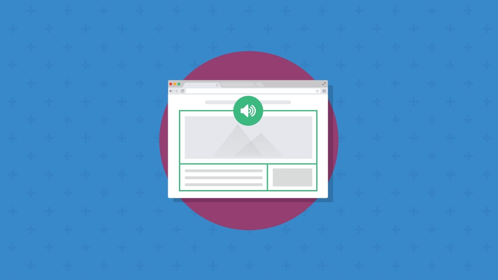
A simple example of progressive enhancement would be displaying a series of stacked, static images with descriptive alt text as the default in all clients, then using a media query to conditionally display an AMP image carousel for clients that support AMP.
Graceful degradation vs progressive enhancement
Graceful degradation is basically the opposite of progressive enhancement. Graceful degradation begins with the most modern and complex styles and functions and then adds options that gracefully degrade what is presented to the user.
One example of graceful degradation that every email developer should be using is font stacks. In a font stack, you begin with the ideal custom web font that you want to display, then add other acceptable fonts in order of preference with the final font option being the most basic option. Declaring serif, sans-serif, script, or monospace at the end of your font stack will allow the email client to display whatever their default font is for that family.
font-family: 'Roboto', Verdana, Arial, sans-serif;
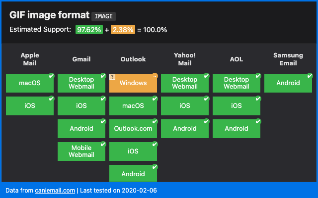
Some graceful degradation happens automatically, like with GIF support. If an email client doesn’t support animated GIFs, then it will default to displaying the first frame of the GIF. The only thing you need to do on the design side is to make sure your first frame displays the full content that you want the recipient to see. Otherwise, you don’t have to use any conditional statements to control the fallback display.
Which approach is right for email development?
Both! Using these techniques together (depending on the scenario) will help you develop an optimal user experience as well as make email coding less frustrating.
Email development expert, Rémi Parmentier, has this to say on the matter:
As far as I’m concerned, email development is all about progressive enhancement and graceful degradation. Just because a nine years old desktop client like Outlook 2007 doesn’t support border-radius or animations and transitions in CSS doesn’t mean I shouldn’t use these for more modern clients. All that matters is that the email content is fully understandable by the recipient. If we had to conform to the lowest common denominator, we’d only send plain text emails.
10 progressive enhancements for email
There are some common progressive enhancements used in HTML email development. The support for these features varies and it can be confusing to try to keep track of what clients support which ones.
We’ll discuss ten of these widely-used progressive enhancements below, and we’ll use live images from the website Can I email to show you which of the major email clients support them.
When using any of the following enhancements, always make sure that you have default content and styles that display well and provide adequate functionality to all your email recipients, whether you’re using a progressive enhancement technique or graceful degradation.
1. Checkbox interactivity
Most interactive emails are based on the punched card method, which uses checkboxes or radio button inputs. These features are actually supported to various degrees on quite a few email clients, which makes them popular to use for email developers who want to add interactive features to their emails.
You don’t have to use checkboxes and radio buttons just for creating simple forms, either. You can use them for creating an in-email checkout experience, tabbed content, accordions, quizzes, and games.
Of course, there are clients that lack support for this functionality in HTML emails. In some cases, checkboxes can be displayed but aren’t active. The :checked CSS pseudo-class selector is used to make that happen. Can I Email indicates there’s support in Apple Mail and Outlook for macOS as well as Yahoo Mail, AOL, Samsung Mail, and Thunderbird.
Checkbox interactivity could also be coded using AMP for Email to bring that enhancement to Gmail accounts.

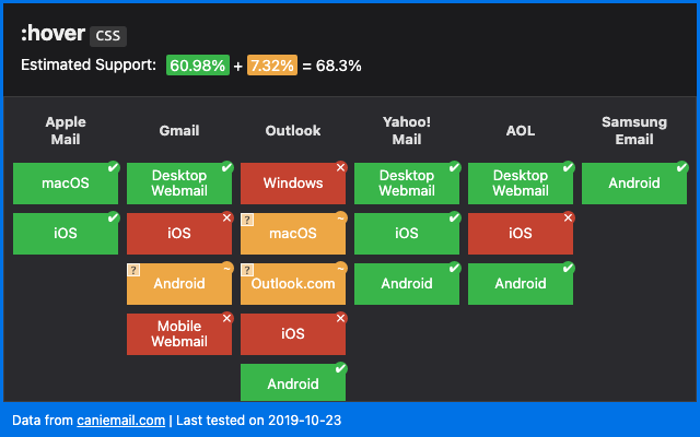
2. Hover effects
Hover and rollover effects are a great way to add interactivity to your emails. You can use hover and rollover effects to provide additional viewing angles or color options for a product, create engaging buttons, reveal hidden clues for a puzzle, or as teaser content.
A lot of email clients support the :hover selector, too, so it’s a great place to start if you’re just getting into experimenting with interactive email.
3. AMP for Email
AMP for Email is a framework, using a subset of AMPHTML components designed specifically for email, which allows recipients to engage with interactive content directly within an email. While AMP for Email has limited support, if you have a lot of Gmail and Yahoo! Mail users, you might find it worthwhile to include some AMP elements. AMP for Email allows you to add quite a long list of interactive features. A few that stand out as particularly useful include:
- Date selection for bookings
- Payment acceptance
- CSS animations
- Product carousels
- Product pages
- Shopping carts
- Dynamic accordions
- Linked drop-downs
- Multi-page flow
- Paged lists
- Polls
- “Show more” buttons
- Star ratings
- Tic-tac-toe games
- Videos
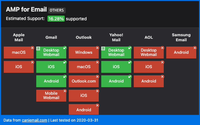
Keep in mind that there are some AMP limitations in Yahoo Mail. Smaller clients like Mail.ru and FairEmail also have AMP support.
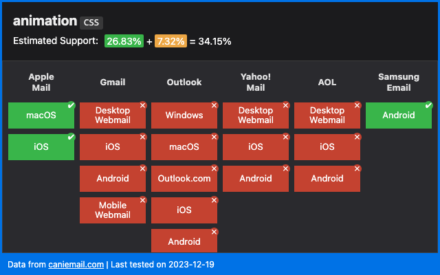
4. CSS animation
CSS animations are a great way to grab your reader’s attention and provide a unique experience. They’re more lightweight than GIFs, so they’ll help keep your email file sizes much smaller, which is key to preventing Gmail from clipping your emails. Keeping your email file sizes small also makes it less likely that mailbox providers will flag your message as spam.
CSS animations also look a lot nicer than GIFs. For accessibility purposes, GIFs must have a slow frame rate, which can make them feel jarring. CSS animations are usually driven by scrolling or tilting and have a much smoother, user-driven speed. They also look great in high resolution mobile screens, whereas GIFs can feel blurry.
5. GIFs
Like CSS animations, GIFs can be a great way to enhance your subscribers’ experience and improve conversions.
Even though GIFs come with some drawbacks, there are still quite a few good use cases for them. For instance, CSS animation has limited support. Gmail – which holds a large market share – doesn’t support it. And while it’s not universal, most clients do support GIFs.
If you want to create an animation quickly and aren’t well versed in CSS animation, a GIF is probably the easiest solution. Additionally, if you have GIFs that you’re using in other circumstances, you might want to use them in your email to retain brand consistency and save time.
Check out what some email marketers from big brands are doing with GIFs in email.
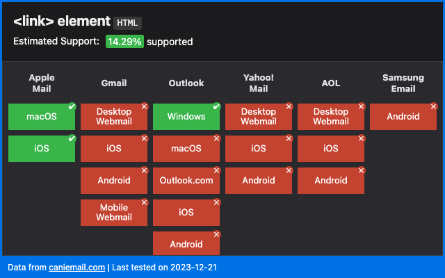
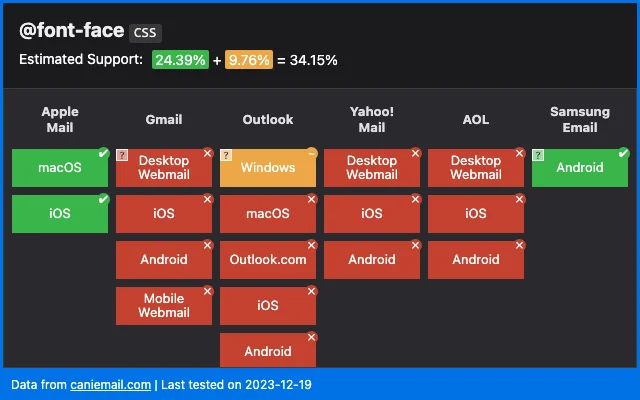
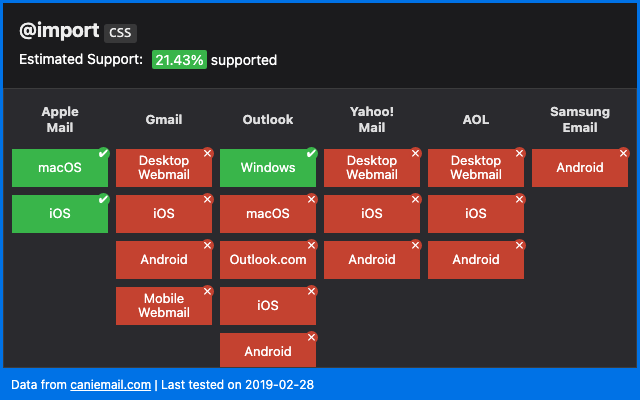
6. Custom fonts
There are a few different ways to add custom fonts to your emails. You can use <link>, @font-face, or @import. Each has its limitations and none of them are fully supported by all email clients. Below are the different methods of adding custom fonts and what clients support those methods:
<link>
@font-face
@import
Adding custom fonts can help you maintain brand identity and create eye-catching typographic designs in your emails. Custom fonts are also one of the easiest enhancements, as you can simply list fallback fonts for clients that don’t support custom web fonts.
Make sure that when you’re providing fallbacks, you choose fonts that have similar weight, x-height, letter spacing, style, and width. Not all serif fonts at 24px and normal font-weight will display at the same size or take up the same amount of real estate.
We’ve written a fairly in-depth article on how to include custom fonts in your emails if you want to explore the topic further.
7. Custom bullets
Depending on what level of customization you want to do, custom bulleted lists in email are pretty widely supported. This is when you’d use brand colors or icons for your bullets.
But there are notable exceptions (Outlook for Windows — surprise, surprise — only supports list-style-type) and list-style-image enjoys less support than list-style. Keep that in mind when implementing custom bullets. Always make sure you include a fallback bullet list-style-type in case a client doesn’t support your custom bullet icon or image.

8. Rounded corners
Using CSS to give email elements rounded corners is an elegant way to customize the appearance of images, buttons, infoboxes, and other pieces in your email. If you use rounded buttons and other elements with a border-radius on your website, it makes sense to use them in your emails as well.
Border-radius is supported on most email clients, but not all. We’ll let you guess which one definitely doesn’t support it (spoiler – it’s Outlook for Windows). Orange’s webmail doesn’t support it either, and while Yahoo! Mail and AOL support border-radius, they don’t support elliptical borders using the / notation.

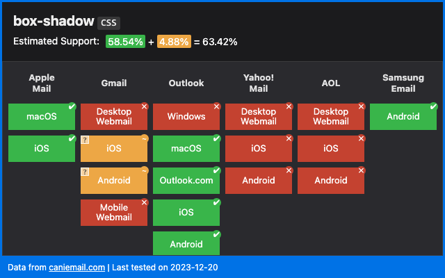
9. Drop shadows
Drop shadows can help add dimension and depth to your emails. By using box-shadow or text-shadow, you can give your emails a more three-dimensional, layered feel. While drop-shadows are supported in one way or another across many different email clients, some only support text-shadow or box-shadow. The handful that (for the most part) don’t support either are unfortunately some of the biggest players — Gmail and Outlook.
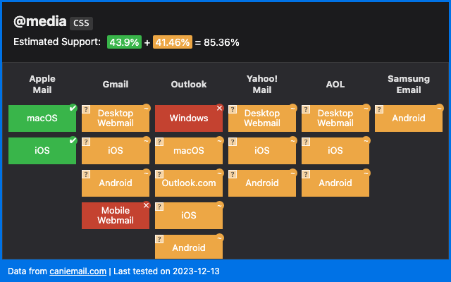
10. Media queries
Media queries are commonly used in responsive design to instruct a browser or email client to only display certain content when the device environment matches a rule that you specify. Your conditions may be based on viewport size, height or width of the device, orientation, resolution, or whether a browser is webkit-enabled.
Media queries can be a useful way of implementing progressive enhancements because they only display content if the conditions of the media query are met.
Learn more about how to use media queries across different email clients.
Why fallbacks are important
In reading through all of the above enhancements, you’ll notice a common thread. None of these features are universally supported across all email clients. This is where fallbacks come in.
Fallbacks in email are the content and styles that automatically display when a more advanced element is not supported by a client. We mentioned font stacks earlier in this article as an example of graceful degradation. But graceful degradation is ultimately built on fallbacks. When the first font in your stack isn’t supported, the client will “fall back” to using the next supported font in the stack.
In the case of font stacks, using the fallback/graceful degradation approach is the shortest and most reliable way to display fonts in email. If you used a progressive enhancement approach, it would probably involve a bunch of media queries, generating needless extra code, and wouldn’t display as reliably as using fallback fonts.
Other examples of fallbacks include:
- Merge tag fallbacks. If your merge tag values are empty, always include a fallback default value so that your recipient doesn’t get an email that says, “Dear first_name.”
- Fallbacks for interactive elements. For some types of interactive content it may be a good idea to use progressive enhancement to only show the interactive content to clients that support it. But sometimes it may also be more efficient to provide fallback content instead. Here are some examples of progressive enhancement and fallback options for interactive content in email.
- Background image fallbacks. Some clients support background images, but many do not. When using a background image, always provide a background color fallback that has high contrast with your content so your text and buttons are still readable.
Providing fallbacks for more advanced elements of your email will help keep your content readable and accessible to all your subscribers.
Are progressive enhancements worth it?
The beauty of progressive enhancements is that they’re optional. It may not always be worth the time and effort to pursue advanced appearance and functionality in your emails – especially if they don’t impact results. Here are a few questions you should ask yourself when considering progressive enhancements for your email:
- Will it improve the experience significantly?
- Will it help your subscribers?
- Will it boost engagement and conversions?
If not, it may not be worth it.
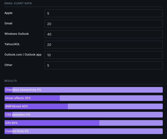
You’ll also want to consider what email clients your subscribers are using. Take the time to comb through your email list and find the percentage of subscribers that use platforms that support more advanced features. Then, visit Parcel’s Progressive Enhancement Calculator to determine what features would be accessible to your subscribers.
Enter the percent of subscribers on your list using each email client.Check out the common enhancements below and see how much of your list the enhancement will impact.
If you have a large percentage of subscribers that support animated GIFs and AMP and you have a major announcement to make like a new service or a holiday sale, you might want to invest the time and effort to add those features for clients that support them.
However, if you’re sending out a terms and conditions update, a newsletter that doesn’t contain a lot of important new content, or even something urgent but extremely last-minute, then you may want to stick to a less complicated format that’s faster and easier to get out the door.
Essential elements or progressive enhancements?
Not everything is negotiable. While you might think of these things as enhancements, they’re actually essential elements that you can’t ignore:
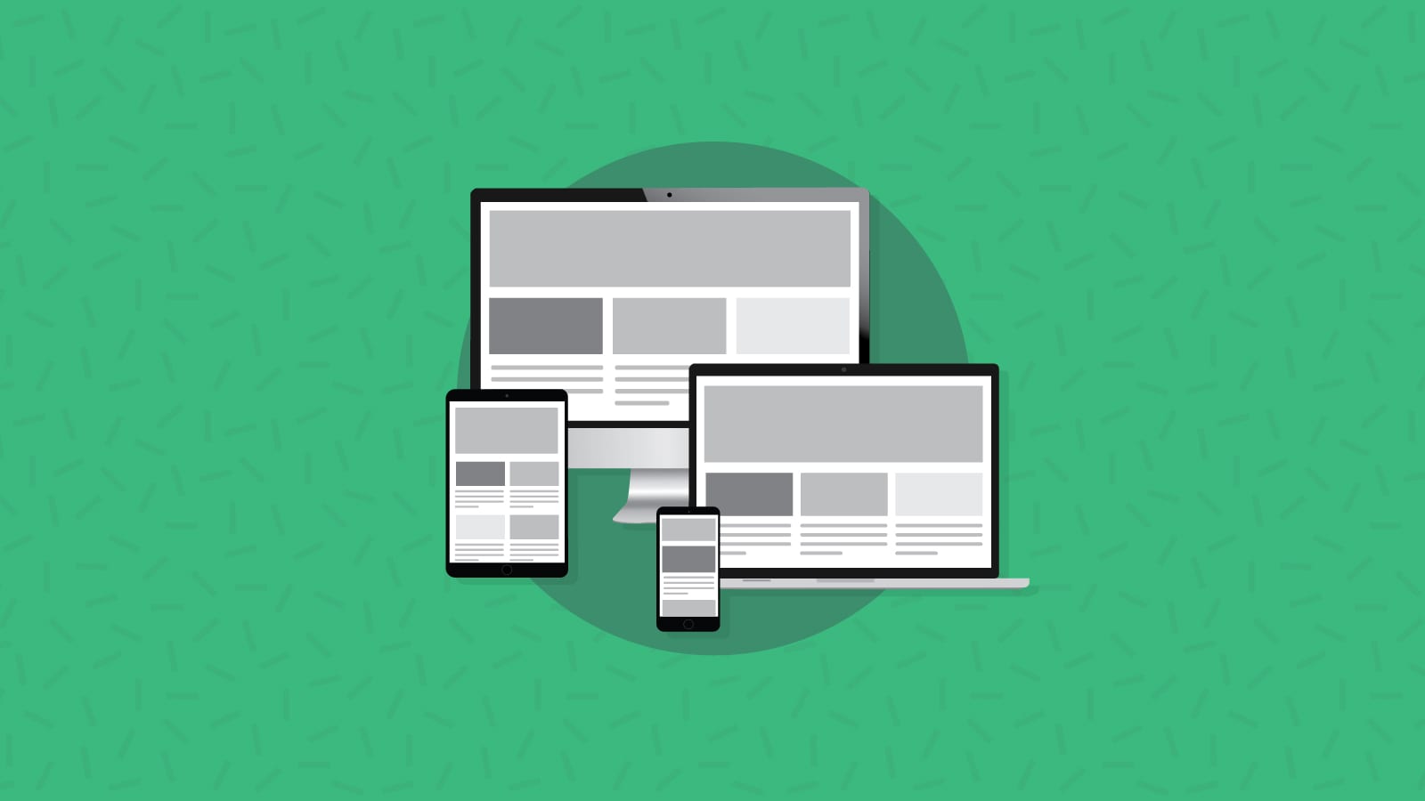
- Responsive email design. While it all depends on your list, stats show the majority of people now open their emails on mobile devices. So, responsive emails aren’t an enhancement, they’re a necessity. In fact, we recommend you use mobile-first design when creating your emails.
- Accessible emails. Coding your emails with accessibility in mind should be part of the foundation of your email design. You want your emails to be accessible to all of your recipients, including those using assistive screen reader technology. If you need to know where to start, check out our advice on how to code accessible emails.
- Dark mode compatibility. While there are plenty of dark mode email development challenges, enough people use dark mode settings that designing and coding for it is a must. This is another factor you should consider throughout the process. Dark mode designs should be part of your email design system.
Test your progressive enhancements
No matter your approach, developing outstanding emails takes time, effort, thoughtful consideration, and most importantly – testing. That’s why the team at Email on Acid by Pathwire built a platform that helps you test your emails to make sure that they look great each and every time, before you hit the send button.
Our automated email checklist streamlines the pre-deployment process and helps you optimize inbox display, accessibility, and more. Developers can rely on our email previews with unlimited testing to catch any remaining rendering issues – including checking to see if your interactive email fallbacks are working.
If you’re collaborating with a team of people on your email campaigns, our team management features help marketers and developers work together to review emails more efficiently.