Email Development
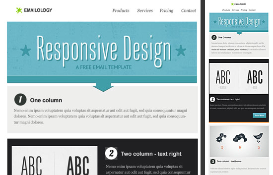
Free Responsive Email Template

This blog post was updated on July 12, 2018. It was last updated in February 2017 and originally published in 2013.
With the popularity of mobile email and so many of our users asking about best practices for responsive emails, we’d like to help with a free responsive email template to get you up and running as fast as possible.
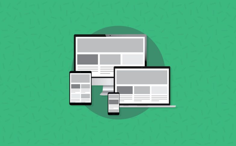
This template offers three different “layouts” that trigger based on the width of the screen. By default, it supports 1-3 columns and as you trigger each media query conditional statement, it converts to a one-column layout for easy reading on mobile devices.
If you have an Email on Acid subscription, you already have access to this template in our Resources section! Simply log in and navigate to the resource center in the left navigation bar.
If you don’t have a subscription, you can find the template here. Simply enter your email and the download is free.
Once you download the template and finish customizing it with your content, don’t forget to test the email. Although we’ve tested this design, the smallest code change could break the email. Luckily, our platform shows you what your email looks like in more than 70 clients and devices. Sign up for our free trial and give it a test today!
Template Details
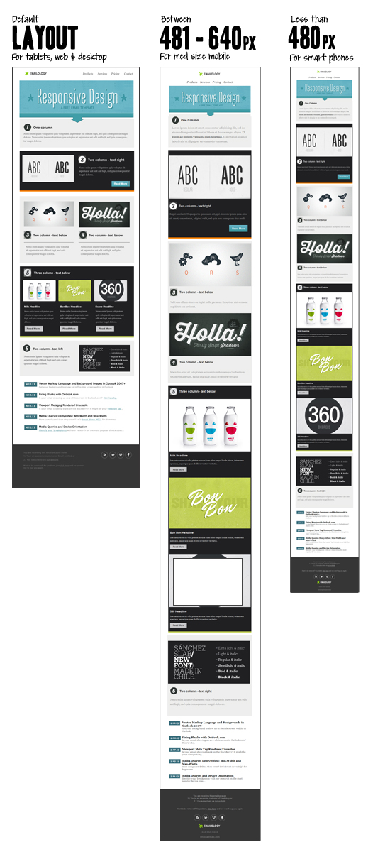
When developing this template, we researched the most common device dimensions and ran a media query test to identify the device widths to target.
The breakpoints we’ve selected for this template are:
- A width less than 480pxfor the iPhone and smaller smartphones.
- A width between 481px and 640pxfor medium-sized Android devices
- A default dimension of 580pxfor tablets, web, and desktop email clients
What’s interesting about these dimensions is that the breakpoint for medium-sized handheld devices is greater than the real estate your email will get in most web and desktop email clients. For that reason, the default width for our template is set to 580px. This dimension is less than the media query dimensions that we used for medium-sized mobile devices.
You can mix-and-match each section of this layout. Plus, we tried to make the template generic, as your email needs will likely change over time.
This template has been tested across most major email clients. But don’t take our word for it: Test it yourself today with our free, seven-day trial.
How Did We Build the Responsive Template?
1. Media Queries
Here’s the entire style block:
                                <style type="text/css">
   .ReadMsgBody {width: 100%; background-color: #ffffff;}
   .ExternalClass {width: 100%; background-color: #ffffff;}
   body	 {width: 100%; background-color: #ffffff; margin:0; padding:0;}
   table {border-collapse: collapse;}

    @media only screen and (max-width: 640px)  {
      body[yahoo] .deviceWidth {width:440px!important; padding:0 4px;}
      body[yahoo] .center {text-align: center!important;}
    }

   @media only screen and (max-width: 479px) {
      body[yahoo] .deviceWidth {width:280px!important; padding:0 4px;}
      body[yahoo] .center {text-align: center!important;}
   }
 </style>
We then used the ‘deviceWidth’ class on all tables and images throughout. This resets the width for each element based on the width of the mobile device. You could add more media queries if you want – feel free check out this blog post for more breakpoint ideas.
2. Floating Elements
The next challenge was creating floating elements that naturally stack when there’s not enough room for them to float. Floating elements for email is rather tricky because several email clients do not support the ‘float’ property. Instead, we used the ‘align’ attribute within table elements.
For example:
<table align=”left”>
Simple enough, right? Yes and no. Using ‘left’ or ‘right’ align tables in Outlook 2007, 2010, and 2013, results in extra table padding. So, we recommend checking out this Outlook padding workaround for getting aligned tables to match up perfectly. In the case of this template, we used percentage-based widths for each floating table and in some instances, we had to rely on the ‘<p style=”mso-table-lspace:0;mso-table-rspace:0; margin:0″>’ fix.
Customize Away!
Feel free to customize this template to fit your needs. You can keep the email short and sweet for your mobile readers by hiding some elements within your layout using media queries. Both the Android and the iOS support the display:none property.
Hopefully, this will save you some time and stress when creating your next responsive email!
Don’t Forget to Test!
We’ve tested this template thoroughly and we trust it, but when you update it with your content, you’ll need to test it again. The smallest code change can have massive consequences in the world of email. That’s why Email on Acid offers unlimited testing on more than 70 email clients and devices. Check out our free, seven-day trial and start testing your new template today.
Note: This blog post is intended for educational purposes. The materials used, including but not limited to, artwork, research, coding techniques, and the overall layout are to be considered ‘derivative’ and in no way do we intend to infringe on any unknown copyrights. We give our utmost respect to the millions of designers and developers who continuously inspire us to learn and create.
If you’d like to obtain rights to use any of the fonts that were included in the artwork of our template, they are available for purchase online: Hand Gothic, Thirsty Rough, Thirsty Script, Veneer.