Email Development
Screen Resolution and Responsive Design
Responsive Design
When it comes to developing responsive emails, there are three common techniques:
- The use of Media Query Breakpoints
Wherein, the developer displays the email differently depending on the width of the screen - Percentage Based Layouts
Wherein every element on the page stretches to fit a given percentage no matter what the size of the screen - A hybrid of 1 and 2
Wherein the elements on the screen stretch naturally until a given breakpoint, then it switches to a different layout or percentage for easy reading in small devices.
Media queries allow a design to “respond” to the device or screen that the email is being viewed on. For example, if the max-width of the device is 480px, your email is being viewed on a smaller device and if the max-width is 480 – 640px it’s likely being viewed on a medium sized mobile device. If it’s larger, your email is being viewed in a tablet, web, or desktop email client. In this example, the numbers I have defined above would be considered “breakpoints.”
Each of the methods defined above have its pros and cons, but it would be hard to evaluate which one to use without identifying your targeted screen resolutions.
So what are the most common device dimensions?
Device resolutions can actually range from 320px – 1,920px! Unfortunately this large of a range brings complexity so let’s break down the good, the bad, and the ugly.
Good:
Each device has a min and max-device width or ‘trigger’ point in portrait and landscape view. In other words, if you use a media query with a given conditional statement in your email, it will respond to that breakpoint.
Bad:
- Email client toolbars can take up space on the screen so manufacturer device dimensions might not be what actually triggers the media query.
- Some devices trigger the same min and max-dimensions in portrait AND landscape view
- Android users can define a ‘zoom’ setting which changes the resolution of the display
- The introduction of Apple’s Retina Display and the HD quality resolutions supported on several new Android devices use a pre-set ‘zoom’ multiplier to display your email. In most cases, it’s based on a 2X zoom.This had us stumped for a while because we couldn’t decipher between each device resolution provided by its manufacturer vs. the max-dimension that triggers a given media query.
Media Query Triggers
Since we don’t have physical access to every popular device on the market today, we have engineered the following chart based on our research. Below, we’ve defined “estimated” media query triggers for each device in portrait and landscape view. We are also working on a follow-up article with test results for the devices that we do have access to. The goal of this research is to give you a starting point for establishing your breakpoints. Items in bold are devices we have access to.
| Estimated Display in Pixels | ||
| Device | Width Portrait | Width Landscape |
| Sony Ericsson Xperia Ray | 320 | 480 |
| iPhone | 320 | 480 |
| iPhone 4S | 320 | 568 |
| Blackberry Bold 9900 | 480 | 640 |
| T-Mobile MyTouch 4G Slide | 480 | 800 |
| Samsung Galaxy S II | 480 | 800 |
| HTC Titan II | 480 | 800 |
| Sprint HTC EVO 4G | 480 | 800 |
| Nokia Lumia 900 | 480 | 800 |
| Sony Ericcson Xperia Arc S | 480 | 854 |
| HTC Amaze 4G | 540 | 960 |
| Motorola Droid 4 | 540 | 960 |
| Motorola Droid Razr Maxx | 540 | 960 |
| HTC One S | 540 | 960 |
| Kindle Fire HD 8.9″ | 600 | 960 |
| Samsung Focus 2 | 640 | 800 |
| iPad Mini | 768 | 1024 |
| iPad | 703 | 1024 |
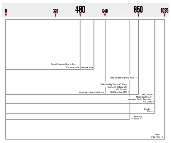
Here’s a graphic representation of the screen sizes listed above (click on the graphic to view in full size):
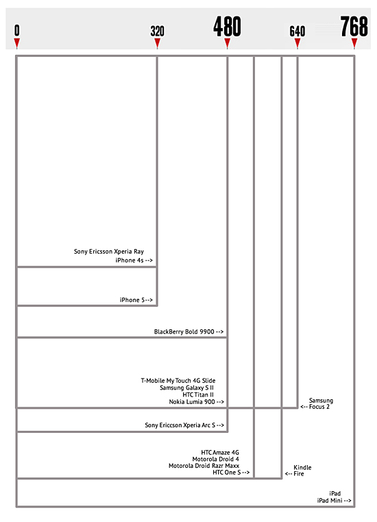
Also in landscape…
Web Client Minimum Widths
We shouldn’t forget that most desktop users can have 1920px or more to view emails (though emails viewed in a browser could have significantly less space if the window isn’t full size). Outside of flip-phone users, you shouldn’t encounter screen widths lower than 480px. This number also holds pretty well for minimum width of a web email client. Though the browser window might get smaller, the content pane of each email client has a minimum width. Content will take up more vertical space as the horizontal space contracts. Check out the minimum widths we found in the table below.
| Minumum Client Width | ||
| Client | Wide | |
| Yahoo! | 618 | |
| Gmail | 482 | |
| Outlook.com | 371 | |
| AOL | 715 | |
The interesting thing about the chart above is that most web clients do not use iFrames. So that means the max-width conditional for your media query won’t trigger because the overall browser window is likely greater than 1000px. The only web client that uses iFrames is Gmail but since Gmail doesn’t support the Style block, it doesn’t support media queries to begin with.
We are simply sharing this chart so that you can determine your game plan for your default dimensions. It also makes a good argument for percentage based (fluid) layout techniques since there are so many possible combinations of web and desktop viewports.
How can we use this information?
When considering “responsive” layouts, with breakpoints that render based on the width of the screen, we recommend making sure that your layout looks good in the following dimensions: 0-480px (for iPhone and smartphones), 481-640px (for the larger Android devices), and a default of 580px for tablets, web and desktop clients. In our next series of blog articles, we are going to be posting templates and best practices for developing percentage based (fluid) and breakpoint based email layouts so stay tuned!


