Email Development
Media Queries Demystified | CSS Min-Width and Max-Width | How Do They Work?

Media queries are an effective and reliable way for developers to code responsive email designs. Getting campaigns to display in a way that works across mobile devices with various screen sizes is crucial if you want to deliver an acceptable experience to every subscriber. But this task isn’t always easy…
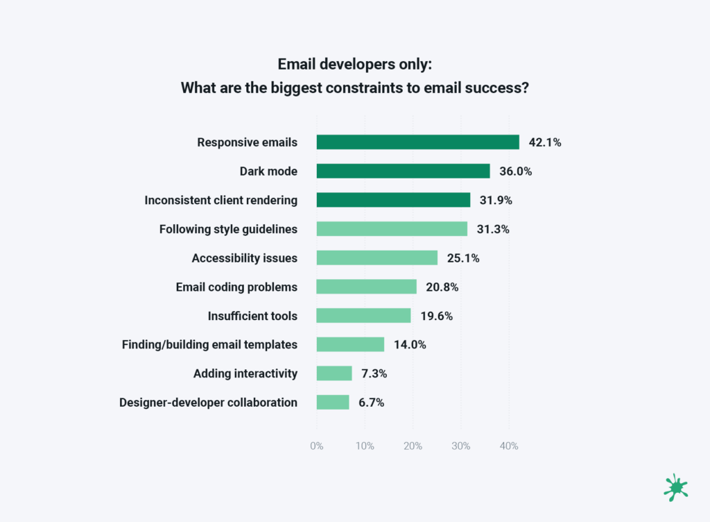
2023 research from Sinch found more than 70% of consumers in the U.S., UK, France, Germany, and Spain say they primarily use a mobile device such as their smartphone to view emails. However, Sinch Mailjet also found that the process of developing responsive emails can hold senders back. Among email developers, it’s an even bigger deal. More than 42% of those who code say responsive email design is a constraint to success.
CSS media queries are used to target screen sizes or resolutions as well as specific email clients. You may have heard that there are min-width and max-width media queries. But which should you be using and why? Let’s explore the best ways to use media queries for responsive design and better email development.
What are media queries?
A media query is a CSS technique that uses the @media rule to add a block of CSS properties when certain conditions are met. For example, if the screen size reaches a certain point, a media query indicates when to show X instead of Y.
A media query consists of an optional media type (all, handheld, print, TV, and so on) and any number of optional expressions that limit when the query will trigger, such as width, pixel-density or device orientation. Media queries are part of CSS3 and enable developers to customize their content for different presentation mediums.
At the basic level, media queries allow an email developer to create responsive emails by detecting the width of the display. For responsive email design, coders use the min-width and max-width media queries.
You can also use media queries for other purposes. That includes targeting device orientation and the preferred theme (dark mode or light mode).
How min- and max-width media queries work
How media queries function can be a bit confusing. Let’s take a look at the two queries which are commonly used in email: min-width and max-width. They are also used in web design to create a mobile-friendly experience as they allow for different layouts based on the viewport.
In an email design, for example, you may code a two-column layout for desktop viewing, but you want the content to stack for a better mobile viewing experience on recipients’ smartphones. While you can use either the min-width or max-width query to make your layout responsive, there is a better option for mobile-first email coding.
That’s because one option defaults to desktop screens and the other prioritizes smaller screens.
The max-width media query
A max-width media query triggers styles for smaller screens when the viewport or device width is less than a certain number or pixels. It is the maximum width before styles stop being applied. CSS styles are ordered from largest to smallest.
Here is an example of a max-width query:
@media only screen and (max-width: 600px) {...}
What this query really means is, “If [device width] is less than or equal to 600px, then do {...}.”
So, when an email is viewed on most mobile devices, it will apply the styles defined in the query. The styles will also be applied if a recipient adjusts the size of their browser window to less than 600px wide.
With this approach, you are essentially making your desktop screens the default and changing the layout when viewed on a mobile device. It shrinks down and resizes the content for smaller screens. For quite some time, this is how most developers coded responsive emails.
Here’s some sample email code showing how you’d use a max-width media query:
                                <style>
  :root {
    color-scheme: light dark;
    supported-color-schemes: light dark;
    font-size: 16px;
    font-color: #222;
  }

  h2 {
    margin: 0;
  }

  .column {
    width: 50%;
    display: table-cell;
    padding: .5em;
  }

@media screen and (max-width:480px) {
  .column {
    display: block !important;
    width: 100% !important;
  }

  .column:last-child {
    margin-top: 2em !important;
  }
}
</style>
This will give you a responsive two-column layout in which mobile styles are displayed when the device width hits 480px or smaller. The problem, however, is that this is not a mobile-first approach to coding. If you’d rather build an optimal design for smartphones, and then have your emails adapt and expand for larger screens, the min-width media query is a better option
The min-width media query
A min-width media query triggers styles for desktop screens when the viewport or device is greater than the defined number of pixels. It is the minimum width before styles start being applied. Here’s an example of a min-width query:
@media only screen and (min-width: 600px) {...}
What this query really means is, “If [device width] is greater than or equal to 600px, then do {...}“
So, if an email recipient views your campaign on a smartphone with a display less than 600 pixels wide, it will not show the defined styles. In this situation, you code for the smaller screens first and used the media query to define desktop styles.
Here’s some sample email code showing how you’d use a min-width media query:
                                <style>
  :root {
    color-scheme: light dark;
    supported-color-schemes: light dark;
    font-size: 16px;
    font-color: #222;
  }

  h2 {
    margin: 0;
  }

  .column:last-child {
    margin-top: 2em;
  }

@media screen and (min-width:480px) {
  .column {
    width: 50%;
    display: table-cell;
    padding: .5em;
  }
  .column:last-child {
    margin-top: 0;
  }
}
</style>
An advantage of the mobile-first or min-width approach is that your email code is a bit cleaner and more concise. The desktop-first approach with max-width often requires you to override more in the media query. On the other hand, with mobile-first email coding that uses the min-width property, most mobile styles will transfer to desktop.
Which property should you be using – min-width or max-width? Take a look at your email analytics and find out how most subscribers open your emails. If you’re coding emails for a business-to-consumer (B2C) brand, there’s a good chance mobile opens are significantly higher. However, if your a business-to-business (B2B) brand, your contacts may be more likely to be opening emails on a desktop.
Combining min-width and max-width media queries
Max-width and min-width can be used together to target a specific range of screen resolutions or viewport sizes. Use this approach when you want to target certain mobile devices with known widths. Here’s an example of using both min- and max-width in a media query.
@media only screen and (max-width: 600px) and (min-width: 400px) {...}
The query above will trigger only for screens that are between 600px and 400px wide. Want to figure out how to target a specific device based on the screen’s width? Visit CSS Tricks to find a list of standard device widths and the media queries to use.
Breakpoints for media queries
The breakpoint is the screen width at which the design and layout of an HTML email or a web page will adapt to provide an optimal viewing experience.
Exactly what these should be set to is a matter of some debate amongst email developers.
iPhones and iPads provide us with a few easy breakpoints to start from. Coding styles for these specific clients will ensure emails look great on these screens. Android devices, on the other hand, vary widely in screen size because there are so many different manufacturers and devices. Jay Oram of ActionRocket (who wrote the original version of this guide) recommends creating two to four breakpoints, based on popular Apple devices, which will cover most devices.
Here are some of the most-common breakpoints according to W3Schools:
| Breakpoint Setting | For Device |
| max-width 320px | Smartwatches |
| max-width 420px | Smaller devices |
| max-width 600px | Phones |
| min-width 600px | Tablets and Large Phones |
| min-width 768px | Tablets |
| min-width 992px | Laptops and Desktops |
| min-width 1200px | Monitors, Desktops |
Remember, CSS rules that appear later in the embedded styles override earlier rules if both have the same specificity. This means you’ll need to order media queries from either largest to smallest or vice versa – depending on whether you use min-width or max-width.
Here is an example order for the max-width approach:
- Desktop styles (not in a media query)
- Tablet styles (max-width: 768px)
- Mobile styles (max-width: 414px)
It is common to produce an email with just one media query and breakpoint, choosing a breakpoint that suits your content, such as an email with two columns side by side with a width of 300 pixels. The breakpoint would be 600 pixels – the lowest width before the content in the columns would start to get squashed. If you used a max-width media query, at 600 pixels the columns could stack on top of one another and expand to the device width.
4 steps for coding emails with media queries
Using media queries in your emails can really help with targeting and making your emails responsive. However you normally add your CSS styles, you can insert your media queries. In the example below, with embedded CSS in the <head> of the html, you can include the media query between <style></style> tags.
In the steps below, you will notice the use of the property max-device-width (or min-device-width) in addition to the max and min-width properties. The difference is that, with max-device-width and min-device-width the CSS style doesn’t change when a browser window is resized. So the responsiveness only relates to the device screen size. Using max-width and min-width, however, will result in adjustments when a browser window is resized.
STEP 1
Add a class and the CSS you would like between style tags. In this case, the class is .100pc, which is similar to those widely used on mobile to make tables and elements stretch to the full width of the device or containing table.
                                <style>
.100pc {
Width: 100%;
}
</style>
STEP 2
We now add the media query around the class. In this case, for devices with a max screen size of 640px.
                                <style>
@media screen and (max-device-width:640px), screen and (max-width:640px) {
    .100pc {
        Width: 100%;
    }
}
</style>
STEP 3
Now we add !important (an email developer’s magic bullet). With some email clients needing inline styles, you will have to add !important after the style to ensure it overwrites the inline style.
                                <style>
@media screen and (max-device-width:640px), screen and (max-width:640px) {
    .100pc {
        Width: 100%!important;
    }
}
</style>
STEP 4
Add the class to the HTML element:
<table width="640" style="width: 640px;" role="presentation" border="0" cellpadding="0" cellspacing="0" class="100pc">
Coding for two columns with media queries
When coding an email to be responsive using media queries, a common technique is to create tables with align = "left" and a special class to target inside the media queries. For example, a two-column section might look like this:
                                <table border="0" cellpadding="0" cellspacing="0" align="center" class="deviceWidth">
	<tr>
		<td style="padding:10px 0">
            <table align="left" width="49%" border="0" class="deviceWidth">
                <tr>
                    <td>

                    </td>
                </tr>
            </table>
            <table align="left" width="49%" border="0" class="deviceWidth">
                <tr>
                    <td>

                    </td>
                </tr>
            </table>
        </td>
    </tr>
</table>
Each of the tables with 49% width can fit side by side when on desktop view. 49% is used instead of 50% because Outlook can be very picky about what fits side-by-side and what doesn’t.
You can make 50% width fit if you set all of your styles just right (no border, padding, etc.). You can make a three-column section using similar code, but use three tables set to 32% width instead.
When the responsive code kicks in, we’ll want to make these content blocks 100% width for phones so that they fill the whole screen. This can be accomplished for most phones with a single media query:
                                @media only screen and (max-width: 414px) {
    .deviceWidth {width:280px!important; padding:0;}
    .center {text-align: center!important;}
}
You can continue to add media queries with special styles to cover as many different screen sizes as you’d like. You should also add code to your media queries to optimize font-size and line-height for each screen size, improving readability for your subscribers.
Email client quirks and support for media queries
Media queries are widely supported among nearly every modern email client. Check out CanIEmail.com to see the latest on media query support for min-width as well as support for the max-width property. The most notable problem area, which you may have already guessed, is Outlook for Windows. These desktop apps do not support media queries.
However, if you’ve take a mobile-first approach and use a min-width property, you’r emails should look find on desktop version of Outlook. The nice thing about mobile-first email coding is that, when desktop styles fail, your email still looks okay with mobile styles applied. You can’t say the same about desktop styles on a smartphone.
Here are a few email client quirks to consider when using media queries for responsive layouts:
Outlook.com
As highlighted by Rémi Parmentier, with past updates to Outlook.com and the Outlook apps that are following suit, it seems there is now support for one media query.
Using the above example, setting one breakpoint with a media query to distinguish between larger (desktop) screens and mobile sizes would bring responsive email support to most versions of Outlook.
Gmail
Gmail supports media queries for device width, but it is especially strict with CSS. One misplaced curly bracket can render the whole lot being ignored. Using a CSS validator such as the official w3.org validator will pick up on any obvious mistakes.
Outlook Desktop
As mentioned, Outlook on desktop doesn’t support media queries, but we can use this to our advantage. By wrapping any @font-face for linking web fonts in a media query, they will be ignored and stop Outlook rendering fonts as Times New Roman:
@media {@font-face…}
Using media queries to target email clients
We can also target specific clients using media queries, and with updates, developer discoveries and documentation, more are being discovered constantly. Check out howtotarget.email for a searchable list of ways to target different email clients.
Gmail on Mobile (webmail and app)
                                @media screen and (max-width: 480px) {
u + .body .foo {…}
}
Outlook on Android
                                @media (min-resolution: 1dpi) {
body[data-outlook-cycle] .foo {…}
}
Yahoo! Mail
@media screen yahoo{ … }
WebKit email clients with pixel-density
This media query can be used to target only devices that have a certain pixel density. Combined with WebKit, this can effectively let the email developer target any WebKit devices. This can be useful when adding interactive code that is known only to work in certain clients:
@media screen and (-webkit-min-device-pixel-ratio: 0) { … }
Can you code responsive emails without media queries?
While media queries are effective and popular with many developers, there are ways to code responsive emails without them. Rémi Parmentier has a 2016 article in which he used the CSS calc() function along with min-width and max-width properties.
Another great responsive email tutorial comes from Nicole Merlin, who has another approach for coding responsive emails without media queries. Nicole uses the fluid-hybrid method for responsive emails:
The fluid part refers to the fact that we use lots of percentages and elements that can move and expand to fit the space they are given. The hybrid part is because we also use max-width to constrain these free-flowing elements, and restrict the overall size of our email on larger screen sizes.
One potential benefit of developing emails without media queries is that it may require a bit less code, which could help you avoid Gmail clipping if that’s a concern. More importantly, GANGA accounts (Gmail app for non-Google Accounts), do not support the <style> tag.
Test your emails on mobile devices before you send
Sinch Email on Acid exists to make the complexities of email marketing a little easier. We know developing responsive email campaigns can be challenging, that’s why we help marketing teams see what they’re delivering before anyone hits the send button.
Our platform provides email previews on more than 100 clients and devices. That includes dark mode previews and screenshots of how your email renders on the latest smartphones – like the new iPhone 15. In addition to previewing your campaigns, email marketers also use Sinch Email on Acid for quality assurance on everything from accessibility and inbox display to deliverability and URL validation.
Put your best email forward when you use Sinch Email on Acid to deliver perfection. Enjoy unlimited testing with every paid plan.

Special thanks goes out to Jay Oram who wrote the original version of this article in 2019. Much of Jay’s code and advice is included in this version. He is the lead developer at the UK-based digital agency, ActionRocket.


