Email Development
What’s the Difference Between Mobile-Friendly, Responsive, and Hybrid Email Design?

Email Development
The world has fully embraced mobile email. More than half of all email opens worldwide are now on mobile devices, and 40% of consumers say that their mobile phone is their primary device for checking email.
We also know that developing email for mobile isn’t always straightforward, and all the different mobile email terms can be confusing. Should your email be mobile-friendly, responsive, or hybrid? Is there a difference? Let’s break down each term, what they mean and when to use them.
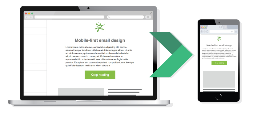
Mobile-friendly email, also known as mobile-first, scalable or mobile-aware, is a method of creating emails that look great on all device sizes. These emails rely on a single-column layout, large fonts and large calls to action (CTAs). This helps ensure the emails are still readable when they scale to the different screen sizes.
These emails are the simplest to create but do have some drawbacks.
+ Simple to design and code
+ Supported across all devices
– Limited design options; primarily single-column layouts
– Not technically optimized for mobile devices
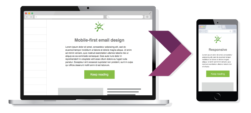
Responsive emails are emails that rely on CSS media queries that change and modify the email based on specific rules you set. These emails will adapt to fit any screen width, which means you can make changes to font sizes, colors or content order. Making these adjustments can help create a better reading experience on mobile.
Historically, one of the biggest drawbacks to a responsive email was that Gmail did not support it, but that all changed in late 2016 as Gmail moved to support media queries.
+ Gives you more control over your email design
+ Supported across many clients, thanks to recent updates in Gmail
– Has a more time-consuming development process
– Not supported on every device
Hybrid email, often called “spongy” email, is a development style that allows us to adjust the email based on the device’s width. The major difference between hybrid and responsive is that hybrid email doesn’t rely on media queries or specific breakpoints to change the email layout. Hybrid emails will work universally across any email client or device.
Hybrid emails use a combination of percentage-based widths, max-widths, and clever workarounds for Outlook clients to ensure this universal support.
If you’re looking to get started with hybrid coding we created a handy hybrid primer, which is the perfect foundation for building bulletproof hybrid emails.
+ Works on all devices and email clients
+ Allows you more control over your email
+ Doesn’t rely on media queries
– Requires more development knowledge
– Can become tricky with complex layouts
Ultimately, this decision will come down to your development resources, your subscribers and their needs. Remember, your emails don’t have to look the same everywhere.
Here at Email on Acid, we use hybrid coding to create the foundation of our emails. We then progressively enhance the design with media queries for the email clients that support them.
Perhaps in the future, we’ll live in an email development world without tables, where we can code freely for different clients. Until then, we like to get our emails working on every client available to us.
At Email on Acid, testing is at the core of our mission. After you’ve finished setting up your email campaign design, make sure the email looks good in every inbox. Every email client renders your HTML differently, and Email on Acid helps you test your email across the most popular clients and devices.
Try us for free for seven days and get access to email, image and spam testing. Make sure your email gets delivered and look good doing it!