Email Development
The Power of Simple Email Design: Will It Work for Your Brand?
Why would Parcel, a platform created for those who code HTML emails, send plain-looking emails to its customers and subscribers? Could there be a reason to send your list a very simple email design?
When the team tested their flashier HTML designs against simple, text-based emails … the simple email design won. (Yeah, our minds were blown too.)
We wanted to know more, so we asked Naomi West, Product Marketing Manager at Parcel, and Emily Ryan, Email Strategist and Co-Founder at Westfield Creative, to talk us through what they’ve learned about experimenting with minimalism at Email Camp, our two-day virtual email marketing strategy, development, and design virtual event.
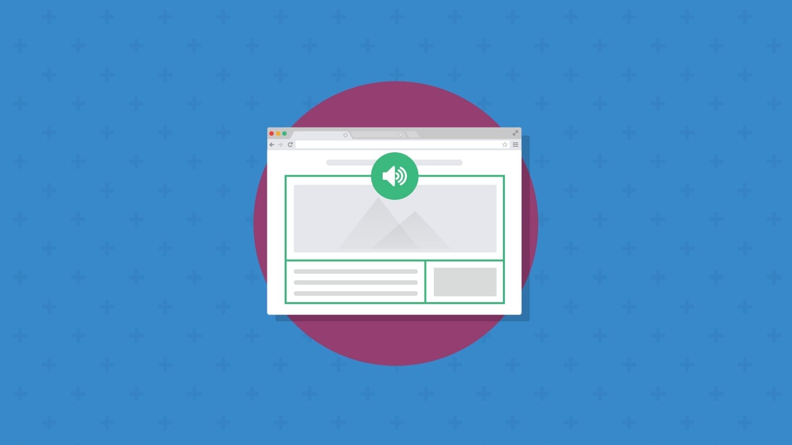
Watch the on-demand presentation below to find out more about what Naomi and Emily why less can be more in email design.

Couldn’t make this year’s epic space-themed version of Email Camp? Don’t worry. We’ve put together a recap of what we learned from Naomi and Emily about how simple email design and text-based emails can work for your brand.
HTML email campaigns vs. plain text emails
Before we jump in, let’s define what plain text emails look like as opposed to more traditional HTML-based email campaigns. As an email marketer, you already know and love well-designed HTML email campaigns – you know, the ones that have bright colors, beautiful imagery, and maybe a little something extra, like animation or interactive elements.

True plain text emails are messages that only include text. That means no HTML code is used whatsoever in the creation of the email. There are no images, graphics, columns, tables, CTA buttons, or hyperlinks with anchor text. In fact, if we get technical about it, formatting text as bold or italics would also exclude it from being a literal plain text email.
What Naomi and Emaily are really talking about are simple, text-based emails with minimal code or graphics. This still technically uses HTML to build the email – for example, coding in hyperlinks or adding a simple CTA button at the bottom – but has the look of an email that you could send from your personal account.
This is sometimes referred to as “simple,” “low-design,” or “minimalist” email design.
Plain text emails, they don’t get a lot of TLC, but they’re so important. We’ve started to see them convert better, and they can be a great approach for anyone with limited resources or who wants to simplify their email.
The benefits of simple email design
We all love beautiful, design-heavy emails. (That’s why you’re reading our blog, right?) And while those emails will always have a place in any marketing strategy, simple email design can be a surprisingly high-performing tactic worth testing in your next email campaign.
Why? Email has always been one of the most personal channels a marketer can access.
Email is perceived as a one to one interaction. You are going into one person’s inbox. You may be emailing 100,000 contacts, but it is a personal interaction with one subscriber that they experience.
Naomi and the team at Parcel ran a five-month variant test for their welcome automation with designed emails next to a text-based approach. What happened took them a bit by surprise.
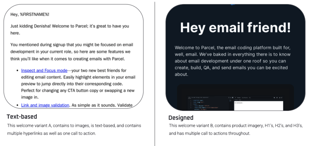
My hypothesis going into the A/B test was that more individuals would be inspired by the design variant, but what we ended up seeing was a higher conversion for the text-based emails. So I said to [our developer] Mark Robbins, thank you for designing this beautiful email, but I will not be proceeding with it. I’m going to go back to the email that takes zero resources to get out the door. A text-based approach ultimately caught people’s eyes and allowed them to reply a lot easier.
As email marketers, it’s important not to let our own biases dictate our design choices. Every audience has different preferences — and since email is designed to be personal and conversational, it makes sense that subscribers would prefer a simpler approach.
Taking an approach like this one also gave the Parcel team a big advantage: Standing out in the inbox. We often talk about designing the most eye-catching email or working with specific psychological colors for conversion (remember when everyone had orange CTAs?) but with so much on the internet these days, it’s actually the simpler email that can stand out.
4 examples of minimalist email design
Minimalism doesn’t have to be boring. Streamlining your design elements gives your copywriting team a chance to really shine. Here are five examples of simple, stripped-down email designs you can take inspiration from for your next campaign:
1. Customer service email – Outdoor Voices
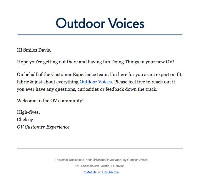
Different emails require a different level of design, and when it comes to customer service emails like this one from Outdoor Voices, taking a super-personal approach pays off. This email is a quick check-in for customers after they make a purchase and sets up a stronger relationship in the future.
2. Welcome email – Zeplin
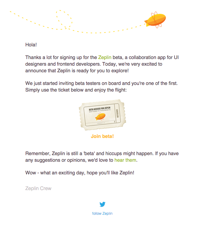
Welcome emails are your opportunity to deliver a great first impression for your subscribers, but they don’t have to be super flashy. This email from Zeplin has a few small design elements, like a whimsical footer and unique CTA button (a golden ticket!) but is otherwise mostly text.
3. Product launch – Robin
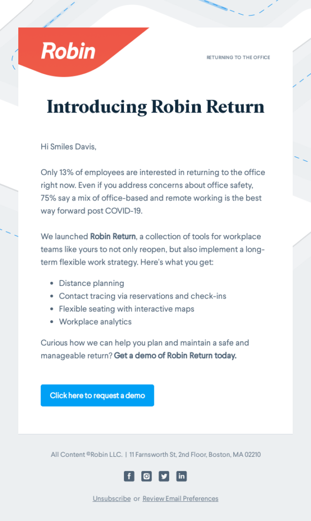
If you’ve got some brand new features to share, why not test out whether you need a fancy new email design or if you want to keep it simple? This is a great tactic if you have a product that isn’t easily visualized, like software or a subscription. This product launch email from B2B brand Robin uses a simple template and focuses mainly on the why behind their new product.
4. Offers and discounts – Everlane
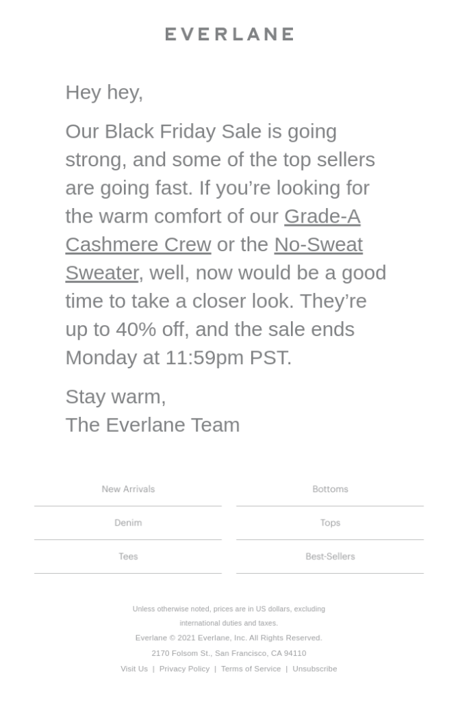
Everlane’s clothing brand is all about simple neutrals, but they usually send out heavily designed emails or ones that feature strong visuals of their retail products. This email, especially for Black Friday, is a great example of standing out in the inbox by paring down. It’s a quick, personalized note featuring a few key items and a reminder that the sale ends soon.
Test every campaign to deliver your brand’s best
Whether you’re looking to dip your toe into more minimalist email designs or want to experiment with a text-based approach, every brand and every email list is different. That’s why A/B testing this kind of thing is so important. You never know how your subscribers will respond.
Obviously, we love HTML, design-heavy emails that are gorgeous and amazing and interactive, but we found that working with our clients and customers that plain text actually works really well as part of your marketing strategy. It’s really interesting when you start testing to see what people are going to respond to.
You can get started by putting one of your highly designed emails up against a plain text version, just like Naomi did.
Don’t forget – there are two kinds of email testing. While A/B testing gives you insights into how your subscribers respond to changes, pre-send email testing is different. It’s quality assurance for email marketers, and it’s needed for both minimalist emails as well as complex designs. Both types of testing help with email marketing optimization, but one takes place before you hit the send button, and the other takes place after you launch.
Sinch Email on Acid gives senders unlimited pre-send email testing with every paid subscription. That means you can test as many versions of your HTML email designs as you need. You’ll feel confident that when you hit send, you’ll be delivering the best version of your email marketing campaign.
Join us for Email Camp in 2024
If you enjoyed the presentation from Emily and Naomi, you’ll love Email Camp – our free, virtual event.
We’re already getting things together for another fun-filled, mind-expanding gathering of email geeks in 2024. Want to be part of it? We want you there. Sign up to get updates about Email Camp 2024. We’ll fill you in on dates, speakers, and more.
In the meantime, check out more on-demand Email Camp 2023 presentations on YouTube.