Email Development
Fluid Retina Images for Email
“Retina” images are actually just ordinary images displayed in such a way that they become more crisp on Apple’s retina displays. For the basics of retina images, check out our blog from last year, Mobile Optimization: Retina Images in Email.
This blog will cover the challenges of coding images that are fluid and retina ready, but won’t break your email’s display in Outlook. If you’re not interested in why it’s challenging, just skip down to the code!
Why do retina images look better?
Apple’s retina displays use four or more physical pixels to create one “display” pixel for CSS and layout purposes. A 300px wide image displayed at 300px will not take advantage of Apple’s retina technology. The 2×2 group of physical pixels that comprise each display pixel will all show the same color, making the image look blurry. But, if a 600px wide image (or more) is shown at 300px, the retina screen will be able to show increased detail for that image. Each of the physical pixels will show a different color. This creates a crisper, more appealing image for users with retina screens.
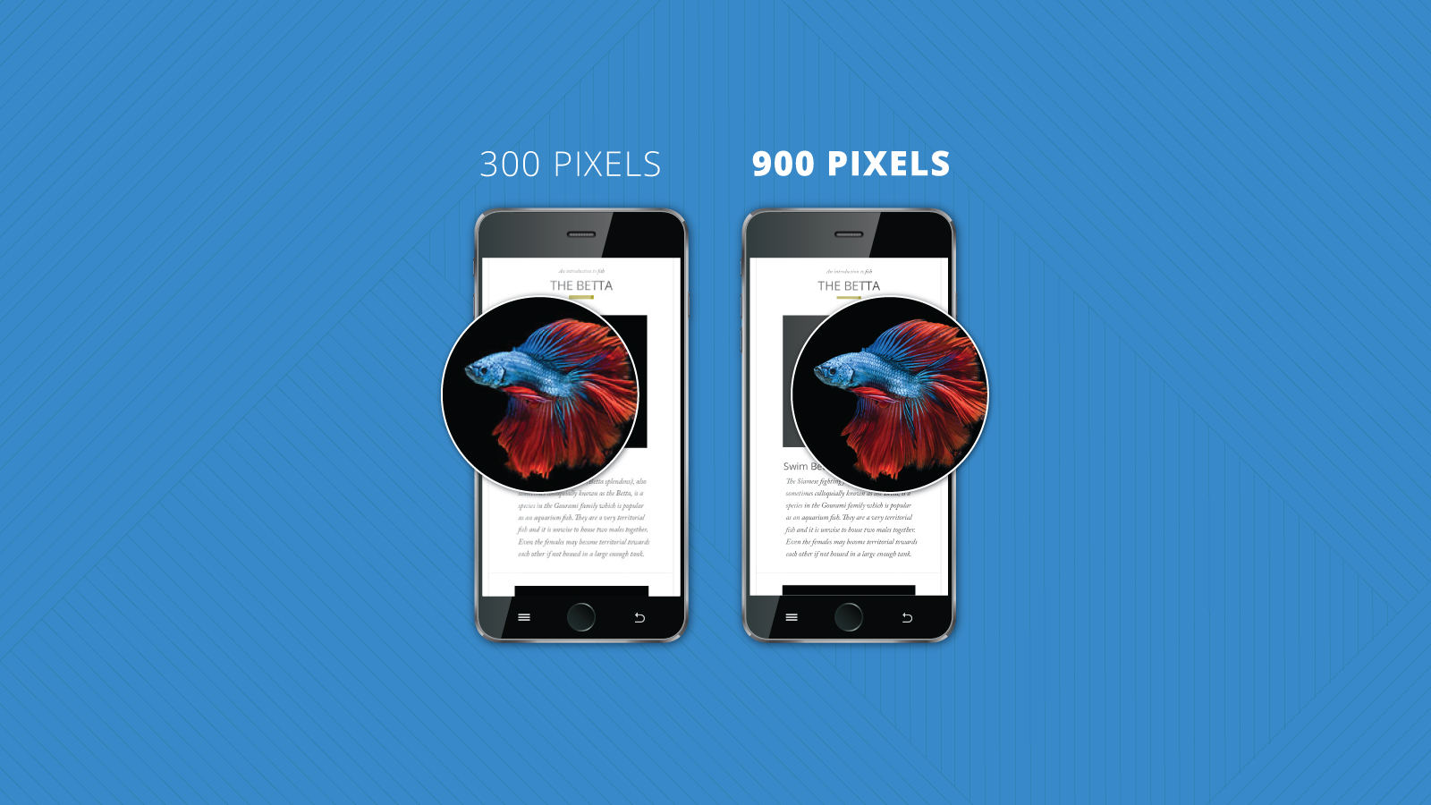
Below, you can see a side by side sample of the difference this can make. This example is from an iPhone 5S, in the native client, running iOS10. One image was saved at 900px wide and the other at 300px wide, but both are displayed at 300px wide.
The image below shows a zoomed in portion of the image (using pinch and zoom on the phone) which makes the crispness of the retina image even more clear.
Fluid design and retina image sizes
When building fluid emails, such as any email using the popular fluid hybrid technique, retina images become more of a challenge. This is partially because the designer may have to choose even larger images to make sure that they are “retina” on all screen sizes. For example, a given email may be designed to slim down to 320px for iPhone 5S (and earlier) but can also fill the given space up to 768px wide for iPad Retina screens. The image would have to be 1536px wide to still be considered “retina” on the iPad. At that size, the image would be nearly five times as wide as the iPhone 5S display!
Email designers and developers will have to decide how large of an image is worth it for them. Large images increase the amount of data required to download the email, and may make the email take longer to load. An image doesn’t need to be exactly double the size it will be displayed at, but to get the most crisp image possible it should be as close to double as possible.
Outlook for desktop and fluid images
Developers will have their own way of coding fluid images, but the technique below is often used.
<img src="RetinaImageURL.jpg" width="100%" style="max-width:600px;" />
This coding technique depends on the image having the same native size as the listed max-width. This is because Outlook for desktop (2007, 2010, 2013, 2016) will only allow images to be resized using the width attribute (not the width style) and doesn’t respect max-width. It also doesn’t care about the size of the container. It will blow out all the tables in your email to show the image at its native size. This is at odds with the retina technique, which requires that we use images larger than their displayed size in the email.
Coding fluid, Outlook-friendly images
It turns out that this is a super easy fix. A big thank you to Charles Hall for pointing out a better route to me! By setting width as an attribute we can appease Outlook, but other clients will respect the CSS width and max-width styles.
<img src="RetinaImageURL.jpg" width="600" style="width:100%;max-width:600px;" />
The “retina_image” class is included only for progressive enhancements. For example, on iPads you may want to override the max-width setting to use even more of their screen size.
Completed code sample
Check out the completed code sample below. You can send this to an iPhone or iPad with a retina display to see the difference this powerful code makes.
                                <!DOCTYPE html PUBLIC "-//W3C//DTD XHTML 1.0 Transitional//EN" "https://www.w3.org/TR/xhtml1/DTD/xhtml1-transitional.dtd">
<html xmlns="https://www.w3.org/1999/xhtml">
<head>
</head>
<body>
 <img src="https://www.emailonacid.com/images/emails/2016/Fish_900.jpg" width="300" style="width:100%;max-width:300px;" />

 <!-- The image below is shown only for comparison purposes. It's the same as the image above, but saved at a width of 300px. -->
 <img src="https://www.emailonacid.com/images/emails/2016/Fish_300.jpg" width="300" />
</body>
</html>
What challenges does fluid coding present for you?
Coding fluid emails can be difficult when trying to implement certain techniques. If there are any conundrums that fluid coding has offered you, let us know in the comments below! We’d love to try and find a fix.
For all of your email coding needs, Email on Acid is here for you. We offer everything from email testing to email analytics, as well as a whole bunch of handy resources like coding tips and free templates. Sign up today and take your email game to the next level!


