Email Development
How to Use CSS Animations in HTML Email Design

Your team wants the next email campaign you code to stand out from the crowd, and they’ve asked you for an upgrade on simple static images. Now it’s your move on how to implement animated emails. After all, you can choose from so many different options, like animated GIFs or CSS animations. We’ve talked about using GIF animations in email marketing campaigns elsewhere, so we’ll focus on CSS animations in this article.
Let’s start from the basics, like pros and cons, support, and some CSS animation examples in emails. Then we’ll wrap up with some code tutorials.
What are CSS animations?
You can use CSS animations to create various animations – from spinning icons to subtle hover animations on a Call to Action (CTA) button. But what exactly are CSS animations?
CSS animations refer to the animation property of Cascading Style Sheets (CSS). This animation property allows us to animate individual HTML elements like img, span, and div by using only the CSS and HTML that’s already part of an HTML email template. In other words, CSS animations eliminate the need to use an external scripting language such as JavaScript or Flash, which are not supported in email. For email developers, that means we can use it as an enhancement for email clients that support CSS.
CSS animations also eliminate the need to generate animated GIFs. If you’re not sure why this is important, read on! We’ll dive into that in the section below.
What’s the difference between CSS animations and animated GIFs?
While cool animated GIFs have long been a cornerstone of email design, CSS animations can step up and fill in the gaps where GIFs lag behind. Let’s look at a comparison between the two types of animation:
| Animated GIFs | CSS Animations |
| Easy to create through sites like Giphy | Require more knowledge to create and troubleshoot |
| Slow loading speed | Lightweight and loads fast |
| Good support across major email clients | Limited client support |
| Tend to lag and lack the smooth look of CSS animations as the images go frame by frame | Look very good on high-quality mobile devices |
| Image-based | Code-based |
As you can see, both GIFs and CSS animations have their pros and cons. This guide focuses on CSS animations, but you can check out this article to learn more about using GIFs in emails. Below, we’ll unpack some of the pros and cons about CSS animations listed above and show you how to harness their power.
What are some pros of using CSS animations in emails?
We briefly compared CSS animations and GIFs above, but let’s dive into the benefits in more detail:
CSS animations are great for emails because they:
- Load fast
- Grab your subscriber’s attention
- Allow you to inject some creativity into your email
Let’s unpack each of these below.
Why do CSS animations load faster than GIFs?
CSS animations are relatively lightweight and small in terms of file size compared to GIFs. That means that CSS animations will load faster than GIFs.
As any email marketer will tell you, subscribers don’t have a long attention span. Speed is of the essence. Your subscriber might get tired of waiting for a GIF that loads slowly and gets stuck on the first frame. In fact, they might even close out of your email before they’ve even seen your well-crafted animation. But fast-loading, lightweight CSS animations can quickly grab your subscriber’s attention. Don’t miss out on conversions due to a slow load time!
How do CSS animations grab a subscriber’s attention?
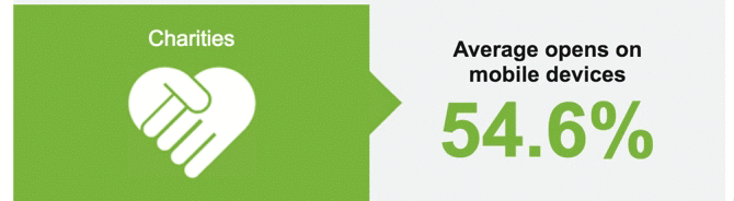
Our eyes are drawn to movement, and animation in emails is no exception to this evolutionary rule. Check out the following CSS animation from display block, a creative email agency, and tell us it doesn’t grab your attention right away:
How do CSS animations allow email designers to spice up emails?
You might not be an email designer, but it’s good to remember why CSS animations matter to other members on your team. For instance, CSS animations are a great way to spice up a boring email and inject the look and feel of your brand at a glance.
Check out the CSS animation example from above. Not only does the bouncing heart quickly grab your attention, but it also adds a creative touch. Doesn’t it almost look like a handshake?
What are some drawbacks of using CSS animations?
While there are many benefits to using CSS animations, they’re not the perfect tool for every email situation. Some considerations and potential drawbacks to using CSS animations include:
- Repeating animations
- Delaying animations
- Scroll-based/scroll-triggered animation
- Not visible to every subscriber
What do these mean? Let’s dig into each consideration below.
Can CSS animations support repeating animations?
One major drawback of CSS animations is the lack of email support for the animation-iteration-count property. This property enables us to control the number of times an animation repeats. That means we can either have an animation repeat once or infinitely. It’s a pretty heavy drawback, but there are still lots of amazing animations you can do in emails with continuous looping.
In addition, check out how pseudo-classes can help you restart CSS animations.
Can CSS animations do delayed animations?
Another drawback is the lack of support for the animation-delay property. This is the CSS snippet that allows us to delay how long before an animation triggers and starts. That means all our animations will start as soon as the email loads.
Can CSS animations do scroll-based or scroll-triggered animation?
Unfortunately, CSS animations can’t do scroll-based or scroll-triggered animations. These techniques use jQuery (a sub-branch of JavaScript) to handle scroll-based triggers to call in the CSS animations. It’s a beautiful technique, but we all know the pitfalls of trying to get JavaScript to work in an email!
How much time do you have to create your email campaign?
Time is a very important factor when making changes to your email campaigns. For instance:
- Will the animation be complex and take many hours to create? If so, consider the use of animated GIFs.
- Will the animation take a lot of time to test across different platforms?
At Sinch Email on Acid, we’ve got your cross-platform testing needs covered. So if you’re concerned about the latter, check out our Campaign Precheck tool.
You can also mitigate time issues by creating an animation “framework.” Every time you create a cool new CSS animation, consider saving the animation code by itself. That way, you can build a reusable library of animations you can pull into your email campaigns. This is an example of modular design, which can really speed up email development.
What email clients support CSS animations?
Perhaps the most important consideration is your subscriber base. CSS animation functionalities are supported across a mix of different email clients. However, if you’re dealing primarily with a B2B subscriber base, you’ll definitely want to know your subscriber’s device. If only 10% of your list opens on a device or email client that supports CSS animations, you may want to use an email GIF instead. After all, our goal is to optimize the user experience, and more email clients may support GIFs than CSS animations.
Check out the following table to see if an email client supports CSS animations.
| Email client | Supported? |
| Apple Mail | Yes |
| Gmail | No |
| Microsoft Outlook (except macOS) | No |
| Microsoft Outlook (macOS 2011, 2016) | Yes |
| Yahoo! Mail | No |
| AOL | No |
| Samsung Email | Yes |
| Mozilla Thunderbird | Yes |
For other email clients, check out the full list from Can I Email.
How can I use CSS animations in emails?
Now that we’ve gone through some CSS animation basics, let’s look at two examples of how to use CSS animations to enhance email campaigns.
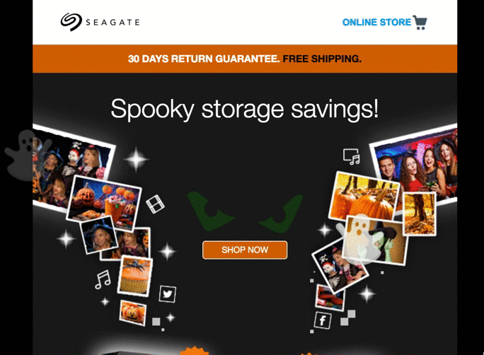
Seagate’s Halloween email
Check out the following Halloween email from Seagate. Notice how the creative agency behind this email used CSS animations to create the effect of ghosts flying down the email. Talk about spooky.
display block
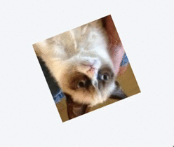
Creative email agency display block used a few different CSS animation styles to include a bit of motion in the example below.
By moving a background layer behind an image, they create the effect of a scrolling iPhone:
What are some CSS animation techniques?
As email developers, we’re used to having limited support for web techniques in email, and, unfortunately, CSS animations are no exception. Check out the following code snippets for a few ways to add CSS animation to emails with at least moderate support.
If you need a refresher, take a look at our CSS basics tutorial.
Rotate
rotate is one of the most common CSS animation techniques around. A simple rotate can add a lot to your email technique.
Here’s what we’re going to achieve:
The following code handles the animation above:
                                @-moz-keyframes spin { 100% { -moz-transform: rotate(360deg); } }
@-webkit-keyframes spin { 100% { -webkit-transform: rotate(360deg); } }
@keyframes spin { 100% { -webkit-transform: rotate(360deg); transform:rotate(360deg); } }
Let’s look at what’s going on here. We’ll start with the following:
transform:rotate(360deg);
This snippet controls the animation. It’s pretty simple, but we’re simply telling the browser to “transform” the CSS element. The transform we’re calling in is the rotate transformation, and we’re going to rotate it 360 degrees.
Then, the rest of the code simply covers different browsers and email clients. As you can see, we’re targeting Mozilla clients, WebKit clients and non Webkit clients alike.
Now that we’ve set up the CSS animation, we can simply declare it for the element(s) we wish to animate. Create a class and call the animation we created (named “spin”) with the following code:
                                .spin {
-webkit-animation:spin 4s linear infinite;
-moz-animation:spin 4s linear infinite;
animation:spin 4s linear infinite;
}
We’ve called the animation for Mozilla, WebKit, and non-WebKit clients. All we’re doing here is telling the browser that for any element with the class spin applied to it, we want to call our animation and have it spin for four seconds for an infinite loop.
Fading
In this tutorial, we’ll use the same principles as above to create a fading animation. This is what we’re going for:
We’ll target the three main different browser types to ensure our code appears in every possible client it can.
                                @-webkit-keyframes fade {
0%   { opacity: 0; }
50% { opacity: 1; }
100% { opacity: 0;}
}

@-moz-keyframes fade {
0%   { opacity: 0; }
50% { opacity: 1; }
100% { opacity: 0;}
}

@keyframes fade {
0%   { opacity: 0; }
50%  { opacity: 1; }
100% { opacity: 0;}
}
The big difference here is that we’ve thrown in some extra keyframes. All this means is that at 0% of the animation cycle, the opacity is set to “0,” meaning it’s fully transparent. Then, at 50% (or halfway through the animation), the opacity will be “1,” or fully opaque. Then, at 100% of the animation cycle, the animation is set to “0” opacity again.
Using this keyframe method, we can control exactly what we want our animation to do and when. By having it start and end on 0 opacity, we create a nice fading loop.
We call our animation exactly the same way as we did for the rotation:
                                .fade {
-webkit-animation:fade 3s linear infinite;
-moz-animation:fade 3s linear infinite;
animation:fade 3s linear infinite;
}
Simulated “Loading Bar”
Ever wanted to make a loading bar? Let’s learn how by using a sequence of changing background colors to mimic the effect of a loading bar, like so:

As this code is a bit longer and a bit more complicated, we’ve put it onto Codepen so as to not fill the page. We’ll reference the code to dig into it below, but check out the full working code here.
Basically, what we’re doing here is creating five different animations. Each has five stages of animation:
- 0%
- 25%
- 50%
- 75%
- 100%
We color each box black to create this effect at a different stage of the animation. For example, the first box has this:
                                0% { background: #000000}
25% { background: #ffffff }
50% { background: #ffffff }
75% { background: #ffffff }
100% { background: #ffffff }
For the first 25% of the animation cycle, we’re saying we want the box to have a black background color.
On the third box, we have the same sort of thing, but the cycle changes the box to black at the third 25% of the animation:
                                0% { background: #ffffff}
25% { background: #ffffff }
50% { background: #000000 }
75% { background: #ffffff }
100% { background: #ffffff }
If you look at the full code, you’ll also notice we still make sure to target the three browser types – hence why the code is so long!
Background animations
A really powerful feature we have access to is the ability to animate backgrounds. This is one of our favorite ways to add subtle animations to give your emails an edge without worrying about fallbacks. When it doesn’t animate, it just looks like a regular background.
This is the effect we’ll be creating:

Check out the working code sample before you get started.
So how do we create this amazing effect? Again, it’s all about getting your head around what’s supported and how to use keyframe animations.
In the code, we tell the background image to scroll to a pixel value that’s either in a positive or negative direction from the starting point of the background:
                                @keyframes animatedBackground {
0% { background-position: 650px 0; }
100% { background-position: 0 0; }
}

@-moz-keyframes animatedBackground {
0% { background-position: 650px 0; }
100% { background-position: 0 0; }
}

@-webkit-keyframes animatedBackground {
0% { background-position: 650px 0; }
100% { background-position: 0 0; }
}
We can modify this further by adding images/text on top of the scrolling background to create clever animations like the creative company display block did above.
How can I be sure my CSS animations will work?
As we mentioned before, CSS animations have limited support across email clients. While it’s possible to create fallbacks, how can you be sure your email will look as you intended?
At Email on Acid, we like to say, “Don’t guess, test!” Let us help you send your best email using our Campaign Precheck tool. This feature can help you:
- Preview your email on major clients
- Validate your links
- Check your spelling
- Collaborate via Team Management tools to make the review and QA process organized, streamlined, and efficient
Why leave the success of your CSS animations up to chance when you can see how your email will appear to your subscribers across major email clients?
That’s a wrap
CSS animations and animated GIFs are great ways to enhance your emails. Help your email marketers and designers create emails that stand out from the competition.
Ready to get started? Take Email on Acid for a free trial spin for seven days, and let us help you get sending now.
This article was updated on July 7, 2022. It first published in June of 2016.


