Email Marketing
How to Choose the Right Colors for Effective Email Marketing

Android green. McDonald’s golden arches on red. Facebook blue. Colors are a core component of brand recognition. What are yours?
You probably stick to a brand color palette to keep your messages consistent. And, if it’s a special email – like a holiday send – maybe you’ll switch it up from the norm. Although it may be routine for many of your emails, color is an essential part of your email template design and development process. For instance, how many colors should you use? What color should you make your call to action (CTA) button? What about links? What does purple mean?
Let’s dive into the essentials of color psychology, some examples of the right colors for effective email campaigns, and how to use contrasting colors to improve accessibility.
What is color psychology?
You probably already know the basics of color psychology, like blue, which is calming, and red means danger. But how does this affect your email marketing campaign?
Color psychology is the ace up your sleeve to add nuance to your messaging and appeal to your target audience’s emotions. In short, color psychology is the study of how our perception changes because of different colors. Colors have a significant impact on our feelings. If you can affect your subscriber’s emotions through color, you can also affect their behavior.
For instance, color can attract specific types of shoppers, as shown below. Keep your target audience in mind while selecting colors for your email campaigns.

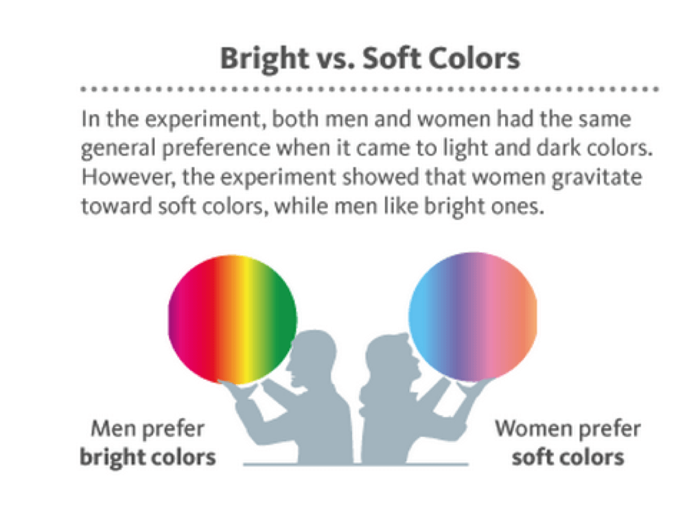
In addition, color psychology can be gender-specific. Specific colors are favored more by men than women, as shown below. While these insights can be helpful, be careful not to jump to conclusions. The colors used in email campaigns are the perfect thing to A/B test in order to find out what really works with your subscribers. Every list is different.
With that said, how do you choose the right colors? Let’s start by learning what different colors mean and then look at some examples for using color in specific types of emails.
What do colors mean?
Colors are highly subjective, but they’re also powerful tools in enhancing your email campaigns. Now that we know why colors matter, here’s a list of colors with their HTML color codes and a short explanation of what they mean:
- White (#ffffff): Let’s start with the basics. White usually has a positive meaning, like purity and innocence. It’s also a nice blank slate for the rest of your colorful content. But overusing white as the primary color can also be boring or look unimaginative or unengaging. If you use a white background, make the rest of your email pop with tasteful color combinations.
- Black (#000000): Black is a powerful color that doesn’t have to be negative. Instead, it can be mysterious, chic, and futuristic. Use black to convey a sense of elegance and luxury. But, don’t use too much black. Overwhelming black can bring down the tone of your email.
- Red (#ff0000): Opinions are split about red. It can be tacky and too bold. Or, used in small doses, red is a great way to add a little contrast and highlight your CTA button. Remember not to use too much red because this can make your email look spammy to your subscribers and thus impact your email’s deliverability. Of course, an exception to this rule is if red is an important part of your brand’s visual identity, like Target or Coca-Cola.
- Yellow (#ffb800): Yellow (and orange) evoke happiness and hopefulness. Use calming shades of yellow in small doses to convey sunny, cheerful messages to your subscribers. Be careful not to use certain louder shades of yellow, as these can be attention-grabbing but seem like warnings instead of invitations for engagement.
- Purple (#77629d): Purple is luxury. It was the color of emperors and kings in the Middle Ages, and even now, that connotation hasn’t faded. Brighter purples also convey creativity, wisdom, and fun. Avoid dark purple since that can be seen as depressive and lowers the mood of your message.
In general, bright, energetic colors grab your reader’s attention, while neutral and dark colors help them relax. Below, let’s look at how to pick the right color for certain types of messages.
What are the right colors for effective email campaigns?
The most important part of determining the color palette for your email templates is making sure the colors are consistent with your brand. Maintaining brand integrity is your first priority. After that, we can start to think about how to use colors to sway the moods and preferences of our target audience.
Let’s look at three examples of specific types of emails and the right colors to fit our messaging.
1. How do I use red to raise urgency and click-throughs?
Check out this email campaign from MAC. With a subtle white background and simple black text, they’ve used bright red to make their message pop. They use the same red below in their CTA button to inspire a sense of urgency and appeal to their subscribers to click through to their web page.
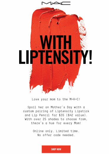
Takeaways: Use red sparingly to boldly appeal to your subscriber’s impulsivity.
2. How do I use yellow to energize my message?
Bright yellows add a sense of energy and sunniness appropriate for Calzedonia’s summery message.
This email pairs bright colors with a neutral palette to tone down the email. Too much bright yellow by itself might create a sense of anxiety instead of a feeling of a light and cheery vibe.
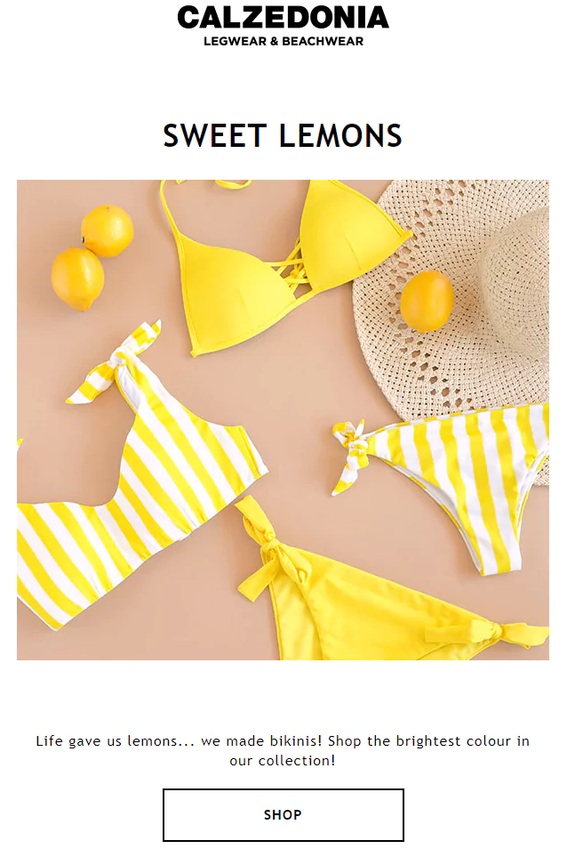
Takeaways: Use bright yellows to make your messages pop with energy. Remember to pair the yellows with something more neutral to keep your messages from edging into anxious territory.
3. How do I use black to convey prestige in my emails?
This powerful example from Chanel screams elegance and prestige with its dark palette. Notice how the email designer used white to make the Chanel name and messaging stand out while using darker tones to create a sense of mystery.

Takeaways: Use black to add a sense of luxury and je ne sais quoi to your email marketing. Use contrasting colors to highlight your messaging.
How can I use color to improve accessibility?
Besides using color to spice up your email campaign and stay on-brand, you can improve email accessibility by choosing the right contrasting colors.
Worldwide, the World Health Organization estimates that 1.3 billion people live with some form of vision impairment. Roughly 217 million of those have moderate to severe vision impairment. How many of those people are interacting with your emails?
Below, we’ll learn how to improve your email marketing accessibility by using the proper contrast ratios and some best practices for using certain colors associated with vision deficiency.
What is contrast ratio?
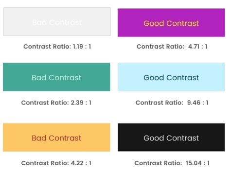
Contrast ratio is the variation between the background colors and foreground colors. In an email, the foreground color is often the color of the text you’re working with, but it can also apply to graphics, diagrams, or logos.
The Web Content Accessibility Guidelines (WCAG) 2.0 set standards for web accessibility, including contrast ratio minimums. WCAG has a calculator that assigns a number between 1 and 21 that indicates how much contrast your background and foreground colors have. A 1:1 ratio is very little contrast (white text on a white background), while a 21:1 ratio is high contrast (black text on white background).
Colors with a lower contrast ratio can be difficult for certain subscribers to read; people with vision impairments may have trouble discerning text that is too close to the background color.
Check out the diagram below for examples of good and bad contrast examples. Try squinting your eyes a bit and see how difficult it is to read the bad contrast examples:
What are the WCAG color contrast guidelines?
WCAG’s Level AA standards specify that your email colors should have a contrast of at least 4.5:1 for standard-sized text. For text larger than 23px or bold text larger than 18px, the contrast ratio can be 3:1.
If your team needs to meet level AAA guidelines, you must use a contrast ratio of at least 7:1 for normal text and 4.5:1 for large text.
What are some best practices for using colors in an accessible way?
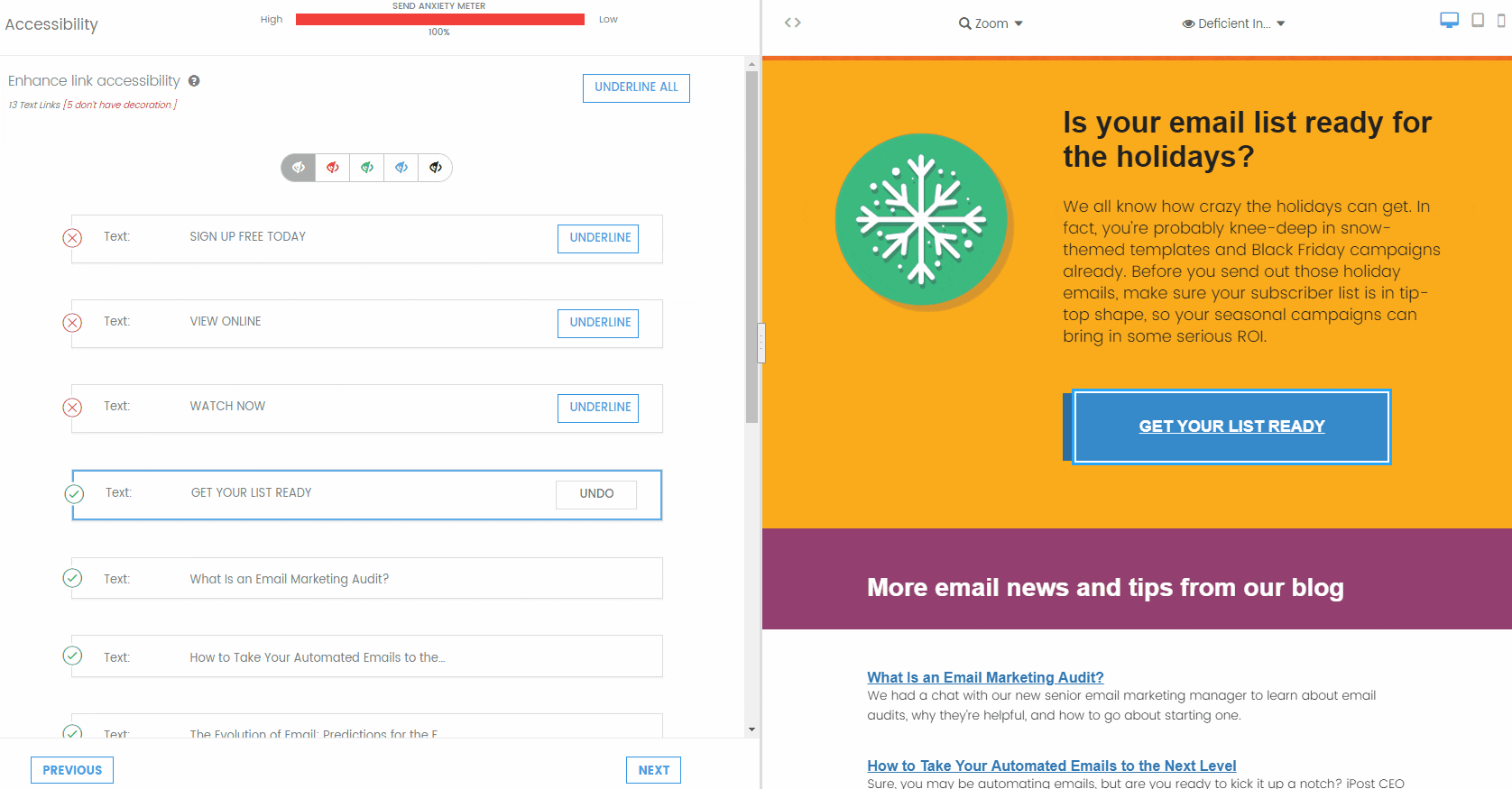
If a subscriber cannot see blue, will they be able to figure out where the links are in your email?
People with certain color vision deficiencies can find it difficult to tell what text is clickable if it does not have a different typeface or an underline. And if your subscribers can’t see a link, they can’t click and engage with your email. This principle applies to all text in your email. If you’re using color to differentiate some text from others, remember that not every subscriber may be able to see those colors.
When designing and developing your email, remember that color shouldn’t be the only defining characteristic for a link. Use underlines, bold typeface, symbols (>), or buttons to indicate clickable text.

Color choices and dark mode emails
Imagine that you’ve coded a beautiful email with brand colors only to find the email client completely reversed your color choices to show the opposite hue.
That’s what can happen when emails are opened in dark mode with certain mailbox providers. They will invert colors. This doesn’t happen with graphics so much as with the hex colors coded into the background and fonts of your email.
However, if you designed an email for a white background, will your images and graphics still look good on a dark background? Will your text still be readable?
With dark mode usage on the rise, these are important questions to ask. Find out more about dark mode emails and how to address common dark mode development challenges.
What are some best practices for using color in emails?
We’ll leave you with a few simple tips for using color in your emails:
- Don’t use too many colors: Usually, three to four colors are enough. Too many colors make your email too busy, which might make your subscriber lose sight of your message.
- Use contrasting colors: Remember to use contrasting colors to improve email accessibility for low-vision readers. But, don’t use too many contrast colors. Pick one main color for your CTA and links to stand out.
- Develop a brand color palette: Not only does this improve brand recognition, but it also saves you the trouble of having to develop a new color scheme for each new campaign.
- Pick colors for specific purposes: Use bright, energetic colors to grab your reader’s attention and trigger a response. Use neutral and dark colors to relax.
- Test, test, test: Here at Email On Acid, we always recommend you test everything. For colors, it’s essential to test for deliverability, accessibility, and for whether your colors are the right colors. In addition to checking out email previews for color problems, we also recommend A/B testing your color scheme to make sure it packs the right punch.
Remember, everything depends on your target audience. Build your visual brand identity with your target audience in mind, and develop your color scheme to reflect your subscriber base and intended messaging.
Wrapping up
If you’re curious about how your email design measures up to accessibility standards and subscriber preferences, run it through Campaign Precheck. This tool includes a step for email accessibility that checks the contrast ratio and flags anything below the level AA standard. If anything doesn’t meet the standard, Campaign Precheck will adjust the email code, so the colors meet the minimum requirements.
Try us free for seven days and get unlimited access to email, image, and spam testing to ensure you get delivered and look good doing it!
This article was updated on April 4, 2022. It was first published in December of 2018.