Email Marketing
Preview vs. Preheader Text: How Long Should Preheader Text Be?

Effective preheader text offers value and creates interest, leading subscribers to open your email.
Consider when you go to the movie theater to catch a flick, one of the best parts is watching the previews (or at least we think it is). Previews let you know what’s coming, which films to look forward to and the ones to skip. In an email, preheader text functions the same way.
While preview text and preheader text are often used as synonyms, they are not the same thing. Preview text is part of the inbox display (the email envelope) and preheader text is the copy applied in the email code above the email header.
Whether preheader text is set to be visible or hidden, preview text will always populate in email clients that support it. If you don’t include preheader text, the preview text in the inbox can pull in random pieces of the email.
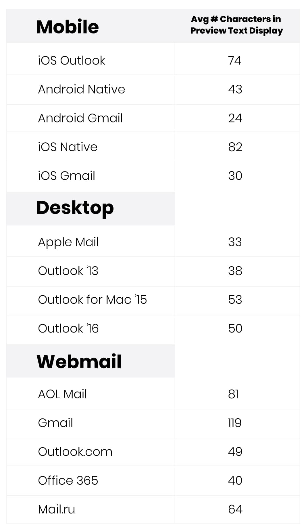
Use this chart as a frame of reference as you craft preheader text and play with length:
If you think of your email like a movie, the subject line is the main character and preheader text is the supportive best friend. They work together to make something spectacular. Where the subject line is meant to grab your subscriber’s attention, the preview text is an opportunity to personalize the email, showcase a promotion, build your brand, preview the email’s contents and generate interest so your subscribers are motivated to open it.
Preheader text is your BIG opportunity to convince subscribers to open your email, so getting it right is important.
So, What Makes Good Preheader Text?
Some preheader text is more useful and more engaging than other kinds.
Have you ever felt motivated to open an email that said, “Having trouble viewing this email? Click here to view it in a web browser” next to the subject line? We didn’t think so.
Other examples of ineffective preheader text include repeating the subject line or filling that space with your website or phone number. Too often, the preheader isn’t utilized or doesn’t offer any real value to the subscriber, which is a huge missed opportunity and a potential loss of revenue (ouch).
Provide a clue of what’s inside
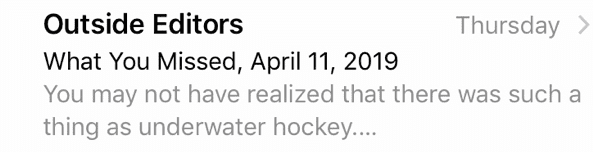
In this example from Aspiration, they pulled in copy from the first line of the email. The personalization is a nice touch, but this subject line and preview text do very little to explain why they are even sending an email in the first place and doesn’t give subscribers any reason to open it. There might be an explanation in there, but the preheader text gets cut off, so we never get to see it.
Optimize across devices
Similarly, this email from REI lets their subscribers know that it’s the final day of something – but final day of what? They could have used their preheader text to explain the promotion, but instead the email client is pulling in text from their email footer in this mobile client.

REI’s email displays much better in a webmail client. The promotion is clearly displayed in the preheader text, they just didn’t optimize for mobile—but perhaps they know more about their desktop users vs. mobile users than we do (more on that later).

One strategy you can try is to include the first sentence or so of the email’s copy—but only if the copy is compelling. Or try adding a supporting line, copy that adds value to whatever the subject line is and provides more context, asks a question or raises a sense of mystery. When it comes to preheader text, your only limit is your imagination.
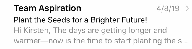
Motivate subscribers to open the email
Here, Outside Magazine offers a tantalizing tidbit in their preheader text. Working together with the subject line, this Inbox Display baits the reader with enticing information. Plus, the amount of copy is optimized for mobile. Nothing is cut off and the client isn’t pulling in text from random parts of the email.
Either way, you probably want to read about underwater hockey now, don’t you?
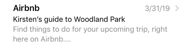
Personalization
Personalization, like in this example from AirBnB, is a great way to connect with subscribers. The content is relevant and the preview text tells the reader what to expect from the email. The important information is all there.
It displays perfectly on the webmail client as well:

Think Mobile First
There’s been much debate about how long preheader text should be. First, always assess where your subscribers are reading your emails. While up to 77% of email opens occur on a mobile device, that doesn’t mean your subscribers read your emails that way.
With desktop and webmail clients, you can get away with longer preheader text (around 50-100 characters). However, for those that read your emails on mobile, many devices display an average of only 35-50 characters, so it’s better to keep it short and sweet.
On the flip side, if your preheader text is too short, random text, such as “view in your browser” or “download images,” may populate, diluting your message and distracting the reader.
In the examples above, Outside Magazine’s preheader text contains 64 characters and AirBnB’s has 49. Perfect.
Speaking of Mobile, Hey Siri!
Because mobile clients render differently, the key is to keep the most compelling copy in your preheader text at the beginning so it’s visible to each subscriber, regardless of device or client. This is low-hanging fruit for increased email open rates and the ROI that follows.
Next, consider that screen readers read people their inbox displays. Siri, for instance, reads the first 499 characters of your email out loud, whether text is hidden or not. Make sure to craft your preheader text with Siri in mind.
How to Add Preheader Text
Don’t have preheader text currently? You can add either visible or hidden preheader text to your email code, or you can add it during the Inbox Display step of Campaign Precheck. This tool will allow you to see how your preheader text renders on 15 of the most popular email clients and devices.
Plus, you can tweak and optimize the copy right on the platform (we’ll even fix the code for you) to make that preview text look perfect in your subscriber’s inbox and motivate that open. You can also preview your preheader text on mobile, tablet and desktop devices, giving you the opportunity to truly optimize your emails for all subscribers.