Email Marketing
How to Increase Your Click Rate in Email Marketing

When you plan out your latest email marketing campaign, you likely have a goal in mind. You may want to drive traffic to your latest blog post, see more registrations for an upcoming event, or simply push for a purchase.
No matter what your overarching goal is, your click rate in email marketing gets you there.
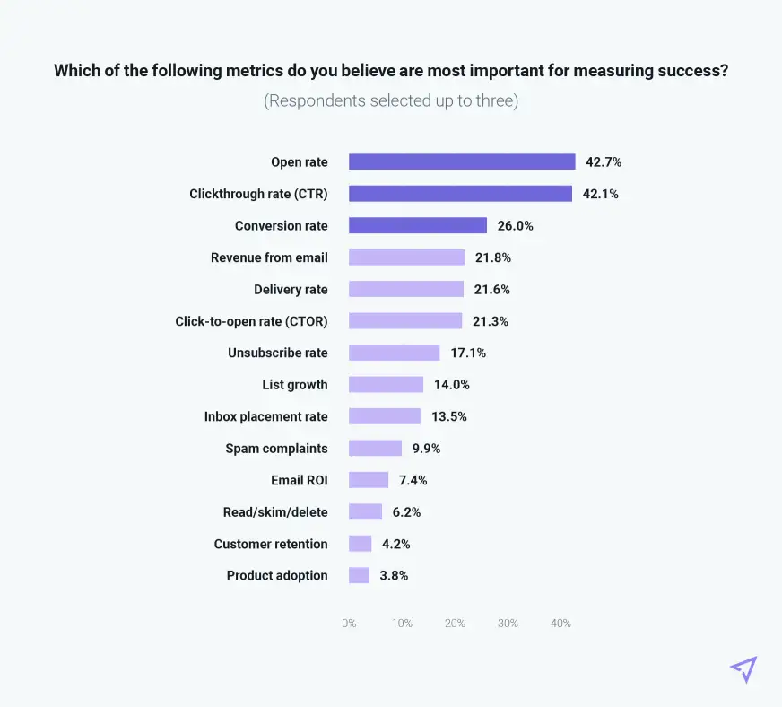
When asked to pick the three most important metrics for defining email success in a recent Mailjet survey, click-through rate (CTR) came in practically tied with opens as the most important at 42%. Other metrics that rely on clicks came close behind, such as conversion rate (26%) and revenue from email (22%).
The more clicks you receive on your emails, the more successful your email marketing will be. But that’s easier said than done. Here’s what you need to know about increasing your click rate:
What is the email click rate?
Email click rate is the percentage of clicks on a button, link, or image within an email out of the total number of delivered emails.
Click rate = Total links clicked / (Emails sent – Bounces)
This measures the total number of links clicked, so if one subscriber clicks multiple times on your CTA button (or clicks multiple links within an email), they’re all counted toward your click rate.
We’ll illustrate this with an example. Let’s say you send an email to 1,200 subscribers. Of those 1,200 subscribers, 200 of those emails bounce or don’t reach the inbox. That leaves 1,000 successfully delivered emails. Then, if you receive 100 clicks on that email, your click rate is 10%. (Note that this doesn’t count any clicks to your unsubscribe button, thankfully.)
This is not to be confused with the very similar click-through rate, or CTR. While click rate and click-through rate are often used interchangeably, click-through rate is the percentage of subscribers who click on a button, link, or image within an email out of the total number of emails delivered. This is a more common metric when it comes to engagement because it tracks clicks on a subscriber-by-subscriber basis, rather than all of the clicks your emails receive.
Click-through rate = Unique links clicked / (Emails sent – Bounces)
Let’s take the same example to show this. Remember, you’ve sent 1,000 successfully delivered emails. In this case, if 100 subscribers click on your CTA button, you have a click-through rate of 10%.
Just to make it even more confusing, there’s click-to-open rate (CTOR), which compares the number of unique clicks to the number of unique opens your email campaign receives. This is increasingly becoming more popular as a unit of measurement because it compares the two most important campaign metrics (opens and clicks) against one another.
Click-to-open rate (CTOR) = Links clicked / Email opens
Again with that same example, let’s say your open rate is 22%. Out of your 1,000 delivered emails, you’ll receive 220 opens. Then, if 22 people click on that email, you have a click-to-open rate of 10%.
What is a good click-through rate for email?
When it comes to CTR, brace yourself: The average rate is around 2-3%, depending on who you ask, and it varies by industry.
Is 2% that “good”? That really depends on you. It’s best to benchmark against your own emails and your own audience, because every industry and every email list is slightly different.
However, there are a few strategies to experiment with if you’d like to increase your click rate:
4 ways to get more clicks from marketing emails (+ 4 mistakes to avoid that reduce your click rate)
The trick to getting more clicks in your emails? Sending better emails.
I know, I know. You were hoping for magic fairy dust or some super-cool hack. But the truth is, you can’t hack your way to more clicks because it’s the best measure of how engaging your emails actually are. The best way to increase your click rate is to send targeted, relevant emails that your subscribers want to engage with. It’s as easy and as hard as that.
There are, however, a few ways you can better optimize your emails so you can make them more engaging—and a few mistakes worth avoiding:
Do: Create targeted campaigns
The first step toward more engaging emails is to make them as relevant and targeted as possible. The more you know your audience and serve up what they’re interested in, the more likely they’ll respond.
This means experimenting with different segments within your overall email list. For example, try separating email campaigns with different messages to subscribers who:
- Have purchased from you
- Have browsed in a particular area of your site, such as a certain product line or product type
- Are located in a certain geography
- Often read your blog
- Are new to your list
- Have never clicked on an email
Consider personalizing your email copy, imagery, or CTAs with names or other information you’ve learned about your subscriber.
Don’t: Forget to check in with your subscribers
As you start to experiment with segmentation and personalization, remember that there’s nothing wrong with asking subscribers what they want to see from you. Personalization isn’t just about using “first name” in the body of your email. It’s also about sending the right number of emails at the right time, with the right information.
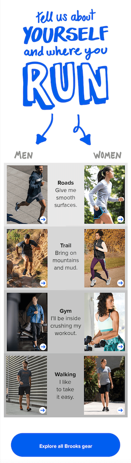
This example from Brooks running is a great way to approach it. They offer tons of different running products for men and women—some of which are suited to specific types of running, like trail running or city miles. This is a great way to gather information to tailor future campaigns toward different segments and make it that much more relevant.
Do: Use creative calls-to-action (CTAs)
It’s time to leave “click here” and “learn more” behind. If you’re looking to increase your click rate and you’re already segmenting your audience, it’s time to try some more creative copy.
Think about what your call-to-action is really asking. Is it to sign up for an event? Download a report? Make a purchase? Pulling in language or concepts from a link’s final destination can be a great place to start. You want to answer the question, “What’s in it for me?”
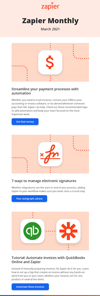
This email newsletter from Zapier uses some playful puns in CTAs. Their brand voice is casual and humorous, so it makes sense to loosen up a little, even for a product update. Experiment with different copy styles and see what resonates with your audience.
Similarly, experiment with placement. Does including a CTA button above the fold (where your subscriber first has to scroll) improve your click-through rate? What if it’s a hyperlink instead? Certain emails lend themselves to different placement styles. For example, a transactional email needs to have the key information front-and-center, while a newsletter email might have links placed throughout the email.
Don’t: Use too many CTAs
Count the number of links you sent in your last email campaign. If it’s more than one link besides the footer, ask yourself why.
When you send too many links in a single email, you open up too many choices for your subscribers. It’s a psychological concept called the paradox of choice. With too many options, we often become overwhelmed and choose nothing. Instead, pick one (maybe two) CTA buttons for your email. You can always send another campaign.
Do: Optimize for mobile
More than 75% of consumers use a mobile app from a major mailbox provider to access their email, according to a report from Mailjet. If you haven’t yet adopted mobile-first development and you want to increase your click rates, it’s time to consider it. When asked for a recent Mailjet survey what developers think is the most challenging element of coding email, responsive took the top spot with 42%.
But responsive emails are the future. At this point, almost all of the major email clients support media queries (though it’s possible to code responsive emails without them.) What’s more, your email subscribers expect to be able to read your email wherever they are receiving it—and that’s increasingly done via mobile.
In mobile, clicks are taps. Make sure buttons and links are easy to access regardless of screen size. That means buttons should be 44px by 44px at a minimum.
Don’t: Forget about dark mode
36% of email developers cited dark mode as their greatest challenge in that same Mailjet survey, coming in second place. Dark mode is most popular among mobile users, so you can’t ignore it in your designs. That’s likely why a 2021 survey on dark mode from Sinch Mailjet and Ascend2 found 44% of email marketers are considering the darker UX and another 28% plan to start making it part of the email production process soon.
Do: Make your images clickable too
If you’ve spent time designing or curating the best images to add to your email, then don’t waste that effort. Make sure all of your images, including your logo, are clickable to subscribers. Our lizard brains love shiny things, and subscribers may be more interested in clicking or tapping a visual instead of your CTA button.

This Lululemon email plays on our desire to click on images with this email advertising their latest comfy-cozy line of clothing. (“Oooh, I want that!”) If you’re going to try something like this, make sure your destination page is relevant to the image or graphic pictured. In this example, if you link a specific product like a sweater or leggings, then the image should match it exactly. Otherwise, it will just be a frustrating experience for your subscriber.
Don’t: Make CTA buttons that are graphics
While you want to make your images clickable, you don’t want to replace your CTA buttons with graphics (or use images in place of a button at all.) Avoid image-only emails, for example, because you risk losing your message entirely. Images won’t display if users have image downloading turned off, and some email clients automatically send all-image emails to the spam folder. Instead, use bulletproof buttons for your key links.
Do: Conduct A/B testing experiments to see what works
Every audience is different. As you put these and other strategies into action, it’s always a good idea to test your email to see which receives the most clicks. You’ll want to do this in a systematic way, changing one element at a time.
A/B testing (or “split testing”) is a simple way to test. It looks like this:
- (Version A) The current design of your web page, email marketing campaign, or ad
- (Version B) Changes to your current design.
That way, you can tell which changes actually drove more clicks or not. You’d be surprised how even small changes can result in big wins. For example, CTA button color, size, and shape can all influence clicks. You want your CTA button to stand out, so think about complementary or contrasting colors and shapes and see what works best for your audience.
Don’t: Neglect your landing page as well
The worst thing you can do is put all this effort into increasing clicks only to send subscribers to a 404 page or a page so generic they have no idea what to do. ::facepalm::
You don’t need a dedicated landing page for every single email campaign, but it’s important to pay attention to where you plan to send your subscribers after they click. After all, if they can’t actually take the action (sharing a post, signing up for a webinar, or purchasing a product) you asked them to do, that defeats the purpose of the email.
How pre-send testing increases email click rates
One final “do” for your list: Always test your emails before you send them. Email previews and testing can help marketers catch potential problems that could reduce the number of clicks they get — including elements of an email not rendering correctly.
With Sinch Email on Acid, you can make sure your emails look great in every email client, whether you’re dealing with some tricky responsive email coding or changing up the design of your CTA button. Our URL validation feature also makes sure that every link actually works — no apology emails needed.