Email Marketing
The Guide to Effective Email Header Design
Email design lives or dies by the details. One obvious detail is the subject line. Another is the email header. Both of these elements provide important first impressions. One comes before an email is opened and the other immediately after.
Once your subject line entices your subscribers to open your email, your email’s header is the first thing your readers will see. As such, your email header has to hook your subscriber, so they’ll read the rest of your email.
We’ll discuss what an email header is and its elements. We’ll also share five tips for designing email headers.
What is an email header?
First, let’s clear up some possible confusion around similar terms. In HTML email templates, the header often refers to the chunk of code enclosed in the <head> before the <body> element. The <head> or header includes details like your email authentication signature and CSS stylesheet. This code is usually invisible to your readers.
But that’s not the kind of email header we’re talking about here. Instead, we’re focusing on design elements that appear at the top of your email.
Check out this sample email:
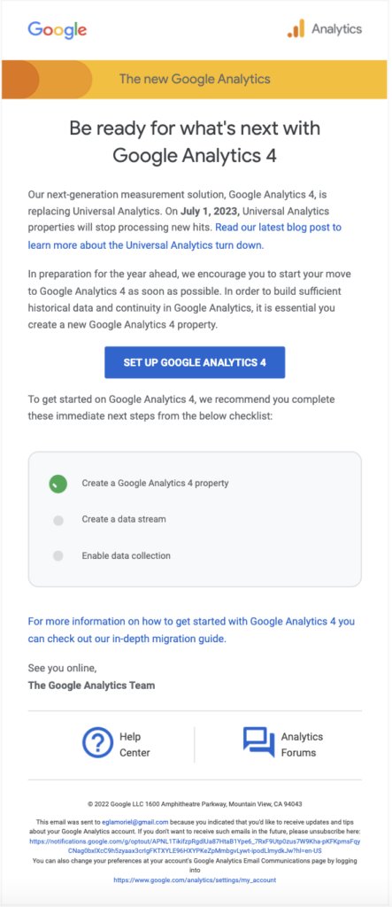
This email header example consists of the Google logo and the Google Analytics logo. This gives the reader an idea of who the sender is and what to expect from the email.
Below the header is the body of the email, which encapsulates the main message and content of the email. At the bottom, the email footer rounds off the email with links to the Google Help Center and the Analytics forum.
The header is a great place to include important information for your subscriber. Indicate to your readers what to expect from your emails at a glance.
What can you include in email headers?
There are many elements you can include in an email header. Check out our list of five components you can use to design your email headers:
- Logo
- Menu
- Countdown
- Call-to-Action (CTA)
- Social media icons
We’ll dig into these components and some of the well-designed email headers we’ve seen below. In the following section, we’ll review some best practices when using these email header elements. One of our top best practices is easy: Don’t overdo it! One element per header may be plenty.
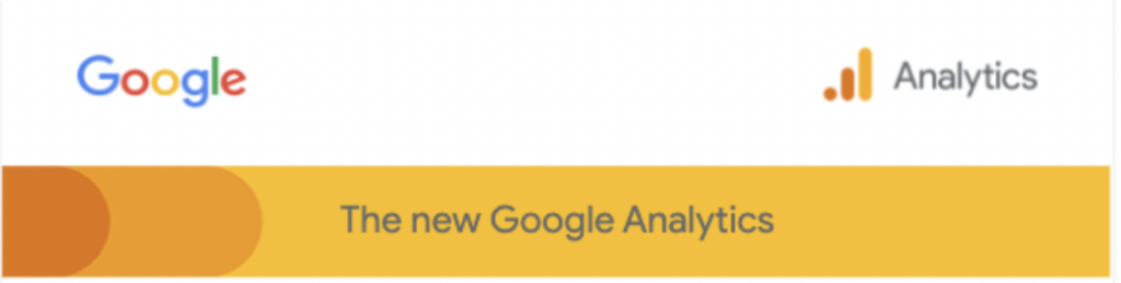
1. Logo
Marketing is all about brand recognition. Don’t miss the opportunity to get your company logo out there as soon as your subscribers open your email. It’s good to establish your brand’s authenticity as soon as possible. Don’t let your readers have a shred of doubt regarding your email’s sender.
However, this doesn’t mean you must include a large, overpowering logo. As you saw in the last example, Google Analytics keeps headers nice and simple with the Google logo and Google Analytics logo.
Be aware of readers using dark mode and how it’ll affect your email. For example, the black from most logos may disappear when a subscriber views an email in a darker interface. Altering your header image to work in both light and dark mode is one way to avoid this issue. Find out more in our post on dark mode logo problems.
Menus are a great way to drive traffic to your ecommerce web page. They complement your CTA by creating defined subcategories for your subscribers to navigate. Check out how Adidas does this:
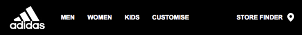
They replicated the menu bar on their web page to simultaneously create a feeling of familiarity and funnel clicks to their site. If your email headers include a menu or navigation bar, try to design them to look as much like your website as possible. That way, you’ll provide a more consistent experience to subscribers who click through.
3. Countdown
Countdown timers are a popular way to make email campaigns dynamic. They create a sense of urgency that can encourage your subscribers to take action before time runs out. Increase your click-throughs and conversion rates with an easily visible countdown timer at the top of your campaign.
Look how Casper pairs a simple menu with a countdown timer to help subscribers navigate the path to purchase:

4. CTA
Don’t underestimate the power of a CTA. If your goal is to drive clicks to your website, why not include a CTA front and center in your email header? Make it the first thing your users see, just like Moschino did with their abandoned cart email:

They convincingly used an email header image with their CTA.
Use social media icons in your email header to encourage subscribers to become followers as well. Let’s say you’ve always engaged with your subscriber via email. How about redirecting them to your Instagram account? Find new ways to start conversations with your subscribers. Since subscribers are already familiar with your brand and your content, many will be happy to become part of your social media audience too.
5 tips for designing effective email headers
Besides only using one element in each email header, we have a few other recommendations. Now that we’ve addressed the basics, let’s look at five best practices for email header design:
- Play with colors
- Use animations, GIFs, or images
- Customize but be consistent
- Keep it readable and accessible
- Use email-safe fonts
Let’s dig into each of these below.
1. Play with colors
We’ve talked about the importance of developing a visual brand identity. Use colors in your header to frame your email with your visual brand identity. Perhaps you’ll choose contrasting colors to help your message pop or choose from your trusty brand palette.
Either way, colors tell a story and help you engage with your subscriber base! Remember to define email header colors and other formatting in your email design system.
2. Use animations or images
As we saw in the Moschino example, a well-chosen image or GIF can be a powerful, eye-catching tool to improve your customer engagement. We’ve talked about how images can supercharge your emails. Why not put them in the header and establish your visual brand identity up front? Of course, don’t go overboard with animations or images. You want to make a statement to engage your user – not create clutter that stops them from reading the rest of your content.
3. Customize but be consistent
The email header is a space for you to play with how you introduce your brand. Each time subscribers open your email, they make another connection with your brand. You might want to use a slightly different header when targeting customers during the Halloween season versus New Year’s. However, while it’s nice to keep your content relevant, you also want to keep your content consistent.
Make it easy for your users to recognize your brand at a glance. If you’re sending out a monthly email newsletter, you want to keep the newsletter header fresh but recognizable as part of a series of emails from your brand.
4. Keep it readable and accessible
When you choose your colors and design your header, remember to select colors that make your text pop for both regular-vision and low-vision readers. Accessibility is key to engaging your subscribers. If your email header includes important information, add it as live text and not a graphic. That way, screen readers will interpret and read back text to subscribers with vision impairments.
5. Use email-safe fonts
The email header is a place to let your creativity shine. However, don’t sacrifice accessibility or deliverability for creativity! Use email-safe fonts when coding your email header templates to ensure your readers can view your message exactly as you intended.
Wrapping up
Email header design is a great way to create a consistent and memorable inbox experience for your subscribers to showcase your brand.
Do you know if every mailbox provider displays your email header design as you intended? There’s one way to know for sure: Preview your emails on dozens of popular email clients and devices.
At Sinch Email on Acid, we like to say that good mail isn’t just about a good design – it’s about testing your emails to ensure they work for all your subscribers across their various email clients and devices. If you’re ready to start, head to Email on Acid and try out our email testing tools for seven days for free.