Email Marketing
A Complete Guide to Building Effective Emails and Landing Pages
On the winding road that is the customer journey, emails and landing pages are two crucial connections along the path to purchase. One leads to the other.
A landing page that’s designed to collect new contacts helps you build your email list. Just as importantly, email marketing sends subscribers to pages on your website where the customer journey continues.
Here’s the problem… Too often, the connections between marketing emails and landing pages are an afterthought. Goals aren’t clearly defined. Copy and design get created in silos. Different teams use different metrics to measure success.
Ultimately, that leads to a disconnected subscriber experience and lackluster results. But it doesn’t have to be that way.
Emails and landing pages need to work together. So, here’s some guidance on creating a cohesive customer experience – in the inbox and on your website.
What defines a landing page?
Technically speaking, every page on your website could be a landing page. When someone clicks a link from a search result, a social media post, an email newsletter, or any other referral source, they’ll land somewhere else. That page becomes a landing page.
But traditional landing pages have a different, less general definition. They are usually meant for a specific campaign and encourage website visitors to take a particular action, such as:
- Signing up for a trial
- Purchasing a certain type of product
- Using a promotional code
- Registering for a webinar
- Watching an explainer video
- Downloading digital content
The landing page may be optimized for certain keywords to attract organic visitors from search engines. There could also be paid ad campaigns driving traffic to the landing page.
However, email marketing is one of the best ways to get the right people to the right landing pages on your website. That’s why many email service providers (ESPs) and customer relationship management (CRM) platforms have tools for designing and sending emails as well as building and publishing landing pages.
How emails and landing pages work together
Email is an effective way to drive qualified traffic to key landing pages. That’s because emails get delivered to people who are already familiar with your brand and have raised their hands to say they want to hear from you. This is the whole idea behind what Seth Godin calls permission marketing.
You’ve already established trust with the people on your email list. On the other hand, someone who sees a display ad or a promoted social post may have no idea who you are and what your brand is all about.
Even if they click through, most people will view everything on your landing page with a healthy dose of skepticism. If we asked which was more valuable, 2,000 followers on any social channel or 2,000 valid email subscribers? We know exactly which one a savvy digital marketer would choose.
Organic search traffic and paid search ads convert pretty well. However, many people who come to your site through search engines are closer to the start of the customer journey. They may be researching a problem or comparing options.
On the other hand, marketers can use the email channel to strategically guide prospects through the decision-making process. Email educates subscribers and nurtures leads so those contacts eventually choose to become loyal customers.
Curiosity: The ace up email marketing’s sleeve
To get the click, there’s one thing you must do as an email marketer – generate curiosity. That’s how the magic happens. You want your subscribers to wonder what’s on the other side of your email’s call-to-action (CTA).
This psychological phenomenon is sometimes called the “information gap” or the “curiosity gap.” When we don’t know something (and sometimes, even when we do), human beings are driven to fill in the blanks. Watch the video below from Andrew Davis to find out more.

If you want email subscribers to click through and visit a landing page, you need to generate curiosity at each point along the way.
- Your subject line needs to make people curious enough to open the email. (What’s inside?)
- The headline and email copy should make people curious enough to keep reading. (What’s this all about?)
- The images you use in the email can generate curiosity too. (This looks interesting.)
- Then, your CTA button needs to generate enough curiosity to earn the click. (I’ve got to see this for myself.)
Finally, the landing page where subscribers end up needs to deliver on the promises you made in your email. And of course, once they land on a page, you can create another curiosity gap that gets them to convert.
Start with the strategy
Getting subscribers to click through from an email to a landing page might be your big-picture goal, but it’s not a defined strategy. If possible, try to get everyone involved with the campaign on the same page from the very beginning.
Here are some questions you can ask to help create an effective strategy for emails and landing pages:
- Who do we want to visit the landing page? (This is your target audience/buyer persona.)
- What action do we want them to take when they get there?
- What pain points will be relieved, and what benefits will they experience if people take that action?
- How will you measure the success of both the email and landing page?
Once you’ve got clear answers to questions like these, your team can begin crafting the copy and design of the landing page, emails, and paid ads in the marketing campaign. Just make sure this isn’t done in silos. That could cause inconsistencies and confusion that negatively impact the results.
Instead, start with the end in mind. If the landing page is already created, use that to inform and inspire persuasive email copywriting, consistent visuals, and creative email CTAs.
Design and copy for emails and landing pages
When writing and designing emails and landing pages, consistency is key. If you’ve ever clicked a link in an email and thought to yourself, “Wait, what just happened?”, you know exactly what we mean.
It can be confusing and jarring to go from a promotional email to a landing page that looks completely different or seems to be about an unrelated topic. Subscribers have certain expectations when they click. Consistency between the email and landing page helps meet those expectations.
Here are three examples of brands doing it the right way:
1. Clay makes it mysterious
Product launch campaigns are a big deal. It’s the moment of truth. When that time came for Clay, an AI-driven professional networking tool, the brand effectively generated curiosity with their email and delivered on promises with the corresponding landing page.
The email’s design and headline spark a sense of mystery around a future that’s almost here. Meanwhile, the copy reminds them why they’re on this waiting list, and the CTA button encourages contacts to claim their spot in that mysterious and exciting future.
Once they arrive at the landing page, visitors from email are greeted with a strong headline and two options: Get the product right away or watch a video to see what it does. By the way, a 2019 study found that adding a video to your landing page can increase conversions by as much as 80%.
The email

The landing page
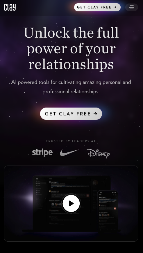
One thing you’ll notice immediately is how the design of the email and landing page closely matches. There’s no denying the fact that you are in the right place if you click the CTA in this email.
2. Asana keeps it simple
While there is a time and place for longform copy on emails and landing pages, a good rule of thumb is to keep things short and sweet whenever possible. You’ve got a limited amount of time to capture the attention of subscribers and website visitors – so use it wisely.
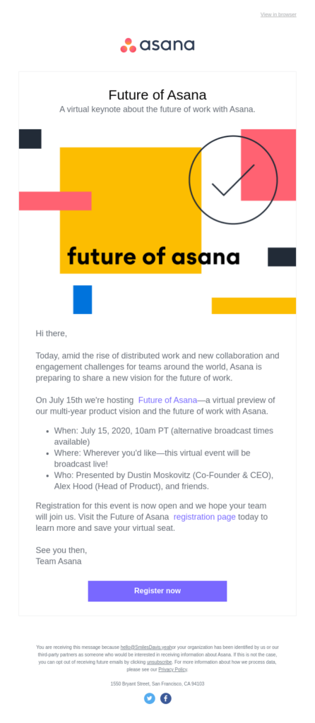
When Asana promoted a live online event unveiling major product updates to support the future of work, it sent out a pretty standard webinar registration email. But what happens if customers click from the email after the event is over?
The brand’s stroke of genius here is that if people didn’t have time to attend the live virtual. keynote, they probably didn’t want to watch a full replay either. That’s why the landing page features a short recap. Again, you’ll notice how both the language and visuals of the email and landing page are nearly identical.
The email
The landing page
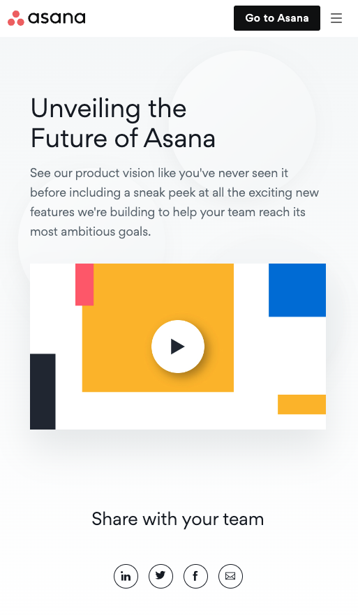
The goal here was to educate customers on the benefits of using Asana for project management and collaboration. They want to encourage loyalty and reduce customer churn by illustrating the ways Asana continuously improves its software and makes your team more efficient.
Notice that there’s no push to upgrade or sell anything at all. The CTA on the landing page simply encourages visitors to share the short video with colleagues.
3. NHC’s ecommerce connection
On an ecommerce website, nearly any page can become a “landing page.” Where you decide to send customers and subscribers from email campaigns helps define their online shopping experience.
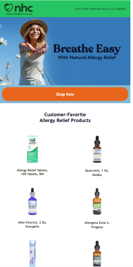
The online vitamin and supplement store Natural Healthy Concepts (NHC) sent an email that hit on a big pain point for many people – seasonal allergies. While the copy in the email is sparse, the imagery does the selling.
NHC could have illustrated the pain point by showing someone with a runny nose and itchy eyes. Instead, the email features imagery of a woman enjoying the outdoors without a care in the world about her seasonal allergies and all that pollen.
The email
The landing page
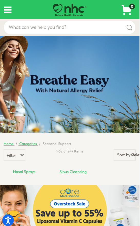
In this case, email subscribers could click the CTA, which took them to a category page with dozens of products. Or they could start shopping in inbox and choose from popular products featured in the email.
Notice how the same benefit-driven headline, “Breathe Easy: With Natural Allergy Relief”, appears in both the email and at the top of the store’s category page. Plus, the brand uses the same stock photo model to create a consistent visual experience from the email to the website.
Consistent digital experiences: Beyond the basics
There’s more to a consistent customer experience than the words and visuals used in emails and landing pages. Here are a few other considerations to apply to your strategy:
- Responsive design: If you take a mobile-first approach to email coding, but your landing pages aren’t mobile friendly, that’s a huge disconnect. Make sure to consider the full experience for all screen sizes.
- Accessibility: Likewise, make sure both your emails and web pages are accessible. If a user with low vision can engage with your email but lands on an inaccessible page, your efforts will fall flat. The standards you follow for email accessibility should be reflected on your website too.
- Font support: If your brand uses custom fonts, they may not be supported in all email clients. Make sure your font stack includes fallback options that are consistent with what visitors will see on the landing page.
- Dark mode: Email clients and web browsers may display content in dark mode differently. How do your dark mode emails compare to the landing page?
Segmentation and personalization of landing pages
Segmentation and email personalization represent yet another way to create a consistent experience from email to landing page.
If you are taking the time to write and design emails for different segments, then why would you want to send those unique audiences to a generic landing page? Chances are – your campaign will be more effective if you send subscribers from different email segments to landing pages that are also tailored to their needs, interests, and preferences.
Email segmentation makes content more relevant to individuals and that should continue with the website experience. Yes, this may take a little extra time and effort from copywriters, designers, and web developers, but for big campaigns it may certainly be worth it. In fact, there’s a good chance your email segments reflect the audiences you’re targeting with paid ads and social promotions. So, you can drive that traffic to custom landing pages too.
The next level is personalization. Research from Salesforce found that 99% of marketers planned to maintain or increase their personalization budget. But while 95% of those surveyed are personalizing emails, only 50% are personalizing the website.
Just like emails, landing pages can also be personalized. Depending on the tools in your martech stack, you may be able to add a customer or subscriber’s name to the landing page copy. Better yet, you could send them to a landing page with personalized product recommendations or content.
Measuring email and landing page performance
Keeping track of opens and clicks might tell you how well the email performed, but they aren’t a good measure of a successful connection between what happens in the inbox and on the website.
For that, you’ll want to measure the conversion rate, which tells the story of what happens after an open and a click. The report Inbox Insights 2023 from Sinch Mailjet found that opens and clicks top the list of email metrics considered most important for measuring success. Conversion rate came in third place with 26% of respondents saying it was a top three email metric.

What qualifies as a “conversion” will depend on the action you expect subscribers to take once they reach the landing page. Using the three examples from earlier in this email:
- A conversion for Clay’s product launch email would be new signups.
- A conversion for Asana’s email would’ve been registrations before the event and then video plays and/or social media shares after the event.
- A conversion for NHC’s allergy campaign would be adding any of those products to the cart and purchasing.
To accurately track email marketing conversions, you’ll need to use UTM parameters on links to landing pages. This will help attribute website traffic to a specific email campaign. If you need to manually calculate the email conversion rate, here’s the basic formula:
(# of subscribers who took desired action ÷ # of emails clicked) x 100 = Email conversion rate
So, if 500 subscribers opened the email and clicked through to the landing page. Then 100 of those people converted on the landing page. Your email conversion rate would be 20%.
Testing and optimizing emails and landing pages
In email marketing there are two types of testing that can optimize performance:
- A/B testing, which helps you improve future performance.
- Pre-send or predeployment testing, which provides email quality assurance.
A/B testing happens after you hit send and after people visit your website. You can test headlines, imagery, calls-to-action, and more on both landing pages and in email campaigns.
The email testing that happens before you hit send lets you preview campaigns in different mailboxes and on popular devices. Sinch Email on Acid provides reliable screenshots from the top email clients and live devices. It’s another way to ensure you’re delivering a consistent experience every time.
But that’s not all Email on Acid does to ease the worries of marketers. You can also use it to catch accidental profanities, run accessibility checks, and make sure you’re not on a blocklist before you launch a crucial campaign.
And Email on Acid’s automated URL validation feature can even help double-check UTMs and watch for broken links. Because sending subscribers to a 404 page instead of your landing page would be a huge bummer.