Email Marketing
Dark Mode vs. Light Mode: What’s a Better User Experience?
Who doesn’t love a good old-fashioned debate? You’re guaranteed to start a conversation by wondering aloud if pineapple should be on pizza or if a hot dog is truly considered a sandwich (I’m a big N-O for both, if you’re wondering.)
When it comes to user experience, though, debates feel more high-stakes. Do we optimize for fringe email clients, like someone reading Outlook on their Kindle? How many A/B tests are too many for one campaign? And have we ever gotten closure on pronouncing it “GIF” or “JIF”?
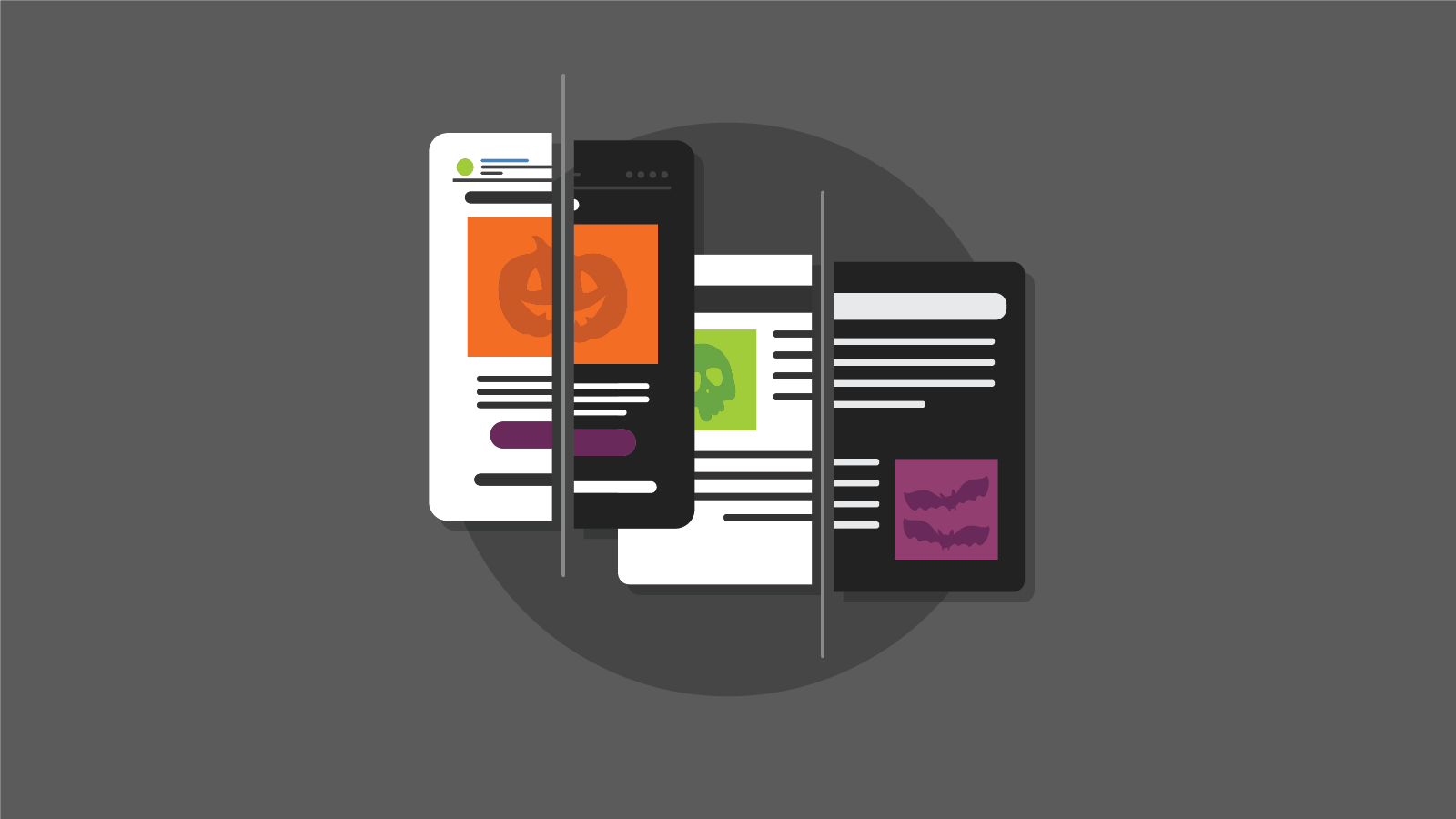
One such debate is dark mode vs. light mode. Which is better? Whether you’re designing an app’s interface in dark mode or developing dark mode emails, it seems everyone has an opinion. As the folks from Setapp showed us on Twitter, “there are two kinds of people …”

Here’s what you need to know about the dark mode vs. light mode debate for your email marketing campaigns:
That’s kind of a trick question. Dark mode is here to stay, and increasingly popular. One isn’t better than the other…you’re going to have to do the work needed for both. Let’s start by deep diving into the dark mode vs. light mode debate:
Dark text on a white background (aka light mode) became the standard for most digital interfaces with the rise of word processors, which emulated the look of ink on paper.
One of the first jabs light mode lovers take at dark mode is the claim that it’s not ideal for readability. Beyond matching the look of ink and paper, dark text on white background has a strong contrast polarity, or the difference between the text and the background. More contrast = more readable.With HTML emails, where different components have defined colors, dark mode inverts code to make light colors dark and dark colors light.
This is where things can get complicated. Text colors might change and have unintended effects. Black logos and graphics may look like they’ve “disappeared” from your email, or white backgrounds may appear behind images.
A 2018 MIT Agelab study tested dark mode vs. light mode’s readability for lexical-decision tasks, or the kinds of reading we do on smartphones while we’re distracted by other things—like glancing at directions while driving, or checking an email while waiting in line for coffee. The study found that while there was no significant difference between the two modes during the day, though light mode performed slightly better at night for readability.
It’s contrast (and context) that matters more than the choice of mode, here. If you’re reading longform articles like this one at night, dark mode might be more difficult to read. But it can be easier to interact on social media, make quick decisions, or might simply be your preference.
The last few years have seen a few solutions for the way technology disrupts circadian rhythms.
Software like Fl.ux claims to shift the background light on your laptop or phone to more closely mirror outdoor conditions and away from “blue light.” Studies have shown exposure to blue light from phones or other devices in the hours before bed suppresses the body’s production of melatonin, the hormone that induces drowsiness.
Blue light from our screens is also linked to digital eye strain as well as symptoms such as dry eyes, blurry vision, headaches, and sleeplessness. In fact, research published in the science journal Nature found that long-term exposure to bright screens is linked to myopia, or nearsightedness. One way to combat this is by reducing the brightness of the screen, or activating dark mode.
While dark mode may be easier to read at night, it’s not necessarily going to fix these issues. According to the American Academy of Ophthalmology (AAO), it’s the way we use our devices that creates eye strain, rather than the type of light. The best way to sleep better and reduce the chance of myopia is to actually rest—no phone in sight.
One common marketing claim is that dark mode saves battery life. That’s true…sometimes.
According to a 2021 Purdue University study, using your phone’s default auto-brightness setting at 30-40%, switching from light mode to dark mode saves only 3%-9% power, and only on OLED screens (organic light-emitting diode, most common on smartphones released after 2017.) Translation: You’ll only experience energy savings if your phone uses an OLED screen. Regular ‘ol LCD screens more commonly found on laptops or tablets don’t necessarily see any benefits.
As dark mode continues to rise in popularity, and as apps more accurately track their energy usage, we may see more energy conservation benefits in the future. In the meantime, dark mode can technically extend your battery life, but not by much.
Dark mode is often described as more accessible, but that depends on who you ask. Darker screens can help with those more sensitive to light or in low-light conditions and can reduce overall eye strain because of less contrast.
According to the Bureau of Internet Accessibility (BOIA), however, people with conditions such as dyslexia (affecting an estimated 5-10% of the US population), and astigmatism may struggle to read the text in dark mode.
When an email client automatically inverts colors for dark mode, it may also cause color contrast issues that make text difficult to read and impact email accessibility as defined by the Web Content Accessibility Guidelines (WCAG). For those navigating the web without using a mouse, dark mode may hide keyboard focus indicators or make it challenging to find navigational cues.
Search for “dark mode email” on developer message boards like Stack Overflow and you’ll run into plenty of people looking for help dealing with all sorts of issues. Here are just a few of the many questions:
- “Is there anything that can be done to prevent dark mode from changing our text from black to white?”
- “Is there any ‘easy’ way to automatically switch the whole HTML to dark mode, whenever possible?”
- “I am having an issue in the rendering of my custom coded HTML Email template in Dark Mode. The email and all the colors work perfectly fine except this one top header.”
What makes dark mode so challenging is the lack of consistency between email clients. Some auto-invert colors and some don’t. Others partially invert colors. Some clients support media queries for dark and light color schemes, and some don’t. (Ahem, looking at you, Gmail.)
| Email Client | Auto-Inverts Colors? | Common Dark Mode Challenge |
| Apple Mail (iPhone/iPad) | Yes | Auto inverts when the background is transparent or pure white (#fffff). |
| Apple Mail (macOS) | Yes | Auto inverts when the background is transparent or pure white (#fffff). |
| Outlook (iOS) | Partially | May make background color darker. |
| Outlook (macOS) | Partially | The only Outlook option that does support @media (prefers-color-scheme). May make background color darker. |
| Outlook (Windows) | Yes | The only Outlook option that consistently auto-inverts colors. |
| Outlook.com (webmail) | Partially | The only Outlook option where image swap works. May make background color darker. |
| Gmail (Android) | Yes (when not already dark) | Does not support the query @media (prefers-color-scheme). |
| Gmail (webmail) | No | Does not support the query @media (prefers-color-scheme). |
| AOL (webmail) | No | No current dark mode user interface. |
| Yahoo! (webmail) | No | No current dark mode user interface. |
A few tips to get you started coding for dark mode:
- Work with your branding team on interpreting logo, color scheme, and other brand elements in dark mode
- Use PNGs with transparent backgrounds
- Use white strokes around black design elements
- Watch for vanishing images or logos
- Add workarounds in the code to address dark mode specifically
The truth is, more and more of your subscribers are likely using dark mode. It depends on your target persona—for example, developers, Gen-Z, night owls, and early adopters might be more likely to open your email in dark mode vs. light mode.
“Dark mode settings in email have caused a fair share of headaches among email designers and developers. But as always, we learn to adjust.”

Results from dark mode experiments and surveys
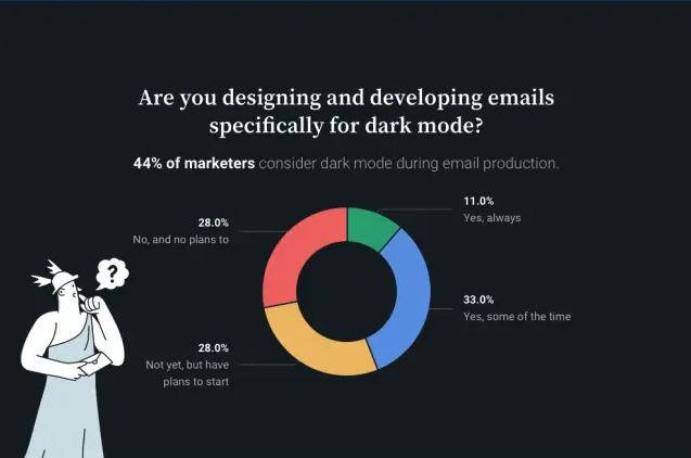
When we tested this out at Email on Acid, we found that 14% of our subscribers opened our emails in dark mode. And almost half (44%) of the email marketers Sinch Mailjet surveyed in 2021 said they optimized for dark mode some or all of the time. We expect this number to keep going up as dark mode becomes more mainstream.
One thing is clear: Dark mode is here to stay. You can’t force light mode on subscribers who want to read their emails on dark mode. (Trust us, it’s a great way for really *~funky~* email designs, and not in a good way.) Instead, it’s time to add dark mode optimization into your development cycle and implement dark mode workarounds whenever possible.
It’s time to join the dark side.
With dark mode’s inconsistency between email clients, the only way to make sure an email looks right is to test it. Email on Acid allows you to easily preview your email across multiple email clients, in both light and dark mode. Get started > https://www.emailonacid.com/email-testing/
Not sure if your subscribers even use dark mode? We can help with that, too. Email on Acid now offers dark mode open tracking inside our application. Check your analytics to see the percentage of subscribers viewing emails in dark and light modes on specific email clients, so you can better maximize your time. Learn more > https://www.emailonacid.com/email-analytics/