Email Marketing
Email CTA Best Practices: How to Get More Clicks and Conversions

Every email campaign presents a series of hoops you hope your subscribers will jump through. Did it make it to the inbox? Check. Did they open the email? Check.
And then…the moment of truth. Did they actually click on your call to action (CTA)?
Email marketers spend a lot of time agonizing over deliverability and subject lines. And those are vital to the success of your campaign – after all, you can’t get a click if you don’t get an open in the first place – but the CTA is where you find out whether your email actually succeeded.
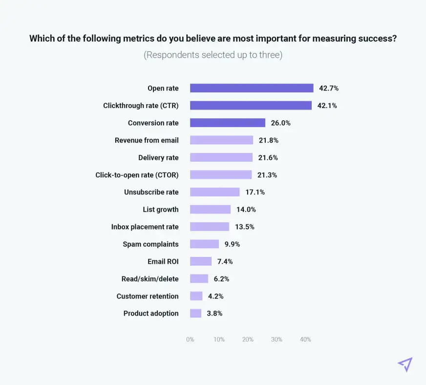
The Inbox Insights 2023 report from Sinch Mailjet found that senders identify opens, clicks, and conversions as the top three metrics for measuring email success. Clicks are what connect the opens to conversions. And if subscribers click anything in your campaign, it should be the call to action. Let’s explore some tips and best practices for email CTAs.
Every email you send has a goal in mind, right? The call to action is the email element that asks your subscribers to do something in response to receiving your campaign. Traditionally, this looks like a big fancy button at the bottom of your email that says, “Click here!” or “Shop now!”

However, a call to action can be more than a button. You could ask subscribers to answer a poll, respond to the email with feedback or their opinion on a topic, forward the email to a friend, click a link to register for an event, purchase a product, or read an article…the possibilities are endless.
The important thing is that you’re not sneaking in a CTA where it shouldn’t be. If you’re going to ask your subscribers for something, ask it. We’ll talk a lot more in depth about what makes (or breaks) a CTA below:
Best practices for writing email CTAs
Choosing the right CTA is both an art and a science. We’ll talk about testing your way to high-performing CTAs in a minute, but for now, start with your overarching goal for your email. Your CTA must directly reflect that goal.
The biggest mistake email marketers can make? Trying to make every email achieve every goal. You can’t make one campaign do it all. A CTA that’s going to encourage clicks should be as focused as possible on a specific action – and the ideal number of CTAs is just one.
Yes, one! Consider sending a separate email if you have more than two calls to action. Otherwise, you’re asking too much of your subscribers. You’ll dilute your effort and make it difficult for them to understand what it is they should do or click. This is even more important for mobile readers, who can have trouble with tap targets or multiple links and may give up altogether.
Finally, think about your language. A good CTA button should be 2-5 words, max. You have more room to play with an in-line CTA, but you can’t go wrong with being concise. That’s not a lot of space to demonstrate value and explain why someone should click. Focus on action-oriented language (aka lots of verbs!) that drives a sense of urgency with words like “now,” “soon,” “limited time,” or “hurry.”
Common email CTA copy examples:
- Learn more
- Get started
- Buy now
- Shop now
- Get XX% off today
- Download the app
- Register now
- Order now
- Follow us on social media
- Try it yourself
- Read more
- Book now
Don’t worry about having the best, most creative email copy ever for your CTA. There’s a place for that throughout your emails, but a CTA should be clear first and foremost. If you’re able to be clever, even better. The worst thing you can do is make your CTA confusing or unclear (and let’s be real, even boring CTAs like “Learn more” do get clicks.)
To summarize:
| Do | Don’t |
| Be specific | Be sneaky about your CTAs |
| Choose one CTA to focus on | Have too many CTAs in one email |
| Use action words | Make it difficult to click on mobile |
| Create a sense of urgency | Write confusing email CTA copy |
| Be clear about your ask | Send subscribers to a non-existent page |
Let’s look at a few effective CTA examples:
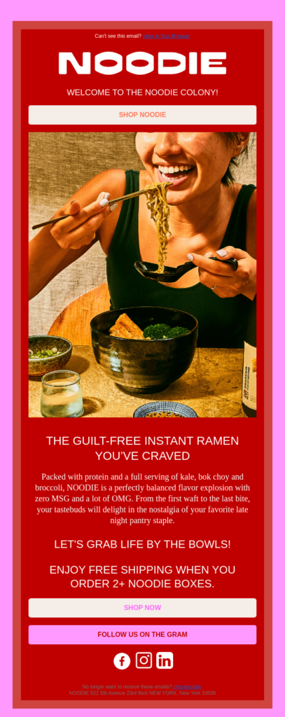
This email from Noodie is short and to the point, with eye-catching colors. The CTA copy is a simple “Shop now” repeated twice at the top and bottom of the email, with a secondary CTA to follow the brand on Instagram.
Athletic Greens does a great job showcasing the different features of their products in this email. While this email marketing campaign is more bottom of the funnel with a clear CTA at the end of the email that makes you want to try their product. They’re also using first-person.

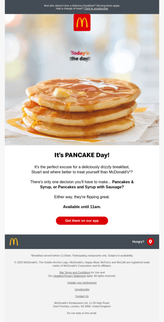
If you want to increase click-through rates, think about sending more tailored email campaigns like this one. This email from McDonald’s is a great example of a clear, action-oriented CTA. (Not to mention a subject line that’s creative and fun.)
This email from Orangewood Guitars is a great example of a slightly softer CTA, inviting subscribers to “Explore” and “Learn more.” If you’re going to go for a “discover” or “explore” CTA, make sure you’re still sending subscribers to a specific landing page—in this case, their 2023 guitar product page—instead of your homepage.

This email tells a story about a customer’s trip to a resort/spa. But it also has a clear CTA that’s easy to click on. While there are several links throughout the email, it’s obvious which one is the main call to action based on the design. This is a great example of how to tell a story and drive bookings without using salesy email copy.

Copy is only part of what makes a CTA clickable. Your CTA is the most important element of the email, and there are plenty of email design decisions to make. Place it after the first paragraph or at the bottom? In-line or call-to-action button? Main vs. secondary?
An important email CTA design best practice is to use an adequate amount of white space around it, especially if the call to action is a button. You want that CTA to stand out on its own – just begging to be clicked.
As you design your emails, remember that contrasting colors are key. You want to make sure that your CTA stands out from the rest of your email so that it’s obvious what subscribers should click. A complementary brand color is a good place to start, but it’s also worth looking into color psychology as well.
Bright, energetic colors like red, orange, and yellow grab attention and are often used in CTAs.
CTAs, like other design elements, are also subject to the whims of design trends. Right now, more subtle black-and-white CTAs are everywhere. Check out this stunning design from Lumos with a subtle yet stark email CTA.

Most importantly, make sure your CTA is accessible. After all, the point of the email is to get subscribers to click — and if they can’t do that, you’ve lost not just revenue from that email but trust and credibility for future campaigns. Double check every CTA:
- Has strong color contrast.
- Uses live text by coding bulletproof buttons instead of making CTA graphics.
- Retains its functionality in every email client.
- Takes dark mode into consideration.
- Is easy to click or tap on any device.
- Goes to a specific landing page with a link that works (not a 404).
The best way to know whether your email CTA is accessible? Test it.
Because email CTAs are so important to the success of your campaign, it’s worth focusing your attention on A/B testing them. You want to make sure the entire email marketing campaign goes smoothly, from the email to the landing page. And it’s worth double checking your email templates and email automation now and again, too.
There are two ways to test your email CTAs:
- Quality assurance: First, make sure your CTA works. Can a subscriber on any email client see it and click on it? Is the link working? Is the attribution tracking firing?
- A/B testing: Second, get strategic about what kinds of CTAs encourage your subscribers to click. Test different copy ideas, color, or placement to see which performs better. If you’re not seeing a great conversion rate, test out a few different variations over the next few campaigns.
If you commonly have multiple CTAs, or use in-line CTAs more frequently, then looking at click maps or heat maps can help you understand subscriber engagement. As you test your emails, make sure you’ve got UTMs or other tracking devices on every single link, ideally with an attribute that notes the placement in the email.
Your CTA is the culmination of the entire email campaign. The stakes are high — no one wants to send out an email with a corrected link and hope for the best. At Sinch Email on Acid, we’re here to prevent those “oops” moments from happening.
- URL validation: Keeps you from sending subscribers to 404 pages and validates your UTMs.
- Email accessibility checks: Find out if your links, font size, and color choices are accessible. Adjust code for screen readers and even view your email with different color vision deficiencies.
- Email previews: Make sure no email clients mess with your CTAs. Check how things look in dark mode too. Fix any issues before you hit send…and breathe easy once the campaign is on its way.