Email Marketing
How to Write Creative CTAs for Better Email Engagement
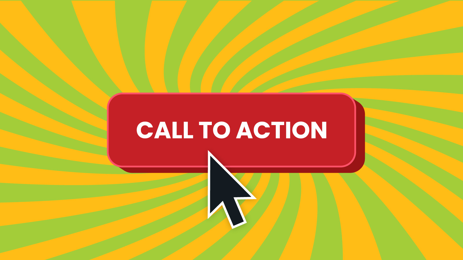
When we talk about calls to action (CTAs), there are probably a handful of phrases that immediately pop into your head: Shop Now, Read More, Download Today, Contact Us, or even Click Here (hopefully not that last one).
Because you’re an email marketer, you’ve seen those words a million times. But the truth is, so have all your subscribers. So, if you want a call to action to stand out, you might want to get a little more creative with your copywriting.
In my opinion, the CTA copy is just as important as what you write for email subject lines. One gets an open, and the other earns the click. According to Inbox Insights 2023, opens and clicks are still the most popular metrics for measuring email marketing performance.
Sinch Mailjet asked more than 3,000 email senders around the world to pick their top three email metrics, and these were the results:
- Open rate (42.7%)
- Clickthrough rate (42.1%)
- Conversion rate (26.0%)
Unfortunately, open rates have always been a bit unreliable, and now they could be inflated by what happens with Apple Mail Privacy Protection (MPP). So, a successful email campaign often comes down to the clicks. And the most clickable thing in your campaign should be the call to action.
Why creative CTA copywriting gets results
Inbox Insights 2023 also found that Standing out in the inbox remains the biggest thing holding marketers back from email program success. Creative calls to action are one effective way to make your campaign different from every other message.
CTA copywriting matters because what you put in those buttons or choose to highlight with link text could be the deciding factor between a click and a delete. In fact, some overused or over-selly CTA copy might even trigger spam filters or prompt people to make spam complaints.
Andy Crestodina, one of my favorite digital marketing experts, shared a quick video on LinkedIn recently that was all about this. He says that while there are standard best practices for CTAs, people won’t click unless they feel there is value in doing so. That means your contacts are always asking, “What’s in it for me?” before they choose to click or tap a CTA.
We all get tons of emails every day, and honestly, a lot of them are pretty boring. So, if you have the opportunity to surprise and delight your subscribers with anything, I say you should take the chance and write some creative CTAs.
Brand voice and audience considerations
While I love writing creative calls to action for buttons and links, I do have to show some restraint. It all depends on the brand and the audience we’re targeting.
For example, we’ve learned that the Sinch Mailgun audience does not respond well to cutesy copy. They deal with serious, technical stuff, and there’s not often room for joking around. That doesn’t mean we can’t be creative; we just need to be careful about how we do it.
There’s more room for fun with the Sinch Mailjet audience. However, getting too clever and creative could also be confusing. So, I want to be clear and concise while still avoiding overused call-to-action copywriting.
When it comes to Sinch Email on Acid, the brand voice gives us more leeway to be creative. I’m not worried about using a little sass or even sarcasm in CTA button copy. Plus, the audience is full of seasoned email veterans who’ve seen it all and are intrigued by something different.
To sum it up, before you write and design a creative email CTA, be sure it vibes with brand guidelines and takes your target personas into consideration.
Five creative CTA examples
Now, let’s dive into some creative CTA examples from the Sinch Email brands. Don’t forget, these were tailored for our audiences and written with specific goals in mind. We’ll talk about CTA writing strategy next.
How do you think subscribers react when they see “Read More” all over your latest newsletter?
To a lot of people, reading sounds like work. Sadly, for those with uninspiring educational experiences, so does learning. So, “Read more” and “Learn more” may not be enticing calls to action for your newsletters. That’s why, in the Email on Acid newsletter, I try to think of unique CTA link text for every piece of content we feature.
2. Webinar CTAs that stand out
When you open an email promoting a webinar, you probably expect to find a call to action with “Register Now” as the text in the button. If the email marketers are a little bit creative, they might use something like “Grab Your Spot” or “Save Your Seat” in the CTA.
But you can do even better than that. When we partnered with ActionRocket for a series of debate-style webinars on email and artificial intelligence, our CTAs got pretty creative.
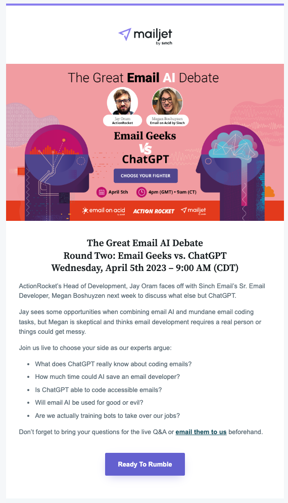
Earlier, I mentioned how we are careful about getting too clever and creative with email CTAs for the Mailjet audience. However, this situation is a little different.
With webinar emails, just about everyone knows exactly what’s going to happen when they click or tap the CTA button. They’ll end up on a registration page where they can fill out a form and sign up to attend the webinar.
That means it’s okay to have a little fun with words we choose to use on the CTA button. “Ready To Rumble” makes perfect sense here.
3. Gated content CTAs
As with webinars, when you’re promoting a piece of gated content, like an ebook or white paper, your audience knows they’ll land on a page with a form. So, when Mailjet released an ebook on omnichannel communications, I felt free to get imaginative and tried casting a spell on our subscribers.
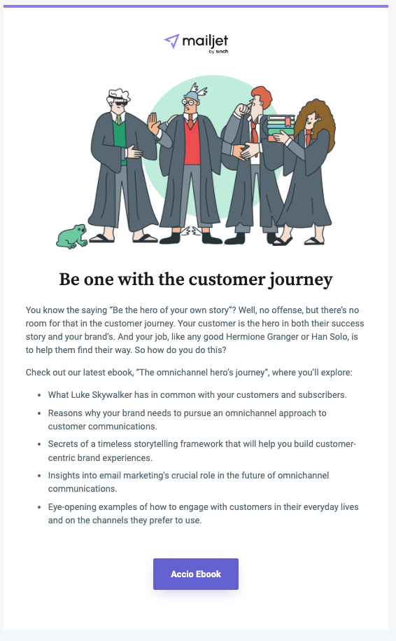
The “Accio Ebook” CTA works thanks to the Harry Potter imagery and copy earlier in the email.
Here’s another example of non-traditional CTA button copy for a report on email and the economy. This time, the call to action reflects the recipient’s potential concerns about what’s going to happen with the global economy and how email could help them “Face The Challenges Head On.” It takes an encouraging and inspirational approach.

You may notice the CTA copy above is longer than the two or three words typically recommended for calls to action.
In most cases, a short and snappy CTA probably is best. However, it’s tough to include a pain point or a benefit in just a couple of words. But that could be exactly what convinces someone to click. So, don’t be afraid to experiment with that copy to see how your list responds.
4. Lifecycle email CTAs
Welcome emails, onboarding campaigns, and other business-as-usual email automations are another place to get creative with CTAs. Those first few messages a new subscriber receives from your brand will set the tone moving forward.
You want new subscribers to engage, but you also want to be completely clear about the intent of lifecycle emails. That’s why putting a straightforward CTA in the email is key. But you can get creative by including a promise in the button copy that shows the value of clicking.
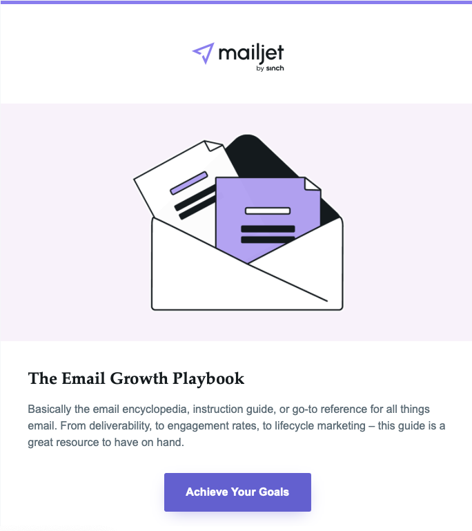
The Mailjet onboarding email above acknowledges that new customers have goals they want to achieve. That’s why they signed up in the first place. The CTA button lets them know we have resources that will help them do exactly that.
5. Creative CTAs that follow a theme
We get to have a lot of fun with email design and copy when we’re promoting our virtual event, Email Camp. Every year, we come up with a new theme for the event. In 2022, we presented Email Camp: Road Trip Edition. Here’s one of our last-minute reminder emails with a creative CTA button.
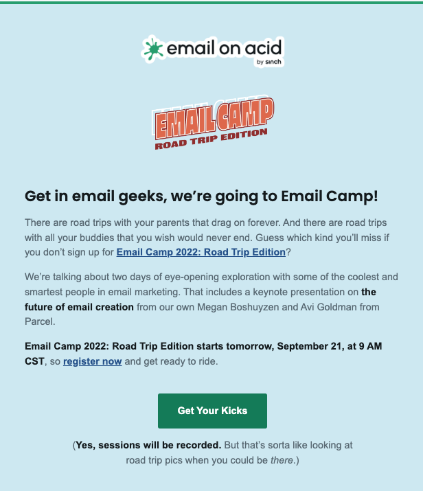
Part of the fun of Email Camp is the playlist we rock out to in-between sessions. We had a sweet collection of road trip songs that inspired us to come up with some creative CTAs for our emails. When you read email copy about road trips, and then see a button that reads “Get Your Kicks,” most people immediately hear this song in their heads.
Seasonal emails, such as holiday campaigns, are also a good opportunity to write a call to action that connects to a theme.
Email CTA writing strategies
Before you let your imagination run wild, it’s smart to take some time and consider the strategy behind your email copywriting and how the CTA fits into the overall campaign.
Start with the goal
First and foremost, don’t write your CTA before you define the goal of the email. What is it you want subscribers to do and why? You could write the cleverest, most hilarious button copy ever, but if it doesn’t encourage people to take the right action, it fails.
Try using the “Think, Feel, Do” marketing strategy when crafting an email:
- Think: Start with logic. What do you want subscribers to think about your brand, the offer, or the content you’re distributing? Your subject line will help take care of this.
- Feel: Next, get to the heart of the matter. What emotions do you want your email to generate? The copy, graphics, and other content should support those feelings.
- Do: This is where the “action” in a call to action comes in. You have people thinking and sparked an emotion. What can you say to get them to take the next step?
Maybe you’ll start with the basic action, like “Shop Now.” That’s what you want people to do. Now, how can you encourage people to shop using more creative language?
- Pick Your Favorite
- Let’s Go Shopping
- Find Your Style
- Fill Up Your Cart
Get in your subscriber’s head
There’s a lot of psychology in email marketing. When you put yourself in your subscribers’ shoes, you can imagine how they might react to creative CTAs.
For example, the fear of missing out (FOMO) is used regularly in advertising and marketing. When a recipient sees your CTA button, it should feel like their last chance to act. A sense of urgency definitely makes CTAs more effective. An urgent CTA next to a countdown timer for a sale or big event could be a powerful combo.
You could also try using reverse psychology in an email CTA. What if the button copy said, “You’ll Hate It” or “Don’t Click This”? Could you resist the urge to find out where the link will take you?
Point of view is yet another copywriting consideration. Most of the time, emails are written in the third person, meaning it’s you or your brand talking to subscribers.
But sometimes, you can make the button copy first person. That essentially makes the words reflect your subscriber’s inner dialogue. It’s almost like having a conversation. You propose something in the email body copy, and the CTA is the response you want the recipient to have.
- Email copy: Ready to get your tickets to the big event?
- CTA copy: Yes, I am in
- Email copy: Want to look like a million bucks this summer?
- CTA copy: Gimme The Goods
Punctuate with care
Most calls to action won’t require any punctuation. But if you do use it, there should be a reason. Sometimes punctuating a CTA helps create a desired effect.
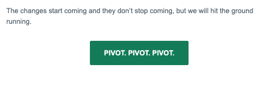
In an email on switching up your strategy, we included a button that read, “Pivot. Pivot. Pivot.” It made sense with the subject matter, and it’s also a funny catchphrase from the sitcom Friends.
If you feel like you need to add an exclamation point to your CTA, it could be a sign that the words you’re using aren’t strong enough on their own. I’m not saying there’s never a reason to use a (!) on a button, but don’t make it a habit.
Question marks are another thing to consider carefully. Question CTAs can work in some instances and not others. They may stir up some curiosity. But they can also make the CTA less assertive. Imagine seeing a button that read “Shop Now?” or “Get Started?” It feels a lot easier to say “No thanks” to that.
If our webinar CTA example from earlier said, “Ready To Rumble?” It wouldn’t have felt the same at all. Instead of decisively declaring readiness to register, it would come across as weak and wishy-washy.

Creative CTA design and placement
Getting creative with calls to action can include how your buttons look and where you place them in the email. Creativity is all about experimentation. So, try new things and test them out.
Maybe you can bend the style guidelines and use a button color that clashes with the brand colors to help the CTA stand out?
Adding interactivity to CTA buttons is another way to get creative with design. It could be as simple as a rollover or hover effect, which you can learn how to code on our web series, Notes from the Dev: Video Edition.
Just make sure creative design choices don’t leave you with email accessibility issues. Code bulletproof buttons with live text. Use good contrast between button copy and color. Make sure you have appropriately sized tap targets. A call to action you can’t read or click will not perform well.
Another way to experiment involves choosing where the CTA is located or how many you add. While it’s a best practice to include just one call to action in marketing emails, that’s not feasible with newsletters or ecommerce campaigns that showcase a bunch of products.
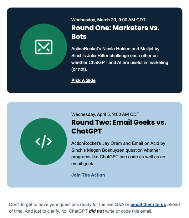
If it’s a longer email, try adding the main CTA twice, once near the top and again at the end, using different language for each button. For emails with multiple places to click, I’m a big fan of what you could call feature or call-out boxes. They create an eye-catching visual inside the campaign, which you can use to increase email engagement.
In the example below, we offered two different options for subscribers. Each callout has a unique look, and both the linked text and the icons take you to the intended landing page.
Part of the fun is figuring out what works. So be sure to conduct some email A/B testing to measure the results you get from creative CTA copy, design, and placement.
Don’t let your creative CTAs go to waste
Of course, there are two types of email testing. While split testing helps you improve campaign performance in the future, pre-send email testing makes sure everything is perfect before you hit send.
At Sinch Email on Acid, we’ve assembled a collection of tools and features that help you conduct email marketing quality assurance. That includes email previews so you can see how your campaigns render on 100+ clients and live devices. Your CTA button could look a lot different on Outlook than on Gmail. But you won’t know – unless you test.
Our platform also has accessibility checks to make sure every subscriber can act on your CTAs. Plus, there’s even URL validation, which ensures you never accidentally stick a broken link in an email and send people to a 404 page. Stop relying on manual testing and start automating your campaign prelaunch processes with Sinch Email on Acid.