Email Marketing
How People with Color Blindness See Your Holiday Email Campaigns

The holidays are colorful time of year. It’s the perfect opportunity to showcase festive and vibrant email designs. But not all of us perceive colors in the same ways. Color blindness impacts how millions of people experience the holidays. As you prepare to send seasonal promotions to the inboxes of your subscribers, it’s important to keep email accessibility in mind.
Red and green are absolutely everywhere during the holidays – on signage, in decor, in magazines and catalogs, on websites, and in emails. In fact, you’ve probably used this color combination in your own holiday marketing campaigns. However, according to Healthline, about one out of twelve men and one out of 200 women have red-green color blindness.
It’s the most common color vision deficiency (CVD) in the world, and it could represent a significant portion of your subscribers. So how exactly does this affect your holiday email campaigns and what can you do to create more accessible holiday emails?
What is red-green color blindness?
People without color blindness are able to see and tell the difference between three colors: red, green, and blue. Nerves in the retinas of our eyes called “cones” perceive the colors, send a message about them to our brains, then convert them into color vision.
People with red-green color blindness are born with either no cones to perceive red or green, or simply a shortage of those cones. All About Vision lists four ways this occurs:
- Red-blind (protanopia) – Red can’t be seen.
- Green-blind (deuteranopia) – Green can’t be seen.
- Red-weak (protanomaly) – Some red is visible; green and blue are normal.
- Green-weak (deuteranomaly) – Some green is visible; red and blue are normal.
So, depending on the type of color vision deficiency a person has, they might see things that are red and green all in a kind of murky green tone. Or they may have trouble differentiating between shades.
How people with color blindness see the holidays
Let’s put ourselves in the shoes of an email subscriber with color blindness. How would this person experience your holiday email designs? First, here’s how someone with a color vision deficiency might see one of the most popular figures at Christmastime, Santa Claus. Notice how the vibrant colors are muted and there’s no clear distinction between red and green. The jolly old elf looks a little more like the Grinch, doesn’t he?

Now, it’s true that someone who’s dealt with red-green color blindness their entire lives may be accustomed to seeing Santa like this. However, the color choices you choose to use over the holidays and throughout the year could affect the way certain subscribers engage with your emails.
The impact on holiday email designs
Take a look at a couple of holiday email campaigns through the lens of someone who is color blind. Here’s a campaign featuring the famous red cup from Starbucks.
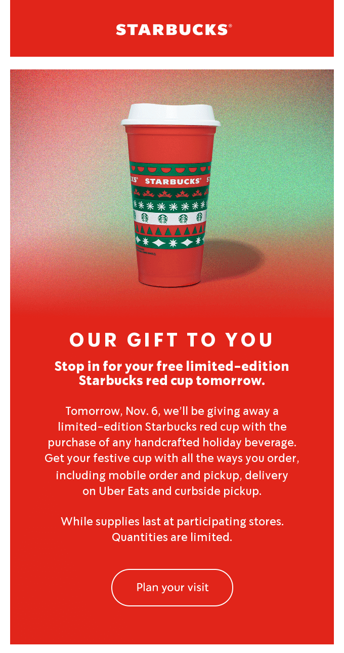
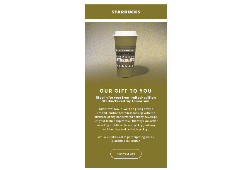
Notice that pretty much everything is red or green. A red, white, and green holiday cup sits on top of a background that fades from green to red. Now check out the filtered version of this email that simulates how someone with protanopia sees the campaign. This holiday email certainly doesn’t have the same impact for someone with red-green color-blindness.
Here’s another holiday email that uses lots of red and green in the design. This time, however, there’s an important element that red-green color blindness could affect – the email’s call-to-action (CTA), which is green and stands in stark contrast to all the red. That’s an effective way to draw attention to the button and increase the click rate, but it won’t have the same impact for subscribers with a color vision deficiency.
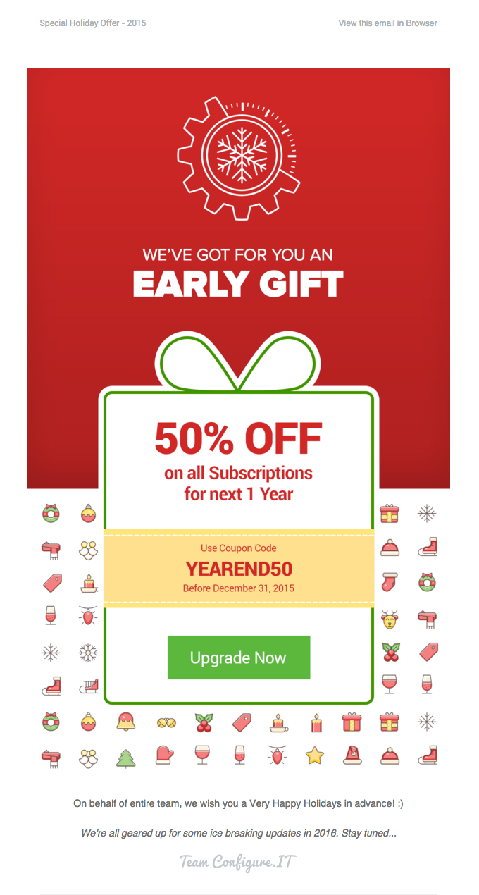
The example below shows how someone who struggles to perceive the color green (deuteranopia) sees this email campaign. That CTA button doesn’t have quite the same pop, does it? There’s really no contrast at all. Of course, this isn’t the end of the world. But when every click counts, it’s worth considering how color choices and accessibility go hand-in-hand with email engagement.

We’re not trying to say you should never use red and green in holiday email campaigns. However, it’s wise to avoid using those colors for important elements or to convey essential information. That’s solid advice for the entire year – not just the holidays.
Using certain combinations for your email campaign’s text and HTML background colors, for example, could render the message unreadable for certain people. A good email accessibility best practice is to avoid using color to convey meaning.
Tips and alternatives for accessible holiday emails
Inclusive email marketing means keeping subscribers of all types in mind as you design and develop templates and campaigns. So, it’s worth considering ways to create holiday email campaigns without focusing too much on red and green.
Here are a few brands that found other ways to deliver emails that are merry and bright.
1. Rely on holiday-themed copy and icons
Instead of sharing holiday cheer through color, consider using things like symbols. Think wreaths, candy canes, snowflakes, gifts, and stockings. Apple did this in a really unique way in one of their email campaigns:
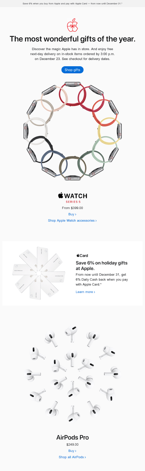
Though they stuck to their typical brand colors, they turned their products into wreaths and snowflakes, highlighting the holidays in a fun way.
Bicycle accessory brand Rapha didn’t even get close to traditional holiday colors in this email. Yet, it still captures the spirit of the season because the copy makes it clear what their gift guide is all about.
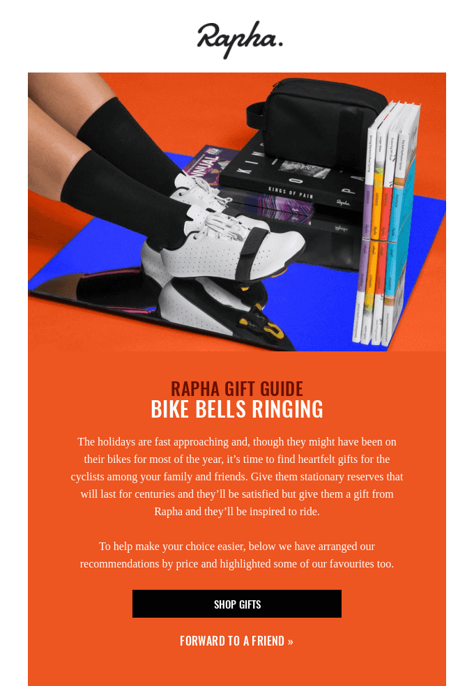
The brand uses phrases like “bike bells ringing” and “all the trimmings” to get in the festive spirit without typical red and green color schemes.
2. Consider other holiday color combinations
There are other colors that can communicate that Christmassy feeling.
You might use blue and white to depict a snowy scene, silver and gold for a classy Christmas, or black and white in Black Friday emails. Not only will this make things easier for your entire audience to consume your emails, it can also help you stand out from the hundreds of red and green emails they’ll get this season.
BarkBox embraced this concept in their holiday email:

They went with a blue color scheme, adding white snowflakes and music notes to make it seem wintery. It still feels festive but works for everyone on their list.
3. Use patterns or textures
Patterns and textures are another great way to add holiday flair without using red or green. Create your own, branded pattern or find a great texture from a stock library. BathLife used a classy gold pattern as the background of their holiday email:
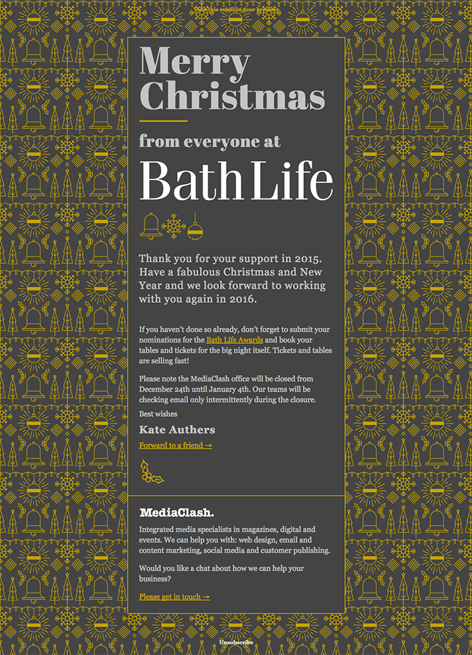
This design choice is sort of like creating your own gift wrap for an email. Find out how to code background images in email so you can pull of a look like this.
4. Use more than color to distinguish links and CTAs
The goal of most holiday email promotions is to convince your contacts to click links and CTAs that send them to a landing page on your site.
While it may be tempting to make your links red or green this holiday season, make sure you’re distinguishing them in other ways, too. Consider adding an underline, an arrow, or another symbol to make links stand out.
To someone dealing with color-blindness, your green or red buttons may look the same as the rest of your email. But you want them to stand out. So think of other ways to highlight them:
- Make them big
- Add an icon
- Include a border
- Switch up or emphasize the font
- Place them in their own area of the email
And of course, writing creative email CTAs can do a lot to boost your clicks. Instead of “Buy Now” or “Read More”, write CTA copy that gets a laugh, makes a promise, or stirs up curiosity in your subscribers.
Accessible email matters now more than ever
Accessibility isn’t just good practice; it’s becoming law in some regions. Starting June 2025, the European Accessibility Act (EAA) requires digital communications, including email, to meet accessibility standards. If you’d like a full breakdown, check out Sinch Mailgun’s webinar recap on what the EAA means for email.
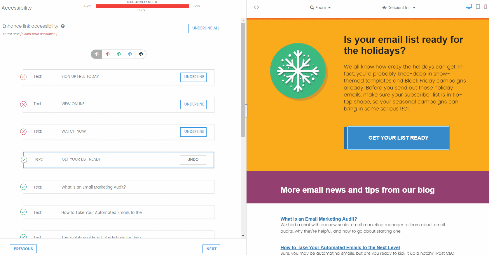
The best way to know that your emails look good for every single one of your subscribers is through pre-deployment testing. That’s where Sinch Email on Acid shines. The accessibility features in our email readiness tool check your email for color contrast, code for screen readers, title attributes, alt text, and other accessibility factors. You can even preview the email with filters that display different color deficiencies.
Enjoy unlimited testing with every one of our plans. That means you can preview campaigns on more than 100 clients and live devices, and you can do it as many times as you need before hitting send. That’s not a holiday promo, my friend. It’s just how we do things around here.