Email Development
How to Write Alt Text for Better Accessibility in Emails

They say a picture is worth a thousand words.
So, how do you take on the challenge of effectively describing images in emails for subscribers using assistive technology like screen reading software?
Understanding how to write alt text for images is a key step toward improving email accessibility – not just for your subscribers with disabilities, but for all of your subscribers. Done right, alt text can serve as an important part of an optimized inbox experience.
It’s time to stop overlooking alt text as a “nice to have” element in your emails. Here are our top tips for writing better alt text, plus a few examples:
What’s the purpose of an alt attribute in HTML?
Alt text, known as an <img> alt attribute in HTML code, supports accessibility in email marketing by providing a text-based description of an image. This means that if a subscriber cannot see an image for whatever reason, they can still understand the content of your email.
The primary purpose of the alt attribute in HTML is for accessibility, particularly with screen readers. Screen readers assist those who have visual and mobility impairments with reading and navigating digital content. During a recent episode of Notes from the Dev: Video Edition, we took a listen to a few emails on screen readers and the difference between those optimized for accessibility and those that weren’t was striking.
Alt text doesn’t take long to write, but it can have a huge impact on the overall experience for someone using a screen reader.
Alt text isn’t just for emails, but for all sorts of digital content. Sometimes it’s used in web content for search engine optimization (SEO) because Google uses it to index images. But SEO is not at all the primary purpose of writing alt text. It’s there to support people with disabilities.
That’s why it’s important not to cut and paste website alt text without evaluating its content first. If you write your alt text as a bunch of keywords strung together, it will read as gibberish to any screen reader (and be weird to anyone else with images off.)
Why do email images need alt text?
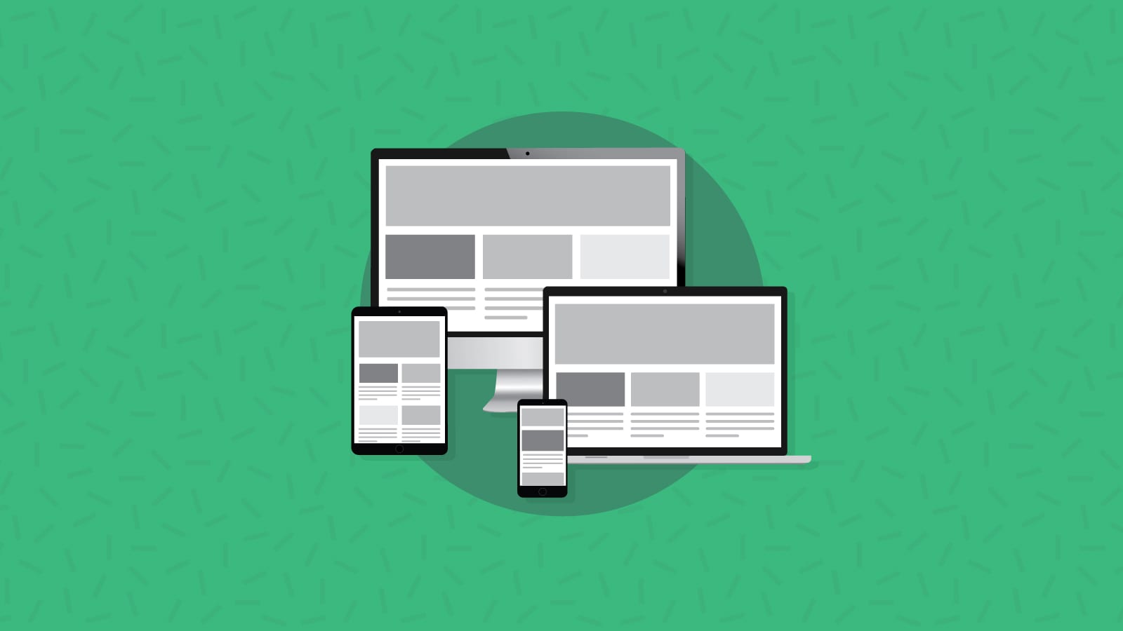
For most email designs, the graphics and the copywriting go together. They complement each other. You wouldn’t have the same inbox experience with just one or the other. For subscribers who are listening to your campaign rather than viewing it, alt text is essential to bringing that campaign to life.
Think of your email alt text as part of your overall user experience – even beyond accessibility. That’s because many email clients, like Outlook, turn image downloading off by default.
With alt text, you won’t sacrifice readability of your emails. And while screen readers are top of mind with alt text, it’s not the only use case for writing it – in fact, most of your subscribers can benefit from well-written alt text throughout your email campaigns, like those with:
- Slow internet connections, which may cause delays in image loading
- Email clients that turn images off automatically, such as AOL Mail, Outlook, and Office 365
- Manual settings that turn images off to save data or bandwidth
This is a big reason why we don’t recommend image-only emails. Not only do they present an issue with accessibility, even with alt text, but they also aren’t always responsive for mobile users and could get you into trouble with spam filters.
How do you write code for image alt text?
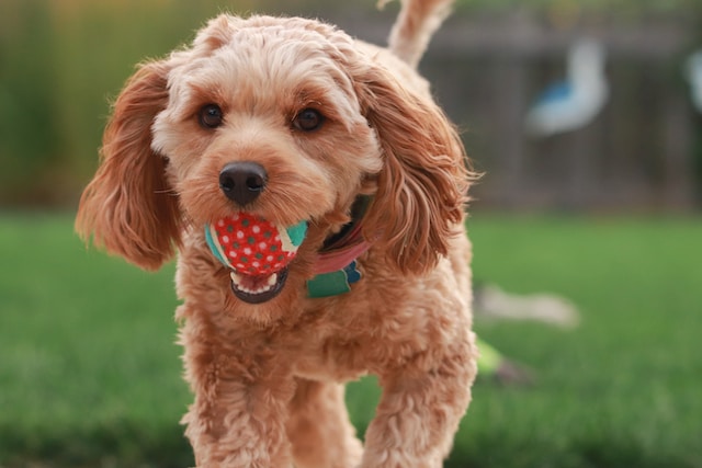
Let’s say you want to code alt text for the adorable image above. Here’s an example of what alt text looks like in your HTML code:
<img src="goldendoodle.jpg" alt="Miniature golden doodle puppy with a tennis ball" width="500" height="600">
If you want to skip alt text, use <alt=""> instead of leaving alt text blank altogether. That way, screen readers will skip over it instead of reading, “unlabeled image” out loud. Email developer often chose to do this on less important images such as decorative icons or other small design elements that aren’t essential to the experience.
How to write alt text copy for images
As you’re building the email copy, think about what each image adds to the messaging of your email and plan accordingly. Here are a few alt text copywriting tips to keep in mind:
Keep it short and simple
With alt text, your goal should be to accurately describe the image. But that doesn’t mean writing a novel’s worth of description. Include a few key details that help someone paint a picture in their mind.
In this Bonobos example, instead of “blue shirt,” write, “Blue, Oxford-style dress shirt with white buttons.”

Oh, and don’t worry about adding filler words like “image of…” or “picture of…” before your description. Be as concise as possible – no more than two lines of text.
Add value with your descriptions
Alt text isn’t the star of your email copy, but you don’t have to treat it like wasted space. Think about how you can add value to someone who isn’t able to see an image—what do they need to know? You want to balance the length with what’s important in the image.
If you’re stuck, think about why you or your designer chose the image in the first place. Pretend it’s hanging in a museum and you’re trying to describe it to someone on the other side of the room. What are the most important elements? Why is it hanging in this particular room, with these other works? What does it add to the conversation?

For example, in this image (a still from a music video), there are plenty of details you could include, like naming Beyonce and Jay-Z, the color of their outfits, and details about their surroundings. But what is most important about this image is the way they are challenging traditional ideas of “art” in the music video. Distilling that into alt text could read something like:
Beyonce and Jay-Z triumphantly stand in front of Leonardo Da Vinci’s Mona Lisa at the Louvre Museum.
The more you can distill an idea or story into your short description, the more helpful it will be.
Avoid repetition with your alt text
You wouldn’t repeat the same paragraph six times in your email copy, so don’t do it for your alt text. It’s like nails on a chalkboard when listening on a screen reader to hear the same thing over and over and over. That means avoiding using image titles as your alt text, too, since screen readers can read both back-to-back, causing confusion.
Even if you’re including similar images, be creative and vary your alt text. And if you do find yourself consistently struggling to differentiate between multiple similar (or the same) images, it may be time to re-evaluate your design strategy.
Use punctuation
For longer alt text descriptions, use punctuation wherever it makes sense. This makes it easier to read and tells screen readers when to pause.
Here, for example, you would use an Oxford comma to break up the list of ingredients: “Mushrooms, avocado, tomatoes, eggs, and herbs on a cutting board.”

The only grammar rule to break? Don’t use quotation marks in your alt text. It breaks the HTML.
Who should write alt text?
It’s not necessarily the email developers’ responsibility to write alt text, in the same way it’s not their responsibility to write the subject line, preheader text, or body copy. We’re certainly not saying that email developers can’t write alt text – but not everyone who likes to write code likes to write descriptive yet succinct text too.
The person in charge of email copywriting could be the one to write your alt text. If you have a dedicated email copywriter, boom. Alt text is totally in their wheelhouse. Otherwise, a content creator or designer could do it. Either way, consider adding an explicit step into your email production cycle.
Here’s where having marketers write alt text copy can get messy, however. It is not marketing copy. You should not be including calls to action or trying to sell something with alternative text for images. Its purpose is functional, and that function is to describe the image – not persuade recipients to make a purchase.
If there’s an empathetic accessibility advocate on your team, they might be the best person to write alt text for email images. Or at least they should give the writers some pointers.
3 examples of how to write good alt text
As you write alt text, don’t overthink it. Look at the image and describe what you see.
1. Put your product in context
When you’re describing a product, you don’t have to include detailed specifications, SKU number, or measurements, but make sure to include a product name if you have one so that someone could easily find it later.
In this example, you would want to describe the vibe of the image, not just the product itself. Think something like: “A woman sits cross-legged against a wall, wearing our new cat-eye sunglasses.”

If you often name models or influencers in your catalog or social media campaigns, do that in your alt text, too.
2. Build a scene
With lifestyle images, there are often multiple elements to include in your alt text. To tie it all together, build a story—one that should mimic your overall email message.
For this example, you’ll want to write more than, “two women.” Add a few details that place the image in the overall context of your email campaign: “Two female friends embrace each other as they smile and laugh on the beach.”

3. Include emotion or humor in your description
Animated GIFs need alt text love, too. If you’re using a reaction GIF, you need to clearly explain the emotional beats or humor you’re trying to evoke. You can do this in a tongue-in-cheek way so that the alt text is still funny.

This popular Simpson’s GIF is typically used when someone is embarrassed or just wants to fade into the background. For alt text, you could do something like: “Homer Simpson slowly disappears into a bush, after emailing the wrong link to our entire list.”
Make sure your emails are accessible
Alt text is one of the easiest ways to make your campaigns more accessible, but it’s also easy to forget. With Sinch Email on Acid’s Campaign Precheck, we’ve simplified the process and set everything up for you so you’ll never miss an image again.
Use it to check your overall accessibility with alt text, color contrast, table roles, and preview how campaigns look on more than 100 of the most popular clients and devices. All before you hit send!