Email Development
Add These Two Innovative Email Layout Techniques to Your Toolbox

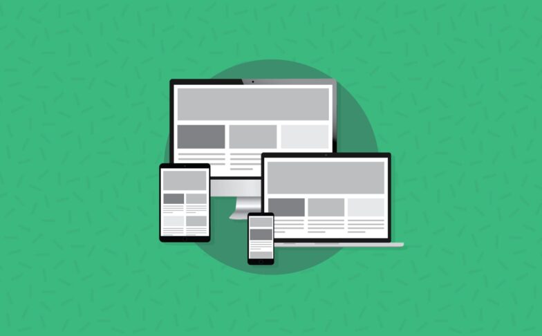
Chances are, if you’re reading this blog you know the challenges email developers face with finding adaptable email layouts. It therefore comes as no surprise that email developers are constantly trying to innovate on and perfect the layouts of their emails. In this blog, I’ll be looking at two innovative email layout techniques, their advantages and disadvantages, and how they fare with real content.
The Max-Width Method
Currently, the most common technique of structuring an email is to have a 100% width table as the container, with a centered cell inside. Within that cell we have a table with a max-width to control the width of the email’s content. Structuring a table like this means we need to employ a ‘ghost table‘ due to Outlook’s lack of support for max-width.
The centered table will float in the middle of the email on screens wider than the max-width (usually around 600px), and it will shrink to fit smaller spaces, like mobile devices or narrow browser windows.
The table of your dreams
The first technique we’re going to look at was posted online by Mark Robbins on the Rebelmail blog, aptly named “The table of your dreams.” Mark claims that by using a three column structure with a set width on the middle column, we can emulate the much used margin:0 auto; centering technique for web development.
Before we even get into the nitty gritty of the code, we need to test the example provided. I dropped the code through our Email on Acid testing platform and was pleased with the results.
It plays nice on all the major email clients, even the normally tricky ones. I see green ticks for the Gmail App and all the Outlooks. On top of that, it looks good on all the major mobile devices.
So, let’s have a look at how and why we’d employ this technique.
Using Mark’s table structure obviates the need for max-width and ghost tables to control the layout. By having a 100% width table with a hard width on a cell, while the other two are blank means that the two either side will fill the rest of the email, forcing the hard width cell to be centered on all devices.
This also means that we can use the cells either side to force “wonky” layouts by offsetting the number of cells either side
I know what you’re thinking; “What about mobile layouts? There’s nothing to force it to be mobile!” the clever part of this code, is that once the width of the viewport is less than the width of the hard width cell in the middle, it uses the 100% width of the overall table as an override of the hard width we put in
It sounds like a winner to me. Less code for our structure, a bit more bullet proof and less future proofing! But, it’s all too often with these code examples that we can forget the bigger picture and get too excited about the code. We need to see what it looks like with real content in. I mocked up a really simple layout to test how it stood up with real content, as seen below.
Once again, I ran this through our testing software. I was pleasantly surprised to find it worked in a lot of places. The one place it seems to fall down is on mobile. This may seem like a big drawback, but looking at the results all it really needs to make it user-friendly is some mobile enhancements. I have to stress that I only ran very basic tests on the code for base usability.
So, what’s the final verdict on ‘The table of our dreams’? I found the code to be very nice to work with. I plan to play with it more, too. The simplicity is definitely a big plus and something we’ll be looking to work into our own hybrid structure.
This code won’t change the email world, but it could simplify your table structures.
The Fab Four technique
The next code sample we’ll be looking at is the Fab Four technique, originally devised by email wizard Rémi Parmentier. He claims to be able to code responsive emails without media queries, a big claim!
So, just as we did with the prior method, we’re going to run the example code through Email on Acid to see how it renders without any of our content in it, just the base example.
It fares a little worse than the other structure with the main culprit being Outlook 2003. We do, however, have good mobile support. So if you find you have very low Outlook 2003 readership, this is definitely still a viable method for developing emails.
So, what makes this method special?
Rémi states in his post that this idea was born out of wanting to emulate flexbox behaviour in email. This is a fairly advanced technique, but I’ll try and break it down into simple terms.
The Fab Four technique relies on 4 different CSS properties working in tandem to control the widths, aka The Fab Four (in CSS):
- calc()
- width
- min-width
- max-width
I highly advise reading Rémi’s post as he explains why and how each property is used.
Rémi’s example already features a lot of content for example purposes, which means we don’t need to test that, rather we’re going to look at the cons he lists himself in the post;
It won’t work on Yahoo. The desktop version of its webmail supports media queries, though. So we could improve things a bit by making a mobile first version of our email, and then enhancing it on desktop with media queries.
As he states here, you’ll have to work pretty hard to get it working on Yahoo, which still has a pretty big readership. The media query support makes it highly workable though, nice!
You can only set one breakpoint. This might not be such a problem for emails though, as designs rarely go beyond 600px on desktop and don’t require more than one breakpoint to adapt on mobile.
I personally don’t see this being an issue, in fact I see this as a benefit for this development style. I believe having one breakpoint then having it adapting is the way we should code all emails.
You can only diminish the number of columns from a desktop version to a mobile version. While this rarely happens, you couldn’t go from a four columns layout on mobile to a single column layout on desktop.
Again, I don’t really see this as a negative. I very, very rarely see this method employed in email. While it could be a rare user-case, this shouldn’t be enough to put you off this method.
The final version of the calculation (to support the old Outlook.com and degrade gracefully on the new one) is hard to read. Using a preprocessor and a mixin to generate all the required properties could be more than helpful.
This one could be a bit of a hang-up for some developers. It can be a bit of a chore to generate the properties. But, just like stated above, using mixins of a preprocessor such as LESS or Sass will vastly speed up this process.
So, what’s the final verdict on ‘The Fab Four Technique’? While there a few barriers to start using it straight away, it’s definitely worth getting stuck into the code and seeing what you can come up with. An email without tables is a long sort-after goal for many developers, and this does it gracefully. Make sure you remember the drawbacks of Outlook 2003 and Yahoo, too.
Final thoughts
As stated in the introduction, email developers are constantly trying to innovate on their layouts. I’d highly recommend trying out these two examples. Even if you don’t end up using them in your production process, you’ll no doubt learn something about how and why people use these techniques.
Interestingly enough, Mark and Rémi were both trying to emulate web techniques; margin:0 auto; and flexbox respectively. A lot of email developers refuse to even look at web development techniques, but these two innovators have both seen a web development technique and created that in email, drawing inspiration from web techniques rather than writing them off. As email developers we have to be ready to adapt any code we can find for email.
I’d love to know if anyone has tried these techniques, please reach out in the comments or on Twitter with your thoughts.