

The Last Bulletproof Button You’ll Ever Need
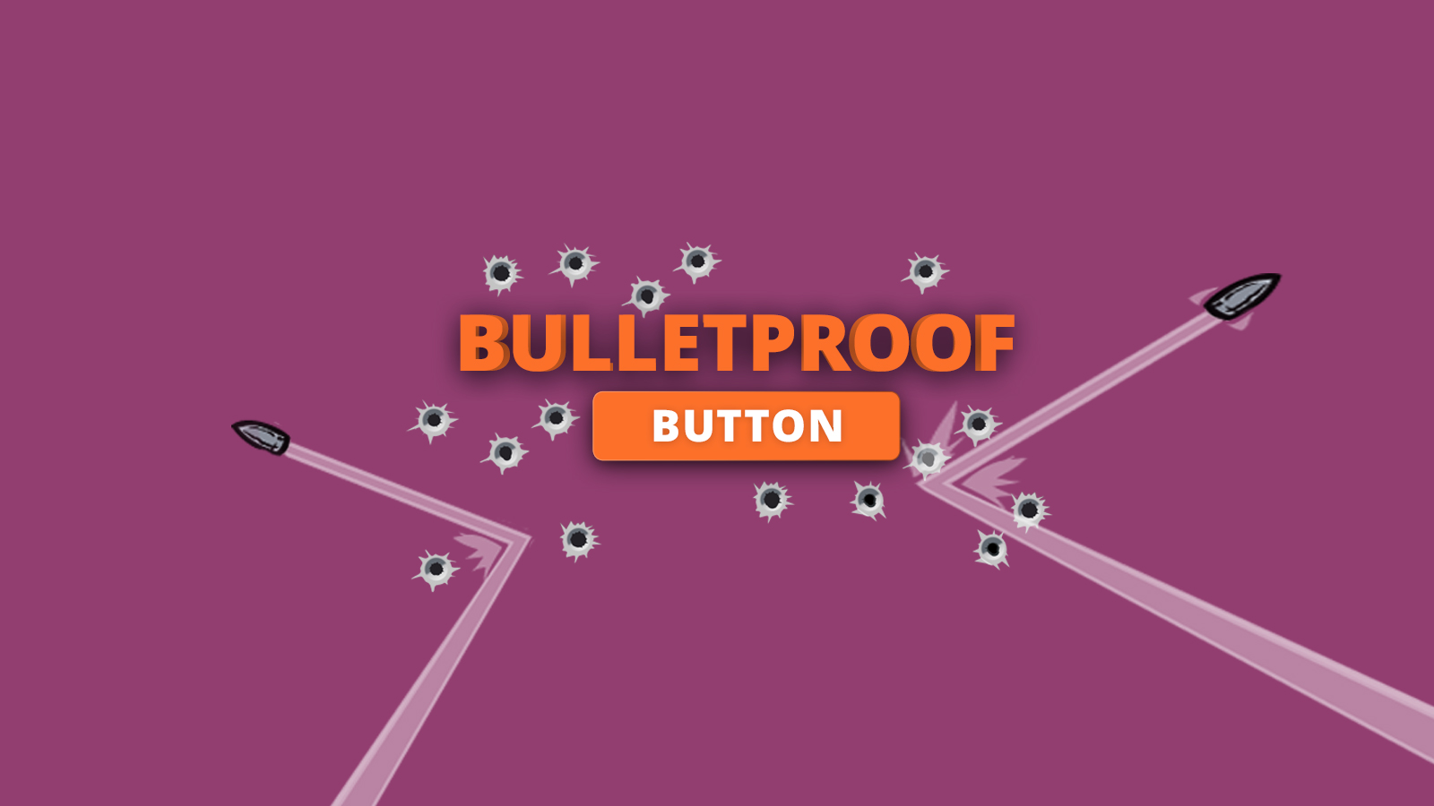
Buttons can be one of the most frustrating parts of email development. It has to look great (or at least look like a button) in every single client, because this little colored block is what all your high-conversions dreams are resting on. I built this button to use for our in-house mailings, and I thought I’d share it here.
|
This button accomplishes a few things. It includes spacers to help you control how much space appears before and after the button. It’s also built so that the entire colored area of the button is clickable/touchable, not just the text. One advantage this button has, being code-based instead of image-based, is that it’s always visible, even when image blocking is turned on. There are two versions of this button included, one centered and one left aligned.
Here is an example of the centered button.
<!-- START CENTERED BUTTON -->
<center>
<table width="100%">
<tr>
<td>
<table border="0" cellpadding="0" cellspacing="0">
<tr>
<td height="20" width="100%" style="font-size: 20px; line-height: 20px;">
</td>
</tr>
</table>
<table border="0" align="center" cellpadding="0" cellspacing="0" style="margin:0 auto;">
<tbody>
<tr>
<td align="center">
<table border="0" cellpadding="0" cellspacing="0" style="margin:0 auto;">
<tr>
<td align="center" bgcolor="#87be45" width="150" style="-moz-border-radius: 4px; -webkit-border-radius: 4px; border-radius: 4px;">
<a href="http://www.example.com" style="padding: 10px;width:150px;display: block;text-decoration: none;border:0;text-align: center;font-weight: bold;font-size: 15px;font-family: sans-serif;color: #ffffff;background: #87be45;border: 1px solid #87be45;-moz-border-radius: 4px; -webkit-border-radius: 4px; border-radius: 4px;line-height:17px;" class="button_link">
Get Started!
</a>
</td>
</tr>
</table>
</td>
</tr>
</tbody>
</table>
<table border="0" cellpadding="0" cellspacing="0">
<tr>
<td height="20" width="100%" style="font-size: 20px; line-height: 20px;">
</td>
</tr>
</table>
</td>
</tr>
</table>
</center>
<!-- END CENTERED BUTTON -->
In clients that can handle CSS3, the button will be rounded at the corners. The button will be square in Outlook and other clients that don’t support advanced CSS. If you need it to look identical in all clients, then I would suggest removing the “border-radius,” but I consider this to be an example of progressive enhancement. Users with better clients see a slightly better looking button, and other users see a square button.
The left aligned version of the button is below.
<!-- START LEFT BUTTON -->
<table width="100%">
<tr>
<td>
<table border="0" cellpadding="0" cellspacing="0">
<tr>
<td height="20" width="100%" style="font-size: 20px; line-height: 20px;">
</td>
</tr>
</table>
<table border="0" align="left" cellpadding="0" cellspacing="0">
<tbody>
<tr>
<td align="left">
<table border="0" cellpadding="0" cellspacing="0" width="150">
<tr>
<td align="center" bgcolor="#87be45" width="150" style="-moz-border-radius: 4px; -webkit-border-radius: 4px; border-radius: 4px;">
<a href="http://www.example.com"
style="padding: 10px;width:150px;display: block;text-decoration: none;border:0;text-align: center;font-weight: bold;font-size: 15px;font-family: sans-serif;color: #ffffff;background: #87be45;border: 1px solid #87be45;-moz-border-radius: 4px; -webkit-border-radius: 4px; border-radius: 4px;line-height:17px;" class="button_link">
Get Started!
</a>
</td>
</tr>
</table>
</td>
</tr>
</tbody>
</table>
<table border="0" cellpadding="0" cellspacing="0">
<tr>
<td height="20" width="100%" style="font-size: 20px; line-height: 20px;">
</td>
</tr>
</table>
</td>
</tr>
</table>
<!-- END LEFT BUTTON -->
Making Changes
This button is pretty straightforward, but I’ll go over a few settings you can tweak to change the size and shape of the button.
- To change this to a right aligned button, just change align=”left” to align=”right” in both places that it appears.
- You can edit the spacing above and below the button by changing the line-height, height, and font-size of the TDs in the tables above and below the button.
- To change the width of the button, make sure to edit both the width attribute on the TD and the style on the hyperlink.
- To change the height of the button, you can edit either the line-height style or the padding style on the hyperlink.
- You can control how rounded the corners are through the trio of “border-radius” styles on the hyperlink.
- The color of the button can be controlled through the bgcolor attribute on the TD and the background-color style on the hyperlink. Make sure to use a 6 digit hex code, as Outlook doesn’t like 3 digit shorthand codes.
- Finally, text size and color can be controlled through the font-size and color styles on the hyperlink.
How are your emails looking?
Do you know how your email will render in all of the most popular clients? Give our free trial a shot and find out today!
Author: Kyle Lapaglia
27 thoughts on “The Last Bulletproof Button You’ll Ever Need”
Comments are closed.
Hi Geoff,
This button doesn’t work the way its supposed to in Outlook 2010. Don’t think this is the final button we need.
Cheers
Great bit of code and seems to work great, except in Outlook 2007/10/13 where the button doesn’t obey the height in the code. It snaps to the height of the content. Perhaps some conditional mso tags are needed here for specific code for these clients?
Thanks !
But two things :
– the center tag is bad 😉 and deprecated : http://stackoverflow.com/questions/1798817/why-is-the-center-tag-deprecated-in-html
– You can add one more thing in the css : mso-line-height-rule:exactly; for outlook 2010 and 2013
Otherwise, EmailOnAcid rocks
Shameer and Jaina, looks like I had a typo in there. It should work in all clients now.
Nelson, yes it’s true. In email we sometimes work with deprecated code. But I have found that this helps the button center in Yahoo! Mail in some cases. Feel free to leave it out if the button works for you without it.
Hey – any reason why the button doesn’t snap to 100% width on mobile? I think that’s a great feature to have – thoughts? I’ve used that in previous buttons.
Phil,
You could make that kind of enhancement using media queries, but I didn’t include it here. I wanted to make these buttons simple enough to drop directly into an email design. Media queries add another layer of complexity.
Thanks again Email on Acid and Geoff. I’ve been using your previous bulletproof button exclusively. Really awesome to see iteration and community involvement.
Cheers!
Hello!
That looks great. I have two questions from the Mailify team:
– Why use tables for the upper and lower spaces before and after the button?
– Is the lineheight on the tag to get all the height clicable really useful?
Thx Geoff!
Paul,
I chose to use tables because they provide consistent spacing across all email clients.
The line height (and clickable button area) is included to increase usability on mobile devices. It can be a bit harder to hit the text just right with your finger, but easy to hit a big colored button.
Thanks for your questions!
I recently tested different email clients to assess support for the border radius- Outlook 2011 and 2016 *will* show the rounded corners, but the rest won’t.
FYI here’s the list-
Border Radius Supported:
Android 2.3
Android 4.2
AOL Mail
Apple Mail 8
Gmail
Gmail App (Android)
Google Apps
iPad (Retina)
iPad Mini
iPhone 5s (iOS 7)
iPhone 5s (iOS 8)
iPhone 6
iPhone 6 Plus
Office 365
Outlook 2011
Outlook 2016
Outlook.com
Thunderbird 31
Border Radius Not Supported
Yahoo! Mail
Windows Phone 8
Outlook 2013 120 DPI
Lotus Notes 8.5
Lotus Notes 8
Lotus Notes 7
IBM Notes 9
BlackBerry 5 OS
Outlook 2000
Outlook 2002
Outlook 2003
Outlook 2007
Outlook 2010
Outlook 2013
I’m using this code and it still doesn’t look right in Office 365. Is anyone else having that issue?
Ali,
What doesn’t look right? Can you add a shared test link with code analysis? I can help you fix any problems that may have occurred.
All due respect, calling this button ‘bulletproof’ is a bit of stretch. If you use this button more or less as you have it set up here, it’s fine. But change the background color to a lighter color, *without* changing the color of the border to match and you’ll quickly see where this button fails. Since you’re using the tag to set the border, and a padding:10px in the same tag to create the height, I assume for Outlook, the border doesn’t span to the width of the background color. Then if one starts messing with the width, the font size, the combination of padding, border and line height can create a bit of mess.
It’s a good start, but it’s far from bulletproof.
CPuffer,
Thanks for the feedback! You certainly need to know HTML to make this button continue to look good. The border color is actually kind of unnecessary, unless you want a different color there. I’ll take this into account for our next iteration.
Geoff, Well the border color is only unnecessary until the designer gives you a button with a border color that’s different than the background color. 🙂
Once again it’s Outlook that’s foiling your best intentions.
https://www.emailonacid.com/app/acidtest/display/summary/P3ihBIRNZVRRJ0HPks8cu20uUH8o827eAYGetXxEgYdj5/shared
All I’ve done with this test is change the background color & text color. And in the first one add a few more words to create a wrap.
This table-based button has an advantage over that other ‘bulletproof’ button on the web, in that you’re not using the line-height to create the button height. But as you can see from the linked test, wrapped text in Outlook looks even stranger. It looks like Outlook is ignoring the width:150px i the tag, which means it’s going to take a bit of futzing with the padding to align border to line up with the width of the button. I tried moving the border to the containing
My problem with this as bulletproof, is that once you break out of the parameters of what you built it is kinda a crap shoot. There’s a lot of inline styles targeting the same issues; this, of course, is the nature of email coding. But what I need to do is start stripping them out and seeing what are absolutely necessary.
All that said, sorry if I’m coming off a overly critical. I don’t mean that. I’m trying to figure out how to take the best features of this — full-button clickable area, works in GMail app — and make it work in Outlook with a border.
*shakes fist at Outlook*
this is great, though it doesnt work correctly with
tags in 2007, 2010, and 2013, if you want 2 lines of button text.
Here was the hack I added to make the height of the button work in Outlook > 2003. Don’t ask me why a span above and a div below. That’s just what worked best for me.
<!–[if mso]>
Call To Action
<!–[if mso]>
I also moved all the a.button_link styling into the CSS. I have to run an inliner anyway, so better to keep it organized for my own sake. And for having consistency with multiple buttons in an email.
It’s a great button/tutorial. Thanks Geoff! Out of curiosity, why is there a even a class on this button? All of the styles appear to be inline anyway. Am I missing something here?
Thanks Ryan! The class is there for any styles you might want to add. It’s not used in the example.
For what it’s worth, this button doesn’t work in Lotus Notes. The padding and label color isn’t applied, so for me I get a small dark blue rectangle with a blue label.
Thank you so much for this, I was fighting for days with Outlook. This code finally made my button work as intended.
This wasn’t working on mobile when viewed in Outlook 2016. I made some tweaks for it to work:
– moved the background colour to the table element
– removed the padding CSS and used “cellpadding” for the table instead
– removed “width” declarations on TD or in CSS
Example code:
Thank you Austin –
When I made my border a different color from the button, the bgcolor of the kept spilling out behind the in Outlook.
Moving bgcolor from td to table + removing width on the td solved it!
Oof, EOA stripped the tags from my comment ^^
The problem was that the td bgcolor kept showing behind the a bgcolor in Outlook.
is there a change I can make in the code to make the button open in a new window?
Hi J —
You would use
target="_blank"
just before the href to have it open in a new window.Hope that helps!