Email Development
Coding Interactive Hotspots in HTML Email

Oct. 1, 2016 Update: This technique was updated to address the new Gmail support of media queries.
Interactive hotspots, or positioned information overlays, are a good way to deliver additional contextual information on an image. This article will go into how you can implement interactive hotspots in email that work in many of the major email clients.
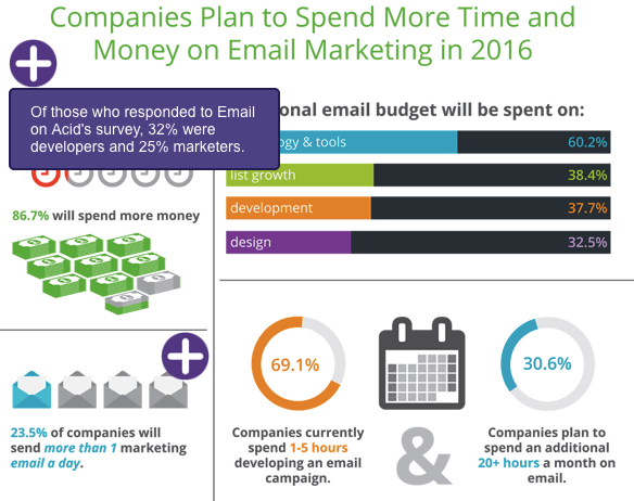
A few weeks ago we sent out an email with an infographic that incorporated interactive hotspots. When the user hovered the cursor over the hotspot a small text overlay appeared next to the hotspot that provided more information about the statistics within the infographic.
A lot of recipients asked us how we did it, so this article will go into the nitty gritty of how it’s done.
Interactive Hotspot Support
As usual, interactive hotspots only work in certain email clients – in this case email clients that support the :hover pseudo-class. This includes iOS Mail, Apple Mail, Yahoo! Mail, AOL Mail and the Webmail version of Gmail (except Gmail for Business). In the other email clients the infographic is shown without the hotspot markers.
Hotspot Building Blocks
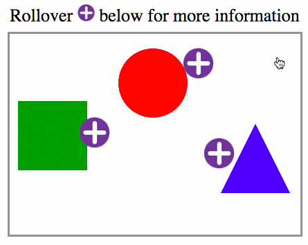
We’ll go through the steps in building a simple hotspot example.
“Absolute” positioning using margins.
As most email clients don’t support absolute positioning, we position the hotspot icons with a technique that Mark Robbins of Rebelmail pioneered, which uses margins.
The technique positions elements in a container by first wrapping the element you want absolutely positioned with a div that has zero width and height and overflow set to visible. Then within the first wrapping element, wrap the element with another div with display set to inline-block and with the element relative positioned within the container using left and top margins.
                                <!-- main container -->
<div style="width:400px;height:300px;">
    <!-- first wrapper -->
    <div style="max-height:0;max-width:0;overflow:visible!important;">
        <!-- second wrapper -->
         <div style="position:relative;Margin-top:10px;Margin-left:140px;display:inline-block;">
             <img src="https://…./hotspot-icon.png">
         </div>
    </div>
</div>
It’s a pretty cool technique and you can read more about this positioning technique in the Rebelmail blog.
Using the :hover Pseudo-Class
We then add a div with the text overlay that we want to show once the hotspot is triggered. It is hidden by default by having its max-height set to zero. Then we wrap both the hotspot marker and the overlay with a div with a class name “ehotspot”.
Within the style block, we add a :hover selector that displays the hidden div once the user hovers over the element. Simple, right?
                                <style>
    .ehotspot:hover div {
        max-height:none!important;
    }
</style>

    <div style="max-height:0;max-width:0;overflow:visible!important;">
        <div style="position:relative;Margin-top:10px;Margin-left:140px;display:inline-block;">
            <div class="ehotspot" style="max-width:0px;overflow:visible!important;">
                <img src="https://…./hotspot-icon.png">
                  <!-- hotspot text overlay -->
                <div style="max-height:0px;overflow:hidden;width:240px;">
               The infamous pi (π) is used to calculate the circumference or area of circles.
                </div>
            </div>
        </div>
    </div>
Example Without Fallbacks
You can see the example without fallbacks here. We still need to add some techniques to handle the clients that this won’t work in – Outlook, Office 365 and the Gmail mobile app.
Implementing Fallbacks
To make implementation straightforward, we’ll hide the entire interactive container from non supported clients and display a separate container that just contains the image with the shapes. This also means you can display an entirely different image in the fallback container if you like. Alternatively you can choose to just hide the markers and show the base image.
                                <!-- fallback: displayed by default -->
<div class="fallback">
  <img src="https://.../shapes-fallback.png" style="display:block;">
</div>

<!-- interactive: hidden by default -->
<div class="kinetic" style="mso-hide:all;display:none;max-height:0;overflow:hidden;">
  … interactive content …
</div>
Interestingly as of this writing, all clients that don’t support interactive email also don’t support media queries, so we can use a simple media query to hide the fallback and display the interactive containers.
                                @media screen and (max-width:9999px){
        .fallback{
            display:none;
            display:none!important;
            max-height:0;
            overflow:hidden;
        }
        .kinetic{
            display:block!important;
            max-height:none!important;
            position:relative;
            overflow:hidden;
            width:400px;height:280px;
        }
    }
Update: Due to the Gmail app’s recent support for media queries but not the :hover pseudo-class, we need to use this technique to hide the kinetic elements from the Gmail app. This technique includes setting a class to the body of the email (ie. gmailbody) and adding the media query code below. Alternatively you can use the -webkit-min-device-pixel-ratio media query in the above code to limit interactivity to only Webkit based clients and forgo the following code:
                                @media screen and (max-device-width:1024px){
        u + .gmailbody .kinetic{
            display:none!important;
        }
        u + .gmailbody .fallback{
            display:block!important;
            max-height:none;
        }
    }
Supporting Hotspot Toggling in Touch Devices
To support toggling of the hotspot in touch devices such as on mobile, a hidden alternate hotspot marker is placed outside the hotspot div.
                                <div class="ehotspot" style="max-width:0px;overflow:visible!important;">
  <img src="https://…./hotspot-icon.png">
  <!-- hotspot text overlay -->
  <div style="max-height:0px;overflow:hidden;width:240px;">
      The infamous pi (π) is used to calculate the circumference or area of circles.
   </div>
</div>
<!-- hidden alternate marker placed outside hotspot for mobile toggle/hide -->
<img src="https://…./hotspot-icon.png" style="position:absolute;top:0px;max-height:0;">
The alternative marker will be set to visible when the hotspot is triggered. The alternative marker is absolutely positioned so that when visible it will overlay the original marker. Since the alternate marker is not within the hotspot, tapping the icon will deactivate the :hover selector and close the overlay.
The CSS to display the alternate marker must be put into a media query for mobile or tablet devices so that it will not be active in non-touch devices as it will cause the overlay to flicker. For our purposes, we put it in a max-device-width:1024 media query.
                                @media screen and (max-device-width:1024px) {
        /* hide original marker */
        .ehotspot:hover img{
            visibility:hidden;
        }
        /* show alternate marker */
        .ehotspot:hover + img{
            max-height:none!important;
            z-index:3;
        }
   }
Other Tweaks
You may want to consider a few of these tweaks to polish your email and deal with client quirks.
- Attribute selectors are added to support interactivity in Gmail Webmail.
- The base image is wrapped with a link with an anchor (<a href=”#base”>…</a>) so that the user can hide a hotspot in mobile or tablet by tapping the base image itself.
- A “hint” element is added to the top of the interactive container to inform the recipient that the hotspots below are interactive. This hint element is only visible in clients that support interactivity.
- Animations are added to grow and shrink the hotspot to attract the user’s attention in clients that support interactivity.
- You’ll also notice that overflow:visible!important is added to max-width elements. That is to deal with Yahoo! Mail’s addition of overflow:auto on elements with max-width set.
Considerations for Responsive Email
A drawback of this technique is that it does not support responsive images. This is because the margin offsets of the hotspots are specified in pixels. The images should not be made to shrink or expand to its container or the hotspot coordinates will be off.
However you can still leverage interactive hotspots in your responsive designs with a combination of the following tweaks.
- Use media queries to re-adjust both the image size and hotspot coordinates on mobile.
- Use scalable images in the fallback image so your hybrid/spongy email will still scale appropriately in the Gmail mobile app.
- Use a narrower base image so that the email has room to shrink in a mobile client.
- Use large fonts in your email so a fixed width email will still look good in mobile.
Are you an email geek?
You’re in the right place! Join Email on Acid’s community, 100% free of charge, and gain access to lots of tips, tricks, templates, white papers and more!


