Email Development
HTML Email Background Image Optimization Guide

Email Development
In the realm of email marketing, design plays a crucial role in capturing your audience’s attention. Background imagery and graphics can effectively elevate your email campaigns. Beyond just looking good, an email background image helps convey brand identity and create a cohesive experience.
In this article, we’ll explore how you can add background images into your email designs, enhancing the overall design. You’ll find how to make your email background image responsive and make sure it renders correctly on problematic clients like Outlook.
Adding a background image in your emails can significantly enhance their visual appeal because it opens up a lot more options for unique designs. There are several compelling reasons to use email background images.
Background images in email marketing can range from subtle textures and patterns to more elaborate visuals, such as product images, scenic landscapes, or lifestyle shots.
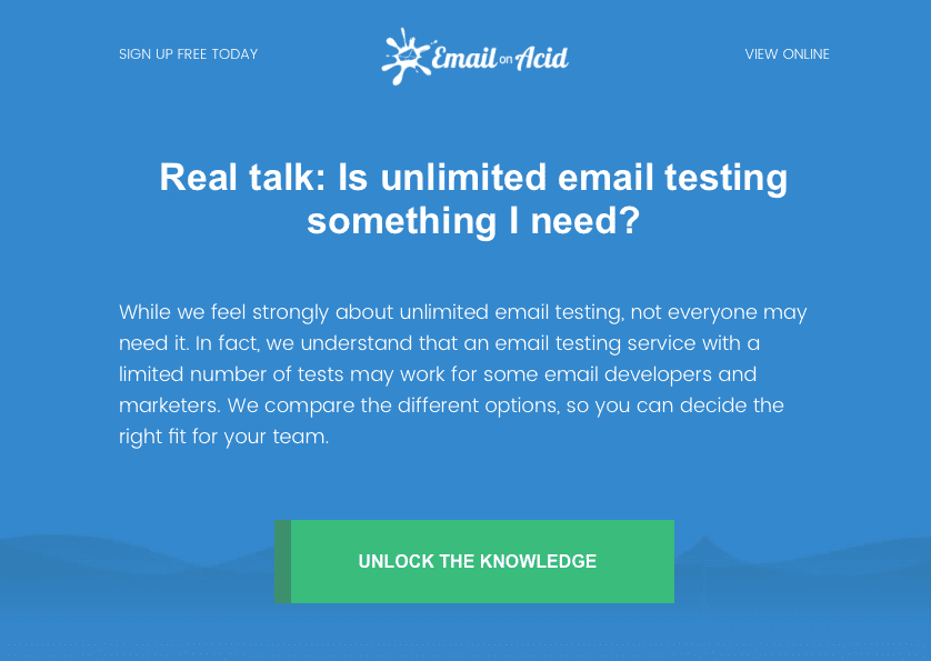
Below you can see an example of a subtle background texture compared to the version with no background image. Notice the darker blue wave behind the CTA button. The background image here helps to add a bit of depth to the design, so it’s not just a large block of one shade of blue. Of course, that solid blue background is better than the alternative.

What we’ve done above is code a solid background color behind the image that works with the design and shows up as a fallback when needed. For example, when Outlook blocks images the email is still readable. If the background image were blocked, and the background was white, a lot of this email would be unreadable.
Here is an example of an email background image that uses more striking lifestyle photography to add layering to the design:

Although it’s totally fine to just use solid blocks of color as your background, you can also use bulletproof backgrounds like these to add a bit of flair to your designs.
You’ll often hear email developers refer to certain elements as “bulletproof”, simply an email element that is bulletproof retains its functionality on any email client, regardless of the level of HTML and CSS support that client has.
It’s worth noting that bulletproof elements may vary visually across clients, but the element’s functionality remains bulletproof.
When email developers refer to a background as bulletproof that means it’ll look good on every email client. Bulletproof backgrounds utilize Outlook-specific code to achieve background imagery on Outlook and have a nice solid fallback color so that whenever images aren’t loaded the email still looks great.
Historically, background images have had varied support across email clients. In modern times, the vast majority of popular email clients will render your background images just fine, as long as they’re coded correctly.
The one outlier for this, as always, is Outlook. Outlook does not support background images in the traditional sense but by using Outlook-specific VML code we’ll be able to get background images looking great on Outlook too!
It’s worth noting that Windows 10 Mail will not render background images using either method, so make sure you check your audience numbers with this client before using the techniques below.
Let’s break down how to code a background image in an HTML email. The snippet below is ready to use if you want to just copy and paste and change the image and color values, but we’ll also be breaking it down and explaining how it works.
We’ll be referencing this snippet throughout this section:
                                <table role="presentation" width="640" style="width:640px;" cellpadding="0" cellspacing="0" border="0" align="center">
    <tr>
        <td align="center" bgcolor="#000000" background="https://via.placeholder.com/640x400" width="640" height="400" valign="top" style="background: url('https://via.placeholder.com/640x400') center / cover no-repeat #000000;">
            <!--[if gte mso 9]>
            <v:image xmlns:v="urn:schemas-microsoft-com:vml" fill="true" stroke="false" style=" border: 0;display: inline-block; width: 480pt; height: 300pt;" src="https://via.placeholder.com/640x400" />                <v:rect xmlns:v="urn:schemas-microsoft-com:vml" fill="true" stroke="false" style=" border: 0;display: inline-block;position: absolute; width: 480pt; height:300pt;">
            <v:fill  opacity="0%" color="#000000”  />
            <v:textbox inset="0,0,0,0">
            <![endif]-->
            <div>
                <div style="font-size: 0;">
                    <table role="presentation" width="640" style="width:640px;" cellpadding="0" cellspacing="0" border="0" align="center">
                        <tr>
                            <td height="400" align="center">CONTENT</td>
                        </tr>
                    </table>
                </div>
            </div>
            <!--[if gte mso 9]>
            </v:textbox>
            </v:fill>
            </v:rect>
            </v:image>
            <![endif]-->
        </td>
    </tr>
</table>
We can break this code down into two sections, the first is our standard background image code. This is how we get our background images working in all the non-Outlook email clients:
<td align="center" bgcolor="#000000" background="https://via.placeholder.com/640x400" width="640" height="400" valign="top" style="background: url('https://via.placeholder.com/640x400') center / cover no-repeat #000000;">
This is a pretty simple section of code, we’re setting the background image on our TD element with both CSS and HTML, we’re also using CSS to center it, telling the client to not repeat the background and adding a fallback color for any instances where images aren’t loaded.
The part of the code where we’re telling the client to not repeat it and instead using a background-size property of “cover” may not always fit your design. There are several other background-size properties to consider, such as contain. Check out this breakdown of the background-size property.
Now that we have our standard background image working for our non-Outlook email clients, let’s start breaking down the Outlook specific portion of this snippet.
We’re using VML here to achieve our Outlook background images. What is VML?
VML (Vector Markup Language) isn’t a standalone coding language like HTML or JavaScript. Instead, it operates within the framework of XML, serving as a tool to integrate 2D vector graphics, such as shapes, into email or web design. These graphics can then be customized with colors, content, and other elements according to your preferences.
When setting up your email, if you are going to be using any Microsoft-specific comment or code along with VML, you need to ensure the correct HTML tag is included in the head of the document, as follows:
<html xmlns="https://www.w3.org/1999/xhtml" xmlns:v="urn:schemas-microsoft-com:vml" xmlns:o="urn:schemas-microsoft-com:office:office">
Now, to add our Outlook background we’re using this conditional code:
                                <!--[if gte mso 9]>

<v:image xmlns:v="urn:schemas-microsoft-com:vml" fill="true" stroke="false" style=" border: 0;display: inline-block; width: 480pt; height: 300pt;" src="https://via.placeholder.com/640x400" />                <v:rect xmlns:v="urn:schemas-microsoft-com:vml" fill="true" stroke="false" style=" border: 0;display: inline-block;position: absolute; width: 480pt; height:300pt;">

<v:fill  opacity="0%" color="#000000”  />

<v:textbox inset="0,0,0,0">

<![endif]-->
The first section we’re just targeting the clients we need, in this case our opening tag of <!--[if gte mso 9]> and closing tag of <![endif]-->, tells us that the contained code will only take effect for, or target, versions of Microsoft Office (mso) greater than or equal to (gte) version 9, Outlook 2000.
Next, we introduce an image using the <v:image> tag, we’re defining the image, telling it to fill the space and also setting the width and height.
Please note: For VML you’ll need to use PTs (points) rather than Px (pixels) to define your sizes, but it’s very simple to do the conversion; just multiply the pixel value by 0.75:
Example of pixels to points conversion: 640px x 0.75 = 480pt
Then we’re adding our image source which is just the src=”link”.
We’re also adding a rectangle below the image as shown by the <v:rect> code, which has the same size dimensions and a fallback color that matches our non-Outlook specific code. This ensures we have control over the styling of the email when the background images don’t load, for example if a user hasn’t yet clicked the “Load images in this email” button.
Finally, you can define the v:textbox positioning to show you’ll be layering additional content over the above rectangle (v:rect) and image (v:image). In this example, we defined the position starting from the top left at "0,0,0,0".
Now, we open the <div> containing the image and VML. Make sure to follow it with <div style="font-size: 0;"> to stop the automatic 20px gap that appears after the image in Outlook.
As the final HTML table tag we used was a <td>, we need to use correct syntax here and either fill the <td> or start a new <table> to add the content.
                                <table role="presentation" width="640" style="width:640px;" cellpadding="0" cellspacing="0" border="0" align="center">
    <tr>
        <td height="400" align="center">CONTENT</td>
    </tr>
</table>
Input the closing tags for all of the above, including the VML tags, closing those within an MSO conditional tag.
The v:fill and v:image tags are self closing, therefore not needed after the table:
                                </div>
</div>
<!--[if gte mso 9]>
</v:textbox>
</v:rect>
<![endif]-->
</td>
</tr>
</table>
Although this VML code can be a bit daunting at first, after you’ve used it a few times and had a chance to modify some of the values and see how it affects the rendering you’ll be a VML pro in no time.
Currently this background image is set to cover the 640 pixel width of the table, which itself is not mobile responsive. If you want to deliver the best experience, you definitely need to make the email background image responsive. Sinch Mailgun’s Email and the customer experience study found more than 70% of consumers primarily view emails on a mobile device.
To add responsiveness to this, we’ll want to add a class to the table and elements that need to be responsive (e.g. class=”width100pc”) and include the corresponding CSS in the head of the email. This can be done within a current media query or its own as shown here:
                                @media screen and (max-device-width:640px), screen and (max-width:640px) {
    .w100pc {
    width: 100%!important;
    min-width: 100%!important;
    max-width: 1000px!important;
    height: auto!important;
    }
}
To make the background image responsive and 100% width, we’ll use the vw measurement and set the image width: 100vw.
By setting a class=”bgmobile”, we can change how our background image behaves within the same media query. Most useful here is the use of background-image: url(), which you can then swap to an optimized mobile image for the background:
                                .bgmobile{
    width: 100vw!important;
    background-repeat: no-repeat!important;
    background-size: cover!important;
    background-image: url(mobile-image.png)!important;}
You’ll want to make sure you have some fallbacks in place, which we handled in the full background image snippet earlier in the article.
There are times your images simply won’t load. It could be that your recipient has images disabled or perhaps they have a spotty connection and the images aren’t loading. Either way, ensure you always have good background color fallbacks.
Luckily, when it comes to background images, we only need a solid color fallback. Just make sure your fallback background color provides appropriate color contrast with text to support good email accessibility.
Here’s something you’ll want to avoid in email campaign backgrounds: important text. Live text is always a better option and should be prioritized.
Designing a background image with key messaging or relevant information on it is almost as bad as sending an image-only email. Subscribers who view the campaign with images blocked won’t see that text. It’s also bad for accessibility. The screen reading software that helps people with vision impairments read and engage with emails can only read the image alt text – not the words on an image. However, it’s usually unnecessary to write alt text for an email background image since it shouldn’t include anything that is vital to the message.
The rise in popularity of dark mode in email clients means we have to consider it when thinking about our background images.
Dark mode can introduce contrast issues with background images, particularly when switching from dark to light text on light-colored background. This shift can affect readability and overall user experience.
To help address the challenge, consider employing the “dark mode image swap” technique. This approach involves creating two versions of an image – one optimized for dark mode and another for light mode. Using the media query prefers-color-scheme, the recipients chosen theme is detected and the appropriate email background image is displayed.
Now that you’re armed with the skills to use background images to take your HTML emails to the next level, it’s important to remember the final step of any email build; the test.
It’s absolutely crucial that you run quality assurance on email campaigns, including for everything we’ve discussed in this article. You’ll want to make sure you’ve added your VML correctly, that your non-Outlook backgrounds are looking great, and that you have no contrast issues with your background images and/or fallbacks when dark mode kicks in.
With unlimited email testing from Sinch Email on Acid, you can preview how your code renders on more than 100 of the most popular clients and devices. Check the background and every aspect of your email in different versions of Outlook, in dark mode, with image-blocking on and off, and much more. It’s the most effective and efficient way to ensure your teams always puts their best email forward.
Credit goes out to our friend, Jay Oram, who wrote the original version of this article back in the day. We’ve reused his solid email code here. You can see Jay’s work and learn more from him over at ActionRocket.