Email Development
How We Created Our Interactive Scrolling Halloween Email
This post was updated on October 8, 2018. It was originally published in November 2017.
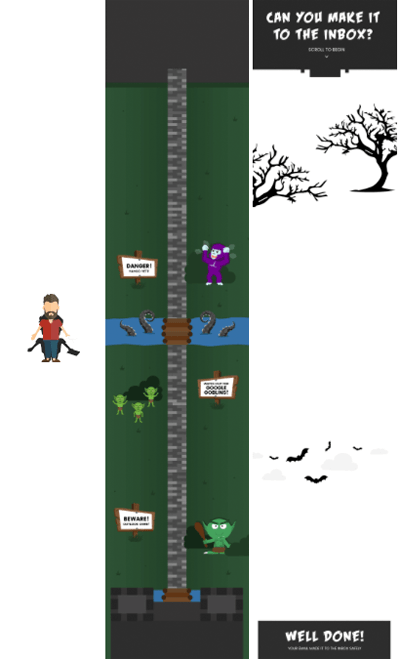
Halloween is one of our favorite times of the year at Email on Acid. To celebrate this spooky and fun season, we created an interactive scrolling Halloween email featuring a person walking through a landscape of “monsters” to deliver an email. There was a lot of interest in how we did it, so we decided to create a code tutorial.
A word of warning, though: We encourage you to test this technique before you send it out to your subscribers. Any code change – no matter how tricky – can break an email.
Faux-Fixed Technique
We’re calling this technique “faux-fixed” because this technique uses some tricks to create an appearance of an object being fixed in a container without using CSS positioning attributes. You can then scroll the content in the container under and over the fixed object. (The name is inspired from Kristian Robinson’s “faux-video” technique).
Normally, positioning a static object within a scrolling container requires us to style the object with fixed positioning (position:fixed). However, because position:fixed is not supported in most of the major email clients, we need to resort to using some CSS trickery.
Because we’re not using pseudo-classes, this technique has a surprisingly broad email client support, including iOS, Apple Mail and all the Gmail apps (Web, Android and iOS).
Simple Example
To illustrate how this works, here’s a simple example of a basketball “falling” through a hoop:

The core of the technique involves three parts:
- A fixed object (the ball)
- A background image (the backboard)
- A foreground image (the hoop).
This technique sandwiches the fixed object, so it appears over the background and beneath the foreground, and it looks like the ball is going into the hoop when the user scrolls.
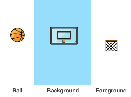
We wrap the background and foreground image in a container with an overflow hidden so the content scrolls. Then, we position the ball statically on top of the container.
Since fixed positioning is not supported in email clients, we’re using a clever technique by Mark Robbins to apply absolute positioning using margins. The code for the ball is placed outside the scrolling container, so it stays in place when the user scrolls the content in the container.
                                <!-- "absolute" position ball over scrolling container -->
<div style="height:0px;max-height:0px;overflow:visible!important;">
  <div style="display:inline-block;position:relative;opacity:0.999;margin-top:100px;margin-left:166px;width:70px;"><img src="bball.png" width="100%"></div>
</div>

<!-- scrolling container -->
<div style="height:360px;overflow:auto;">
 ...
</div>
Sandwiching the Fixed Object
We run into browser quirks when we “sandwich” the fixed object. Out of the box, this technique works in Safari (and iOS). However, in Chrome (and Android), the ball appears hidden by the background image.
Nevertheless, there’s a trick we can use to shift the context so the ball appears above the background. The technique involves creating a new “stacking context.” You’ve probably used z-index to change the stacking order of absolutely positioned elements, but did you know there are ways to “bump up” elements to the top by creating a new stacking context? This article goes into the details.
As mentioned in the article, we can create a new stacking context by using opacity and position. It’s best to use two methods because Gmail supports opacity but not position, and Yahoo! Mail supports position (relative) but not opacity. Unfortunately, Outlook.com supports neither so we’ll have to exclude that client.
Here’s the code to create the basketball example without fallbacks:
                                <!-- "absolute" position ball above scrolling container -->
<div style="height:0px;max-height:0px;overflow:visible!important;">
  <div style="display:inline-block;position:relative;opacity:0.999;margin-top:100px;margin-left:166px;width:70px;"><img src="bball.png" width="100%"></div>
</div>

<!-- scrolling container -->
<div style="height:360px;max-height:400px;overflow:auto;border:2px solid black;background-color:#97defb;">
  <div style="height:630px;background-image:url('background.png')">
  <img src="foreground.png" style="display:block;width:100%;position:relative;opacity:0.999;">
  </div>
</div>
Supported Clients
| Email client | Support |
|---|---|
| Android 4.4 Native Client | |
| Apple Mail | |
| Gmail App (Android & iOS) | |
| Gmail App (Pop/IMAP) | |
| iOS Mail | |
| Outlook for Mac | |
| Outlook for Windows | |
| Outlook.com | |
| Samsung Native Client | |
| Yahoo! Mail Webmail | |
| Yahoo! Mail App |
*Since we originally sent this email in 2017, we’ve found that there are more Gmail clients that support the interactive feature, however, support is not universal thanks to GANGA.
Fallback
As with most interactive email designs, we’ll need a fallback for clients that don’t support the technique. Our strategy is to show the fallback by default and then display the interactive content when we detect clients that support it.
                                <!--[if !mso]><!-->
<div class="interactive" summary="block-outlook-android" style="display:none;max-height:0px;overflow:hidden;">
   ... Interactive content hidden by default ...
</div>
<!--<![endif]-->

<div class="fallback" summary="block-outlook-android">
  ... Fallback content displayed by default ...
</div>
The code to enable interactivity is slightly more complicated since there isn’t a straightforward way to detect clients that support it.
First, we enable interactivity only for clients that support media queries.
                                @media screen {
    .interactive {
      display:block!important;
      max-height:none!important;
      overflow:visible!important;
    }
    .fallback{
      display:none;
    }
  }
Then, we need to block the Android 4.4 client that does support media queries but not this type of interactivity. Because Android 4.4 also does not support the calc CSS function we can use the following code to hide interactivity from Android:
                                @media (max-device-width:800px)   {
    /*
    Block for Android 4.4 using calc(vh)
    We don't filter by (min-resolution: .001dpcm) because 4.4 native doesn't respond to it
    */

    .interactive {
      display:block!important;
      overflow:hidden!important;
      max-height:0px!important;
      max-height:calc(100vh + 1000px)!important;
    }
    .fallback{
      display:block!important;
      overflow:hidden!important;
      max-height:none!important;
      max-height:calc(0vh - 1000px)!important;
    }
  }
And finally, this does not work in the Android Outlook App. The Android Outlook app supports media queries but not attribute selectors, so we add the “summary=block-outlook-android” attribute selectors to the interactive and fallback sections and use that to prevent interactivity in the Android Outlook App.
                                @media (max-device-width:800px) and (-webkit-min-device-pixel-ratio:0) and (min-resolution: .001dpcm) {
    /* Block for Samsung and Outlook Android */
    .interactive {
      display:none!important;
    }
    .fallback{
      max-height:none!important;
    }
    /* Reenable on Samsung only:
      Outlook on android does not support summary attribute */
    .interactive[summary="block-outlook-android"] {
      display:block!important;
    }
    .fallback[summary="block-outlook-android"] {
       max-height:calc(0vh - 1000px)!important;
    }
  }
View the complete code in CodePen
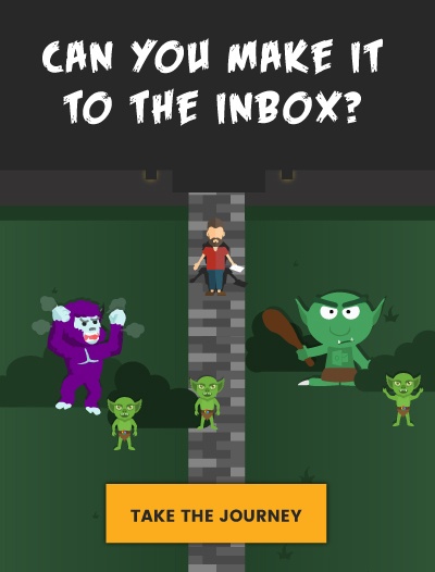
Halloween Design
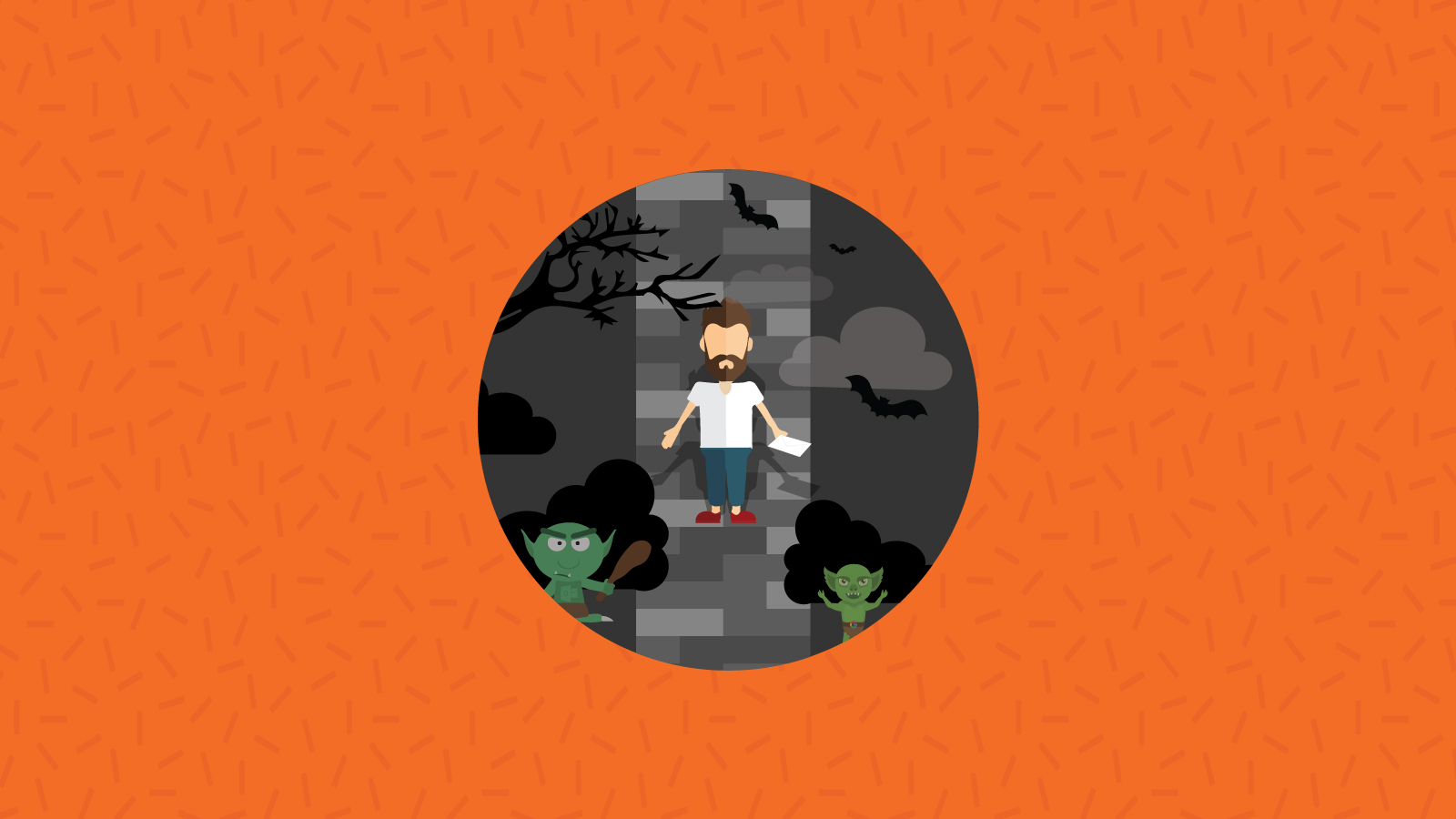
Our Halloween design used the same principles we described in the basketball example. We created an avatar of a bearded man as the fixed object, an animated landscape with monsters as the background image, and an image featuring tree branches and bats with a transparent background as the foreground image.
For the fallback, we displayed a static image and linked it to the web version where readers on unsupported clients can experience the email on a browser.
Many Possibilities
There’s a lot that can be done with this design. Taco Bell sent a great email with a scrolling design two years ago that used CSS fixed positioning (which is no longer supported in the latest iOS Mail). However, we can create this design using the faux-fixed technique. You could also have a race car race down a track or a bird flying through clouds. If you implement something similar, please post a comment below – we’d love to see it.


