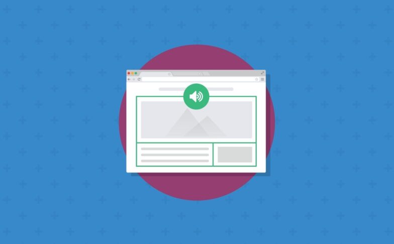
Email Development
How to Build an Interactive Quiz in Email
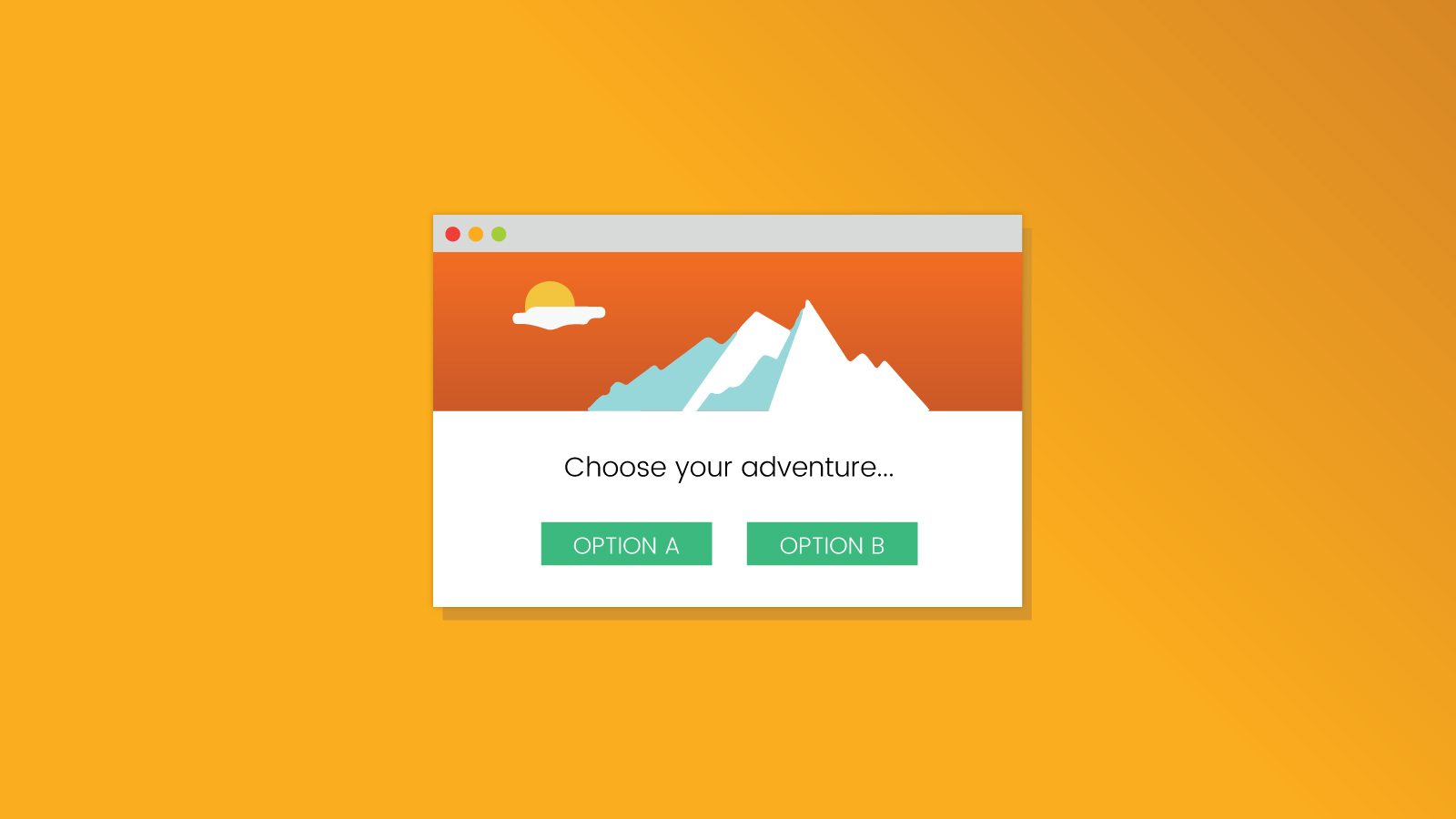
Email on Acid sent a fun interactive email for the 4th of July featuring a “choose your adventure” format where the reader had a choice of sending an email without testing on Email on Acid or after testing. There were a few tricks in the email such as a ticking clock, but at the core the email uses a “quiz format” where successive pages are displayed based on a selection of options from a previous page within an email. Such a setup can accommodate a multitude of other interactive email scenarios that we will go into detail later, such as product listing filters, games, tutorials and carousels.
Check out the 4th of July email here
(view in a Webkit browser like Chrome or Safari)
This article will go into how to implement a simple version of that technique in email. The email clients that this technique will work with include iOS Mail, Apple Mail and Samsung Mail. Other clients will be shown a fallback version.
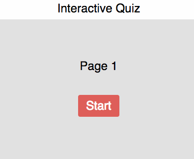
The heart of the technique involves a set of radio inputs, one for each page as well as a set of pages and having each page only be visible when a corresponding radio input is checked. Naturally the first radio input corresponding to the first page will initially be checked.
The following code demonstrates the concept of toggling between two pages:
                                <style>
.page1,.page2{
  display:none;
}
#radio1:checked ~ .container .page1,
#radio2:checked ~ .container .page2{
  display:block;
}
</style>
<input name=choice type=radio id=radio1 checked>
<input name=choice type=radio id=radio2>
<div class="container">
  <div class="page1">Page 1
    <label for="radio2">[next]</label></div>
  <div class="page2">Page 2
    <label for="radio1">[back]</label></div>
</div>
Our example demonstrates a three stage setup with four pages
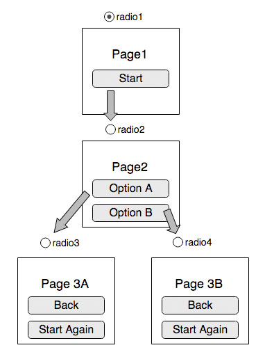
The Start button in Page 1 is a label that has the “for” attribute targeted to the id of the radio input of Page 2. Then Page 2’s two buttons are labels targeting the radio inputs of Page 3A and 3B respectively. Then finally Page 3A and 3B’s Back button targets Page 2’s radio input and the Start Again button targets Page 1’s radio input.
Here is the Codepen for the setup.
Fallback for non interactive clients
We want to ensure that the interactive part only display for clients that support animations and the :checked selector. Following the strategies outlined in this article, we use the -webkit-min-device-pixel-ratio media query and checked checkbox techniques.
Additionally although AOL Mail support checkboxes, it doesn’t support the “for” attribute in labels that we use in our example so we also need to show the fallback for AOL Mail.
The following code shows the code with fallback.
                                <style>
  @media screen and (-webkit-min-device-pixel-ratio: 0) {
    .cbox-support:checked ~ div .fallback {
        display:none;
    }
    .cbox-support:checked ~ div .interactive{
        display:block!important;
        max-height:none!important;
    }
    /*
    Selective blocking for non supported clients.
    - AOL does not support the for="" attribute in labels
    */
    input[class~="aolmail_cbox-support"]:checked ~ div .fallback{
      display:block!important;
    }
    input[class~="aolmail_cbox-support"]:checked ~ div .interactive{
      display:none !important;
    }
  }
</style>
<input type=checkbox class="cbox-support" checked>
<div>
<!-- FALLBACK -->
  <div class="fallback">
    Fallback content
  </div>
<!-- end of FALLBACK -->

<!-- INTERACTIVE/KINETIC -->
  <!--[if !mso]><!-- -->
  <div class="interactive" style="display:none;max-height:0;overflow:hidden;">
    Interactive content
  </div>
  <!--<![endif]-->
<!-- End of Interactive/Kinetic -->
</div>
Absolute positioning and the Samsung client
Unlike the 4th of July email example, this interactive quiz example does not use absolute positioning even though it is supported by the iOS mail client. The reason for this is that we would like to support the Samsung email client that does not support absolute positioning. If you want to use absolute positioning, then you’d need to add the following code to disable the interactivity in the Samsung email client.
                                #MessageViewBody .cbox-support:checked ~ div .fallback{
  display:block!important;
}
#MessageViewBody .cbox-support:checked ~ div .interactive{
  display:none !important;
}
Transitioning between pages
It might be more visually pleasing to have the next page fade in instead of instantly appear. This can be achieved using transitions or animation. To achieve that, we have the page start with opacity: 0 when initially displayed and then animate to opacity: 1. This is demonstrated with the following code.
                                #cbox-1:checked ~ * .interactive .page1,
  #cbox-2:checked ~ * .interactive .page2,
  #cbox-3a:checked ~ * .interactive .page3a,
  #cbox-3b:checked ~ * .interactive .page3b{
    display:block;
    -webkit-animation: fadein 0.5s linear;
  }
  @-webkit-keyframes fadein{
    0%,45%{ opacity:0; }
    100%{ opacity:1; }
  }
Alternative max-height technique
However what about having the original page fade out before the next page fades in? Here things get a bit more complicated. Since we’re using display:block and display:none, the moment the checkbox for the original page is unchecked, display:none kicks in and we aren’t allowed time to change the opacity. However we can perform a fade-out technique by using max-height. This is because, unlike display, you can delay the max-height change by incorporating it as part of the transition animation. Using max-height is much more involved, but allows you the opportunity to implement “transition out” effects.
Here’s a partial CSS example.
                                .page{
    text-align:center;
    overflow:hidden;
    max-height:0px;
  }
  #cbox-1:checked ~ * .interactive .page1,
  #cbox-2:checked ~ * .interactive .page2,
  #cbox-3a:checked ~ * .interactive .page3a,
  #cbox-3b:checked ~ * .interactive .page3b{
    max-height:none;
    -webkit-animation: fadein 0.5s linear;
  }
  #cbox-1:not(:checked) ~ * .interactive .page1,
  #cbox-2:not(:checked) ~ * .interactive .page2,
  #cbox-3a:not(:checked) ~ * .interactive .page3a,
  #cbox-3b:not(:checked) ~ * .interactive .page3b{
    max-height:0px;
    -webkit-animation: fadeout 0.5s linear;
  }
  @-webkit-keyframes fadein{
    0%,49%{ opacity:0; max-height:0px;}
    50%{ opacity:0; max-height:none;}
    100%{ opacity:1; max-height:none;}
  }
  @-webkit-keyframes fadeout{
    0%{ opacity:1; max-height:none;}
    49%{ opacity:0; max-height:none;}
    50%,100%{ opacity:0; max-height:0px;}
  }
Scrolling up on transition (iOS)
The quiz technique works best if the content fits within the page without scrolling. The problem with longer content is that if the button requires scrolling, the next page is displayed already scrolled down, so you don’t see the content at the top and need to scroll back up which can be a bad experience.
On iOS however, there’s a technique you can use to “scroll up” to the next page. Its not a foolproof method and requires some trial and error, but the technique involves shrinking the container to force the client to scroll the email back up. This technique causes Apple Mail to scroll up and back down, so we need to isolate it using a media query to ensure its only enabled in iOS.
                                @media (max-device-width:600px){
    #cbox-1:checked ~ * .interactive .page1,
    #cbox-2:checked ~ * .interactive .page2,
    #cbox-3a:checked ~ * .interactive .page3a,
    #cbox-3b:checked ~ * .interactive .page3b{
      -webkit-animation: fadein-scrollup 1s linear;
      animation: fadein-scrollup 1s linear;
    }
  }
  @-webkit-keyframes fadein-scrollup {
    0% { opacity:0; max-height:1000px; }
    40%{ max-height:450px; }
    45%{ opacity:0; max-height:none; }
    100%{ opacity:1; }
  }
  @keyframes fadein-scrollup {
    0% { opacity:0; max-height:1000px; }
    40%{ max-height:450px; }
    45%{ opacity:0; max-height:none; }
    100%{ opacity:1; }
  }
The Final Code
Here’s the Codepen for the basic example.
Here’s the Codepen using the max-height technique.
Here’s the Codepen with the “scroll up” technique.
Applications of this technique
There are quite a few use cases for this technique:
Quizes
As the title of the article implies, you can create an interactive quiz with an end result that takes the recipient to different landing pages based on where they end up on the quiz. You can also host the quiz on a webpage to allow those seeing the fallback content to take them.
Product list filters
Say you have an apparel store, you can show a simple page with the top level categories such as “men, women, kids”, then when the recipient clicks on men, you can display another list of categories like “shirts, pants, shoes for men” and so on. For the fallback, you can display all the options or a subset in a static table.
Games
The 4th of July email was a form of a “choose your adventure” game, where the reader had to decide on a course of action with associated consequences. This one probably gives you more opportunity for creativity. I embellished the 4th of July email with a clock with a spinning minute hand for effect to transition from one page to the next.
Product tutorials
This technique can be used to great effect to walk the recipient through multiple features of a product or service without overwhelming them with information all at one go.
Carousels
There has been a few examples on how to implement carousels in email, but you can use this technique to implement a simple carousel with previous and next buttons.
Don’t Guess, Test!
At Email on Acid, testing is at the core of our mission. After you’ve finished setting up the perfect design for your campaign, ensure the email looks fantastic in EVERY inbox. Because every client renders your HTML differently, it’s critical to test your email across the most popular clients and devices.
Try us free for 7 days and get unlimited access to email, image and spam testing to ensure you get delivered and look good doing it!