Email Development
How to Build an Interactive Magic 8 Ball for Email
Email Development
This article will go over a technique on creating an interactive email game with a Magic 8 Ball, built entirely in CSS. For those of you who are not familiar with the Magic 8 Ball, it is a toy used for fortune telling or seeking advice that is shaped like a large 8 Ball. It contains a window that displays one of 20 possible answers ranging from affirmative, ambiguous and negative.
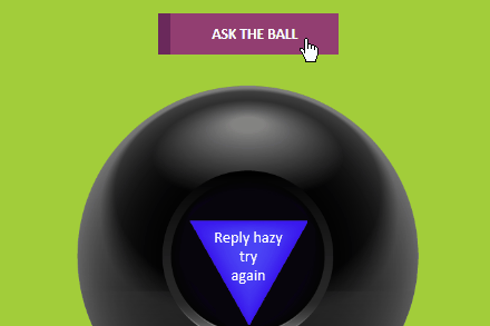
In this example, users will be able to click on an “Ask The Ball” button and a prediction will appear.
One of the key techniques behind the Magic 8 Ball is the ability to generate a random outcome. Creating random outcomes is trivial on the Web using Javascript as Javascript contains a function called Math.random() that produces a number between 0 and 1 (ie. 0.599123). You can get a random number between 1 and 20 with this line of code:
var guess = Math.floor(Math.random() * 20) + 1;
Unfortunately, Javascript is not supported in email clients, hence we need a different mechanism to generate a random result.
Since CSS does not support a “random” function, we’ll generate random outcomes using animation! Let’s start with a simple example. One that involves clicking a button and displaying either red, green or blue randomly.
You can achieve a pseudo-random (almost random) outcome on a button click by overlaying a set of labels and quickly animating the labels so that a person attempting to click on a button is likely to click on any one of the labels being displayed over a button.
Before we get to the animation, let’s start with the basics – three radio buttons that turn the box either red, green or blue when checked.
This technique uses the :checked checked state of a radio button and a sibling selector (~) to set the background color property of an adjacent div.
                                <style>
.box{
 width:200px;
 height:200px;
}
#r1:checked ~ . box{
  background-color:red;
}
#r2:checked ~ . box{
  background-color:green;
}
#r3:checked ~ . box{
  background-color:blue;
}
</style>
<input type="radio" id="r1" name="colors">
<input type="radio" id="r2" name="colors">
<input type="radio" id="r3" name="colors">
<div class="box">
</div>
We then add a button at the bottom of the box and layer a set of 3 labels above the text in the button that targets the three radio buttons. Each label is set to the height of the button so only the first label is clickable.
                                <div class="btn">Color Box
  <div class="lblcont">
    <div class="lblinner">
    <label class="lbl-red" for="r1"></label>
    <label class="lbl-green" for="r2"></label>
    <label class="lbl-blue" for="r3"></label>
    </div>
  </div>
</div>
Finally, we show the various labels by animating the position of the labels using a CSS transform. By using a step function for animation timing, we can break up the animation so that each color appear to pause briefly during the transition.
                                .btn .lblinner{
  animation: shiftlbl 1.5s steps(3,end) infinite;
}

@keyframes shiftlbl {
  from{
    transform: translateY(0px);
  }
  to {
    transform: translateY(-150px);
  }
}
If the animation is running fast, it can be difficult to trigger the radio buttons since the pace that the labels switch can confuse the browser. One technique to deal with it is to pause the animation when a user hovers the cursor over the button. This requires us to shim another element after the user clicks on the button to resume the animation. In this example, we shim a “reset” label that when clicked, resets the input elements.
On iOS, we suffer the same problem, if the animation is running quickly iOS has trouble triggering the radio buttons too. Fortunately, there’s a weird trick we can use! By merely adding an image to the label, it increases iOS’s label sensitivity. Interestingly we can even use a fake image – an image without a src attribute.
Here’s an example code on Codepen demonstrating our example:
Now that we have the basics down, building the 8 Ball is relatively straightforward. Instead of swapping colors, we swap text.
Instead of changing background color:
                                #r1:checked ~ .box{
  background-color:red;
}
#r2:checked ~ .box{
  background-color:green;
}
We use the CSS before selector to set the text in the triangle of the 8 ball.
                                #r1:checked ~ .ball .triangle::before{
  content:'It is\A certain';
}
#r2:checked ~ .ball .triangle::before{
  content:"Don't\A count\A on it";
}
Since we want an equal chance of having the ball show the same result twice in a row, we build the 8 ball with two sets of identical 20 inputs and labels. When one radio input in the first set is checked, we shift the labels so that the second set is displayed to the user – and vice versa.
To simulate shaking a physical ball, we use the CSS translate transform to rapidly move the ball left to right. To simulate the triangle floating up we use a combination of opacity and blur.
                                .predictions:checked ~ .ballwrap .m8ball{
 animation: shakeball 0.5s ease-in;
}

.predictions:checked ~ .ballwrap .m8ball .triangle{
 animation: appear 3s ease-in;
}

@keyframes shakeball{
 0%{
   transform:translateX(0px);
 }
 22%{
   transform:translateX(15px);
 }
 44%{
   transform:translateX(-15px);
 }
 66%{
   transform:translateX(15px);
 }
 100%{
   transform:translateX(0px);
 }
}

@keyframes appear{
 0%{
   opacity:0;
 }
 20%{
   opacity:0;
   filter:blur(2px);
 }
 100%{
   opacity:1;
   filter:blur(0px);
 }
}
This design is only geared to display in Webkit clients that support the :checked selector – primarily iOS Mail, Apple Mail and the Samsung Android client. Therefore we use a fallback technique to only display interactive content.
                                @media screen and (-webkit-min-device-pixel-ratio:0) {
    .cbox:checked + .interactive
    {
      display:block !important;
      max-height: none !important;
    }
    .cbox:checked + .fallback
    {
      display:none !important;
      display:none;
      max-height: 0px;
      overflow: hidden;
    }
  }
For our fallback design we provide a link for the recipient to click to a web hosted version.
One of the allure of interactive email is the ability to surprise and delight recipients who open your email. This technique can be used to implement simple “treasure box” designs as well as the basis for much more involved games.
At Email on Acid, testing is at the core of our mission. After you’ve finished setting up the perfect design for your campaign, ensure the email looks fantastic in EVERY inbox. Because every client renders your HTML differently, it’s critical to test your email across the most popular clients and devices.
Try us free for 7 days and get unlimited access to email, image and spam testing to ensure you get delivered and look good doing it!