Email Development
Four Interactive Email Fallback Strategies
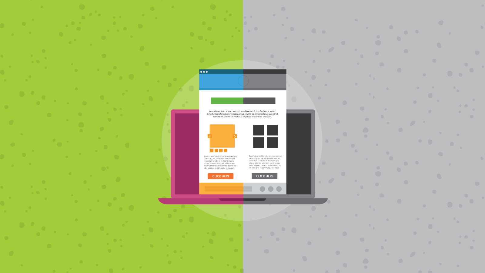
Email Development
One of the really exciting things to happen to email over the past few years is the introduction of interactivity and animations in email using CSS, or what’s being called kinetic design. However, due to email clients having varying CSS support, it is important to ensure that your email still renders nicely in clients that aren’t able to handle advanced CSS by providing fallback content.
This article will go over various fallback methods to handle clients that are not so “capable.”
We’ll go over the specific fallback techniques later in the article but for now let’s go over two common approaches to handling fallback content.
The easiest way to handle different email capabilities is to display different content depending on capabilities. This method is familiar to those who develop responsive email where certain content is shown to a user in the desktop version and different content is displayed in the mobile version.
The downside of this approach is the potential duplication of content as links, images and text in one content block may also appear in the other content blocks.
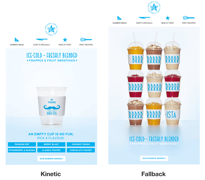
In general, what goes on is that we display the fallback content block and hide the interactive content by default. Then, in the style block, we use CSS selectors and media queries to hide the fallback block and display the interactive block in clients that support interactivity. An example of this is the Pret campaign in the graphic below.
Here’s a simple example that shows how to enable an interactive block only in webkit-based clients:
                                <style>
@media screen and (-webkit-min-device-pixel-ratio: 0) {
        .fallback {
            display:none;
            display:none!important;
            max-height:0;
            overflow:hidden;
        }
        .interactive{
            display:block!important;
            max-height:none!important;
        }
}
</style>

<div class="fallback">
   This is displayed by clients that aren't Webkit based.
</div>
<!--[if !mso]><!-- -->
<div class="interactive" style="display:none;max-height:0;overflow:hidden;">
  This will only be displayed in Webkit based clients.
</div>
<!--<![endif]-->
If you’re wondering why I used all the redundant hiding CSS styles, this article will shed the light on why it is necessary.
The advantage of the previous strategy is that having separate interactive and fallback versions is straightforward and easy to implement. However, the drawback is that you may have duplicate content. An alternative approach is to merely change the layout of elements when rendered in a client that supports interactivity.
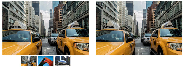
Here’s an interactive carousel tutorial written by Geoff Phillips featuring three content blocks. When viewed in a non interactive client, the content blocks are displayed in stacked order. But when viewed on a client that supports absolute positioning, the content is displayed in a carousel.
While a bit more complicated to pull off, for content heavy elements, the savings in email size may be worth it. Another example of an email that used this approach is the B&Q email below where the same content blocks are laid out differently based on the support of interactivity and absolute positioning. Unfortunately, the HTML of the email is no longer available.

The other method of developing fallbacks for email is simply by hiding the interactive elements in non-interactive clients. For example, if the interactive element is a carousel with thumbnails at the bottom, hiding those thumbnails by default and displaying them in interactive clients is one way to handle fallbacks without creating a separate block for the fallback content.
Certain interactive elements will fallback automatically such as rollover images. A rollover image within an email client that does not support the :hover pseudoclass will just be a static image. Similarly, if you’re applying CSS entrance effects to certain elements that are already visible in the email, these effects will simply not execute in clients that don’t support CSS animations.
Before we go into the actual fallback techniques, it helps to understand the limitations of the various clients. The list below is not exhaustive and you can see more details about each email client here.
| Email Client | :checked, :hover | Animations | Notes |
|---|---|---|---|
| iOS Mail App | Supports absolute positioning, webkit based. | ||
| Gmail, Inbox by Gmail | Gmail webmail used to support :checked but with the latest update only supports :hover. Gmail Apps on iOS and Android do not support :hover or :checked. | ||
| Yahoo! Mail | Supports max-width media queries. | ||
| Outlook.com/Office 365 | The new version of Outlook.com dropped support for :hover and does not support media queries. Outlook.com also inexplicably mangles your HTML if you have checkboxes in your email so be sure to keep that in mind. | ||
| Outlook 2007-2016 | Does not reliably support display:none. Best to use conditional comments to hide content. | ||
| Apple Mail | Best support for interactive email. | ||
| AOL | -webkit-min-device-pixel-ratio: 0 media query will trigger in AOL Mail when using a webkit browser like Safari or Chrome. | ||
| Samsung Android Client | Webkit based client but inexplicably does not support absolute positioning. Use #MessageViewBody to target the client and hide absolute positioned content. | ||
| Thunderbird | Non webkit based client (so uses -moz-device-pixel-ratio instead of -webkit-min-device-pixel-ratio) and has strange quirks with form elements. Use .moz-text-html to target the client. |
This technique is covered in this interactive shopping cart example where fallback content is displayed for clients that don’t support the :checked selector.
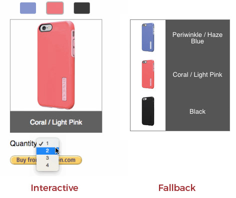
The method to determine :checked support is to place a checked checkbox above the element containing the interactive content and then to display the content using the :checked and (+) sibling selector to display and hide content.
The following is an example code. (When dealing with checkboxes, always keep in mind the Outlook.com checkbox bug).
                                <style>
.cbox:checked + .interactive
{
  display:block !important;
  max-height: none !important;
}
.cbox:checked + .fallback
{
  display:none !important;
  display:none;
  max-height: 0px;
  overflow: hidden;
}
</style>

<!--[if !mso]><!-- -->
<input type=radio class="cbox" style="display:none !important" checked>
<div class="interactive" style="display:none;max-height:0px;overflow:hidden;">
FORM CONTENT
</div>
<!--<![endif]-->

<!--[if !mso]><!-- -->
<!-- Leave out the last semicolon in the style attribute due to Office 365 bug -->
<input type=radio class="cbox" style="display:none !important" checked>
<!--<![endif]-->
<div class="fallback">
  FALLBACK CONTENT
</div>
If you want to display or hide content that depends on CSS animation capability, the simplest way is to target Webkit clients. Certain webmail clients such as AOL Mail allow -webkit-min-device-pixel-ratio so you may want to take that into account. However, AOL Mail also supports more CSS than most other Webmail clients so that may not be an issue.
However if all you are doing is adding simple animation effects to existing elements, then this is safe to use.
                                @media and (-webkit-min-device-pixel-ratio:0){
   ….
}
You can also use the max-device-width filter with the -webkit-min-device-pixel-ratio filter if you only want to target mobile or tablet clients – specifically iOS. This can be handy as there are some webmail (specifically AOL Mail and Comcast) that will also trigger the -webkit-min-device-pixel-ratio media query but not allow certain CSS like animations.
                                @media and (-webkit-min-device-pixel-ratio:0) and (max-device-width:1024px){
   ….
}
Although the fallback techniques work at the time of writing, email clients are constantly changing and sometimes it causes techniques to no longer work. So if you’re building a particularly advanced kinetic email design, make sure you do early tests on the main clients before going down the road and realizing your design may no longer work on certain clients.