Email Development
Email Coding 101: How to Use HTML, CSS, and MJML

Cookie-cutter email marketing is easy. The downside, however, is that doing things the easy way means a lot of other people are doing it that way too. You’re here because you want to do more with email coding. You have ideas. You want to take things further. You’re ready to learn some code and try out real email development
The best way to create high-impact, beautifully designed marketing emails is to skip the generic templates and code your own unique email designs instead.
This article will provide everything you need to know about using HTML, CSS, and an email-specific coding language called Mailjet Markup Language (MJML). Use this to create one-of-a-kind emails without bothering with drag-and-drop templates that limit your creativity. It’s written for both experienced web developers and less technical email senders who might not know how to code.
HTML and CSS may be the best-known way to code, but MJML is made for coding emails. As you’ll see in this guide, there are major differences between web and email development. That’s because each email client supports different subsets of HTML and CSS properties. Since MJML was created especially for email, you can skip over these challenges without compromising full control over your email.
5 things you need to know about HTML emails

You may not have a background in development, but that doesn’t mean you can’t level up your emails with a bit of coding. If terms like HTML and CSS are new to you, here are a few basic concepts to prime you on creating emails in HTML.

HTML stands for “HyperText Markup Language.” It’s the language used to provide the structure for websites and emails. You can think of it as the foundation, beams, and ceilings of a house.

CSS stands for “Cascading Style Sheets.” It’s what we use to style our emails. If HTML is like the structure of a house, CSS is like the paint, polish, and artwork that makes the house unique and attractive.

HTML and CSS coding for email is very different than HTML and CSS coding for the web. Web browsers like Chrome and Safari share standardized HTML and CSS properties, whereas email clients do not. This means creating emails with HTML and CSS is particularly tricky.

Because email clients vary in the HTML and CSS they support, we can only use a subset of HTML and CSS when coding our email. Specifically, this means using <tables> for our structure and inline styles for our CSS. We’ll go into more detail on what that means below.

Most people turn to HTML as the default for creating customer emails, but it’s not the only option. We’ll show you a helpful alternative to coding in HTML and CSS called MJML that can make your life much easier while still providing all the benefits of coding in HTML and CSS.
For a more detailed rundown of HTML and CSS, check out these excellent courses from Codecademy. But if you’re only interested in using them to create and send emails, you’re exactly where you need to be.

The anatomy of typical HTML emails
We’re going to walk you through how to build a responsive email using HTML and CSS. Before we start coding, though, we need a clear picture of what we’ll build.
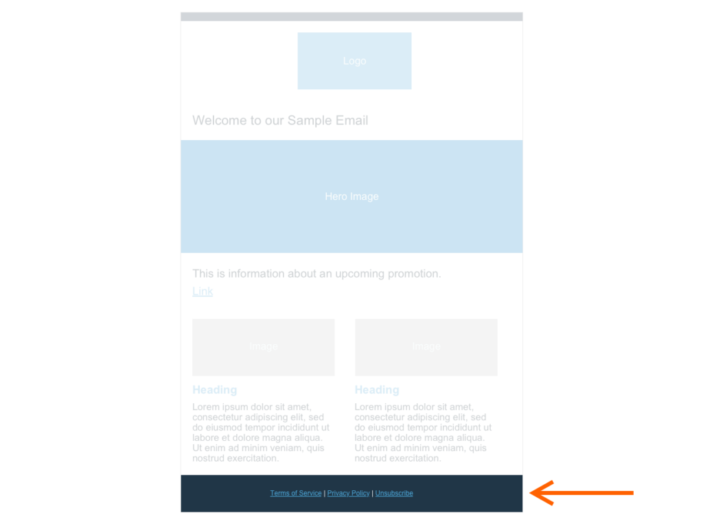
Here’s a basic mock-up of a standard email that we’re going to build in HTML below:
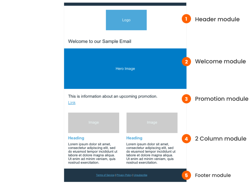
You’ll notice that to help keep things organized and easily create a template from our code in the future, the mock-up breaks down into five different sections, or “modules”. We’ll take a look at each of those modules as well as the basic HTML structure you’ll need to get started.
We’ll code each of these modules one by one in the tutorial below.
How to create the HTML structure for your emails
Every HTML email you create will start with the same basic structure. Let’s take a look at it:
Step 1: Create your HTML email document
At a high level, this block of code lets browsers know you’re coding in HTML and provides some additional configuration information to help the email clients or web browsers render your code correctly. Don’t fret about the details here: Most developers just copy-and-paste this code from email to email. But for those interested, here’s a brief rundown of this code.
                                <!DOCTYPE html>
<html lang="en" xmlns="https://www.w3.org/1999/xhtml" xmlns:v="urn:schemas-microsoft-com:vml" xmlns:o="urn:schemas-microsoft-com:office:office">

 <head>
   <meta charset="utf-8">
   <meta http-equiv="X-UA-Compatible" content="IE=edge">
   <meta name="viewport" content="width=device-width,initial-scale=1 user-scalable=yes">
   <meta name="format-detection" content="telephone=no, date=no, address=no, email=no, url=no">
   <meta name="x-apple-disable-message-reformatting">
   <meta name="color-scheme" content="light dark">
   <meta name="supported-color-schemes" content="light dark">

   <title>Email title</title>

   <!--[if mso]> <noscript> <xml> <o:OfficeDocumentSettings> <o:PixelsPerInch>96</o:PixelsPerInch> </o:OfficeDocumentSettings> </xml> </noscript> <![endif]-->

   <style>
    :root { color-scheme: light dark; supported-color-schemes: light dark; }
   </style>
 </head>
 <body>
      *** We’ll build the content of our email here ***
 </body>
</html>
After that, we have our <head> tags. The <head> contains <meta> tags which provide configuration information, a <title> tag, which is where the title of our email goes, some Microsoft-specific directions, and some style code to support client-specific color schemes.
At the top of this code block, we declare our doctype, which lets email clients know to expect HTML. From there, we open our <html> tag. You’ll notice that this tag contains some XML namespace information that further instructs the browser on how to render our email correctly.
Lastly, we have our <body> tags, where we create the email’s content and design. We’ll be doing most of our coding within these <body> tags.
Step 2: Create your outer tables
Now that we have our HTML document, let’s start coding the content of our email within the <body> tags.
When writing HTML and CSS for the web, we can use CSS properties like flexbox, grid, and more to handle our layout. Unfortunately, email clients don’t consistently recognize common CSS properties, so we can’t rely on CSS for email layout. This means we need to use HTML <tables> instead. HTML <tables> are a component that allow us to position our content in rows and columns. Unfortunately, since these tables were designed to display data (think: data tables), it takes some finessing to get them to look just right.
Before we get into how to use <tables> to code our email, let’s break down the basic structure of an HTML table.
Here’s a simple example:
                                <table style="width:100%" border="solid">
 <tr>
   <td>Column 1</td>
   <td>Column 2</td>
   <td>Column 3</td>
 </tr>
</table>
In this code example, we have three different tag types:
- <table> which defines our table
- <tr> which stands for “table row”
- <td> which stands for “table data” and is basically a column
The above code sample also gives us our first glimpse of inline styles. You can see we’ve used the “style” attribute to give our table a width of 100%.
Here’s the table that the above code creates:
That looks simple enough, but we have to warn you that nesting tables for layout opens a whole can of worms. As we start to nest tables within tables within tables, it’s easy to lose track of where you are in your code. There are many “style hacks” you need to implement to make the layout look modern and appealing.
To keep things as simple as possible for this tutorial, we’ll add in the standard inline styles needed for basic formatting right off the bat. You can copy and paste these inline styles from email to email that you create. In the next section, we’ll guide you through how to add more personalized custom styles to your HTML to get our design looking just like the mock-up.
In the code sample below, you can see we have pasted two nested tables with some default formatting styles attached to them inside our <body> tags.
                                <body>
 <table cellpadding="0", cellspacing="0", border="0" style="width:100%; background:#ffffff; border-collapse:collapse; border-spacing:0; border: 0;" role="presentation">
   <tr>
     <td style="padding:0; text-align: center;">
       <table cellpadding="0", cellspacing="0", border="0" style="border:1px solid #eeeeee; width:600px; border-collapse:collapse; border-spacing:0; text-align:left;" role="presentation">
         <tr>
           <td>
               *** all our email content will go here ***
           </td>
         </tr>
       </table>
     </td>
   </tr>
 </table>
</body>
These two tables work together to provide a structure with a width of 600px and centered with a white (or #ffffff) background. We assign each table a role of “presentation” to indicate that these tables are for styling purposes, as opposed to being data tables.
The inner table has a thin, 1px light gray (or #eeeeee) border. We find it helpful to have a border on the table when creating it so we can see our boundaries. You can delete the border at the end if you’d like.
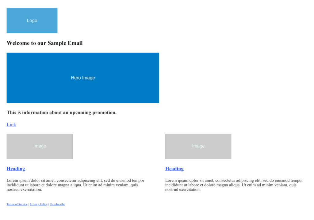
So far, we’ve already written a lot of code, but we don’t have much to show for it yet.
Here’s what our email looks like so far:

Coding emails in pure HTML and CSS isn’t for the faint of heart! Don’t get discouraged, though. At the end of this tutorial, we’ll show you how you can use MJML to make your life much easier when coding for email. For now, let’s continue our deep dive into HTML and start creating your email content.
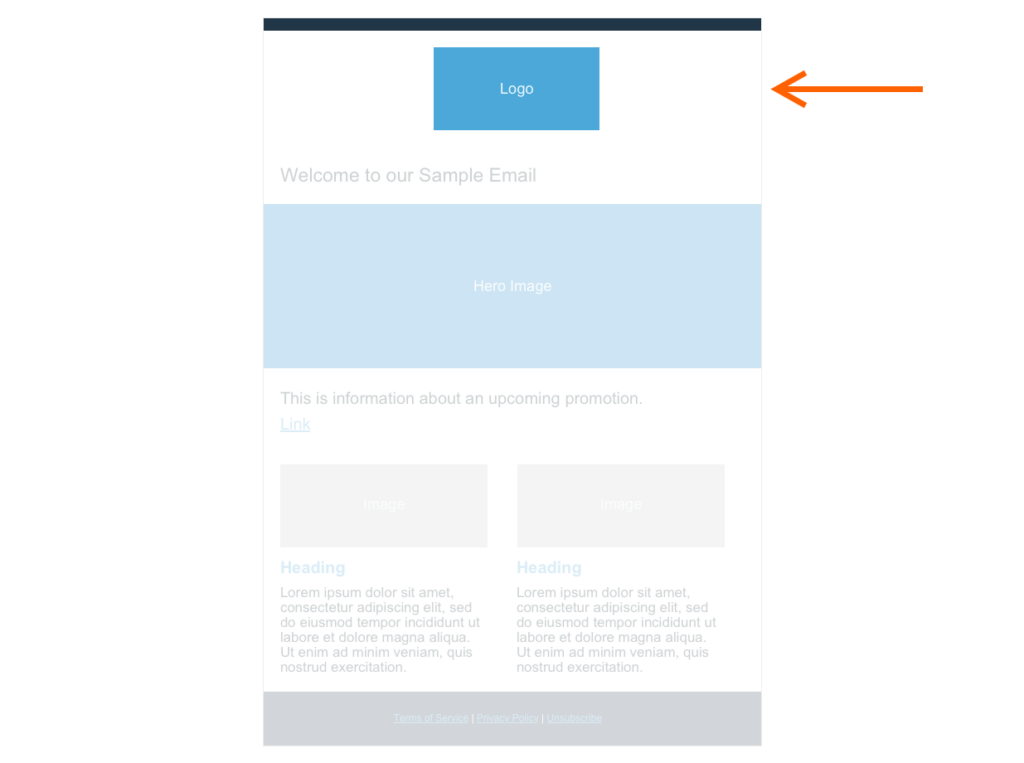
Step 3: Create the structure for your Header Module
Going back to our mock-up, we can see that our header module consists of a decorative dark blue line at the top and our logo.
We’ll contain the code for these two elements in — you guessed it — another nested table. This table replaces the placeholder message “*** all our email content will go here ***” in our above code sample. So it’s nested three levels deep.
Here’s what the code looks like:
                                <!-- Header -->
<table class="header-module" role="presentation" style="width:100%; border:0; border-collapse:collapse; border-spacing:0;">
 <tr>
   <!-- divider -->
   <td class="divider"> </td>
 </tr>
 <tr>
   <!-- logo -->
   <td class="logo">
     <img style="" src="https://via.placeholder.com/200x100/cccccc/4DA8DA/?text=Logo" />
   </td>
 </tr>
</table>
In the code above, you’ll notice we added comments to help us understand what each section of our code does. Comments are contained between <!- – – – >. We can write anything we like as comments. The purpose of them is to keep our code clean and understandable.
The table in the code above has the same role and style attributes as our earlier tables. We also added a “class” attribute. Since we need to rely on inline styles rather than CSS for email coding, this class isn’t technically necessary. However, they’re helpful as an added label to keep track of the purpose of each module and component within the module. If you’re unfamiliar with the class attribute and want to learn more about how they’re used in web development, you can read more about them. For our purposes in email coding, though, they’re primarily just a name tag.
For the logo in this tutorial, we grabbed a placeholder image from placeholder.com. Of course, you’ll want to switch out the source (src attribute) for the correct URL to your own logo.
Now that we’ve written the code above, here’s how our email looks so far:

Not very pretty! Our divider isn’t even visible and the logo isn’t centered. Once we’re done building the HTML structure for all our components, we’ll show you how to use inline styles to make it look much better.
Step 4: Create the structure for your Welcome Module
Now it’s time for our welcome module. As a reminder, our welcome module consists of some text and a hero image.
Here’s what the email coding looks like:
                                <!-- Welcome Module -->
<table class="welcome-module" role="presentation" style="width:600px;border:0;border-collapse:collapse;border-spacing:0;">
 <tr>
   <!-- Welcome Text -->
   <td class="welcome-text" style="">
     <h1>Welcome to our Sample Email</h1>
    </td>
  </tr>
  <tr>
    <!-- Hero Image -->
    <td class="hero-image">
      <img src="https://via.placeholder.com/600x200/cccccc/EEFBFB/?text=Hero Image" />
        </td>
   </tr>
</table>
By now, the outer table should look familiar. It has the same role and style attributes as all our other table modules, and it also has a class to help us easily tell its purpose. Inside our table are <td>s that we’ve also given helpful class names to.
Since we haven’t yet written any inline styles, our email isn’t very pretty yet, but our structure is coming along nicely!
Step 5: Create the structure for your upcoming Promotion Module
This module is similar to our welcome module, but instead of pairing text with a hero image, we pair our text with a button.

Here’s the email code:
                                <!-- Upcoming Promotion Module -->
<table class="upcoming-promotion-module" role="presentation" style="width:600px;border:0;border-collapse:collapse;border-spacing:0;">
 <tr>
   <!-- Upcoming Promotion Text -->
   <td class="upcoming-promotion-text">
     <h2>This is information about an upcoming promotion.</h2>
   </td>
  </tr>
  <tr>
    <!-- Upcoming Promotion Button -->
    <td class="upcoming-promotion-button" style="">
      <a href="https://www.example.com" class="button">Link</a>
     </td>
  </tr>
</table>
In this module, we use an <a> tag for our button. Be sure to replace the pound symbol we have in the href attribute with the correct URL you want the button to link to.
Step 6: Create the structure for your Two-Column Module
Now that we’re warmed up, let’s build a module that’s a little more complicated.
Here’s the code for our two-column module:
                                <!-- Two Column Module -->
<table class="two-column-module" role="presentation" style="width:100%;border:0;border-collapse:collapse;border-spacing:0;">
 <tr>

   <!-- Left Column -->
   <td class="left-column column"  style="">
     <img src="https://via.placeholder.com/250x100/cccccc/EEFBFB/?text=Image" />
     <a class="columnHeading" href="#"><h3>Heading</h3></a>
     <p>Ut enim ad minim veniam, quis nostrud exercitation ullamco laboris nisi ut aliquip ex ea commodo consequat. Duis aute irure dolor in reprehenderit in voluptate velit esse cillum dolore eu fugiat nulla pariatur.</p>
   </td>

   <!-- Gutter -->

   <td class="gutter" style=""> </td>

  <!-- Right Column -->
   <td class="right-column column" style="">
     <img src="https://via.placeholder.com/250x100/cccccc/EEFBFB/?text=Image" />
     <a class="columnHeading" href="#"><h3>Heading</h3></a>
     <p>Ut enim ad minim veniam, quis nostrud exercitation ullamco laboris nisi ut aliquip ex ea commodo consequat. Duis aute irure dolor in reprehenderit in voluptate velit esse cillum dolore eu fugiat nulla pariatur.</p>
    </td>
  </tr>
</table>
As you can see, we use a <td> for each column, with another <td> between them to serve as a gutter. As we’ve mentioned earlier, different email clients handle CSS properties in different ways. Note – if you’re targeting versions of Microsoft Outlook earlier than 2019, then you’ll need to augment the code shown above with “ghost tables.” Email on Acid has a great tutorial on how to use ghost columns
While this two-column module looks great on larger screens like computers and tablets, you might find that you’d like to make it responsive and have the columns stack on top of each other on smaller phone screens. We can do this using CSS media queries. Media queries are CSS properties that allow us to apply certain styles only when a specific screen size condition is met.
Here’s a simple example:
                                <style>
 h1 {
   color: red;
 }

 @media only screen and (max-width: 600px) {
    h1 {
      color: blue;
    }
 }
</style>
In this example, we’re saying we want all content in <h1> tags to be colored red. However, if the user is reading our email on a phone that has a screen 600px or smaller, then make all content inside <h1> tags blue instead. This – like all CSS – is a great feature.
Unfortunately, not all email clients support CSS media queries or even the style tags we need to put them in. That’s why it’s always important to make sure that your email will still be readable for clients without the responsive experience. In our case, these two columns look OK on phones.
So while our media queries allow us to provide an enhanced experience for email clients that support it, the two-column fallback works acceptably well for the email clients that don’t.
We’ll add our media query inside <style> tags up in our <head> right below our <meta> tags.
Here’s what it looks like:
                                <head>
   <title>
   </title>
   <meta http-equiv="Content-Type" content="text/html; charset=UTF-8">
   <meta name="viewport" content="width=device-width, initial-scale=1">
   <style>
     @media only screen and (max-width: 600px) {
       .column,
       .gutter {
         display: block !important;
       }

       .column {
         width: 450px !important;
       }

       .column img {
         width: 450px;
       }
     }
   </style>
 </head>
Since we’re writing CSS inside our media query, we can finally use our classes for something more than just name tags. Notice that we apply styles to our columns and gutter by referring to their class names preceded by a period in our CSS.
Step 7: Create the structure for your Footer Module
We’ve made it to our final module — the footer. We’ll be following the same principles we’ve been using all along.
Here’s what the code looks like:
                                <!-- Footer Module -->
<table class="footer-module" role="presentation" style="width:100%;border:0;border-collapse:collapse;border-spacing:0;">
 <tr>
   <td>
     <a role="button" href="#">Terms of Service</a> | <a href="#">Privacy Policy</a> | <a href="#">Unsubscribe</a>
    </td>
 </tr>
</table>
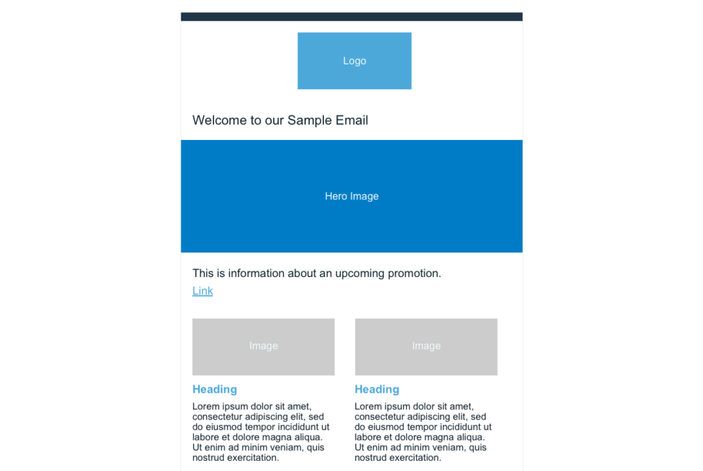
Whew! That was a lot of code we just wrote. The good news is, we’re done with building our structure and are ready to start adding our inline styles. And boy, does our email need some styling.
Here’s how it looks so far:
How to apply inline CSS styles to your email
Our email is in desperate need of some styling.
Here’s why:
- Font size, family, and color are all wrong
- Content is pressed up against the left edge
- Two-column module has spanned well beyond our 600px email width.
- Decorative top line is missing
- Footer doesn’t have a background color
- Spacing between elements is inconsistent
Let’s take a look at how inline CSS styles help address each of those.
As we mentioned earlier, different email clients support different CSS properties. Therefore, the first thing we recommend is checking which CSS your email client supports.
We’ll take a conservative approach and rely entirely on inline styles to handle our styling needs.
Let’s go back to our header module. As you’ll recall, our divider doesn’t seem to show up, and our logo isn’t centered. Let’s fix that.
Here’s the code for our header module again. Notice how we’ve filled in the style attributes on the divider and logo <td>s.
                                <!-- Header Module -->
<table class="header-module" role="presentation" style="width:100%; border:0; border-collapse:collapse; border-spacing:0;">
 <tr>
   <!-- Divider -->
   <td class="divider" style="font-size: 4px; background:#203647"> </td>
 </tr>
 <tr>
   <!-- Logo -->
   <td class="logo" style="padding: 20px 0px 0 0px; text-align: center;">
     <img style="" src="https://via.placeholder.com/200x100/4da8da/EEFBFB/?text=Logo" />
   </td>
 </tr>
</table>
We’ve given our divider some height using a non-breaking space ( ) and a font-size of 4px. Then we added a background color of #203647. We provide some space between our logo and divider by giving our logo 20px of top padding, and then we center it using text-align.
Things are starting to look much better:

Now let’s move on to our welcome module. While the basic structure we put together was a great start, we need to improve the styling by giving our elements some breathing room. We also need to adjust our font.
Here’s the code with our new inline styles added in:
                                <!-- Welcome Module -->
<table class="welcome-module" role="presentation" style="width:600px;border:0;border-collapse:collapse;border-spacing:0;">
 <tr>
   <!-- Welcome Text -->
   <td class="welcome-text" style="padding: 0px 30px 0 30px;">
     <h1 style="font-size:24px; padding: 0; font-family: Arial, sans-serif; color:#12232E; font-weight: normal;">Welcome to our Sample Email</h1>
    </td>
  </tr>
  <tr>
    <!-- Hero Image -->
    <td class="hero-image">
As you can see, we continue to use padding to space our elements out. We adjust the font-family, font-size, and font-weight on our text, and we ensure our hero image spans the entire width of our email.
We’re making great progress. The modules to which we’ve added our inline styles are looking like our mock-up now:

Now let’s apply some styles to our promotion module.
Here’s the code with our added inline styles:
                                <!-- Upcoming Promotion Module -->
<table class="upcoming-promotion-module" role="presentation" style="width:600px;border:0;border-collapse:collapse;border-spacing:0;">
 <tr>
   <!-- Upcoming Promotion Text -->
   <td class="upcoming-promotion-text" style="padding: 0 30px 0 30px; color: #12232E">
     <h2 style="font-size:20px; padding: 0; font-family: Arial, sans-serif; color:#12232E; font-weight: normal;">This is information about an upcoming promotion.</h2>
   </td>
   </tr>
   <tr>
     <!-- Upcoming Promotion Button -->
     <td class="upcoming-promotion-button" style="padding:0px 30px 30px 30px;">
       <a role="button" href="#" style="color: #4DA8DA;" class="button">Link</a>
      </td>
   </tr>
</table>
Our text styles are similar to what we added to our welcome module, although the font size is 20px rather than 24px. For our button, we gave it some breathing room with padding and then changed the color to #4DA8DA. Looking good!

Our two-column module requires a bit more inline styles than our other modules have.
Here’s the code with the styles added in:
                                <!-- Two Column Module -->
<table class="two-column-module" role="presentation" style="width:100%;border:0;border-collapse:collapse;border-spacing:0;">
 <tr>
   <!-- Left Column -->
   <td class="left-column column"  style="width: 250px; color: #12232E; padding-left: 30px;">
     <img src="https://via.placeholder.com/250x100/cccccc/EEFBFB/?text=Image" />
     <a class="columnHeading" href="#" style="color: #4DA8DA; text-decoration: none; font-size: 16px; font-family: Arial, sans-serif; ">
       <h3>Heading</h3>
     </a>
     <p style="font-family: Arial, sans-serif;">Ut enim ad minim veniam, quis nostrud exercitation ullamco laboris nisi ut aliquip ex ea commodo consequat. Duis aute irure dolor in reprehenderit in voluptate velit esse cillum dolore eu fugiat nulla pariatur.</p>
   </td>

   <!-- Gutter -->
   <td class="gutter" style="width: 20px; padding: 0; font-size: 0; line-height: 0;">
   </td>

   <!-- Right Column -->
   <td class="right-column column" style="width: 250px; color: #12232E; padding-right: 30px;">
     <img src="https://via.placeholder.com/250x100/cccccc/EEFBFB/?text=Image" />
       <a class="columnHeading" href="#" style="color: #4DA8DA; font-size: 16px; font-family: Arial, sans-serif; ">
         <h3>Heading</h3>
       </a>
       <p style="font-family: Arial, sans-serif;">Ut enim ad minim veniam, quis nostrud exercitation ullamco laboris nisi ut aliquip ex ea commodo consequat. Duis aute irure dolor in reprehenderit in voluptate velit esse cillum dolore eu fugiat nulla pariatur.</p>
     </td>
   </tr>
</table>
We start off by containing our columns, which had been extending beyond our 600px email width, by giving each column a width of 250px. We give our left column some padding-left and our right column some padding-right so that the content has some breathing room.
We style our column headings by giving them a color of #4DA8DA. We then adjust the font of both our column headings and the text underneath them.
The last thing we need to do now is style our footer module.
Here’s what the code looks like with our inline styles added in:
                                <!-- Footer Module -->
<table class="footer-module" role="presentation" style="width:100%;border:0;border-collapse:collapse;border-spacing:0;">
 <tr class="full-width-background" style="background-color: #203647; text-align: center;">
   <td class="footer-links"  style="padding: 20px 0 20px 0; color:#EEFBFB; font-size: 12px;">
     <a style="color:#4DA8DA; font-family: Arial, sans-serif; text-decoration: none;" href="#">Terms of Service</a> |
     <a style="color:#4DA8DA; font-family: Arial, sans-serif; text-decoration: none;" href="#">Privacy Policy</a> |
     <a style="color:#4DA8DA; font-family: Arial, sans-serif; text-decoration: none;" href="#">Unsubscribe</a>
   </td>
 </tr>
</table>
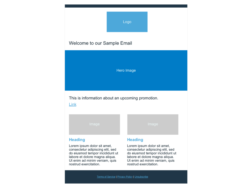
Our footer has a full-width background, so we give that a background color of #203647. Then, we use text-align to ensure our footer content is centered. Our footer gets its height from the padding we add to our footer-links <td>, and then each link has our brand colors and font added. Here’s our final email:
Our HTML email came out great! It took a lot of work, but now you know how to code your own emails in HTML and CSS. If you want to take your CSS even further, we recommend checking out this great guide – The definitive guide to CSS animation in email.
How to create interactive content with HTML
So now we have a great-looking email, but perhaps you’re wondering if you can add interactive content, such as hotspots or hover animation to your email. Unfortunately, we generally don’t recommend adding interactive content to emails. Unlike websites, email clients don’t support JavaScript, which is generally how modern interactive content is created.
There are some workarounds, but these won’t work on phones and other touch screens. So if you do use these workarounds to add interactive content, make sure your email still works and all-important content is available for devices that don’t support it.
How to test your responsive HTML email

Since email clients are so variable, it’s vital to test your HTML emails before sending them out to your email lists. There are a variety of tools you can use to do this, such as Email on Acid.
Email on Acid allows you to preview emails to make sure they look the way you want on multiple email clients, but it also has pre-deployment checklists, content checkers, and spam tests.

How to build a responsive email template with MJML
Fortunately, since each of the modules we created in our tutorial is contained in its own <table>, this is easy to do. Simply save the modules along with the document structure we created earlier in a text file. When you create your next email, copy-and-paste the modules you need into your new email. Just change the text, links, and images as necessary.
As you continue to design more emails with new and different modules, you’ll build up a “module library” that you can pick and choose from to reuse in the future. Considering the effort that goes into creating an HTML email from scratch, it’s well worth keeping this kind of template.
Alternatively, you might consider a route that doesn’t require so much effort: coding emails in MJML.

How to code responsive emails in MJML
Now you know how complicated it is to create nested tables and inline styles required for coding HTML emails. Maybe you’re wondering if there’s a way to get the benefits of coding yourself, without all the hassle. That’s where MJML (aka Mailjet Markup Language) comes in.
MJML is a simple, easy-to-understand markup language designed by Mailjet specifically for coding responsive emails. It allows you to code emails without worrying about what all the different email clients support and without needing to nest tables within tables within tables. Check out our article on how to get started with MJML for more.
At a high level, we can use MJML to write clean, easy-to-understand code that the MJML compiler automatically transforms into nested HTML tables, inline styles, and hacky workarounds. It takes into account fallbacks for different email clients and is responsive to different screen sizes.
There’s also a free online editor we can use to write our MJML. This online editor automatically converts our MJML into HTML and CSS and lets us preview how our email looks in real-time. Try it out on one of the modules we created above.
When you first go to the editor, you’ll see a “hello world” example.
Let’s inspect that “hello world” code:
                                <mjml>
 <mj-body>
   <mj-section>
     <mj-column>

       <mj-image width="100px" src="/assets/img/logo-small.png"></mj-image>

       <mj-divider border-color="#F45E43"></mj-divider>

       <mj-text font-size="20px" color="#F45E43" font-family="helvetica">Hello World</mj-text>

     </mj-column>
   </mj-section>
 </mj-body>
</mjml>
The first thing we want to draw your attention to is the outermost tag <mjml>. This tag automatically adds the doctype declaration, head tag, and all the meta information we needed to add by hand when coding in HTML.
The next tag is <mj-body>. This is where we’ll write all our email code. Most MJML code that we write will also be contained inside <mj-section>s within the <mj-body> tag.
Rather than walking you through all of the MJML tags, we’ll refer you to their excellent documentation.
To get an even better sense of how easy coding in MJML is, let’s rebuild our header module using MJML.
Here’s what the code we’ll put inside our <mj-section> to create our header module looks like:
                                <mj-column>
 <mj-divider border-color="#203647"></mj-divider>
 <mj-image width="200px" src="https://via.placeholder.com/200x100/4da8da/EEFBFB/?text=Logo"></mj-image>
</mj-column>
Looking at the code, we can easily see what’s going on. We’ve wrapped our divider and image in a column. Then we added a couple of easy-to-understand styles: border-color for the divider and width for the image. And that’s all we need to do – our header module is now done.
If you’re following along by coding in the MJML editor, we encourage you to click the “View HTML” button in the upper right corner of the editor. If you do that, you’ll see that the 10 lines of MJML we just wrote are expanded into 133 lines of HTML and CSS. That’s because MJML automatically provides fallbacks and optimizations for a large number of email clients and use cases. This means that the code we write in MJML works even better for all those complicated edge cases than the code we wrote ourselves in HTML and CSS.
Coding responsive emails is the best way to ensure your email designs are unique, on-brand, and stand out from the competition. But coding in HTML and CSS is time-consuming and sometimes unreliable. Fortunately, MJML gives us all the benefits of coding emails by hand in a fraction of the time without any of the headaches that usually go along with HTML and CSS email coding.
Email Dev Showdown: Different ways to code emails
They say there’s more than one way to skin a cat. We do not recommend you skin any cats (that’s mean). But we do know there’s more than one way to approach email development.
In the video below from Parcel Unpacked 2024, Email on Acid’s Megan Boyshuzen joined veteran email developer Anne Tomlin to showcase their unique techniques. Get ideas from their email coding methods and decide what’s right for you.

Get help navigating email’s complexities
By now it should be clear… email coding can quickly get complicated. Once you’ve got the basic steps down, there is still a lot that can go wrong, especially with email client inconsistencies.
That’s why so many email developers conduct pre-send testing to preview their work before anyone hits the send button.
Email on Acid offers unlimited testing, so if you’re just learning how to code emails, you can work through everything until you get it right. The platform also includes checks for inbox display, deliverability, and accessibility. There are even steps for checking links, images, and spelling.
Find out more about why you should test every email campaign every time. There are 12 very good reasons.


