Email Development
Dark Mode Logo Problems: Six Ideas to Improve Email Design
Almost every single marketing email features a logo. Why?
Because a logo is a big part of how a brand visually represents itself. Consistently including one in marketing materials (like emails!) helps establish brand recall and trust in the eyes of customers, clients, and followers. After all, 59% of consumers prefer to purchase from familiar brands and 90% expect companies to be consistent across all platforms. Cohesive design matters.
But with the popularity of dark mode for email steadily increasing, it can be challenging to adapt in a way that’s still on brand. Logos tend to be a particularly frustrating dark mode problem for email marketers.
Pathwire recently conducted a dark mode survey to find out how email marketers and designers like you feel about challenges. 43% of respondents said that optimizing logos and images is one of the biggest challenges related to dark mode UX. And another 33% said the same thing about keeping email design on brand.
So why exactly are logos in dark mode such a big problem? And what’s the solution?
Dark mode logo problems and solutions
Dark mode inverts the colors of your emails, so the black text becomes white and white backgrounds become black. Email clients respond to dark mode in one of three ways, depending on the client:
- They invert absolutely everything. Anything white is black. Anything black is white.
- They partially invert elements. Not all colors will change, but some will.
- They give you total control over your emails in dark mode by supporting media queries. We’ll look at this more later.
These different scenarios create problems with logos that are also hard to predict. Exactly how a logo changes depends on both the email client and your specific logo file. Here are a few things that can happen:
1. A white box will appear behind your logo
If your logo has a white background, it might look perfectly fine on top of white. But once the page is inverted and the background becomes black, it’ll show up with a not-so-pretty white box around it. You can see an example of this below:
Yes, it works. Subscribers can see the logo and identify the brand. However, you’re spending too much time on and dedicating too many resources towards designing beautiful emails to let this slide.
The fix: Use transparent PNGs
Using a transparent background ensures that your logo won’t have a white box behind it on a dark background.
But this only works if your logo is a color that looks great on both light and dark backgrounds. For example, this blue text is perfectly readable on white and black:
However, if that same logo were dark red, for example, a transparent background wouldn’t solve the problem:
2. A dark logo will disappear
Or, maybe your logo is a PNG with a transparent background. That should work, right? Well, maybe.
If your logo is a color that happens to work on both black and white backgrounds, then you’re good to go. But if it’s black, has black elements, or contains another dark color (like navy, for example) then it will be unreadable.
You’ll see that, on a black background, part of our logo looks great. But the dark letters disappear completely. This isn’t a good experience for your subscribers at all.
The fix: Use strokes, drop shadows, or glows
These are all relatively minor changes you can make to a logo file so that it works in both light and dark mode.
Add a stroke
A white stroke around the entire logo will be invisible on white backgrounds but make a black logo still prominent on dark ones. Here’s an example with our logo:
Not too bad! However, it may not be the best option for complicated, detailed logo elements.
Add a shadow
A light-colored shadow is another possibility. As you can see, this makes our logo a little bit easier to read, but still isn’t the best option. A shadow might work better for some logos than others.
Make sure to play with the shadow opacity, blur, x-height, and y-height to find the best fit for your specific graphic. You may also want to just add a shadow to some elements, like logo text.
Add a glow
A glow can also make your logo jump off the page on dark backgrounds. Again, this may not be the best solution for every brand. With ours, it only makes a little bit of a difference:
All three of these solutions may or may not be a good choice for the brand you’re working with. Designers typically don’t love them because they can cheapen the brand or make things look off in general. And, in many cases, they’re strictly forbidden in brand guideline documents.
3. Unsightly color combinations or poor contrast
In the case of email clients that fully invert colors, there can be some really funky combinations. These could come across as unprofessional, be completely off-brand, or lead to poor contrast that makes your email completely inaccessible.
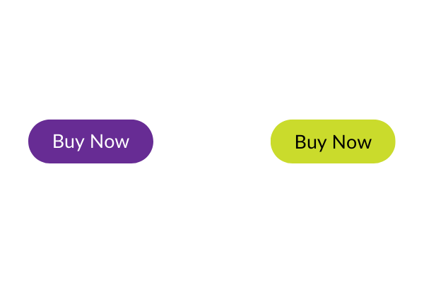
Remember, some email clients invert more than just black and white. So if you use a specific, branded color on a button, that color will be reversed in dark mode. The purple button below, for example, will show up as a shade of green in dark mode. While this doesn’t necessarily look bad, it probably doesn’t fit into brand guidelines.
Honestly, all three of these possibilities are pretty bad — for subscribers and brands.
The fix: Preview emails in dark mode
The only way to really know how your logo (and other graphic elements) look in dark mode is to test them. Of course, since all email clients handle dark mode differently, you’ll need to check your email design in all of them — or at least the ones that your subscribers use most frequently.
The easiest way to do this is with an email preview tool like Email on Acid. It’ll save you a ton of time and frustration. But more on this later!
Advanced dark mode logo tips for email teams
1. Place the logo in a header graphic
You could also create a header graphic that’s the width of your email template and contains your logo. This allows you to have exact control over the logo and what goes behind it.
This graphic might have additional elements — perhaps the title of an email newsletter, for example — or could just be a solid color that has enough contrast with the logo. However, do keep in mind that when the graphic is shrunk on mobile devices, the logo could end up being too small.
This email from Yoco, for example, has a white header image that allows them to use their default logo version. Even though the rest of the content is on a black background, they can stick to their brand guidelines.
2. Put a gradient behind the logo
Adding a gradient behind the logo ensures that it’s still visible without creating the kind of hard, jarring lines that a white box would. The logo could fade gently into the background (or header image) in a way that’s on-brand and accessible. This could also work in both light and dark mode.
3. Target dark mode with CSS
In some ways, this is the best solution because it allows you to set specific design standards for dark mode and light mode. It gives you full control.
For example, you might set your standard logo version to show in light mode and select a different file — maybe one with white text — for dark mode. Or, you could choose to add a colored stroke just for dark backgrounds.
You can do this with the following media query:
@media (prefers-color-scheme)
So, let’s say that you want to set the background color for body text, along with a specific color and padding for headers and tables — just for dark mode. You would use this code:
                                @media (prefers-color-scheme: dark ) {
    .body {
        background-color: #CCCCCC !important;
    }
    h1, h2, h3, td {
        color: #9ea1f9 !important;
        padding: 0px 0px 0px 0px !important;
    }
}
You can also use the @media query to swap images (or logos) when dark mode is enabled so that a dark-mode-friendly version appears when subscribers have the setting turned on.
Here’s how that might look:
CSS:
                                @media (prefers-color-scheme:dark) {
    .dark-mode-hide{
        display:none!important;
    }
    .dark-mode-show{
        display:block!important;
    }
}
HTML
                                <img src="https://marketing.emailonacid.com/hubfs/EOA-Logo-Full-Color-white-envelope.png" width="150" alt="Email on Acid" border="0" style="display:block;max-width:150px;font-family:Arial,sans-serif;font-size:9px;line-height:12px;color:#ffffff;font-weight:bold;" class="dark-hide">

<!--[if !mso]><!-->
<img src="https://marketing.emailonacid.com/hubfs/images/logos/EOA-Logo-White.png" width="150" alt="Email on Acid" border="0" style="display:none;max-width:150px;font-family:Arial,sans-serif;font-size:9px;line-height:12px;color:#ffffff;font-weight:bold;" class="dark-show">
<!--<![endif]-->
Note: the code under <!–[if !mso]><!–> is Microsoft Office conditional code that tells Outlook to ignore the dark mode logo. With Outlook, you can also use the tag “mso-hide:all” to keep elements hidden in dark or light modes.
That’s because, unfortunately, not all email clients support this media query, including many versions of Outlook and Gmail. Interestingly enough, though, the Gmail app does have an option to show emails in light mode, even when the phone as a whole is set to dark.
So, if elements of your email don’t look the best, a subscriber can choose to view it in light mode instead. However, don’t rely on this too much — not everyone knows this setting exists or will be bothered enough to enable it.
Can I Email? has a full list of clients that support @media (prefers-color-scheme).
4. Build a dark-mode friendly template
If you’re creating email templates rather than using a drag-and-drop builder, this is an excellent solution. Build templates that work well in both light mode and dark mode. This is the best way to ensure it’s compatible with all email clients.
That being said, it will require a lot of testing to get it right across all clients. And that brings us to…
Shine a light on dark mode
The only way to guarantee that your logo works in dark mode across the board is to test — and test again! But to check your email across all clients and devices would be incredibly time-consuming and difficult.
That’s where Email on Acid’s email previews come in. You can quickly and easily see your email on all the major clients and browsers and, since there aren’t any testing limits, you can fix any issues and try, try again. Plus, they’re accurate, live clients rather than emulations, so you know you’re seeing the real deal.
So, don’t be afraid of dark mode. Know that your emails look great every single time with Email on Acid’s email previews.