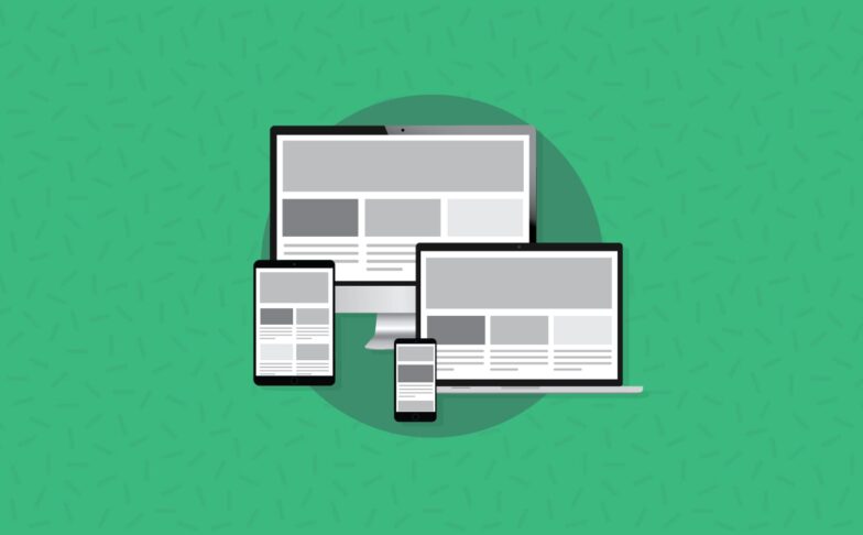
Email Development
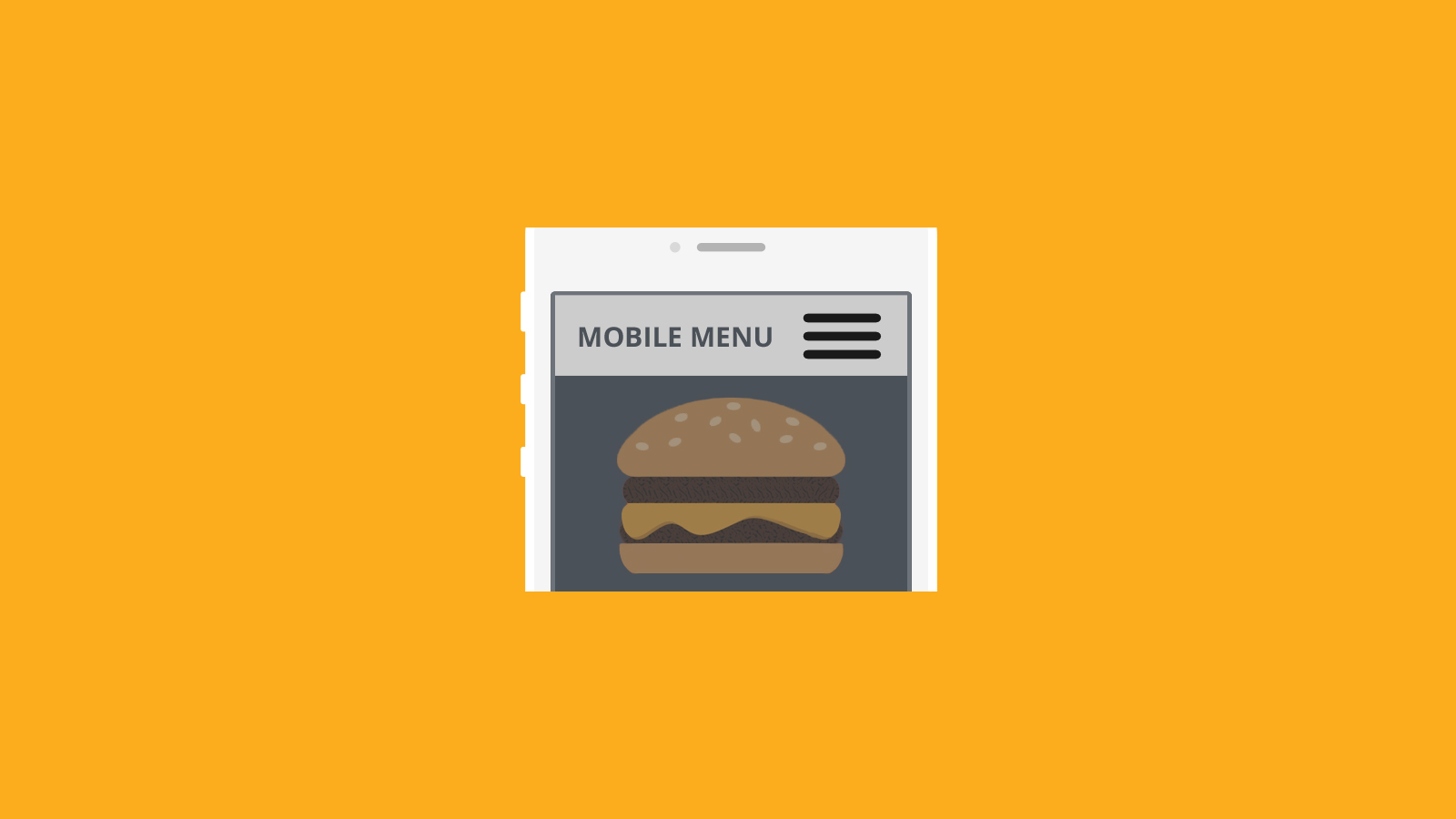
Alternative Uses for Hamburger Menus in Email
Navigation menus in email are often made and displayed as a horizontal bar, with all the links in a row. This can create some challenges when it comes to mobile displays. If the links are still side-by-side, they will become tiny and hard to touch on mobile. If they are stacked at 100% width, they will push all of the content down.
One solution is to hide the links in a “hamburger” menu, so-called for the hamburger-like icon used to show/hide the menu. Of course, if you’re not a fan of this kind of icon you can hide your menu items under anything you like. The example I start with below is based off of the hamburger menu that Justin Khoo wrote about on FreshInbox. Justin added to the design of Jerry Martinez, who posted about this at the beginning of the year. With Justin’s hover fallback, this technique is supported even for senders whose ESP strips form elements, most notably MailChimp. It will also enable support for the technique in Oulook for iOS.
Other uses for this technique
Creating a hamburger menu for mobile clients is actually pretty easy, and the concept can be applied to any kind of information that needs to be collapsed for mobile users. In this tutorial, I’m going to use this technique to collapse information about cars for mobile users. If they are curious about the car, they can click the button to expand the info.
If you want to skip to the completed code sample, just click here.
However, I would not suggest hiding a CTA in this way, as some readers may miss it entirely.
Step-by-step tutorial
First, we’ll want to create the info items. This is just a standard table, with each info item in a new TR.
                                <table cellspacing="0" cellpadding="0" border="0" width="100%" style="width:100%">
        <tr>
            <td height="25" align="center" valign="center" bgcolor="#DBDBDB">
                <span class="info_item">2013 Nissan Z</span>
            </td>
        </tr>
        <tr>
            <td height="25" align="center" bgcolor="#DBDBDB">
                <span class="info_item">22,000 Miles</span>
            </td>
        </tr>
        <tr>
            <td height="25" align="center" bgcolor="#DBDBDB">
                <span class="info_item">2 Year Limited Warranty</span>
            </td>
        </tr>
        <tr>
            <td height="25" align="center" bgcolor="#DBDBDB">
                <span class="info_item">Lease for $200 a month</span>
            </td>
        </tr>
    </table>
Now we’re going to want to add a hidden checkbox. This is what we’ll use to toggle the content section open/closed for mobile.
<input id="exp_checkbox1" type="checkbox" style="display:none !important;">
We need to hide it from Outlook as well, so we’ll add in some conditional code.
<!--[if !mso 9]><!--><input id="exp_checkbox1" type="checkbox" style="display:none !important;"><!--<![endif]-->
Now we’re going to put this entire content section into a div. This is the container element, which we’ll use for styling and positioning purposes when we add our CSS in later.
                                <div id="details_container1">
    <!--[if !mso 9]><!--><input id="exp_checkbox1" type="checkbox" style="display:none !important;"><!--<![endif]-->
    <table cellspacing="0" cellpadding="0" border="0" width="100%" style="width:100%">
        <tr>
            <td height="25" align="center" valign="center" bgcolor="#DBDBDB">
                <span class="info_item">2013 Nissan Z</span>
            </td>
        </tr>
        <tr>
            <td height="25" align="center" bgcolor="#DBDBDB">
                <span class="info_item">22,000 Miles</span>
            </td>
        </tr>
        <tr>
            <td height="25" align="center" bgcolor="#DBDBDB">
                <span class="info_item">2 Year Limited Warranty</span>
            </td>
        </tr>
        <tr>
            <td height="25" align="center" bgcolor="#DBDBDB">
                <span class="info_item">Lease for $200 a month</span>
            </td>
        </tr>
    </table>
</div>
Now it’s time to add in our link that users will click to expand/contract the content section. This is where the “hamburger” button would go, if you want to use it. We’ll be using a text link instead.
We don’t want this to be visible on desktop clients, so we’ll make sure it’s hidden. Doing this requires a few different elements.
First we’ll add the link text. We need to wrap this in a div for styling. We’ll need a second div to create the hover backup functionality.
                                <div class="nav-under" style="display:none;overflow:hidden;max-height:0px;text-align:center;background-color:#3b5369;color: #ffffff;">
        Car Details »
    </div>
    <div class="nav-over" style="display:none;overflow:hidden;max-height:0px;text-align:center;position:absolute;top:0px;width:100%;opacity:0;color: #ffffff;">
        Car Details »
    </div>
Finally we’ll wrap all this in a label tag, hidden from Outlook. This label is associated with the checkbox.
                                <!--[if !mso 9]><!-->
    <label for="exp_checkbox1">
        <div class="nav-under" style="display:none;overflow:hidden;max-height:0px;text-align:center;background-color:#3b5369;color: #ffffff;">
            Car Details »
        </div>
        <div class="nav-over" style="display:none;overflow:hidden;max-height:0px;text-align:center;position:absolute;top:0px;width:100%;opacity:0;color: #ffffff;">
            Car Details »
        </div>
    </label>
    <!--<![endif]-->
The last step for HTML is to wrap the entire section in a container div.
                                <div id="expandable_container1">
        <!--[if !mso 9]><!-->
        <label for="exp_checkbox1">
            <div class="nav-under" style="display:none;overflow:hidden;max-height:0px;text-align:center;background-color:#3b5369;color: #ffffff;">
                Car Details »
            </div>
            <div class="nav-over" style="display:none;overflow:hidden;max-height:0px;text-align:center;position:absolute;top:0px;width:100%;opacity:0;color: #ffffff;">
                Car Details »
            </div>
        </label>
        <!--<![endif]-->
        <div id="details_container1">
            <!--[if !mso 9]><!--><input id="exp_checkbox1" type="checkbox" style="display:none !important;"><!--<![endif]-->
            <table cellspacing="0" cellpadding="0" border="0" width="100%" style="width:100%">
                <tr>
                    <td height="25" align="center" valign="center" bgcolor="#DBDBDB">
                        <span class="info_item">2013 Nissan Z</span>
                    </td>
                </tr>
                <tr>
                    <td height="25" align="center" bgcolor="#DBDBDB">
                        <span class="info_item">22,000 Miles</span>
                    </td>
                </tr>
                <tr>
                    <td height="25" align="center" bgcolor="#DBDBDB">
                        <span class="info_item">2 Year Limited Warranty</span>
                    </td>
                </tr>
                <tr>
                    <td height="25" align="center" bgcolor="#DBDBDB">
                        <span class="info_item">Lease for $200 a month</span>
                    </td>
                </tr>
            </table>
        </div>
    </div>
Now it’s time for styles.
Let’s start by hiding input elements.
                                <style type="text/css">
    input {display:none;}
</style>
That’s actually all we need for regular CSS styles. The rest of the styles will be inside a media query. You can set the exact breakpoint where you like it, but for purposes of this tutorial we’ll use 480. By setting the breakpoint at 480, we can include most tablets as well as smaller screens like phones. Our first styles in the media query will make expandable_container1 and details_container1 position:relative so that we can move them.
                                <style type="text/css">
    input {display:none;}

    @media (max-width:480px) {
        #expandable_container1 {
            position:relative;
        }

        #details_container1 {
            position:relative;
            overflow:hidden;
        }
    }
</style>
Because each info item is on its own row, we don’t need display:block. If you wanted to use this with a horizontal list (each TD in the same TR), you would want to add display:block to the list of styles on each TD. You can see this style commented out in the list, in case you need to add it.
To make the items full-width, we’ll add width:100%. We’ll also need a little padding to help make them touchable, and a border under each item so that we can tell them apart.
                                <style type="text/css">
    input {display:none;}

    @media (max-width:480px) {
        #expandable_container1 {
            position:relative;
        }

        #details_container1 {
            position:relative;
            overflow:hidden;
        }

        #expandable_container1 td {
            /* display:block !important; */
            width: 100%;
            border-bottom:2px solid #ffffff;
            height:18px;
            padding: 10px 0px;
        }
    }
</style>
The next code we’re adding to our styles will keep the content section hidden until the user clicks on the expand link. We’ll also add in some CSS animation to help make the table’s appearance more visually pleasing.
                                <style type="text/css">
    input {display:none;}

    @media (max-width:480px) {
        #expandable_container1 {
            position:relative;
        }

        #details_container1 {
            position:relative;
            overflow:hidden;
        }

        #expandable_container1 td {
            width: 100%;
            border-bottom:2px solid #ffffff;
            height:18px;
            padding: 10px 0px;
        }

        #expandable_container1 table {
            margin-top:-500px;
            -ms-transition: margin-top .5s ease-in-out;
            -webkit-transition: margin-top .5s ease-in-out;
        }
    }
</style>
Now comes the cool part! This is where we make the checkbox functional. This style will over write the -500px margin we added in the previous step, and the animation will kick in to make it ease out.
                                <style type="text/css">
    input {display:none;}

    @media (max-width:480px) {
        #expandable_container1 {
            position:relative;
        }

        #details_container1 {
            position:relative;
            overflow:hidden;
        }

        #expandable_container1 td {
            width: 100%;
            border-bottom:2px solid #ffffff;
            height:18px;
            padding: 10px 0px;
        }

        #expandable_container1 table {
            margin-top:-500px;
            -ms-transition: margin-top .5s ease-in-out;
            -webkit-transition: margin-top .5s ease-in-out;
        }

        #exp_checkbox1:checked + table {
            margin-top:0%;
        }
    }
</style>
Just in case the checkbox doesn’t work (because your ESP may strip out form elements) Justin coded a fallback method which uses the hover state. We’ll add that in next.
                                <style type="text/css">
    input {display:none;}

    @media (max-width:480px) {
        #expandable_container1 {
            position:relative;
        }

        #details_container1 {
            position:relative;
            overflow:hidden;
        }

        #expandable_container1 td {
            width: 100%;
            border-bottom:2px solid #ffffff;
            height:18px;
            padding: 10px 0px;
        }

        #expandable_container1 table {
            margin-top:-500px;
            -ms-transition: margin-top .5s ease-in-out;
            -webkit-transition: margin-top .5s ease-in-out;
        }

        #exp_checkbox1:checked + table {
            margin-top:0%;
        }

        .nav-over,.nav-under {
            display:block !important;
            max-height:none !important;
            padding-top:3px;
            padding-bottom:3px;
        }

        .nav-over img,.nav-under img {
            display:block;
            float:right;
            margin-right:5px;
        }

    }
</style>
Finally, these last few styles help deal with quirks in Windows 8.1 and Outlook for iOS.
                                <style type="text/css">
    input {display:none;}

    @media (max-width:480px) {
        #expandable_container1 {
            position:relative;
        }

        #details_container1 {
            position:relative;
            overflow:hidden;
        }

        #expandable_container1 td {
            width: 100%;
            border-bottom:2px solid #ffffff;
            height:18px;
            padding: 10px 0px;
        }

        #expandable_container1 table {
            margin-top:-500px;
            -ms-transition: margin-top .5s ease-in-out;
            -webkit-transition: margin-top .5s ease-in-out;
        }

        #exp_checkbox1:checked + table {
            margin-top:0%;
        }

        .nav-over,.nav-under {
            display:block !important;
            max-height:none !important;
            padding-top:3px;
            padding-bottom:3px;
        }

        .nav-over img,.nav-under img {
            display:block;
            float:right;
            margin-right:5px;
        }

        .nav-over{
            -ms-transition-delay: 1.5s;
            -webkit-transition-delay: 1.5s;
        }

        #expandable_container1 > .nav-over:hover + div table{
            margin-top:0% !important;
        }

        #expandable_container1 > .nav-over:hover{
            visibility:hidden;
        }
    }
</style>
Here is our completed code:
                                <!DOCTYPE html PUBLIC "-//W3C//DTD XHTML 1.0 Transitional//EN" "https://www.w3.org/TR/xhtml1/DTD/xhtml1-transitional.dtd">
<html xmlns="https://www.w3.org/1999/xhtml">
<head>
    <!--[if !mso]><!-->
        <meta http-equiv="X-UA-Compatible" content="IE=edge" />
    <!--<![endif]-->
    <meta name="viewport" content="width=device-width, initial-scale=1.0">
    <style type="text/css">
        input {display:none;}

        @media (max-width:480px) {
            #expandable_container1 {
                position:relative;
                max-width:263px;
                text-align:center;
            }

            #details_container1 {
                position:relative;
                overflow:hidden;
            }

            #expandable_container1 td {
                width: 100%;
                border-bottom:2px solid #ffffff;
                height:18px;
                padding: 10px 0px;
            }

            #expandable_container1 table {
                margin-top:-500px;
                -ms-transition: margin-top .5s ease-in-out;
                -webkit-transition: margin-top .5s ease-in-out;
            }

            #exp_checkbox1:checked + table {
                margin-top:0%;
            }

            .nav-over,.nav-under {
                display:block !important;
                max-height:none !important;
                padding-top:3px;
                padding-bottom:3px;
            }

            .nav-over img,.nav-under img {
                display:block;
                float:right;
                margin-right:5px;
            }

            .nav-over{
                -ms-transition-delay: 1.5s;
                -webkit-transition-delay: 1.5s;
            }

            #expandable_container1 > .nav-over:hover + div table{
                margin-top:0% !important;
            }

            #expandable_container1 > .nav-over:hover{
                visibility:hidden;
            }
        }
    </style>
</head>
<body>
    <p style="font-size:30px">This is the header.</p>
    <img src="https://www.emailonacid.com/images/emails/auto_template/car_1.jpg" alt="CAR NAME" width="263" height="158" border="0" align="top" style="display:block; border:solid 1px #cccccc;" />
          <div id="expandable_container1">
            <!--[if !mso 9]><!-->
            <label for="exp_checkbox1">
                <div class="nav-under" style="display:none;overflow:hidden;max-height:0px;text-align:center;background-color:#3b5369;color: #ffffff;">
                    Car Details ▼
                </div>
                <div class="nav-over" style="display:none;overflow:hidden;max-height:0px;text-align:center;position:absolute;top:0px;width:100%;opacity:0;color: #ffffff;">
                    Car Details ▼
                </div>
            </label>
            <!--<![endif]-->
            <div id="details_container1">
                <!--[if !mso 9]><!--><input id="exp_checkbox1" type="checkbox" style="display:none !important;"><!--<![endif]-->
                <table cellspacing="0" cellpadding="0" border="0" width="263" style="width:263px">
                    <tr>
                        <td height="25" align="center" valign="center" bgcolor="#DBDBDB">
                            <span class="info_item">2013 Nissan Z</span>
                        </td>
                    </tr>
                    <tr>
                        <td height="25" align="center" bgcolor="#DBDBDB">
                            <span class="info_item">22,000 Miles</span>
                        </td>
                    </tr>
                    <tr>
                        <td height="25" align="center" bgcolor="#DBDBDB">
                            <span class="info_item">2 Year Limited Warranty</span>
                        </td>
                    </tr>
                    <tr>
                        <td height="25" align="center" bgcolor="#DBDBDB">
                            <span class="info_item">Lease for $200 a month</span>
                        </td>
                    </tr>
                </table>
            </div>
        </div>
    <p>This is the body of the email.</p>
</body>
</html>
Instead of using “margin-top” to control the hidden menu, you can also use “max-height.” Just constrain the menu to max-height 0 by default, add an animation to it, and then set the max-height to the desired height in the “checked” state.
To use this technique for a normal hamburger menu, just make sure to remove the TR tags between each TD from the beginning of the tutorial, and set “#expandable_container1 td” to display: block !important; within your media query. Check out the complete example of this technique.
Other creative uses
When you see the power of the “hamburger menu,” what other uses come to mind? Let us know in the comments below!