Email Marketing
How to Make the Most of Your Unsubscribe Page
Seeing that unsubscribe rate tick up after launching an email campaign you’re really proud of can lead to a sinking feeling in your stomach. As an email marketer, that hurts a little, and it’s hard not to take personally, right? Was it something you sent?
Break-ups like these can leave an email marketer feeling a bit heartbroken. But unsubscribes are part of the lifecycle of many subscribers – sometimes you have to let them go.
Still, perhaps all hope is not lost. There are ways to keep that relationship going and save subscribers before they leave your list. That’s where your company’s Unsubscribe page comes in. It’s your last chance to convince contacts to change their minds about opting out of emails. And even if they ultimately choose to opt out, you can still find out where things went wrong.
Let’s talk through why every email marketing program needs an unsubscribe page, our tips for what makes an unsubscribe page effective, and how it can help you convince at least some of those people to stick around.
To comply with regulations like CAN-SPAM, GDPR, and CCPA, your subscribers must have a clear, easy way to remove and change their data from your list. For most email marketers, that’s an easy to find unsubscribe link in the footer of every email. When a subscriber clicks that link, they’ll and on your unsubscribe page.
These landing pages usually have simple, streamlined designs and are often hosted by your ESP rather than on your website proper. Unsubscribe pages may be wrapped in larger email preference centers where subscribers can pick and choose which emails they would like to subscribe to. (We’ll talk more about email preference centers later on.)
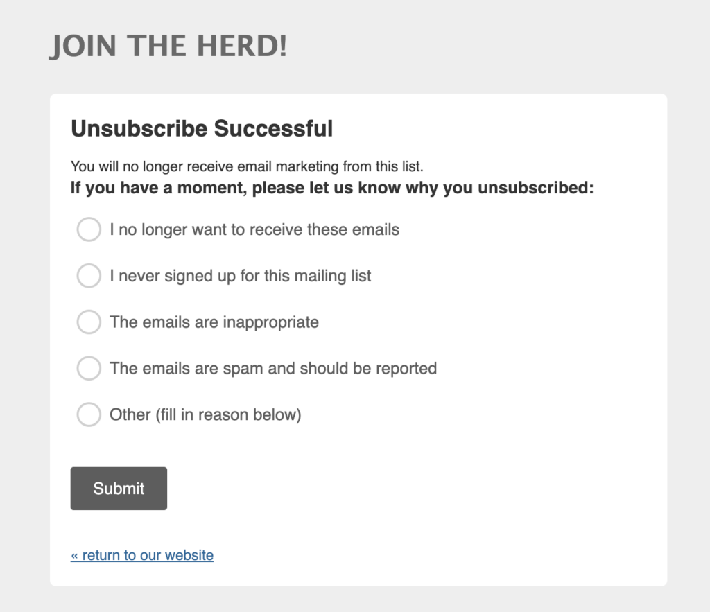
Most of the time, though, when a subscriber clicks “unsubscribe” at the bottom of your email, the page looks like this:
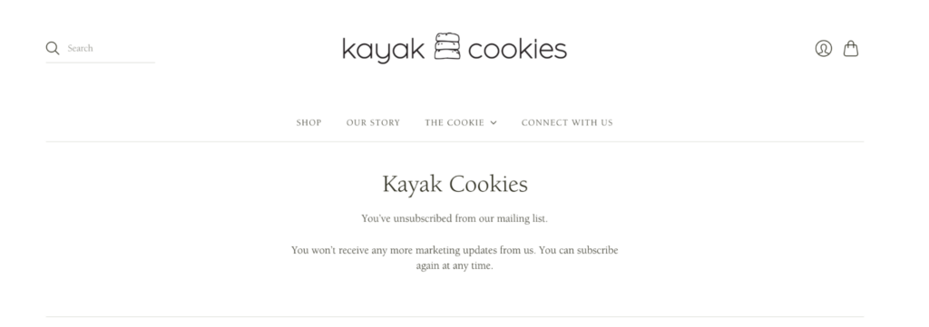
There’s nothing wrong with doing it this way, but it could be a huge missed opportunity. That’s because the unsubscribe page is your last chance to ask, “Are you sure you want to unsubscribe?”
Why you shouldn’t sweat the unsubscribes too much
Remember: If someone wants to unsubscribe from your list, let them go. It’s totally normal for subscribers to come and go—so be sure to honor their request asap when they confirm their choice.
In fact while it can be tough to lose subscribers, there are a few silver linings to keep in mind:
- An unsubscribe isn’t going to hurt your deliverability as long as you stop emailing them right away. (Thank goodness they’re not marking you as spam!)
- When unengaged subscribers leave your email list, they’re doing your regular email list hygiene for you, so you don’t have to purge them later. Better engagement rates beat a huge list of inactive subscribers.
- Clicking unsubscribe isn’t actually the end. That’s left for the unsubscribe page—your last-ditch effort to save your relationship.
You might be thinking: “Well, if they don’t want to stick around, why bother making a landing page at all?”
Someone may not want to get your emails right now because they’re changing industries, purchased an item as a gift, or are simply doing some spring cleaning on their inboxes. And they may unsubscribe from emails but still follow your brand on social media or engage with you in other ways.
The truth is, the unsubscribe experience matters. This is your very last chance to wow them—and may even save them from unsubscribing. Here’s our top tips for designing an effective unsubscribe page:
No one should have to scroll down for an unsubscribe page. You’ll want to keep the copy super simple and clear so that subscribers know exactly what to click to confirm their unsubscribe.
That said, it doesn’t have to be boring or one-dimensional. You have 1-2 sentences to make your case and enough real estate to work with to try to save them from leaving. Depending on your brand, you have a few different angles to try. You can:
- Be sincere with your copy, including an apology
- Add a little bit of self-deprecating humor or crack a joke
- Play it straight and ask them directly to give you another chance
- Let subscribers know they matter and that they’ll be missed
Play around with the page and consider A/B testing it to see what kind of copy resonates the most. This cohort of people won’t be like the rest of your email list or customers, so this is a great place to experiment (and hey, if they’re already leaving, you don’t have much to lose!)
While the unsubscribe button should be prominent on the page, include an option to stay on your email list. This might be as simple as two buttons:
- Yes, I would like to unsubscribe
- Wait! Keep me on the list
You want to give your subscribers just enough hesitation so they say, “Aw, I guess I do like getting their emails.” It won’t happen all the time, but a pause might be all they need to stay on the list.
Often, a subscriber who wants to leave is just annoyed by how many emails they’re receiving, or that they’re receiving irrelevant emails based on your targeting. For example, if your brand sells clothing, they may only be interested in receiving emails around men’s clothing, not your children’s line. In addition to giving them a chance to change their mind, you can also give subscribers more control over their email preferences on this page.
You can adjust preferences like:
- Email frequency
- Types of emails, such as newsletter vs. promotions
- Content topics
- Product categories
This is a slightly more advanced tactic, but it can pay off in the long run by keeping more subscribers and increasing engagement.
4. Ask for feedback on your email program
Even the best landing page won’t save every unsubscribe. It happens, and that’s okay. For the subscribers who truly want to leave, you can ask for one last favor: Feedback on your email marketing campaigns. Find out whether it’s a “it’s not you, it’s me” situation or if there’s really an issue with your emails you should address.
Add an optional survey question underneath the unsubscribe functionality asking why they’re leaving, and include a write-in for any additional feedback. It may take a little time to sort through qualitative responses, but that’s where you’ll find valuable insights that can help make your emails that much better for the subscribers who stay.
An unsubscribe page may be a speed bump, but that doesn’t mean it has to be hard to use. The last thing you want to do here is make someone jump through hoops, or worse, continue to email them after they’ve confirmed they want to unsubscribe. No matter what you add to your page, make sure it’s easy and quick to use—as much as it hurts.
Slapping a button on a landing page and calling it an unsubscribe page is all fine and good, but you’ll be missing a chance to save your subscriber relationship. So many unsubscribe pages out there look boring, but they don’t have to be to be successful. Here are a few great examples from our inboxes:
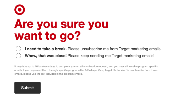
This webpage from Target is exactly the kind of short, snappy copy any brand should aspire to. The language keeps with the brand’s friendly, approachable personality, and they offer a chance to change your mind with a, “Whew, that was close!”

This email preference center offers a lot of choice for subscribers, which makes sense because of Anthropologie’s separate business lines—clothing, home, and bridal—and while the layout is a little long, giving subscribers choice around topic and frequency is a great way to get them to stick around.
3. Jasper Hill Farm
If you’ve never tried a cheese from Jasper Hill, you’re missing out—and their punny, cheese-filled emails are fun too. This unsubscribe page is basic, but asks an important feedback question that allows their team to tailor future email campaigns. You can customize the questions to what best suits your brand.
What’s great about this unsubscribe page is it fits Dr. Becky’s brand so well. The parenting expert often advises using the framework that two feelings can be true at the same time. This copy is exactly what you’d expect her to say in person: “We’re sorry to see you go AND we’ve loved the time we’ve spent together.” She also adds a chance for unsubscribes to easily change their mind.
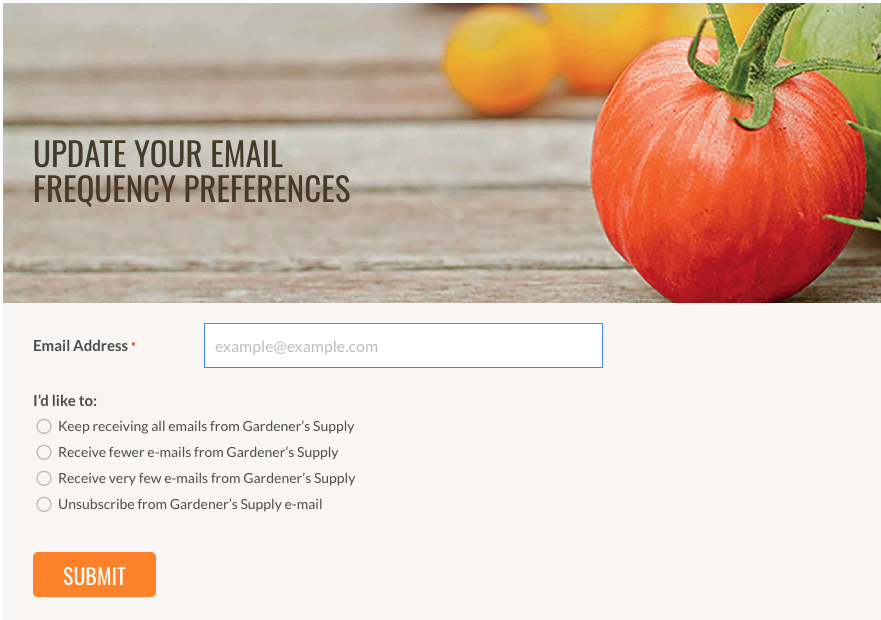
Adding choice to an unsubscribe page is a tactic worth stealing from Gardener’s Supply. They offer several options around email frequency on a pleasing but simple landing page. It’s worth being slightly more specific in your copy if you have several types of newsletters (for example, “I only want to receive Saturday’s newsletter”) but for a more general kind of email marketing cadence, this page does the job.
Do you need an email preference center?
Email preference centers offer your subscribers more control by allowing subscribers to customize their inbox experience. In addition to an unsubscribe button, preference centers may include options to change the frequency, type, and content of their emails. But do you need one?
The answer, like most email questions, is that it depends. If you’re only sending one or two kinds of emails—say, a regular newsletter and the occasional promotion—then probably not. If you’re a high volume sender who segments subscribers, has multiple audiences, or sends different types of newsletters, then you should consider creating one.
This is top of mind for email marketers right now. In a recent survey, 27% of our respondents planned to add or improve their preference centers as an advanced email marketing tactic in 2023.
The best way to keep a subscriber from leaving? Send them great emails in the first place.
That means making sure every single send is accessible, renders correctly, and is free from errors like typos or broken links. Previewing and testing your emails before every send gives you the chance to double- and triple-check your campaigns, giving you the peace of mind that everything is as it should be. That’s where Sinch Email on Acid can help. See how: