Email Marketing
2023 Graphic Design Trends for Email Marketing Campaigns
Who actually has time to keep up with the latest in fashion? Because, honestly, it can be kind of overwhelming. Are we mixing patterns now, or is that still a bad idea? Should you toss those clothes you have shoved in the back of your closet from the 90s or are they suddenly back in style? Are you actually supposed to dress like the runway models?
And keeping up with graphic design trends for email marketing can feel similarly stressful. But doing so helps brands stay relevant to their customers and clients. Graphic design helps you tailor marketing messages to your audience.
While we can’t help you avoid a fashion faux pas, we can help you stay on top of 2023 graphic design trends so you can truly wow your subscribers with eye-catching, on-trend emails. Let’s dive in.
Why you need new email design ideas
Inboxes are cluttered. Email marketers certainly understand the importance of getting noticed. Mailjet’s upcoming study, “Inbox Insights 2023”, found that standing out in the inbox is the most cited constraint to email success.
And while they may not help you get more opens, effective, original designs will boost email engagement.
If your email makes use of popular graphic design trends, then instead of just opening and sending it to the trash, a subscriber might take the time to scroll further. They might read more of what you have to say and click on your call to action.
But a good design supports a good user experience. It also makes your emails more effective in other ways. It helps direct eyes to important information or calls to action. It helps subscribers interpret information faster and more thoroughly. And it helps your brand make a positive impression.
In summary, great email design makes it more likely that subscribers will engage in a meaningful way.
Nine 2023 graphic design trends to consider
Okay, but what exactly are some of the best 2023 graphic design trends? Let’s take a look.
1. Mixed dimensions
Mixed dimension design breaks down the wall between real life and the digital space by combining photography and illustration. This has a sort of surreal effect, making people take a second look and really dive into the details of the design.
You can get super creative with this type of design, bringing everything from doodles and icons to cartoons and watercolor brush strokes into the picture. You can also use this style to play up a certain emotion or feeling that you want to convey.
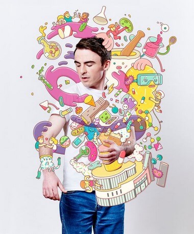
This design, for example, is fun and playful, featuring cute, colorful characters and images. Imagine seeing something like this in your inbox – it’s an instant attention-getter!
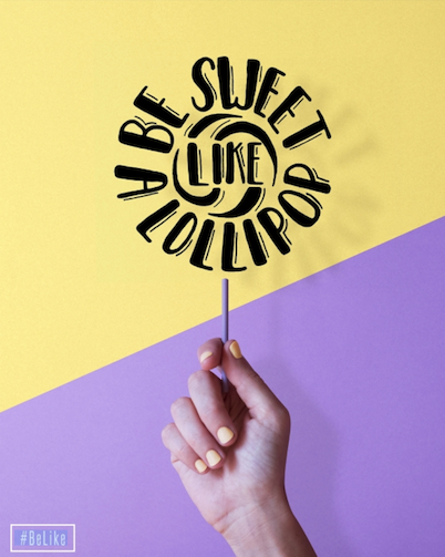
And the design above so clearly emphasizes the text, “Be sweet like a lollipop.” You could use a similar concept to put the focus on the main message of your own email.
2. Eye-catching typography
Typography can be a very powerful way to convey a specific feeling, emotion, or idea. So it’s no surprise that unique, eye-catching typography will be huge in 2023.
Think of typography as more than just a way to display text. Instead, consider it a design element. Have your text interact with your illustration or photo. Use it to represent a shape or idea.
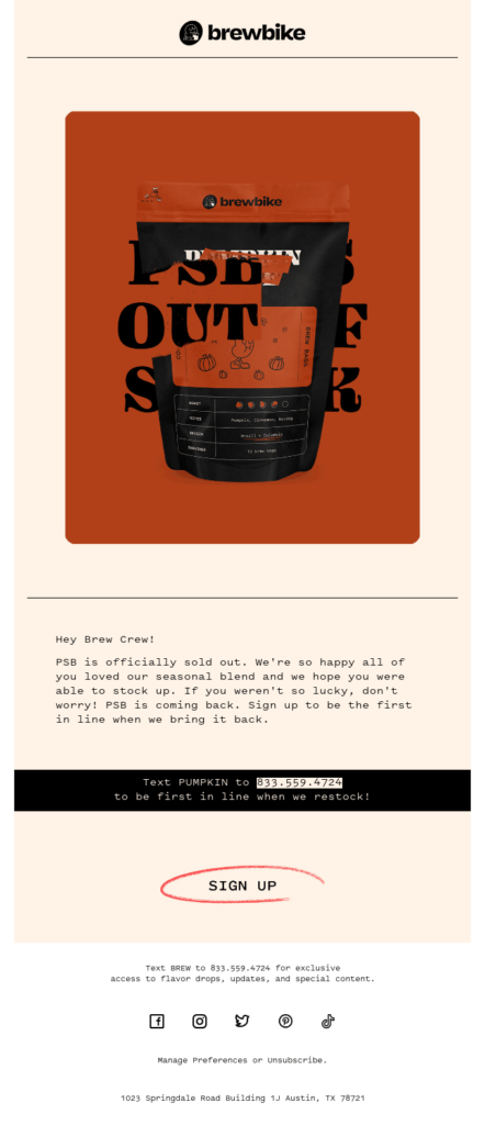
Brewbike, for example, used a bold serif font to announce that one of its blends was out of stock. The text disappears behind the bag of coffee, blending in and out of the graphic.
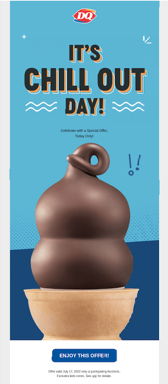
You can also just use a unique font that fits the theme of your email. Dairy Queen used a font with a “groovy” feel for a headline that said, “It’s chill out day!” It’s a bold, colorful, fun way to introduce a special offer.
Here are a few considerations to make when getting creative with typography:
- Keep readability in mind. Make sure that subscribers can still read your text. Don’t sacrifice legibility for creativity.
- Remember accessibility. Along those same lines, make sure that you make accommodations for those with vision impairments. For example, if you include typography in your graphics, make sure you include it in the alt text for that image.
- Don’t forget to build a font stack. A font stack tells email clients what font they should use if your preferred option isn’t available. This is particularly critical when using unique typography.
3. Creative gradients
Gradients are an excellent way to add visual interest to your email designs, while still accommodating any text or graphic elements you want to highlight. And unique gradients are going to start showing up more and more in 2023 graphic design trends – think abstract designs and irregular blends.
Abstract gradients aren’t as uniform as linear and radial gradients. This gives them a sort of surreal effect that can really make your design stand out. A great example are these stunning backgrounds from a Tuts+ tutorial:

And take a look at this landing page concept that uses the graphic design trend:

The irregular green gradient in the background feels almost like the text is floating on a cloud. Can you see how these types of gradients can make a real impression on your subscribers?
4. Data visualization
It can be a bit tricky to display data and stats to subscribers in a way that’s interesting and easy to understand at first glance. But this can be particularly important for certain B2B brands.
By getting creative with maps, charts, graphs, and more, you can both make your email design stand out and thoroughly communicate information. Here’s what Tableau has to say on the subject:
Data visualization is another form of visual art that grabs our interest and keeps our eyes on the message. When we see a chart, we quickly see trends and outliers. If we can see something, we internalize it quickly. It’s storytelling with a purpose.
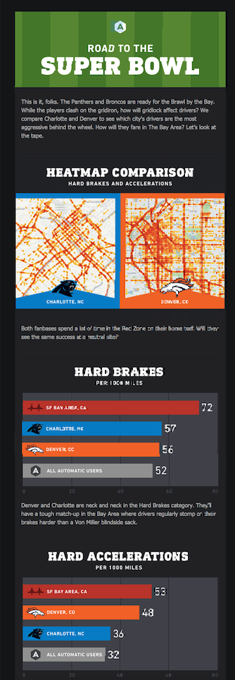
Automatic did a great job of data visualization when representing information about driving during the “Big Game.” They use color and logos to clearly represent groups of people and use size to immediately communicate larger numbers.
When it comes to data visualization, you once again don’t want to sacrifice legibility and accuracy for creativity. Make sure you choose the right type of chart or graph to best and most accurately represent your information.
Looking for some creative email campaign ideas? Check out our B2B email automation ideas.
5. Retro-vintage art
Retro and vintage art takes subscribers back to a simpler time. It evokes a feeling of nostalgia that can really make your clients and customers connect with your brand. Why? Here’s an explanation from a design paper titled “Nostalgia and Its Value to Design Strategy: Some Fundamental Considerations.”
Cognitive theorists believe that emotions have a strong influence on human behavior, that is, people will be attracted by the objects that evoke positive emotions and forced away from those things that evoke negative emotions. Nostalgia, like other positive emotions, when it is evoked by certain stimulus (e.g. products, brands), will incite people to approach (e.g. to purchase or to interact with) it.
While retro and vintage don’t necessarily indicate a specific era, they often focus on characteristics of the 60s and 70s – think pop art, psychedelic design, bold colors, geometric shapes, and hippie motifs.
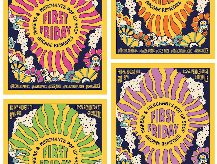
Take these posters, for example. They embrace everything about those eras, with a psychedelic feel, bright colors, and bold designs.
Here’s another throwback look…
These posters for a guest speaker take a slightly different approach. They were designed with the 1960s era in mind, and feature simple styles with muted colors and textures.

6. ‘90s/Y2k style
Concerned that ‘90s and Y2k design styles are already considered “throwback”? We are too. (I feel so OLD!) But that doesn’t change the fact that they’re back as a graphic design trend in 2023. So, pull up your cargo shorts and tie on that hemp choker.
The 1990s and early 2000s cover quite a few different styles, from grunge textures and grid backgrounds to bright colors, fun patterns, and space psychedelia. Again, this can convey a feeling of warm nostalgia and could be a great option if your audience grew up in the 90s or early 2000s.
In an article from Creative Boom, designer Al Connolly said that, “Y2K was a melting pot of low poly CGI, chrome and iridescent patterns mimicking the backs of CDs, unrefined interfaces and cyber-inspired fonts,” he says. “In many ways, it’s an aesthetic that can appear cheap and tacky. But what surrounds this is a sweet sense of nostalgia that captures a ‘the future is here, and anything is possible’ mindset.”
Doesn’t this event ticket take you right back? It’s fun, playful, dynamic, and eye-catching all at once. You get the feeling you’ll meet Zack, Slater, and Screech from Saved by the Bell at this event.

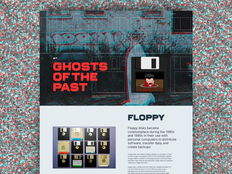
This webpage has a completely different feel, embracing the grunge element of 90s design. It features bold fonts, a graffiti-covered hero image, and cyber-inspired floppy disk iconography.
7. Minimalism
Minimalism is also going to be a big graphic design trend in 2023. In direct contrast to a lot of the other concepts in this article, minimalism is all about the idea of “less is more.” This is a great way to really make your primary message the focus of your email design.
But minimalistic doesn’t mean boring! A simple design with lots of room to breathe lends itself very well to bright colors.
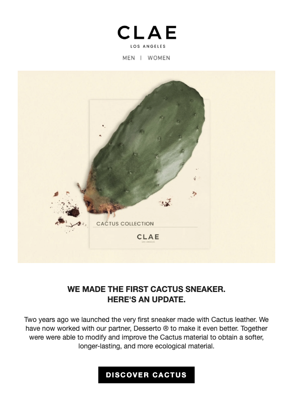
Take this email from Clae, for example. It has imagery that grabs your attention and effectively illustrates the campaign’s message.
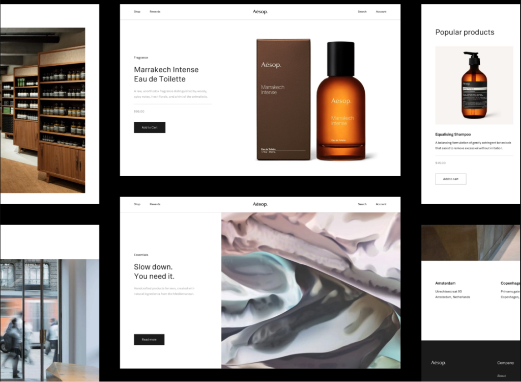
And this website design is simply stunning, and an excellent example of how minimalism can enhance your primary message. The product imagery is the focus of the entire site and really stands out from everything else.
8. Warm, optimistic colors
As we know, colors evoke certain emotions and feelings, often ones you want to be associated with your brand. Warm, soft, optimistic colors are the perfect way to convey calmness in 2023 – and don’t we all need a little bit of calmness?
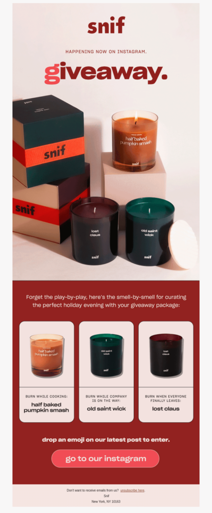
Take a look at this email from Snif, for example. The warm, muted background colors perfectly complement the cozy feel of the candles. It takes you right to a cozy holiday evening, reading a book by a roaring fire with your candle by your side.
And these website colors make you take a deep, relaxing breath right away. The muted oranges and blues are the perfect choice for a company that specializes in stress relief.

But no matter what colors you choose for your email design ideas, don’t forget about color contrast and accessibility. Make sure that any text you place on top of images or backgrounds stands out enough so that it can be easily read by those with color blindness or other visual impairments.
If you’re using Email on Acid, you can take advantage of our email accessibility tools. Our contrast ratio functionality takes all the guesswork out of the equation so that you always know that your design is accessible.
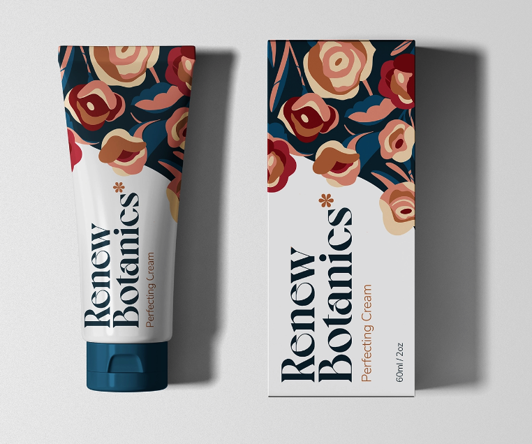
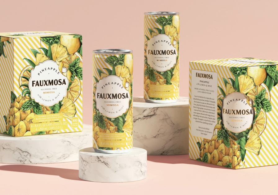
9. Botanical themes
Patterns are a great way to add visual interest to your emails, while also clearly representing your brand. And it looks like botanical patterns are going to be one of the email graphic design trends for 2023.
Designers are taking familiar, comforting nature elements and reimagining them. This can take a few different forms, too – from bright, exciting flowers to muted leaves and vines.
The floral pattern that makes up this package design is stunning. Rather than a literal interpretation of flowers, it takes an abstract approach, invoking warmth while really standing out and feeling unique.
This design, however, really pops, with a bright, vibrant pattern. While still featuring botanical elements, it feels fun and exciting, perfectly playing up the tropical flavors of the product.
Hopefully, this list of trends has given you some great email design ideas for 2023. But remember, the most important thing when designing your emails is to consider your audience and brand. You don’t want to choose a trend that feels disconnected from your brand style, or that will turn off your audience.
Instead, think of what will best resonate with your subscribers. Will a 60s flashback bring them feelings of nostalgia or are you better off going with a 90s feel? Will they love bright, fun colors or prefer warm, soothing tones?
The better you connect with your audience, the more likely you are to see real engagement and results from your emails.
Where to explore graphic design trends in email
Of course, this list of 2023 graphic design trends for email isn’t exhaustive. There are lots of fun ways you can find inspiration and get new ideas. Here are some of our favorite sources:
1. Really Good Emails
Popular with email geeks everywhere, Really Good Emails is chock full of real emails that companies sent to their subscribers. You can scroll through seemingly endless examples, search for something specific, or filter by type of email or company. And for each design, you can view the subject line, preview it on different email clients, and see how accessible it is.
The best part? You can inspect the code so that developers can see exactly how it was created and experiment with their own designs.
2. Email Love
Email Love is another great source for email design inspiration. Similar to Really Good Emails, it lists examples that you can filter by type – announcement, newsletter, welcome, etc. You can also search by trend, which is perfect for staying on top of current styles. When you click on a specific email, you can see the subject line, description, and similar email designs.
3. Milled
Milled calls itself a “search engine for email newsletters” and that’s a great description. While it’s primarily a source for sales, deals, and coupon codes from retailers, it can double as a source of inspiration for email marketers.
Search by brand and keyword, or scroll through all the available examples. When you click on an email, you can see the subject line and interact with elements like buttons.
4. Mailcharts
Mailcharts offers a curated list of emails from ecommerce brands that you’re familiar with, like Patagonia, Nike, and Pillsbury. You can explore examples from each of these brands, then view valuable data like average emails sent per week and average subject line length.
Update your email design system
You’re probably already familiar with the power of an email design system. Setting specific rules and standards for your emails save you time and ensure consistency across all of your campaigns. It also simplifies things as you grow, making it easier for new team members to jump on board quickly.
Our article about how to build an email design system gives you all the information you need to get started, from taking an inventory of your current emails to defining rules and testing your new system.
You can also learn more about defining and developing the components of your email design system. Components typically include things like headers, footers, buttons, and rows. You can pair these with brand styles like fonts, colors, and patterns to create a consistent look.
Then, you can incorporate your new design ideas into your email design system so you can use them consistently and correctly throughout each campaign. This is a great, strategic way to update templates, automations, and more to keep up with the new year.
And no matter which trend you decide to embrace, it’s always a good idea to A/B test design changes. This allows you to clearly see if the new design is effective and monitor any changes – good or bad – to your engagement.
Perfect your email designs before you hit send
The last thing you want is to invest money into cutting-edge, on-trend emails just for them to flop in the inbox because it doesn’t display the way you expected. But challenges with email client rendering discrepancies are a big concern for designers and developers. Protect your investment with Email on Acid’s suite of email testing tools.
If you often get anxious right before you deploy a new email (who doesn’t?), Campaign Precheck gives you an automated checklist that can eliminate mistakes and stress.
Instead of manually reviewing each and every email, and opening yourself up to mistakes, you can preview your email on dozens of clients, run email accessibility checks, validate the images in your emails, and more. It includes everything you need to put your best email forward. And if you need a tool to help you build your email designs, check out the responsive Mailjet Email Editor.