Email Marketing
Color Contrast Accessibility: Tips for Better Email Design

Despite the best efforts of advocates, it appears many brands still aren’t getting the message about color contrast accessibility.
WebAIM published a study this year showing 86.4% of homepages failed the Web Content Accessibility Guidelines (WCAG) for text contrast. That’s worse than results from 2019. If color contrast accessibility is ignored on a business’ website, marketers probably aren’t doing any better with emails.
While taking a multifaceted approach to email accessibility seems daunting, color contrast is one of the easier problems to tackle. Poor contrast is a design issue that’s fairly obvious for people without disabilities. If it’s difficult for someone with full vision to read, consider how color contrast impacts people with vision impairments.
Why color contrast accessibility matters
Imagine you open an email but none of the text is legible. You have to squint to make out the first sentence and quickly give up on the rest. If it’s from a brand you know, you’ll probably think a little less of them.
If your email content is difficult to read, subscribers won’t waste their time — especially when consumers receive an average of around 120 emails per day. Email marketing delivers an unmatched return on investment, but any reduction in engagement means the channel’s effectiveness is reduced as well. Good color contrast helps every subscriber engage with your campaigns.
Vision impairment statistics
So, just how much of your audience is impacted by color contrast issues? You’d be surprised.
There are more than 250 million people around the world who deal with vision impairment. Another 1.1 billion have “near vision impairment” because they need eyeglasses and don’t have them. Beyond reduced vision, other conditions like color blindness impact your audience’s ability to engage with your message.
Color blindness, or color vision deficiency (CVD), impacts 1 in 12 men and 1 in 200 women around the world, according to ColourBlindAwareness.org.
Most people suffer from red/green color blindness. According to WebAIM, improving color contrast helps those who struggle with this deficiency.
Individuals with a red-green deficiency have difficulty distinguishing between some shades of reds and greens, but they can still differentiate between a light color and a dark color. A dark red and a light green will be easy to distinguish because of their contrast difference.
Issues with color contrast accessibility may also put your company at risk of being sued. While it’s unclear whether contrast was ever the primary reason, consumers have filed thousands of lawsuits against businesses for violating the Americans with Disabilities Act (ADA). At least 1/5th of these pertain specifically to online and digital accessibility.
How is color contrast measured?
The Web Content Accessibility Guidelines (WCAG) measure contrast by comparing the difference in perceived “luminance” or brightness between two colors. This difference is expressed as a ratio ranging from 1:1 to 21:1.
Color contrast ratio examples:
White on white has a ratio of 1:1.
(It should go without saying that you wouldn’t be able to see this at all.)
Black on white has a ratio of 21:1.
Red on white (#FF0000) has a ratio of 4:1.
Blue on white (#0000FF) has a ratio of 8.6:1.
Green on white (#00FF00) has a very low ratio of 1.4:1.
Yellow on white (#FFFF00) has an extremely low contrast of 1.07:1.
Even those with normal vision will find this shade of yellow on white next to impossible to read. (That’s why we had to change the background)
You can test the contrast ratios between colors using a variety of free tools:
- WebAIM Contrast Checker: a web-based tool that only accepts hex values.
- Contrast Ratio: a web-based tool that accepts hex, hsla, and rgba values.
- Colour Contrast Checker: a web-based tool that only accepts hex values, but has an interesting color adjustment slider feature.
- Colorzilla: a Firefox extension that can detect color ratios in-browser.
- WAVE (web evaluation accessibility tool): a standalone tool inspects color contrast and other WCAG accessibility guidelines. It also includes a Chrome extension.
- Google DevTools Lighthouse: a natural fit for those already using Chrome DevTools for performance and SEO features.
- Color Contrast Analyser: downloadable software for Windows and Mac.
- WhoCanUse: a web-based contrast evaluation tool that also shows what your color combinations would look like to people with various visual impairments.
Learn more about how to meet WCAG’s contrast ratio standards.
How much contrast do I need for accessible emails?
There are three levels of success criteria for contrast ratios established by the WCAG: A, AA, and AAA.
Level A criteria are the easiest to meet and likely won’t have much impact on the way you currently design your emails. At Level A, you can’t identify something by color alone and will need to use other visual indicators like icons to help readers understand the content. For example, rather than just changing the color of text links, you might also underline them.
Level AA requires all your text and graphics to meet minimum color contrast accessibility. The requirements differ based on the size of the text and the importance of the information but are still quite specific. This can be difficult to achieve as the brand colors you’re working with may not have been developed with accessibility in mind. You might need to alter them if meeting AA requirements is one of your goals.
Level AAA has an even stricter color contrast requirement for text. Effectively, it only really allows you to use very dark colors with very light colors. Almost all medium-toned text fails. This level of conformance is usually reserved for contexts where you’re specifically targeting those with low vision.
If your emails meet somewhere between Level A and AA requirements, the majority of users will be able to read them.
Rules for color contrast accessibility
The WCAG has set the following requirements for acceptable color contrast ratios for text and non-text components:
Text
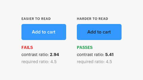
Text and images of text should have a contrast ratio of at least 4.5:1 to meet the AA success criterion and 7:1 to meet a AAA success criterion. However, there are exceptions to these contrast rules:
- Large text: Larger-sized text, like headings and some subheadings, can have a lower contrast ratio of 3:1.
- Incidental text: This has no color contrast requirement and includes text used only for decoration or that isn’t visible to anyone.
- Logotypes: Logo or brand name text has no contrast requirement.
- Text over images and gradients: While there are no specific guidelines for measuring contrast ratio with text over a variable color background, it’s recommended that you test the area of the design with the lowest contrast. It may not always be reasonable to adjust your design in these circumstances to meet the 4.5:1 or 3:1 standard, so use your best judgment.
User interface (UI) components
User interface components include basic navigational elements as well as checkboxes, radio buttons, dropdowns, sliders, toggles, and more. Except for those that are inactive, UI components should have a contrast ratio of 3:1.
Graphical objects
Graphic elements required to understand the content should have a 3:1 contrast ratio. The exception to this is when a specific presentation of these visual elements is integral to the information being conveyed.
Don’t forget to check focus, active, and hover states for your UI components and graphics to ensure they also comply with contrast ratio standards, if possible.
Color contrast accessibility: Exceptions to the rules
While the WCAG guidelines will steer you on the path towards ADA-compliant email design, there are times when suggested contrast ratios are not as readable as you’d assume.
UX Movement made an interesting case for situations when WCAG standards for contrast aren’t necessarily applicable. They did a survey on Twitter asking whether people felt a button with white text on a blue background or black text on a blue background was more readable. While the white text failed the WCAG ratio test and the black text passed, the majority of users found the white text easier to read.
Twitter replies to the survey also pointed out some additional contexts to consider when assessing contrast readability. User @ScrimgeourIan suggested that the background color behind the button and other graphical elements that are in proximity to the button will also play a role in readability.
Below is the original image used in UX Movement’s Twitter survey. You can compare the above image from their website and the image below and decide for yourself if the background behind the buttons makes a difference.

Bounteous conducted a similar survey using white on orange and black on orange as the sample. They asked 20 colorblind participants whether they preferred white text or black text on the orange button and 61% preferred the white text — even though it’s considered less accessible.
The above research is by no means authoritative. However, it does highlight that perception is contextual, so when you’re having trouble making design decisions that jive with WCAG ratio guidelines, it’s likely permissible to occasionally choose something that you feel looks better even though it may not pass accessibility tests. You should try to create ADA-compliant designs and be thoughtful about your use of color contrast to be as accommodating as possible, but there is a bit of wiggle room.
Six tips for color contrast in email design
1. Text and background colors
Steer away from medium to light greys on white backgrounds, mid-toned colors with high saturation, and foreground and background colors that are similar in luminance.
If you’re going to use a lighter color on a light background or a darker color on a dark background, reserve those use cases for heading text so that the increased font size will make up for the diminished color contrast.
Use accessible contrast ratios in all of your buttons’ activity states. Depending on the states and styles you’re using for your button, there can be many different color/contrast combinations to test, so try to keep things simple.
While color and opacity changes can show that a button is in a hover, focus, or active state, a more accessible way to show activity is to increase button and font size during active states.
3. Link colors
Make sure your link colors in both their hover/focus states and default states meet contrast guidelines against the background and the surrounding text.
4. Beyond colors
To accentuate information, use underlined, highlighted, bolded, or italicized text for links. Include icons on buttons and use other graphical indicators like arrows, stars, checkmarks, other glyphs, and even emojis that help convey meaning.
5. Graphics and imagery
Keep your graphics clean and uncluttered. Use a limited color palette that meets WCAG guidelines as much as possible and avoid placing text over busy background images. If you must place text over a background image, use a color overlay that contrasts with your text and helps mute your image so that the information becomes the focus.
Remember that many email clients won’t initially render your images, so always provide alt text.
6. Dark mode emails
With dark mode popularity growing on both desktop and mobile, it’s important to consider it when crafting your emails. Some email clients automatically invert colors from light mode when users have dark mode settings turned on. If you aren’t paying close attention, that could lead to readability issues in dark mode.
If you want to use custom dark mode styles, you can use meta tags and media queries. Get more information in our article on dark mode for email, and be sure to test dark mode emails to preview how they’re displayed in different clients.
Improving the email experience
In addition to checking your design for WCAG contrast ratio compliance, use a vision simulator app to see what your email might look like to those with different visual impairments. Here are a couple of options you might want to try:
- Chromatic Vision Simulator for iOS and Android. This app simulates three types of color deficiencies: protanopia, deuteranopia, and tritanopia. Take a screenshot of your email design within the app, then view and save your simulations.
- VisionSim for iOS. This app, developed by the Braille Institute, simulates different low-vision conditions and gives a list of causes and symptoms for each. Take a screenshot of your email design within the app, then view and save your simulations.
It may take some extra time to develop email designs that are WCAG compliant, but the increased conversions from thoughtful, accessible design will be worth it. To help speed the process along and ensure accuracy, use an email readiness tool. Email on Acid’s accessibility features help you create emails that reach a broader audience quickly and efficiently.
Our built-in accessibility features include:
- Enhancing your contrast ratio
- Setting up code for screen readers
- Removing title attributes
- Setting image alt text
- Enhancing link accessibility
- And color contrast …

Try Email on Acid today and start reaching and converting more customers.