Email Marketing
9 Tips to Craft a Killer CTA

The Difference Between a Lead and a Customer
If you went through the effort of creating a killer subject line and compelling content, it is an EPIC fail if you forgot to optimize your “call to action,” better known as a CTA. Why? Because the whole goal of your email is to have your subscriber take a desired action. Your call to action is the critical stepping stone that turns leads into customers.
Unfortunately, many people create their CTA as an afterthought, without any time or care put into its creation. Don’t fall into this trap. Give your CTA the attention it deserves! We’ve got 9 of the best ways to optimize your CTA to increase your clicks, and in turn, increase your conversions.
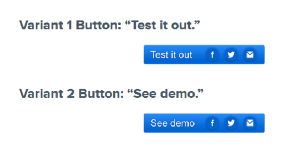
While there is a time to get creative with your wording and add a little pizazz to your marketing material, that time is not when you’re crafting your call to action. Don’t leave any doubt in your readers’ minds. Tell them exactly what you want them to do. A company called Friendbuy is great example of how you can QUADRUPLE the number of visitors who interact with your product, just by creating a clear call to action. Friendbuy had initially made their CTA overcomplicated and were seeing only a 1.44% CTR.

This is a screen capture of Frienbdbuy’s homepage.
Friendbuy saw the need to restructure their CTA and formulated two other variations that were direct, clear and uncomplicated. Friendbuy replaced the original CTA with a 50/50 rotation of the two new versions to ensure their results were legitimate.
This is a screen capture of Frienbdbuy’s homepage.
Below are the results:
- Baseline (original) CTR: 1.44%
- Variant 1 CTR: 2.47% (71% improvement over baseline)
- Variant 2 CTR: 4.49% (82% improvement over variant 1, and 211% improvement over baseline)
In this case, the results clearly show the CTA that resonates the most is one that is crystal-clear about what action you want people to take. A prospect should never question what their next step is. Tell it plainly and tell it simply.
The design of your CTA button is just as crucial as the text. Even if you have crafted a direct CTA that resonates with your audience, it won’t matter if the button’s design doesn’t jump in front of your reader and demand their attention. That is where color and contrast come into play.
When picking the color of your button, make sure to pick a bright color. Colors like neon orange and bright green should be in your color palate. You must also ensure that the color of your button contrasts sharply with your background. For example, it would be a design faux pas to create a CTA like the one below.
“Sign up Now” blends into the background color, leaving your eyes wandering around the page searching for the next step. Check out the two CTA’s below that make good use of color and contrast to draw readers’ eyes directly to the call to action:
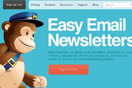
This is a screen capture of a MailChimp CTA. This is a screen capture of PayPal’s CTA.
You can see in the CTAs above that both buttons are not only bright colors, but they stand out nicely against the backgrounds. Next time you are creating your button, think about what kind of design would demand your attention.
Subscribers tend to get “form anxiety” quite easily. They fear sharing personal details because they are afraid you’re going to misuse it. That is why it’s important that you have something on your form that assures your potential subscribers that you will keep their private information, well, private!
Gojee reduced their subscribers’ form anxiety in a fun and creative manner. On their sign up form they wrote, “We swear on our finest bottle of scotch that we won’t spam you.” So brilliant. Check it out below:
This is a screen capture of Gojee’s website.
As a marketer, you need to anticipate the needs of your subscribers. In this case, it is their need to feel safe and secure that the information they pass off to you will stay private and not be strewn across the worldwide web. Throw a quick link to your “Terms of Membership” or “Privacy Policy” near your CTA to set your readers’ minds at ease.
The point of a CTA is to get readers to perform an action – now. Not twenty minutes from now or two days from now; you want them to take action immediately. When optimizing your email campaign, urgency is a powerful psychological motivator. Deadlines compel your customers to take the next step.
Marketing and branding expert Susan Genulius recommends including offers that are time sensitive. Use words that convey a specific time frame or deadline throughout your copy such as “One-day Sale” or “Only Available to the first 20 callers.” This is particularly effective for marketing messages that advertise short-term promotions.
Dunked made great use of this tactic in an email campaign. Dunked wanted to ensure that users activated their account within a short timeframe. They used a 3 day deadline to spur their users into action. See their time-oriented copy below.
This is a screen capture of Dunked’s email campaign.
It doesn’t always have to be a blatant time-crunch, though, to motivate someone to complete your desired action. You can also use urgency in a less in-your-face kind of way. Subtle tactics simply implying urgency without having to spell it out can be effective as well. For example, CTAs such as “Don’t Delay,” “We’re about to hit capacity,” “For a limited time only,” or “While Supplies Last,” do not give a hard deadline, but communicate that there is a deadline in the near future.
Depending on your desired action, figure out whether a deadline-oriented CTA is preferable or if a subliminal tactic would be the most effective for your pitch.
Sometimes less is more, but not when it comes to the size of your call-to-action. The size of the elements in your email campaign should communicate the importance of those elements. Therefore, the larger your CTA is, the more important it is.
This does not mean, though, that you should create an overwhelmingly large CTA that takes away from the integrity of the email. As they say, “everything in moderation.” Olark did a great job of sizing the CTA in their email below. It’s large enough to catch your eye, but not garish or tacky in size.
This is a screen capture of Olark’s email campaign.
Always consider the other elements within your email to appropriately size your CTA. If you are still unsure of how to size of your CTA, check out Hubspot’s helpful measuring guide below.
This is a screen capture taken from Hubspot’s website.
Relevance is key when it comes to marketing. When possible, be specific in your CTA rather than blasting out an email with vague calls to action like “sign up now” or “get it free.” Without understanding the relevance of taking the action desired, there is no benefit. That is why personalizing your CTA could increase conversions ten-fold.
LinkedIn did a fantastic job personalizing their CTA in their email below:
This is a screen capture taken from LinkedIn’s confirmation email.
LinkedIn’s CTA resonates much more powerfully with their subscribers because it speaks directly to them, reaching them on a personal level. Next time, make your CTA more effective by drilling down to a very specific and very personalized action you want your reader to make.
85% of email clients block images by default. That means that unless your readers opt to download your images, they might be missing your primary call-to-action. In order to ensure your message gets across loud and clear, you need to optimize for image blocking.
Ensure that your customer will always see your CTA is by designing the button with HTML instead of using an image. Although this creates some extra steps in your process, it can be well worth your time. An HTML button will spare your message from falling flat and showing up as a red X where image blocking is enabled.
As we noted above, 85% of email clients block images by default. We mentioned two alternatives to get around pesky image blocking, but there is a third way that has nothing to do with maintaining the visual integrity of your images. You can add custom alt text to your CTA image so it comes across through words instead of images.
In case you need a quick refresher, when an image isn’t able to load in an email, the “alternative text” is displayed. Alt text could be the file name of the image like “EOA CTA” or something custom you have crafted on your own. Check out an example of leveraging alt text in html below:
This is a screen capture from Hubspot’s website.
The alt text used above is an example of more generic text as it reads “inbound pra cta.” If the reader saw this text display when the images were turned off, they wouldn’t know what their next move would be. If you are adding alt text to the image that is your CTA, make sure it is customized and actionable. For example, “Download Ebook + Template Now” would have been much better for the CTA above. You should also hyperlink the image so the alt text is clickable. This way, your alt text can be a text-based CTA.
One other aspect that makes alt text advantageous is that alt text can be read by search engines. This means alt text can get you additional SEO points. It’s win-win!
All of the tips given above to optimize your CTA will probably increase your clicks right off the bat. However, to consistently improve your conversions, you need to be A/B testing! A simple tweak in your CTA could significantly increase your bottom line; that’s why testing MUST be part of your marketing strategy.
As I had mentioned previously, Friendbuy made a simple tweak to their CTA and saw 211% improvement in their clicks. The smallest change can make a huge impact. Check out results from a CTA test Hubspot ran. In the results you will see that all they did was mix up a few simple words to generate these results!
This is a screen capture from Hubspot’s website.
There are always more opportunities to convert leads through your CTA because there is always room for improvement in your marketing strategy. A/B testing is a fantastic diagnostic tool to better understand the visitor behaviors and priorities that will ultimately convert them into a customer. However, testing yields the most valuable results only when you test repeatedly. If you make a consistent habit of testing, you’ll find that the accumulated data (and lessons learned from it) can have a dramatic impact on the success of your clicks, and in turn, your conversions. eConsultancy’s 2012 Email Marketing Industry Census concluded that only 16% of marketers test frequently. Are you?
For more tips on A/B testing, check out our blog on 6 Simple A/B Tests to Optimize Your Conversion Rate.
Getting at the heart of your marketing strategy…
At the end of the day, deliverability, killer subject lines or compelling content are not what brings home the bacon. Instead, what really matters is if your subscribers took the action you were encouraging them to. Whether you were hoping to grow your list of subscribers or sell your biggest product yet, it all comes down to the conversions your email generated. That is why when you are optimizing your email marketing campaigns for conversions, the place to start is undoubtedly your call to action (CTA). So grab your thinking hat, a big cup of joe and the 9 tips listed above, and get to testing!
What have you learned while optimizing CTAs in your own emails? Share your insights with us in the comments!