Email Marketing
5 Psychology Principles to Improve Your Next Email Campaign

Every day we are bombarded with hundreds of decisions and it’s impossible to make sound, rational choices at every turn. Instead of logic, we often rely on emotions, or our gut instinct. A great example is in your inbox. It’s impossible to read every email so you skim, mass delete and read only the emails that pique your interest or demand your attention.
With emotions playing such a large role in decision making, it would be foolish to ignore psychological factors that might influence opens, clicks and conversions. Understanding these five basic tactics arms you with the ability to create emails with a “wow factor” that gets results.
Read on to learn more about the 5 persuasive psychology tactics you should use in your next email campaign.
Color
Color elicits emotional responses from individuals. If you know what emotion you are trying to evoke for a conversion, understanding the psychology behind particular colors can be an incredibly useful tool.
While color can have different meanings across cultures and individuals, here are some general guidelines for U.S. marketing from MadMimi:
- Red: Energetic (may increase heart rate)
- Orange: Aggressive (may incite a call to action)
- Blue: Trustworthiness (suggests security)
- Green: Relaxing (also suggests wealth)
- Yellow: Optimistic and youthful
- Pink: Romantic and feminine
- Black: Powerful and slick (often used for luxury products)
- Purple: Soothing and calming
THREE DEEP made a fantastic clockwork conversion color model laying out how to use all the colors in your email or landing page in unison for maximum effectiveness.
From the model above, you can see that not only picking the right color for your email or landing page is important, but then you must be picky when choosing the other colors in your email, say the CTA color, to ensure it compliments your main color choice. From the graph above, you can see that if you have a blue background, an orange CTA is recommend to maximum conversions.
Choosing the right color can have a great impact on the success of your campaign, but it’s important to remember that color is very dependent on personal experiences. So test, test and test again to uncover the color that will speak the strongest to your audience.
Images
The old saying, “a picture is worth a thousand words,” still rings true in the art of email marketing. Why? Just like color can elicit certain emotional responses from your reader, so can images. And about 80% of your audience is scanning your email anyway—not actually reading it word for carefully chosen word (we’re sorry)—so a relevant image is crucial to get your message across to the on-the-go reader.
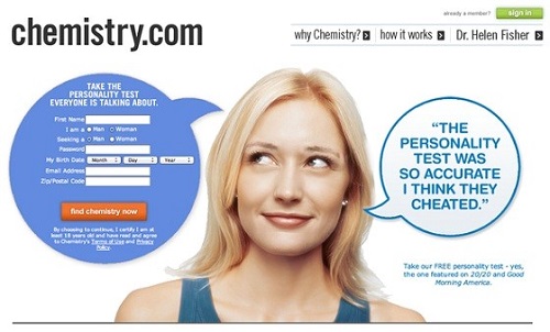
When deciding what images to use in your email, one type will always resonate: images of people. Images of faces are processed in the “fusiform face” area of the brain, which also processes emotional responses. These images allow your reader to create an emotional connection with your content and brand.
When using people in your image, use visual cues for optimal placement. There are two types of visual cues you can leverage: Explicit and implicit directional cues.
Explicit directional cues are obvious: fingers or arrows pointing to the CTA. They exist to draw your attention directly to the form or CTA. An implicit directional cue is less obvious and might, like in the example below, have the subject looking at the CTA rather than pointing to it. This is a more casual and subtle visual cue but still will get the job done.
In Emma’s Brainiac Guide to Using Images in Email, other tactics to remember when leveraging images in email are to put an image above the fold, create a consistent look and design buttons for mobile.
Personalization
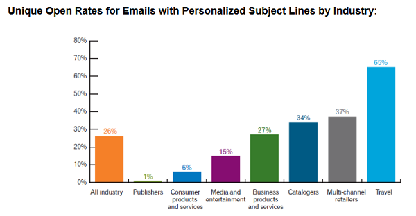
Never underestimate the power of personalization in your email efforts. Experian Marketing Services found that personalized emails deliver 6x higher transaction rates. Additionally, Experian found that personalized subject lines result in 26% higher email open rates.
Check out this graph from Experian Marketing Services breaking down open rates by industry when personalized subject lines are used:
Personalization options don’t end with just using your recipient’s first name. Have you considered creating buyer personas for email marketing? Once you have an understanding of your buyer personas, you can segment and tailor your content based on them.
Here are even more ways to integrate personalization in your email campaigns:
- Demographics
- Survey Results
- Email Activity
- Past Purchases
- Geolocation
- Purchase Cycle
- Weather Patterns
Aberdeen found that personalized emails improve click-through rates by 14% and conversion rates by 10%. So what are you waiting for?
Social proof, also known as informational social influence, is a psychological phenomenon that occurs when an individual looks to other people’s actions to determine what decision they should make. According to CompUSA and an iPerceptions study, “63% of consumers indicate they are more likely to purchase from a site if it has product ratings and reviews.”
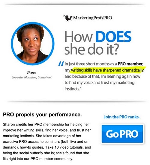
In email marketing, social proof is a must. Sure, you have an incredible offer (product, service, etc.), but you need real people singing your praises to convince other real people. Below, MarketingProfs did a great job with a customer testimonial, using a case study like-example to show what a PRO membership can do for an individual.
Social proof can take many forms. Here are a few more ideas to stir up your creative engine:
- Website/product ratings and reviews
- Badges/seals/certifications
- Number of customers served
- Testimonials from “industry experts”
- “Likes” on social networks
- Positive posts or tweets on social media
- Number of followers on your blog
Bottom line: As an increasingly social culture, people want to feel validated by knowing that others find value in the product or service they are considering. Ease their minds and create an environment where that decision is even easier to make with a nudge from social proof.
Scarcity
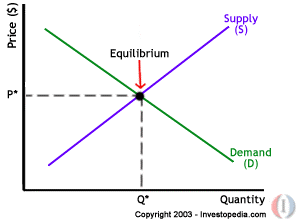
FOMO (aka fear of missing out) is at the center of the psychological concept of scarcity. Scarcity is also tied to the economic principle of supply and demand laid out in the chart below:
The more scarce a product is (or seems to be), the more desirable it becomes. Think about it, you’re online shopping and see that gorgeous cocktail dress that would look oh so perfect on you. You could consider bookmarking the page and check back later, but then you notice it’s almost out of stock. Suddenly you’re clicking the buy button faster than you can say “Bob’s your uncle.”
Exclusivity or scarcity can be a very powerful motivating factor when it comes to email conversions and can be executed as a time-based or limited supply call to action. You probably see scarcity marketing every day and don’t even know it. Take for example, Groupon, who utilizes the scarcity concept as a part of its core business model and in each email campaign sent.
In the email below, Asos does a great job of interweaving scarcity into all the elements in the email. They use the theme of time in the text and even have a clock in the upper right hand corner showing how much time the shopper has left.
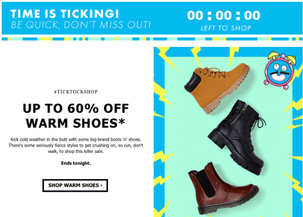
No one likes to think they missed out on something big, so leverage scarcity in your next promotion to increase your conversions. Don’t overdo it, though. You don’t want to desensitize the psychological power of this tactic.
What are your favorite psychological principles to leverage in your email campaigns? Share them with us in the comments below.


Social Proof