Email Development
Mobile Optimization: Retina Images in Email
Retina images are a simple form of mobile optimization that can be implemented in any email campaign. Want to know what a “retina display” really is, and how to code these beautiful images into your own campaigns? You’ve come to the right place.
What is a retina display?
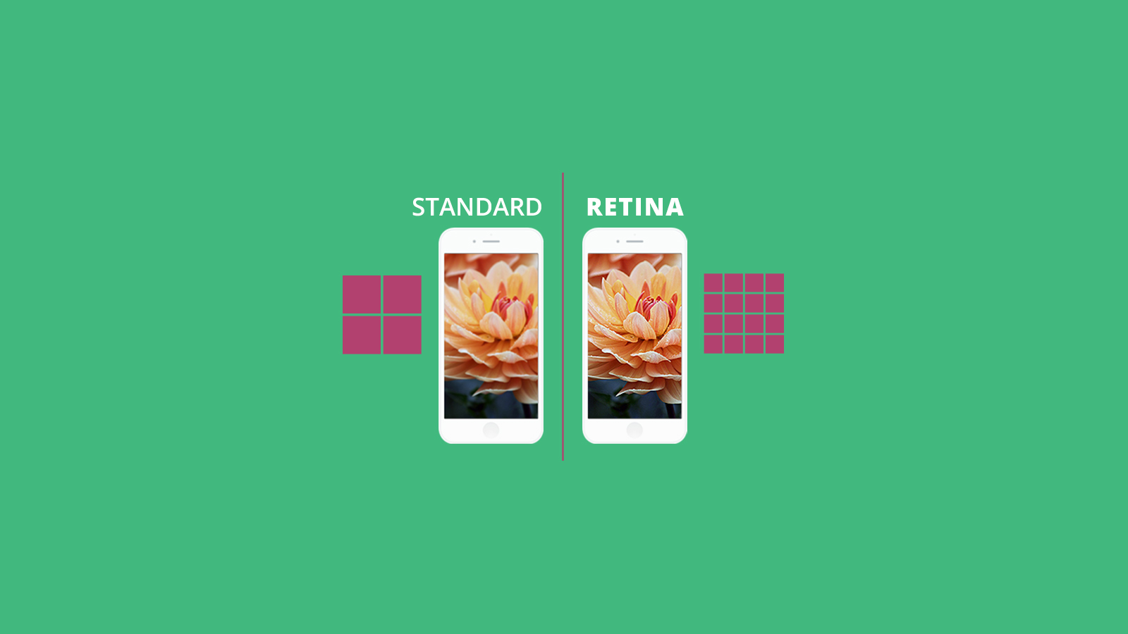
“Retina display” is a marketing term that Apple uses to refer to their high pixel-density displays, usually 300 or more pixels per inch, in which the individual pixels are indistinguishable at a normal viewing distance. The iPhone 6, for example, has a resolution of 1334×750 and 2x pixel density. “Pixel density” refers to the number of physical pixels that are considered to be a single pixel for display/CSS purposes. So a phone with 2x pixel density considers a 2×2 block (of 4 pixels) to be a single pixel in CSS. This enables the phone to show much higher quality images while keeping text readable.
When showing an image at its native dimensions, this can cause it to appear a bit more blurry. For instance, a natively 300px wide image that is being displayed via CSS at 300px on the iPhone (yes, that’s 600 physical pixels) will appear a bit more blurry. This is because in each 2×2 block, all 4 pixels show the same thing. If a natively 600px wide image is displayed at 300px width via CSS, the retina screen will kick in. Each of the pixels in each 2×2 block will be able to show a different color, making the image look a bit crisper.
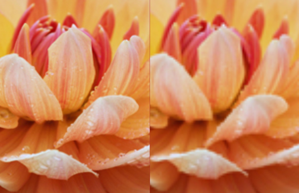
For example, take a look at the flower image below, taken on an iPhone 5S. The top image was saved at 600px wide, but displayed at 300px. The bottom image is saved and displayed at 300px. As you can see, the top image is just a bit more crisp, especially the droplets of water on the flower’s petals.

Image thanks to morguefile.
Why serve retina images?
Some images will benefit more than others from this sort of treatment. Logos, especially, can look blocky if not properly optimized. Also, any image that a user might zoom in on will benefit hugely from retina optimization. Check out the zoomed-in samples of the flower image from above (retina image left, regular image right).
If your emails contain a lot of images, especially for product-related campaigns, I would suggest that you take the time to go retina friendly. Optimizing your email for retina screens is also particularly important if you have a lot of iOS users in your list. They will appreciate the extra effort you undertake to make images that much more beautiful!
How to code images for retina display
Make sure that you save your image (or another version of it) at twice or more the resolution that it will be displayed at. So if the image will be 500×400, save it at 1000×800.
The main challenge in coding retina images is to make sure that the images will be compatible with the various Outlook desktop clients. To achieve this, we’ll set the width as an attribute on the image tag. You can then reset the width using media queries to get the images to be the size you’d like in mobile clients. The height of the images will automatically be scaled to match in most clients. Take a look at the code sample below to see how this is achieved.
                                <!doctype html>
<html xmlns="https://www.w3.org/1999/xhtml">
<head>
    <style type="text/css">
        @media only screen and (max-width: 479px) {
            .deviceWidth {width:300px !important;}
            }
    </style>
</head>
<body>
    <table width="600" class="deviceWidth">
        <tr>
            <td>
                Retina Image (600) using media queries.<br/>
                <img class="deviceWidth" src="https://www.emailonacid.com/images/blog_images/Emailology/2015/Flower_600.jpg" width="600" ><br/>

            </td>
        </tr>
    </table>
    <table width="600" class="deviceWidth">
        <tr>
            <td>
                Retina Image (600) using width attribute.<br/>
                <img src="https://www.emailonacid.com/images/blog_images/Emailology/2015/Flower_600.jpg" width="300" ><br/>

            </td>
        </tr>
    </table>
    <table width="600" class="deviceWidth" >
        <tr>
            <td>
                Regular Image (300)<br/>
                <img src="https://www.emailonacid.com/images/blog_images/Emailology/2015/Flower_300.jpg" ><br/>
            </td>
        </tr>
    </table>
</body>
</html>
NOTE: If it’s important that you support Lotus Notes 6.5 and 7, you’ll need to declare the height as an HTML attribute as well. This will make your media queries a bit more complicated, as you may have to declare a specific height for each image.
Targeting retina displays via media queries
You can use this media query to target high-density pixel displays specifically. The query will trigger for any email that has more than a 1-to-1 pixel ratio. You can use our image swapping technique with this media query to replace a lower res image with a higher res image.
@media all and (min-device-pixel-ratio : 1.5) { retina-only styles go here }
How do you optimize for mobile?
Retina images are easy to implement and can really improve the visual impact of your emails. What other tweaks have you made to increase mobile optimization? Let us know in the comments below.


